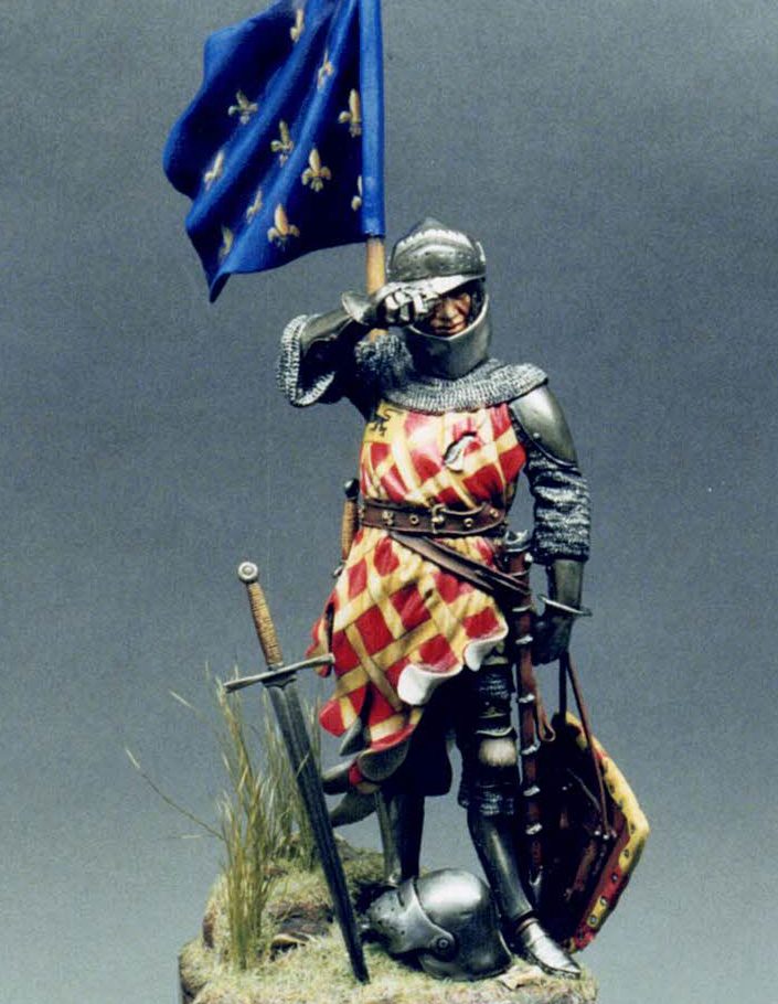
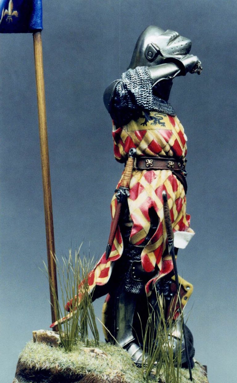
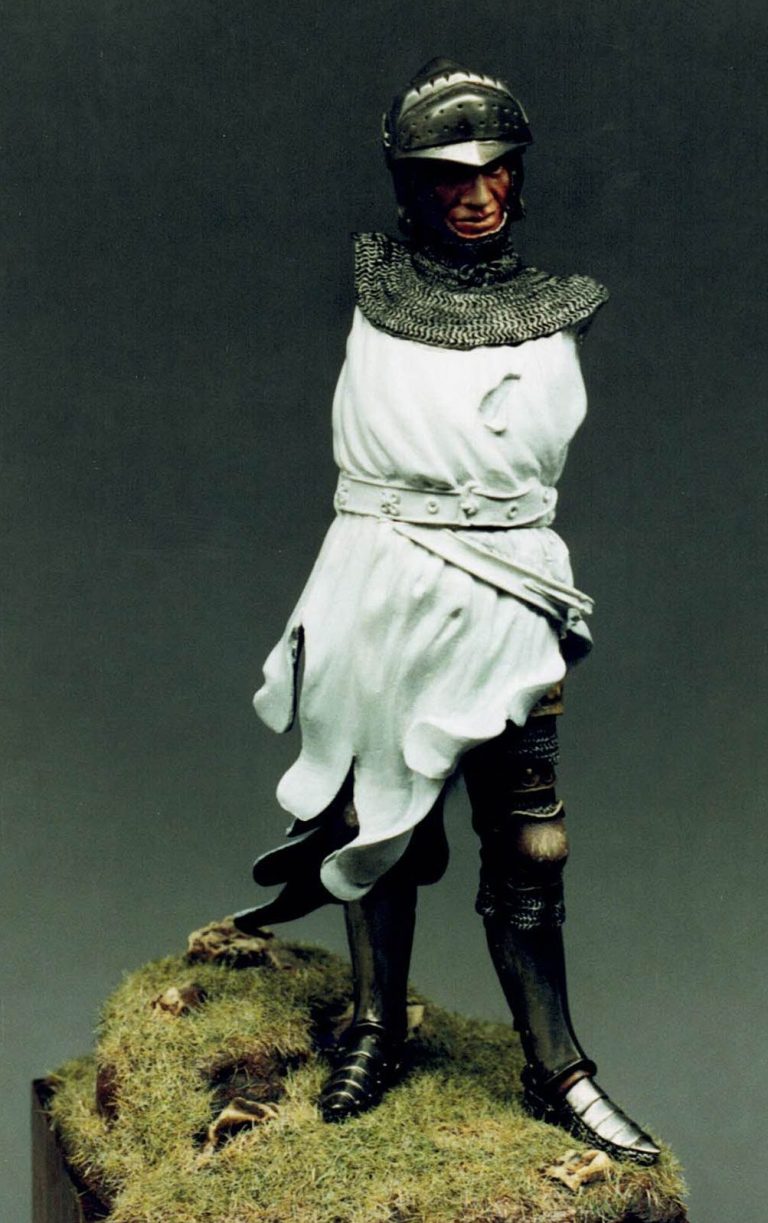
Sir Eustace de Ribeaumont, Standard Bearer at Poitiers
Pegaso 90mm French Knight 1340
90mm White Metal kit from Pegaso Models
Article in Military Modelling magazine in 2003
It's sometimes difficult to know how to begin an article, when faced with a blank page. Should one begin by waxing lyrical about the kit itself, or perhaps start by baffling you with a background story, or move straight on to the cut and thrust of battle with brush and paint pot.
The why and the wherefore
So how to start this one off ?
Well I'll begin with how I came to choose the heraldic colours for this model. I had initially thought to copy the box art to a certain degree, but one of my friends beat me to that idea so I was left somewhat adrift upon the vast sea of designs that were used by knights during this particular period. Plenty of possibilities, but a lot of them seemed dizzyingly complex.
As noted on the Andrea Crusader in Military Modelling 29 / 4. I'm not too confident when doing complex designs that have to be repeated several times on different areas of the figure.
So what to do.
To my rescue came an Osprey Men at Arms book, detailing the battles of Crecy and Poitiers. Within the excellent colour plates is a picture of one Eustace de Ribeaumont (plate F2 ), who was a Standard bearer for King Jean "The Good" of France during the battle of Poitiers. The heraldry looked simple enough once split down, for my meagre skills to cope with, which in the main is what I was looking for.
A potted history
As for history of this particular character, well he is noted as a very brave chap, who, though captured at one point by the then English king, Edward III, was hailed as the "The Best Warrior of the Day" This was due to his feat of knocking Edward to the ground twice earlier on in a battle that saw the French forces attempting to re-take Calais from Edward’s hold.
After Edward had complimented Sir Eustace in this manner, he declared Eustace free, waiving the chance of claiming quite a substantial ransom that could have been sued for, due to Sir Eustace's importance within the French nobility.
Sir Eustace was also involved in searching out, and observing the English disposition of forces at Poitiers, prior to the French attack, and together with Douglas the Scot ( an advisor to Jean the Good ) recommended attacking the English position on foot.
All the above information is contained in the Osprey book, but no mention is made of what happened to Sir Eustace during or after the battle.
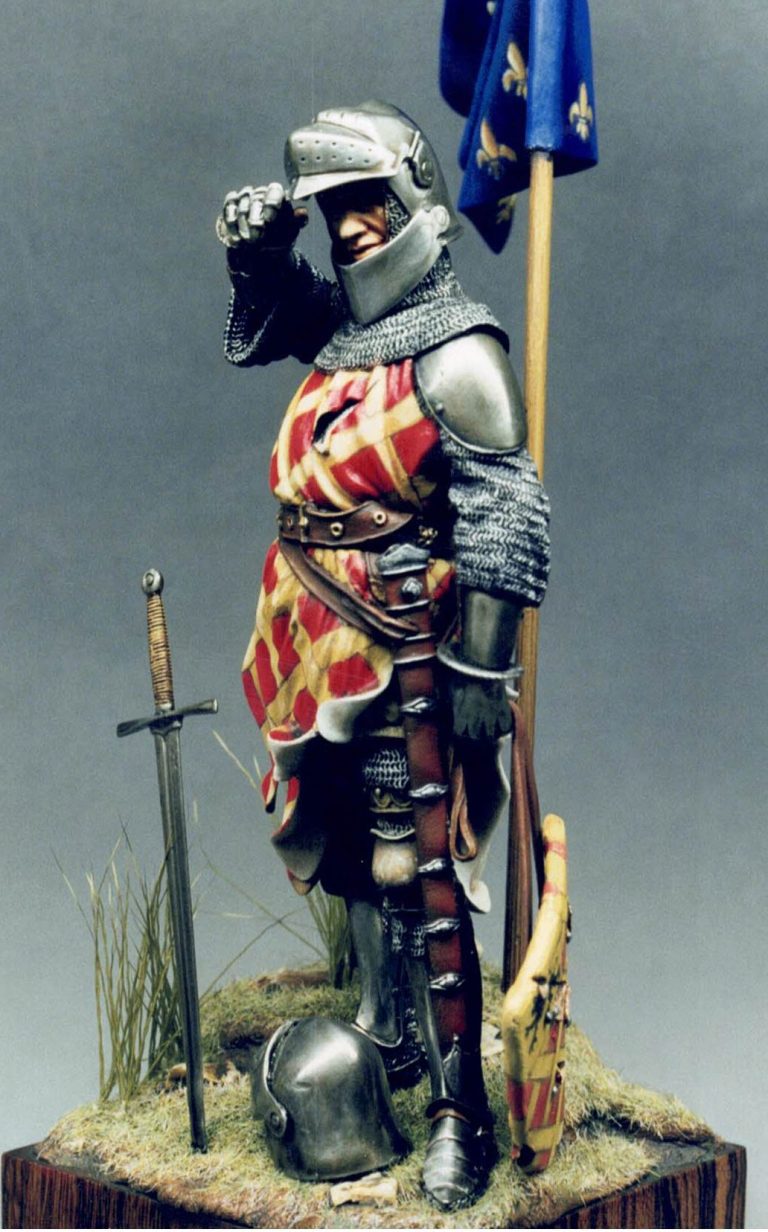
Although the description of Sir Eustace's armour is not quite the same as on the kit, I felt that it was close enough, with the inclusion of the flag for the differences in the design and length of the mail hauberk and the shape of the helmet to be passed over.
The kit
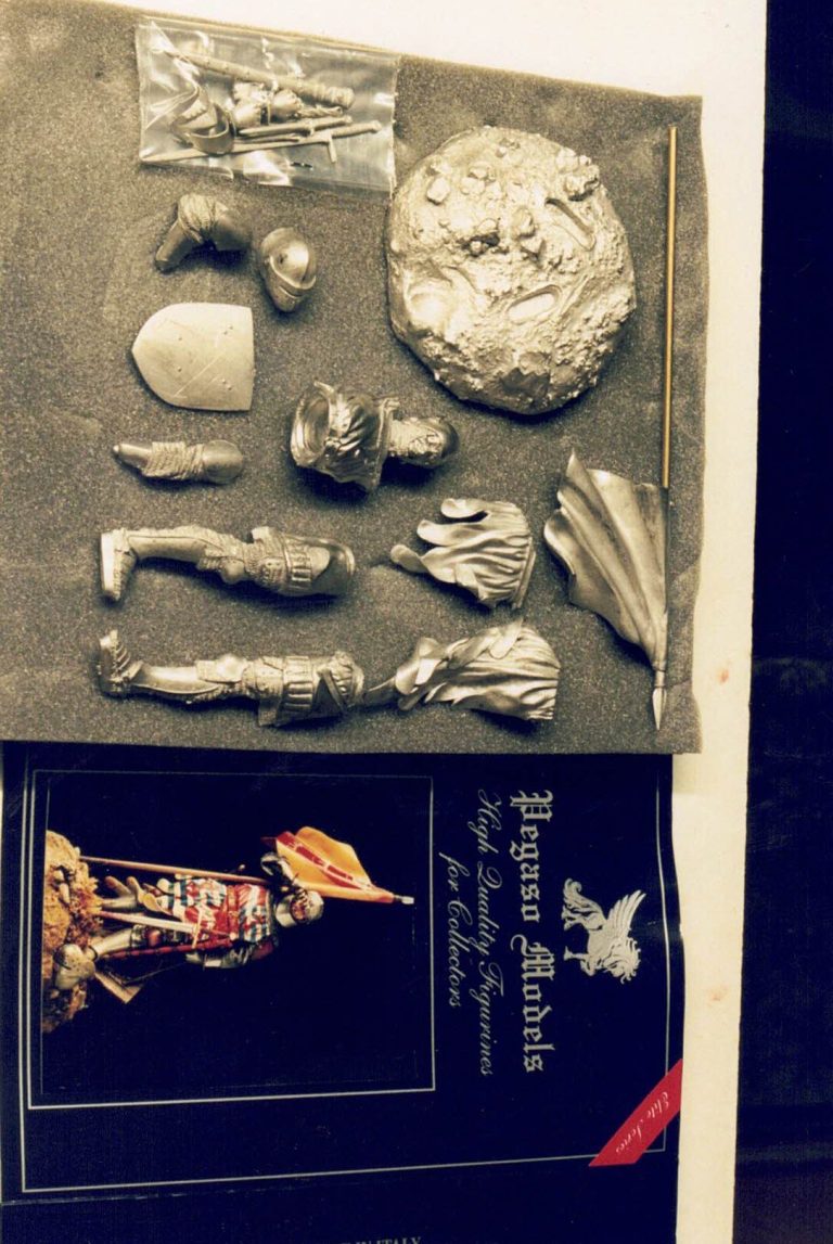
Now to the model. Packaged in the blue sleeved box that is standard for Pegaso kits. The nice addition to the standard format being a colour photo of a completed example on the sleeve front. Nice one Pegaso, much better than the pictures of assembled and primed examples of previous releases.
Inside the box are twenty white metal parts, these being split along natural breaks so that hardly any filling should be necessary. On my example the helmet visor was miscast, but this was replaced with no problem, and very promptly I might add, by Pegaso when I sent the part in question back to them.
All other components were moulded to perfection, and although there were some small mould part lines, these cleaned up easily with needle files and wire wool.
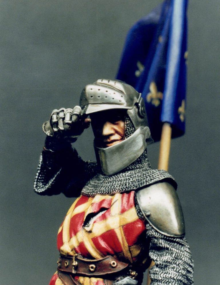
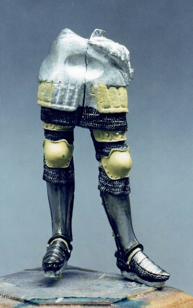
The areas that were to remain bare metal, such as the helmet, shoulder plates and shin guards were all polished in my usual way. The face was painted using oils over an undercoat of Humbrol flesh acrylic, and then I moved on to the real fun.
Paint then glue - but with caution
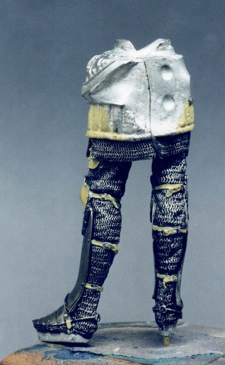
The main castings of the separate legs and upper torso were left apart so that the legs could be painted more easily, and these were completed ( armour, padding and straps completely finished ) before the "tails" of the surcoat and the upper torso were added ( See photo ).
The inside face of the surcoat tails were painted black before joining them to the figure so that there wouldn't be any bare metal visible.
One word of caution when joining the upper torso. Make sure that the casting is angled slightly so that there is a twist to the body. my friend who beat me to finishing his model of this kit, said that there isn't a definite position for the upper torso, and he seemed to think that he'd positioned his incorrectly.
. This seemed to hold true for when he added the left hand / arm, as they fouled the sword scabbard, and made fitting of the parts awkward.
With this in mind, I tacked the arm in position with a minimal amount of superglue ( so that it could be snapped of easily afterwards ). And then fitted the upper torso in position. The upper and lower torso joint is the only one I used any filler on.
There was also an amount of filing to do to the inside of the joint to make the fit better before glue and filler was added, but this is the only complaint - and not a large one at that - that I can level at the whole model.
Digging oneself a pit or two
Now for the mistakes I made.
I decided to make my own groundwork. For this I utilised milliput to form a small hill for the flag to be plunged into, with Sir Eustace standing in front of this.
It seemed like a good idea, but even though I made the "hill" relatively small, I still found that it fouled the bottom of the surcoat tail, and I had to bend this part to allow the model to stand correctly - I'd made the indents to take the feet before the surcoat tails had been fastened in position, and this is what caused the problem.
Second, I should have made the hill higher, so that the flag was raised above the figures' head - it would have looked far better I'm sure. And third, I feel I should have left more space for the shield, which only just - and by sheer luck fitted on the groundwork at all.
All this demonstrates a certain lack of forward thinking - but I'm sure that you'll all do better, won't you ! All this because I didn't like the "Burger bun top" ;ook of the original !
More Milliput
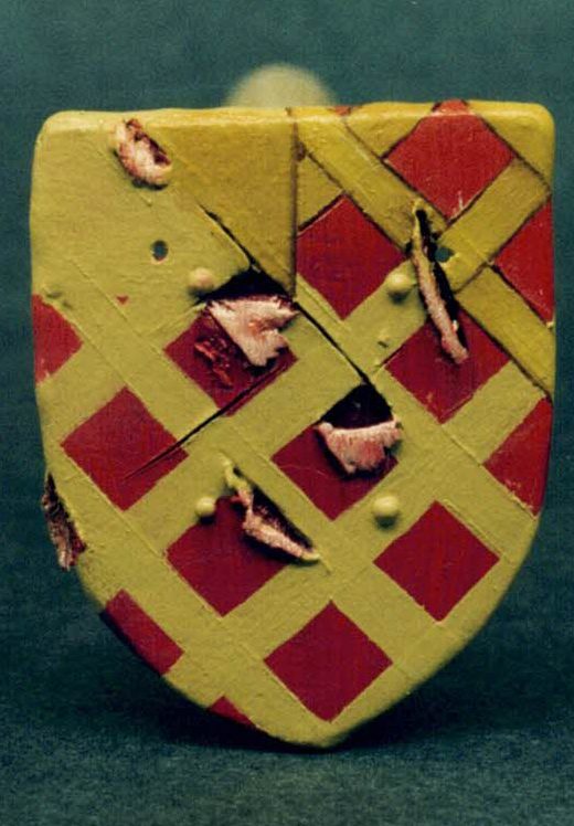
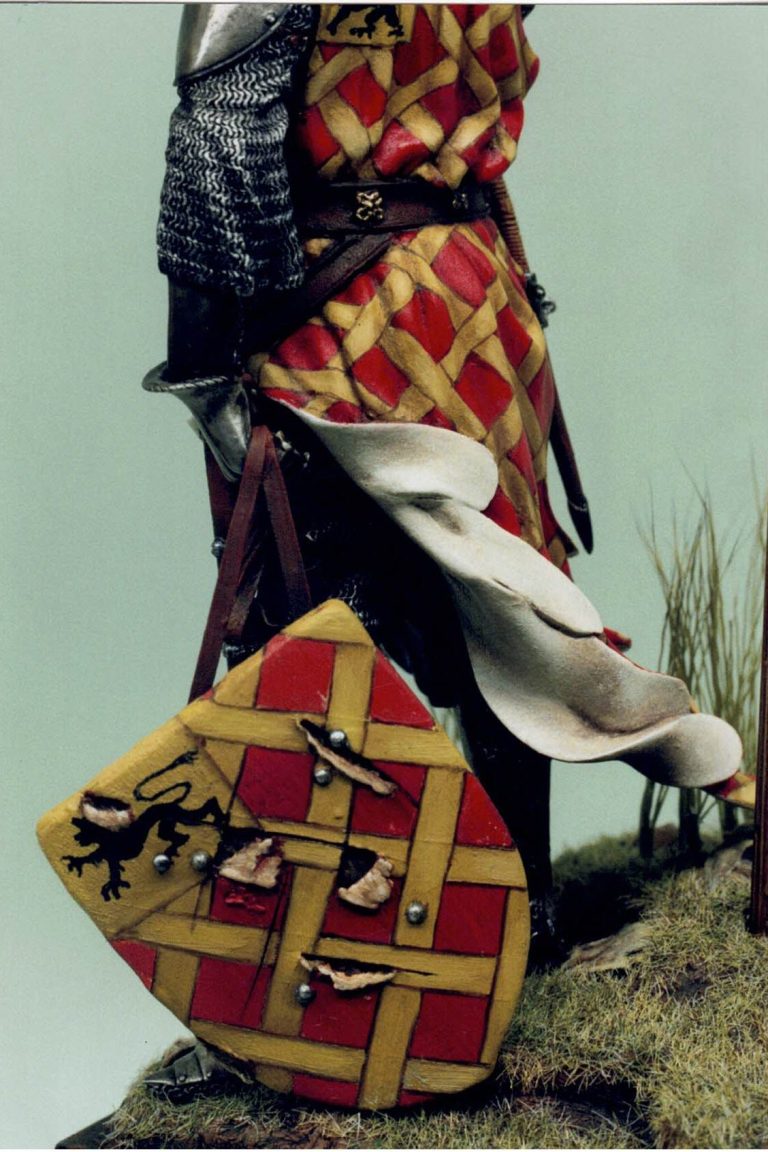
Now for the real fun. Before beginning on some more painting I decided to cover the shield with a thin layer of milliput, so that I could then add a bit of battle damage to the covering. This I did by rolling out some milliput "a' la pastry making" using some French Chalk to stop the milliput sticking to everything.
Once it was thin enough, the face of the shield was dampened with a little water, and the milliput laid on, and pressed into position, folding the edges over the back of the shield, trimming it to size, and pressing the tip of a paintbrush into the milliput to make the indentations for the nail fastening the cover to the back of the shield.
Whilst the Milliput was still relatively soft, several slashes were made across the face of the shield, pulling some of the material down to hang free of the metal casting. This was so that the shield looked battle damaged.
As the rivets on the front face had been covered up, I drilled appropriately sized holes through the shield once the milliput had dried. Through these I pushing some stretched plastic sprue, and trimmed this so that each piece stood about 2mm proud of the surface on each side of the shield.
Heat was briefly applied to the sprue with a cigarette lighter, this made the sprue "curl" back on itself to form perfect little round headed rivets ( this same method can be used to produce buttons, and whilst not being a new idea, I haven't seen it noted in print for quite some time ).
Heraldic designs
With the milliput fully cured and the rivets in place, painting could begin again. I began with the shield, mainly because it was a flat area that would give me a "feel" for the design, and also a way of gauging the size of the heraldic design components.
I began by undercoating the shield with a sand coloured acrylic, this being followed by a couple of coats of crimson acrylic. once fully dry, an overcoat of Alazarin crimson was laid down. This was tinted with orange to form highlights on the shield, and some restrained shadows added in with burnt umber.
The above was "speed dried" by placing it on a metal plate, balanced on top of a radiator, and covered with an old "Tupperware" container to keep the dust off. This dried the piece in a quarter of the usual time, and had the added bonus of curing the paint to take on a more matt finish than would be usual.
Once fully dry, the bars were added on, first with an undercoat of sand coloured acrylic - two thin coats, and then adding yellow ochre oil paint over the top of this. The bars of yellow ochre were outlined with burnt umber oils, this being blended in to the yellow slightly, and the demarcations of where the bands go over or under one another was also marked in using this colour.
Some subtle highlights were added with lemon yellow, just to emphasize the raised portions of the crossovers, but this probably won't show up too well in the photos.
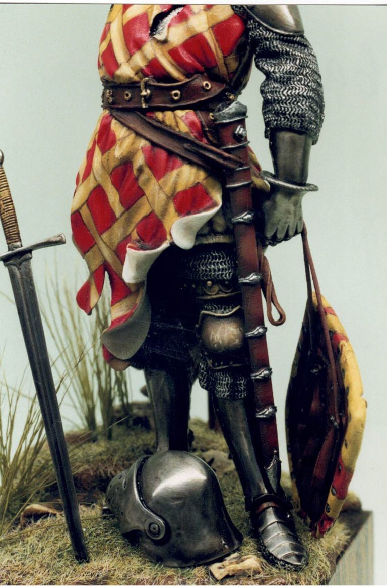
Once I was happy with this, it was a case of a deep breath, and taking the plunge to copy the barred pattern onto the surcoat. The only difficulty here was to retain the design's diamond lattice pattern over the numerous folds and creases.
I decided to do the front of the figure first. adding lines to the sides of the surcoat as demarcations for where the garment would have been sewn together. This helped to retain the pattern by not having to carry the bands on around the figure's torso, but rather beginning afresh on the back of the figure and not matching the bands to those coming from the front of the figure where the front and back of the surcoat meet under the arms.
The design on the surcoat was shaded and highlighted using the same colours as on the shield, but by using these colours to pick out and emphasize the folds in the cloth, rather than trying to make the design look three dimensional.
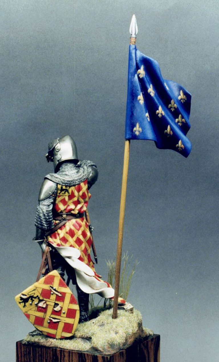
Once all this was dry - again using the radiator to heat dry the parts, I painted in the yellow square and added the lion in black. The back or inside face of the surcoat was painted in an "unbleached linen" colour, fairly close to white, but hinting that the garment was not brand new.
The usual additions
The belts, sword scabbard and dagger were painted in readiness for their being added to the model, and once everything had dried properly, these items were added to the figure. Not forgetting to paint the leather areas of the palms of the gloves in an appropriate colour.
When adding these parts, care should be taken with the right hand that is raising the visor, lining this up should be done carefully, as the separate components of arm, hand and visor allow some amount of play in their positioning.
The hardest bit
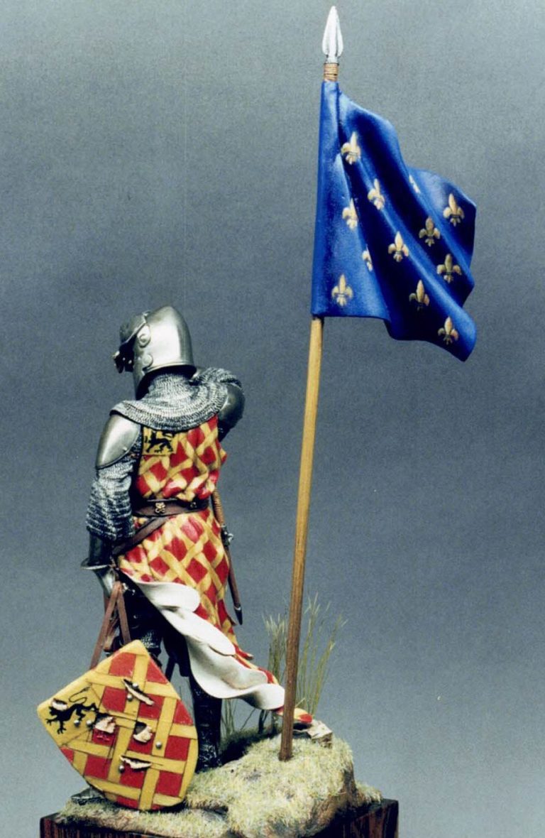
Now for the standard. It all seemed such a good idea at the time, picking this personage's heraldry. But this was the bit that I'd started to have second thoughts about. Several problems presented themselves here.
First of all, I hadn't realised that in the colour plate the flag "runs" off the top of the page, so it was hard to estimate how many fleur de lys were supposed to be on there.
This was hampered by the fact that there didn't seem to be a fixed amount on King Jean's shield, some of his fleur de lys being cut in half by the shield edge. I also couldn't manage to find any references either showing a full flag of this type, or stating amounts of fleurs, so guestimated at the spacing etc of those shown on the flag itself. I had thought of binning the flag when I got to this point, but the challenge of painting it just wouldn't allow me to take the easy path.
So how to cheat at painting a design of this type. The hardship I suppose is getting the fleur de lys all of an even and uniform size, not to mention the added fun of having an already beautifully shaped flowing and billowing flag to use as a canvass.
Before the fleur de lys can be attempted though, the flag was painted with several thin coats of blue acrylic, followed by some blue oils, these having shadows and highlights added.
What I decided to do to get the size uniform was to make a primitive printing block of a single fleur de lys.
I made this from a thin slice of pencil rubber, drawing the design onto that with a ballpoint pen. I then cut around the drawing, and glued it onto a small piece of plasticard to provide support.
This plasticard was in turn glued to the end of a cocktail stick, and printing could begin. I started by using a white undercoat, followed by sand colour acrylic.
The stamp was applied to the surface of the model in a rocking motion, rather than a straight up and down stamping movement, this proved to give a better and more even application of paint. This was then overcoated with yellow ochre, the final shape of the fleurs being added in with burnt umber and a small amount of lemon yellow for highlights.
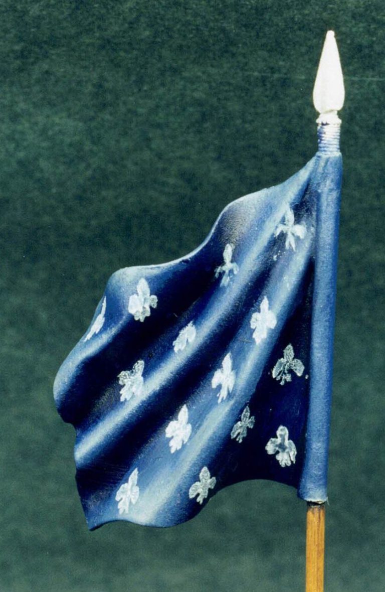
The fleurs were then "trimmed" with some of the dark blue colour of the flag, this first of all evening up the shape, and also outlining them so that they stood out even more from the blue of the flag.
Out with the glue again
With all this done, the flag and figure can be added to the base, together with the sword which has been plunged into the earth at the front of the figure.
The separate helmet, which I assume to be from a fallen soldier, or possibly discarded in the heat of the battle, was placed at the models feet, hinting at his fighting prowess.
Final verdict
What can I say, I thoroughly enjoyed myself with this one - yet again, and feel that, as with the Hussite shield of a previous issue, I've achieved something by managing to paint a relatively complex design, hopefully showing how it can be tackled in a slightly easier way than is thought at first glance, and thus encouraged anyone who's thinking of doing something similar into actually having a go for themselves.

I think I'll finish off by complementing Pegaso the model producer, rather than the model itself, as hopefully the pictures - if not my painting - will let the quality of their wares shine through.
I've made several of the models in their range, of varying scales, and have never yet been disappointed with the final outcome of each piece.
Companies such as this are not so common, and I must admit to having had reservations when Pegaso "took on" several new names to be sculpting for them.
Quality of both kit and subject matter hasn't lowered though - in fact I dare to say it's actually got better, and this I think is one of the most satisfying models I've made to date.
Well done Pegaso, this one, like the rest of the range, I can confidently recommend to anyone interested in the relevant period.
Thanks to Keith Clutton for road testing the kit for me - well finding most of the pitfalls, enabling me to manufacture a whole new set especially for myself. And my thanks to Pegaso of Italy for supplying this kit for me to review.
References :- Osprey Men at Arms " Battles of Crecy and Poitiers by Christopher Rothero ISBN 0 85045 393 3