The Old Gnome
Limited Edition Resin Kit sculpted by Sean Green
Painted in 2008
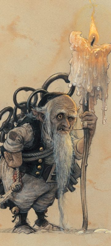
This moderately large model comes from the skilled hands of Sean Green, although the concept is actually from a famous French artist – Jean Baptiste Monge.
To start at the beginning, Sean, like myself, has an affinity for fantasy artwork, both of us collect books filled with pictures from great artists like Boris Vallejo, Chris Achillos, Larry Elmore….well, the list is quite a long one.
Cetero oporteat sensibus his eu. Has ex vidisse perpetua, vis partem mollis mandamus at. Ea nam legere mentitum prodesset, no quo lucilius liberavisse, te oratio debitis omittantur eos. Sea ea iusto detracto, ut scripta sapientem suavitate cum, nam deleniti perpetua intellegam an. Ei per officiis detraxit probatus, vim at graecis tincidunt.
I’ve always liked the Brian Froud stuff too, but hadn’t heard of Jean Baptiste Monge – a French artist, and a very good one at that. Sean educated me on that point, and to be honest I liked what I saw.
Initially I could see a connection between Brian Froud’s work and that of J. B Monge, but only because style’s of the two are similar. J.B’s are more finished and perhaps a bit more rooted in realism, the characters he renders have a mischievous and sometimes dangerous look to them, although there are quite a few that exude humour too.
For some reason I see an Irish influence in some of J.B.’s artwork, maybe it’s the tendency towards gnomes with large tankards of beer; maybe it’s something else.
But whatever the inspiration, the pictures he produces are good…..really good, and like many top artists, there’s a lot of detail in the pictures that only becomes apparent when you sit down and study them.
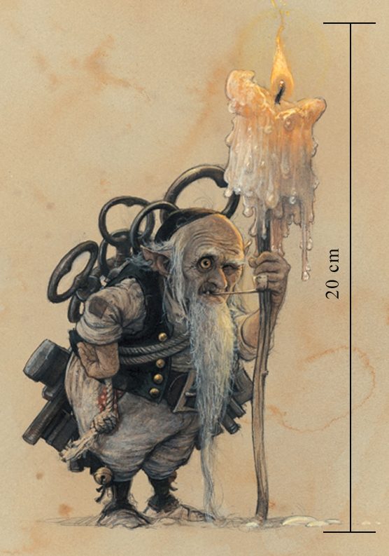
So, with a good artist, and a good sculptor, the logical thing is to get the two together – Again, Sean got a grip of that, and had worked behind the scenes to interest J.B. in having a sculpt of one of the characters he’s drawn produced in three dimensions.
This took quite some time, as Sean and J.B. discussed finer details, not to mention what was actually happening on the parts of the model that weren’t shown in the original picture.
Oh, the original picture – well a copy of that, just to show you what inspired Sean, is shown here – photo #1 in fact.
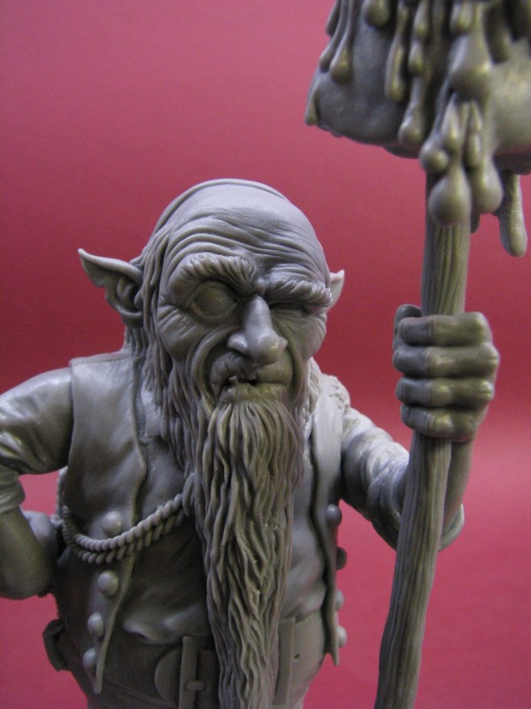
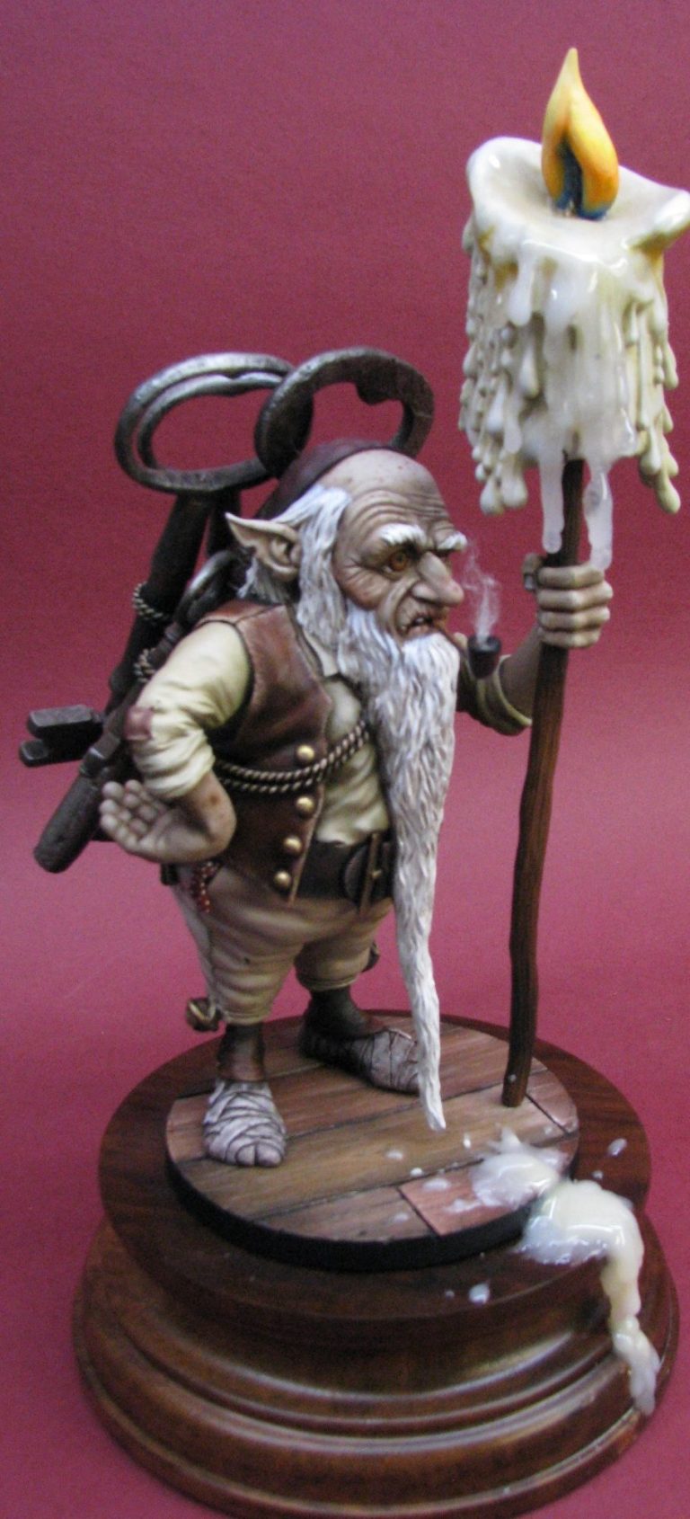
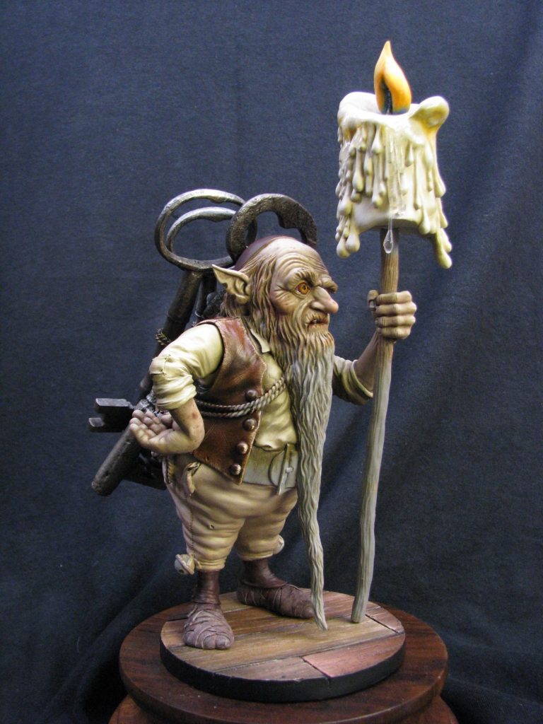
After a lot of work with Super Sculpey, Sean managed to get castings made – only a very limited number, and asked me to paint one that would eventually grace J.B.’s display case. What I was presented with is shown in photo’s #02, #03 and #04,
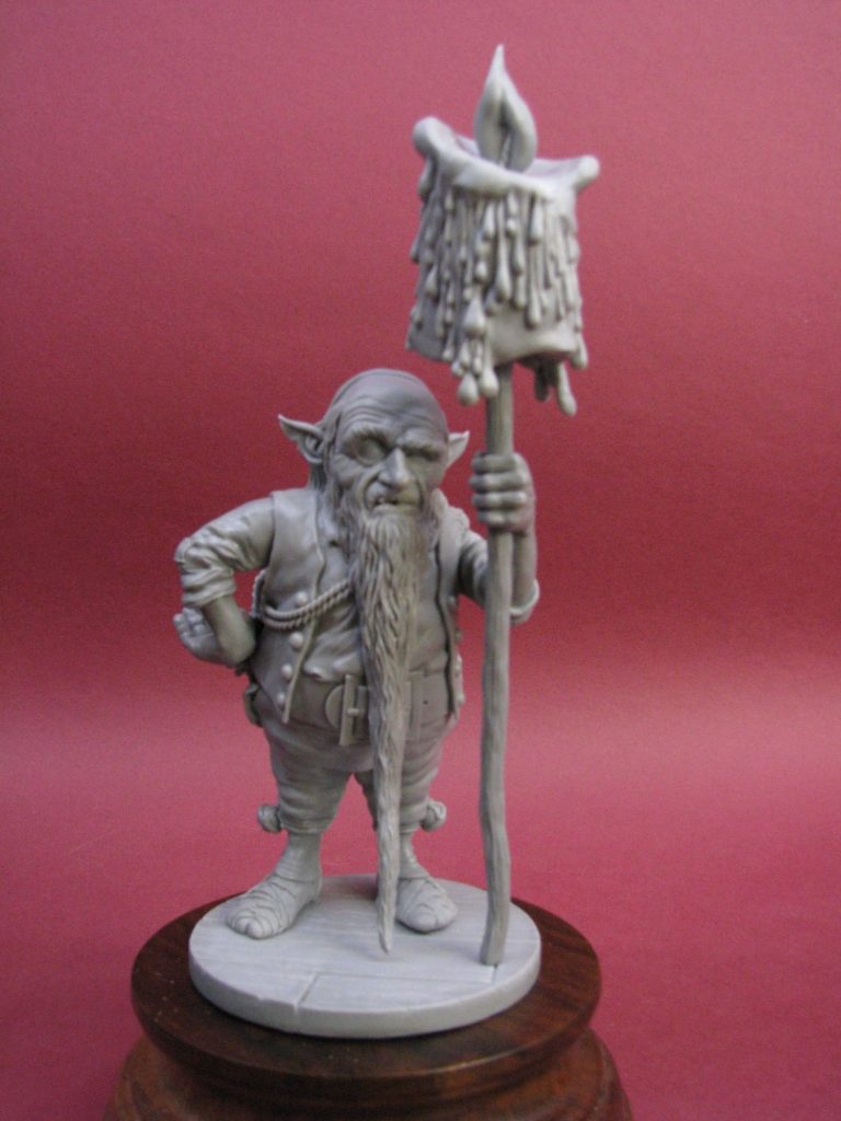
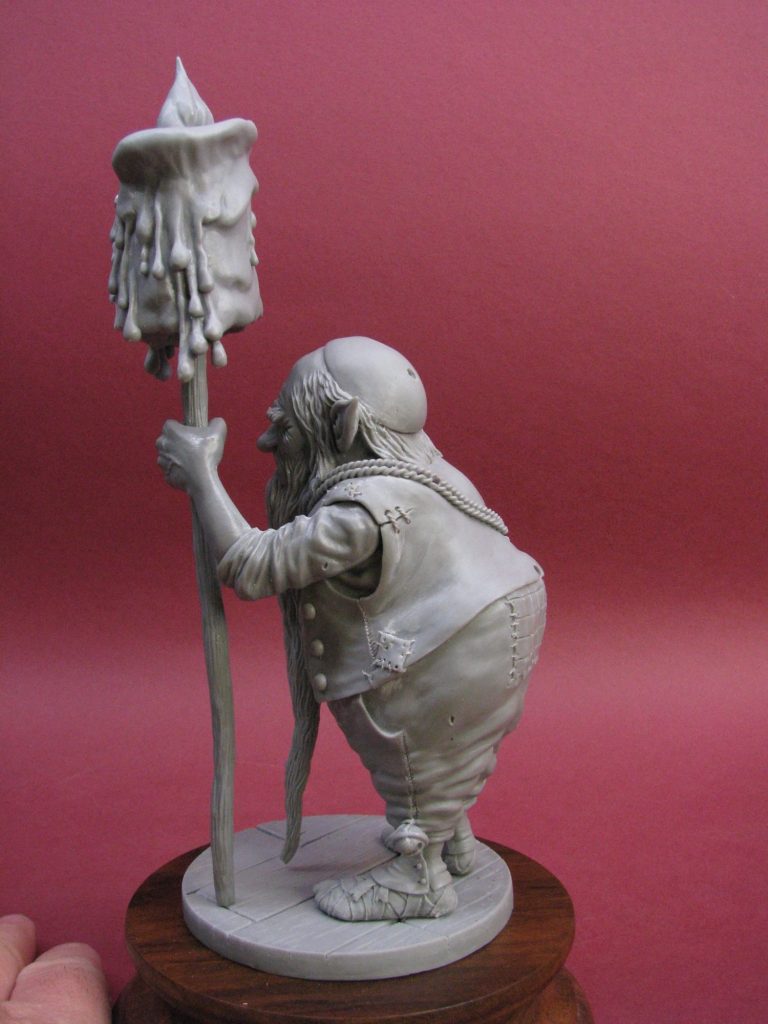
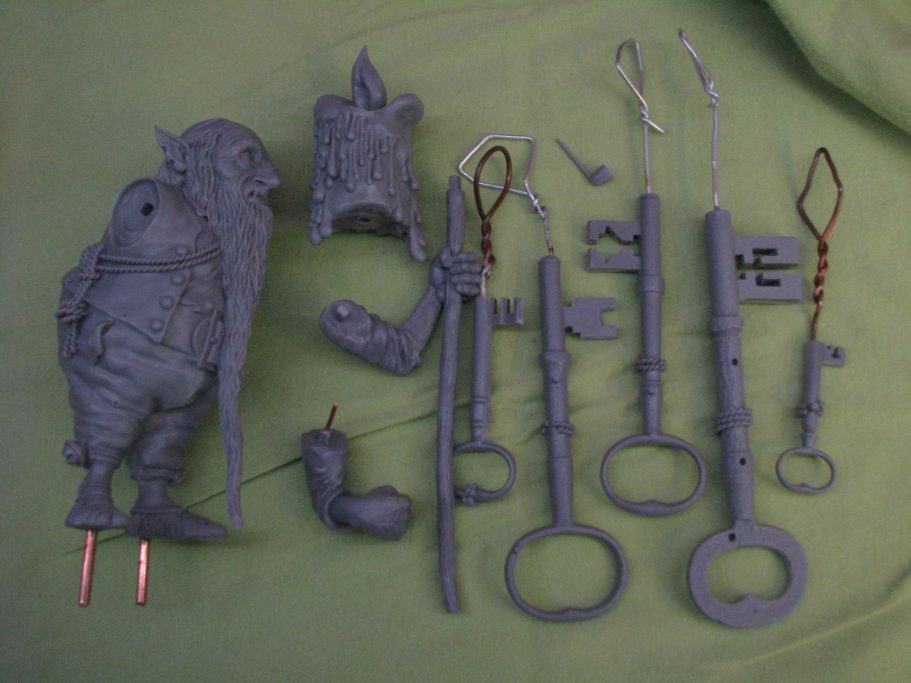
with the parts separated and laid out in photo #05.
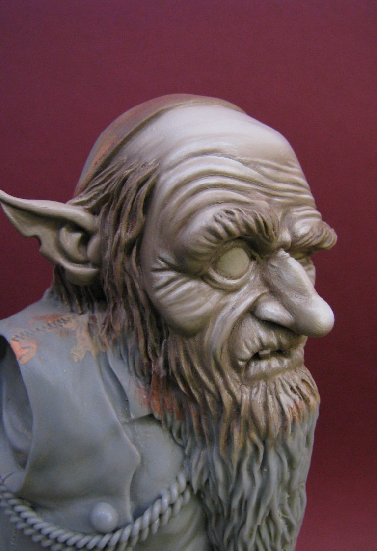
Photos #6 and #7 show the initial and abortive attempt at the face. The area is O.K. but simply the wrong colour. It’s too healthy, too human, and certainly doesn’t appear old. In comparison, photo #8 is much more what I wanted.
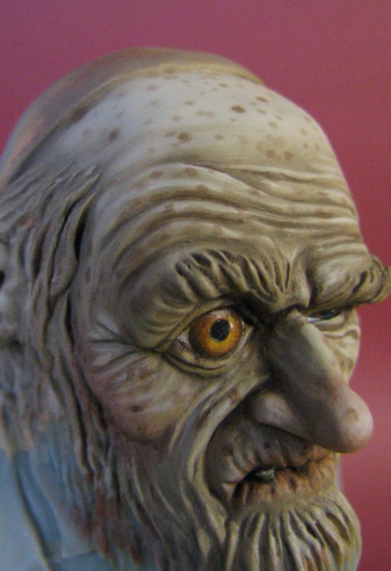
Strangely, no flesh colours were used to get to the result shown in photo #8. It’s all cream colours or greys. I began with a mix of Naples Yellow with just a dab of Mars Black for a mid tone, shading with Raw Umber and Mars Black, and highlighting with Titanium White. This was the first stage, and was allowed to dry fully.
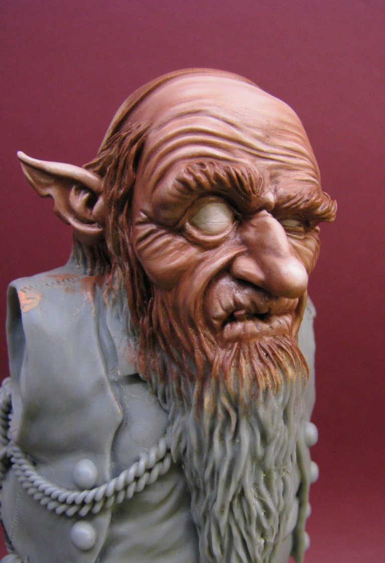
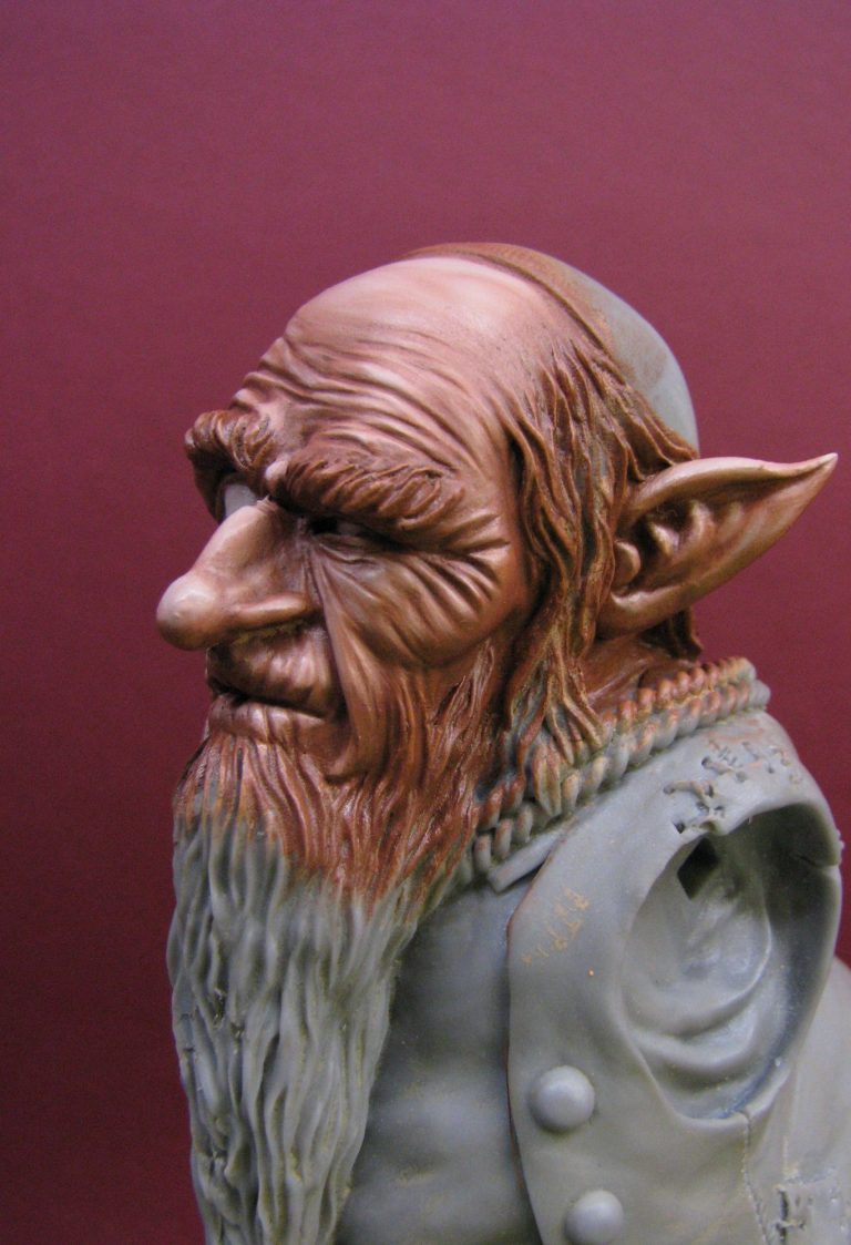
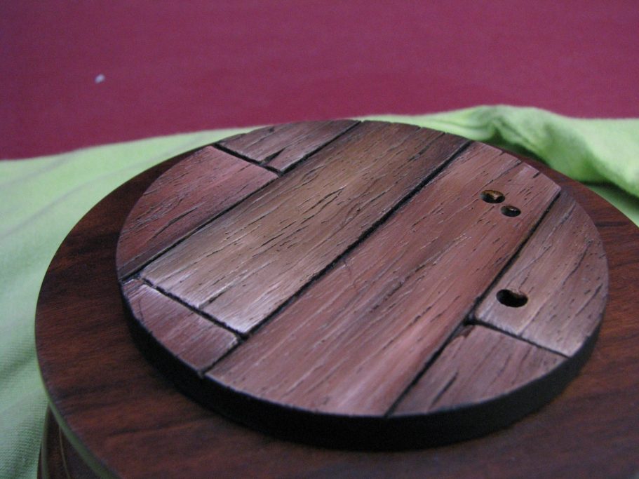
Photo #9, which is the wood base. Sean has used the same design as on the Ninja Goblin and I believe the Crow figures. Nothing wrong with that, as if gives his models a uniformity, plus it’s a rather nice bit of detailed resin to paint up.
As with the one on the Ninja Goblin, I chose to use various browns and yellows to bring out the wood grain, and it’s a credit to Sean’s sculpting that such a simple circle of textured resin looks so good and can be painted to appear differently several times in a row.
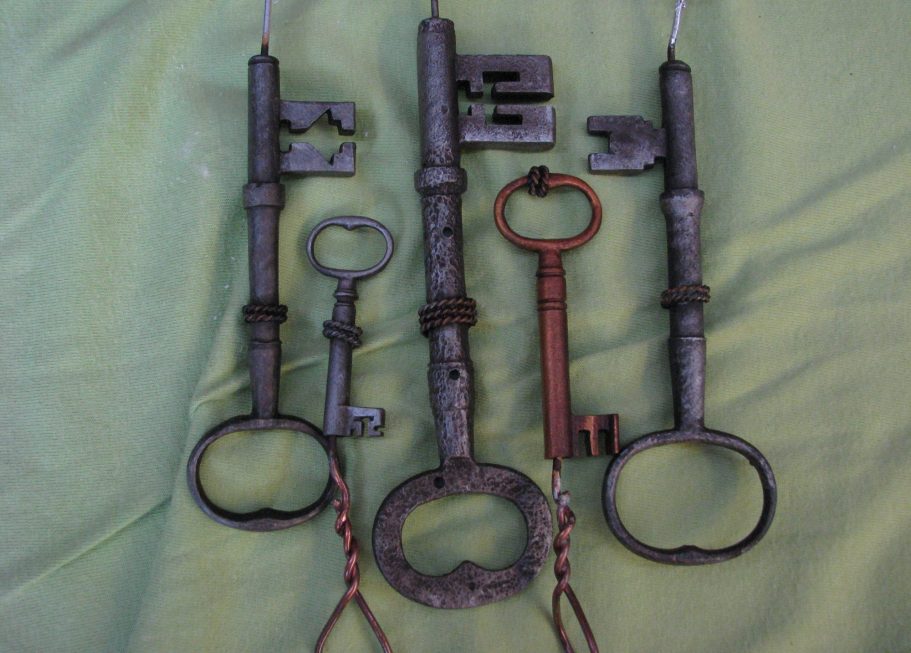
Photo #10 shows the keys. I cheated and sprayed these initially with a couple of coats of Testors metallic silver. I used two shades to get a basic idea of where the highlights and shadows would fall, then coated them with a dark brown oil mix made from Mars Black and a touch of Mars Brown. This was wiped and dabbed off, and then details added with pure Mars Black and some small highlights of Winsor and Newton Silver Ink.
The copper coloured key was done in exactly the same way, substituting a copper coloured Testors paint, then adding Burnt Umber and finally some Gold inks for the highlights. This looked like a newer key, and was much smoother. To be honest, this was the most difficult one to paint, and I wished I’d been boring and gone with the same silver colours as the rest of the keys.
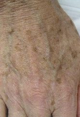
photo #11 shows the arm with it’s final additions – Liver or age spots. These are added as spots of Burnt Umber, and then faded into the rest of the skin colour by stippling them very gently with a soft brush. It’s a laborious exercise, because you have to add a few spots over the whole arm area, and fade them in, then add a few more, and fade those in a little, whilst the initial ones almost disappear. Carry on like this for about five or six sets ( more, if like me, you have nothing better to occupy your sad existence ), and you end up with an area of skin that has liver spots of varying density and colouration. For a little bit of interest, some Burnt Sienna or Mars Brown can be used within the final additions ( maybe in the last two or three layers ), but be sure to only add a couple each time, and well spaced out, as the more orangey colour to the paint really stands out.
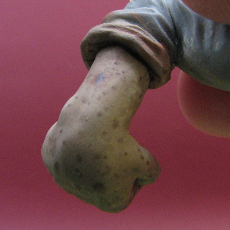
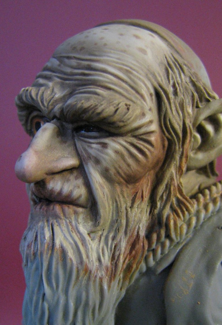
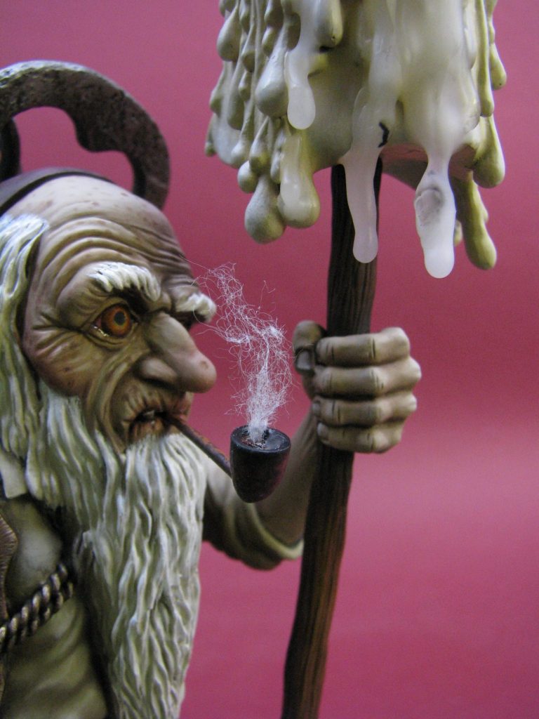
Photo #12 shows a real person’s hand with such spots, so you can see what I was aiming for, and photos #13 and #14 shows the face after the same treatment as the hand. The eyes also gave me problems, simply because of the difference in size. The squinty, half closed one was a doddle, but the large, wide open one was a pain. I think three attempts were made, and getting the pupil as round as possible was the most difficult part. It’s just so big and visible, and to be honest, although the finished eye was good, it isn’t quite perfect I think – well maybe my eyes were looking a little like that now after squinting and grimacing at it so much.
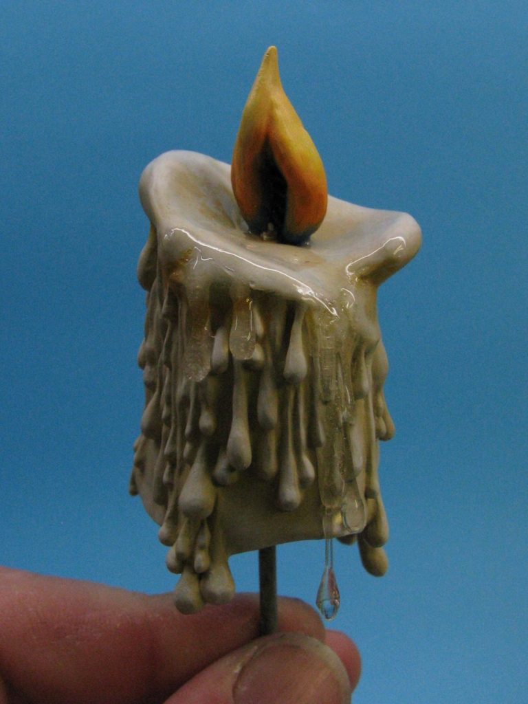
In photo #15 you can see the finished candle. I don’t know what possessed me, but I decided to paint this with acrylics. The detail on the casting is very good, but I think I could have gotten the same effect in about half the time with oils. I used Commando Khaki a lot, with some darker shadows added by mixing in a little Chaos Black. The highlights were built up with many coats of paint, gradually lightening the colour with Skull White, and final highlights being this colour on it’s own. The very last coats of paint on the shadow areas under the lip were done with orange hints, trying to make the wax look semi-transparent with the flame shining through the thinned and almost melted walls of the upper areas of the candle.
The flame itself started off with some Midnight blue at it’s base, then adding white to the blue to gradually lighten it, and after that had dried fully, mixes of Blood Red, Sunburst Yellow ( both to make the red turn gradually into orange through into the yellow colour, and finally some Skull White. This last colour had very thin coats of the Sunburst Yellow added over the top, the theory being that the white undercoat helps the yellow shine a little bit brighter.
To make the wax areas around the flame look wet and melted, I added a thick coat of Epoxy Glue. Obviously I had to be absolutely sure that the candle painting was finished, and I left it a couple of days – checking again and again to see if I’d missed anything, before adding the glue to the area.
Just to be clever too, I let some of the glue run down the sides of the candle, over some clear stretched sprue that I’d added. This made it look like some of the wax had run down the side of the candle and was still fresh.
Later, I added some of the epoxy glue to the base, adding a little Titanium White to the glue before it set, and dribbling it onto the resin base and onto the wood plinth.
Photo #16 shows the almost completed model before the glue was dribbled onto the base,
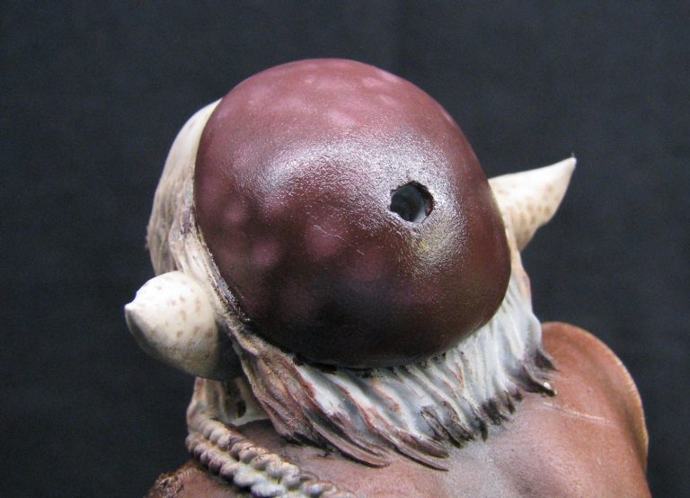
and photo #17 shows the skull cap – painted with a purplish oil colour and with some lighter patches dappled on with Titanium White. I felt that this was a rather flat looking area, and a little artistic license was called for.
On this shot too, you can see the large location holes for the keys. These fit into place very positively, and it’s clever how they interlock. Braiding, which is sculpted around their shanks; hides the holes and there’s absolutely no need for filler.
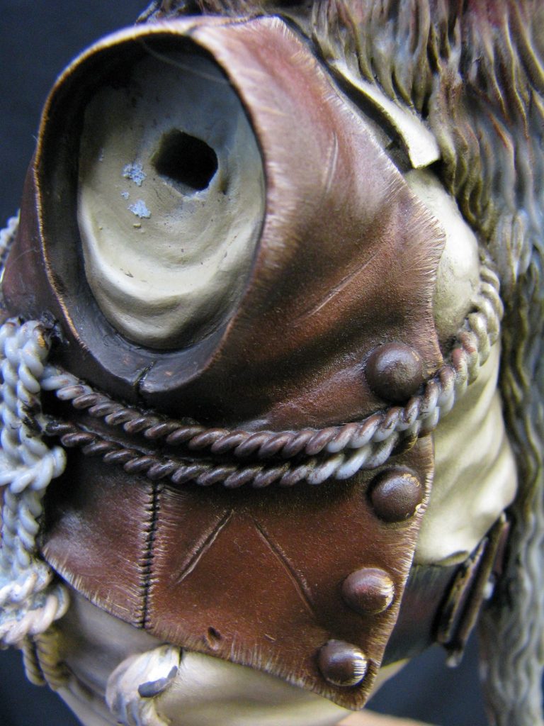
Photo #18 shows a close up of the waistcoat. Again I felt the need to add some painted detail, this time in the form of some damage to the leather. It’s simply dark brown oil paint added whilst the main area of the coat is still wet, and then a light colour ( Naples Yellow ) added underneath it to make it look like the slash is gaping a little. I also added some fraying to the edges of the coat, again to hint at age and make the area just that little bit more interesting to the observer who gets up close.
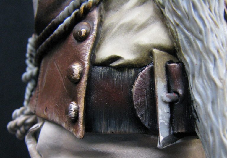
Similar things were done to the edges of the belt ( photo #19 ). It’s a delicate operation, and time consuming, but without it the whole piece looks a little bit rushed and perhaps not as detailed and full of life as the original picture it’s taken from.
Now for real artistic license. Photo#20 is the part of the figure that cannot be seen on the original picture. Sean chose to sculpt a patch on the figure’s pants – obviously he sits down a lot and shuffles his bum to get comfortable…..I mean the Gnome, not Sean !
Given that Sean’s gone to the trouble of sculpting some squares on the patch, it’s be rude not to use it as an excuse to do some check patterning, and I chose some bright colours ( red and yellow – oils of course ) to set this off. When displayed, this side of the Gnome will probably rarely be seen, but whilst that may seem a shame, it’s adding a little colour to catch the eye of anyone who does turn him round to look at the back. Most of this is hidden by the keys too, but it was just fun to paint.
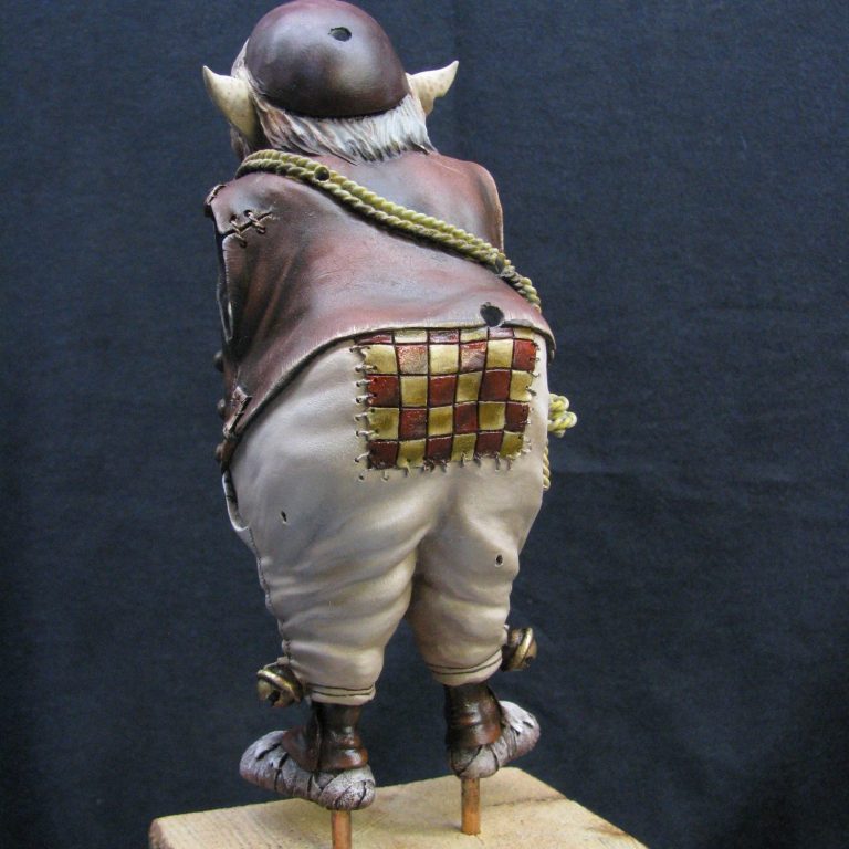
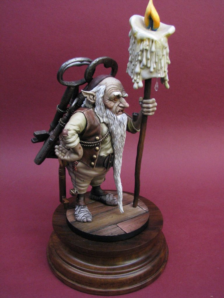
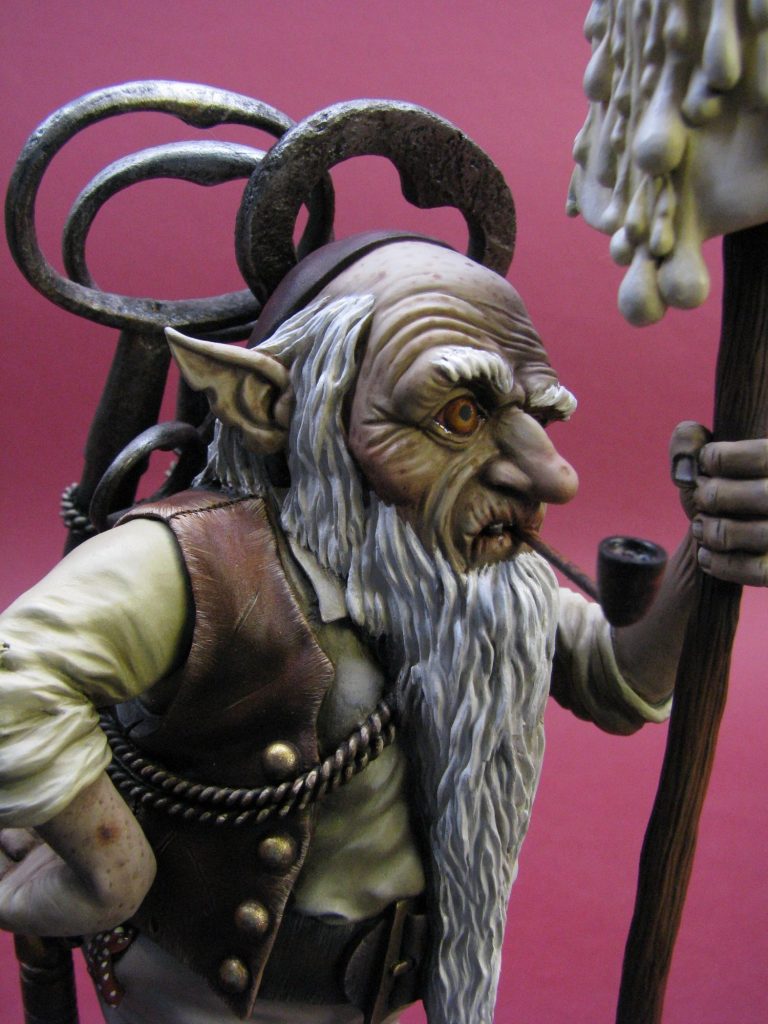
Photo #21 shows the gnome all fastened together prior to that “wax” being simulated on the base. The little details have been added – the spotted handkerchief, the brass buttons and Sean’s speciality – the fingernails. Again, careful painting of these areas just finish the piece off, and whilst not perhaps as noticeable on their own, add to the overall look of the piece when it’s finished.
The rest of the shots take in the painted model, and show how Sean’s careful attention to how an older person stands. He took time to study how someone suffering from arthritis supports themselves – completely differently from someone in their prime and full health, and getting such anatomy to work in three dimensions takes good observational skills. Then getting that to conform to what J.B. has done in his original picture, and still making it “work” is a real juggling act, and I do know that there were discussions and small alterations made during the sculpting process and both Sean and J.B. shared ideas to tweak the model into the shape it holds now.
I got the easy part of the deal to be honest – slapping a bit of colour on, but I do rather admire how this one’s been made to work by a couple of talented chaps working together to form a great partnership.
My thanks to Sean and J.B for trusting me with this; and for letting me risk taking it to Euro Militaire. Between us, we won a gold medal in the fantasy section of the competition, one of only four awarded in that class.
We need your consent to load the translations
We use a third-party service to translate the website content that may collect data about your activity. Please review the details in the privacy policy and accept the service to view the translations.