The Unforgiven
54mm White Metal kit from Andrea Miniatures
Article in Military Modelling magazine in 2009
Westerns – a genre of film that most of us of a certain age grew up with. In fact, John Wayne films were a staple diet of televisual entertainment in the household I grew up in, and although they fell out of fashion with the Hollywood industry for a while, Clint Eastwood managed to revive the genre during the late 1980’s and into the ‘90’s with some cracking and moody films.
Eastwood’s films were grittier and more violent than the films from the previous decades, but they brought a new generation back to the Wild West; and spawned other films, with top actors taking parts that gave us some great entertainment.
Me, I’m still a fan of the old John Wayne films, although Clint has come a close second to that I’ve got to admit.
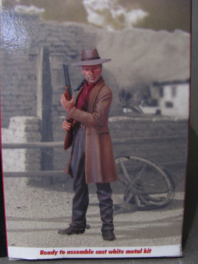
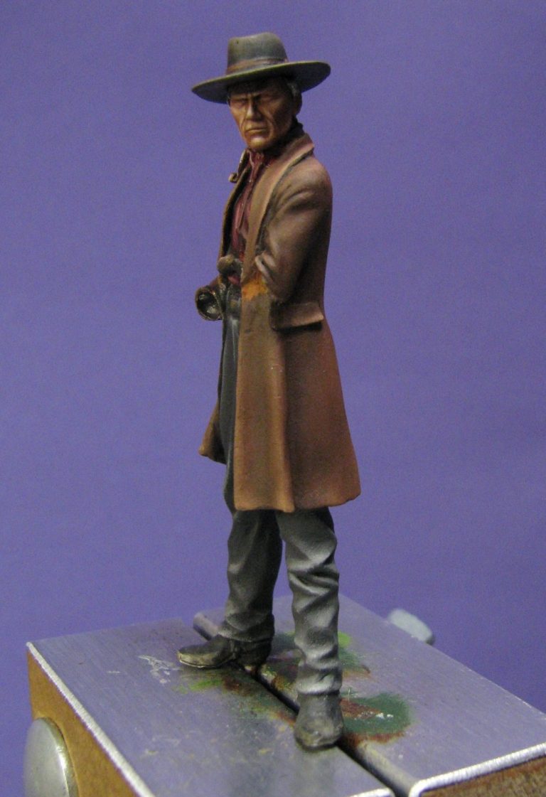
This figure, which has been available for some time, is quite a little gem. The box art doesn’t do it any favours at all ( see photo #1 ), and in fact I didn’t think it looked like Clint Eastwood at all. In fact I was planning on painting it to depict another favourite character of mine – Jon Shannow from the David Gemmell series of books ( Wolf In shadow, Last Guardian and Bloodstone ), telling the story of a future where technology had failed and returned to that of the late 18oo’s.
So, that was the plan.
Beginning painting.
Having done a minimal amount of work to ready the figure for painting – Andrea do actually produce some nice metal castings, and I’m one of the first ( possibly the only person ) to actually say this. I’ve not had a duff casting in metal off them yet – resin however……….
Anyway, minimal clean-up necessary, and off we go with the brushes and paint.
I primed the figure with a very thin wash of acrylic ( Commando Khaki, although the colour isn’t all that important ) mixed with a lot of Isopropyl Alcohol ( Windscreen wash fluid will work just as well ). This mix allows the paint to grip onto the casting, plus it cuts through any grease or oil that washing the castings has missed getting rid of.
I undercoated the trousers with a dark grey acrylic in preparation for their oil colour top coats, and added acrylic flesh colour ( Games Workshop’s Tallarn Flesh, which is one of their excellent colours from the Foundation paint range ). I added two or three coats of this and then after letting it dry fully, added the oils ( see photo #2 ).
I’ve adjusted my method here quite radically from what I used to do to paint flesh. Gone are the complex mixes of different oils, I simply use Mars Brown and Titanium White………Yes, that’s it, just tow colours. This builds up the initial tones for the face, and some colours are added afterwards, but basically, it’s two colours doing all the work, and thus there’s much less chance of messing up and making things a muddy mess.
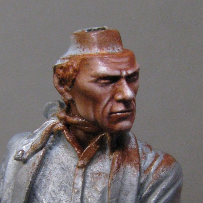
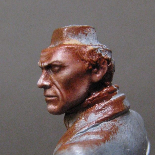
Photos #3, #4 and #5 shows how far I got in my eagerness to paint, and my forgetfulness to take pictures. The face is almost complete, barring a little stubble; the eyes will need doing too, plus some extra shadow for where the hat brim covers the face somewhat, but basically, that’s it.
The method is simple too, although I’d detail that better by running through it with how to paint the hands…….because I did remember to take stop and take photos occasionally.
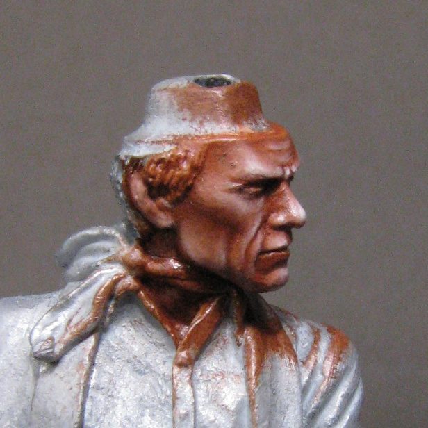
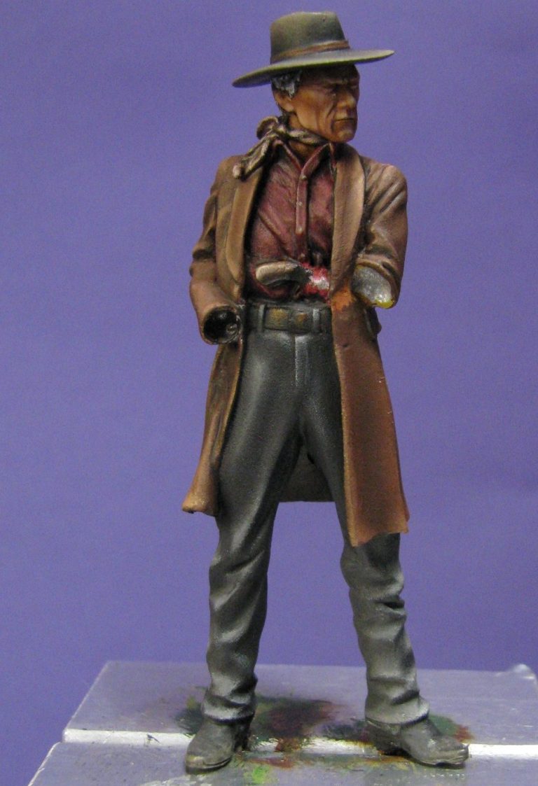
I’ll detail how the hands were painted shortly, but for now, photo #6 shows the shirt. The one in the film is perhaps more of a washed out colour, but this will fade back a little as the oils settle. I used a mix of Carmine oils with a little Mars Black as a starting point, and then added more of the carmines to work up the mid-tones. Highlights were very gradually built up with small additions of Titanium White, trying to stay away from ending up with a pink effect.
The trousers have been painted in this shot too – again, oils over acrylic undercoats, with a very pale grey made from Mars Black, Titanium White and a dash of Prussian Blue. Highlights were added with more of the white, and once fully dry, the shadows were deepened with pure Mars Black being faded into the deeper recesses and creases.
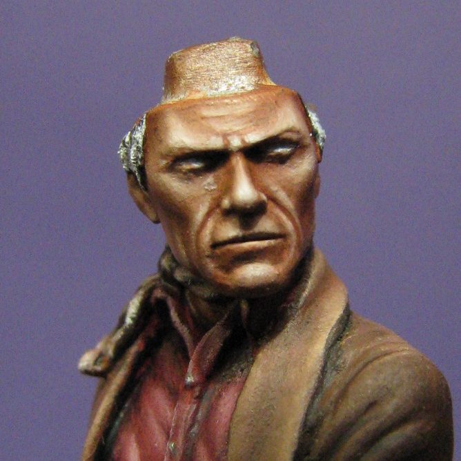
Photo #7 shows the beginning of the eyes. Clint’s eyes are usually little more than slits, he has a perpetual squint it would seem. Painting them is a bit of a problem, because to get any real eye-like effect will mean making them too big.
I began with some Skull White acrylics – the first coat being mixed with Isopropyl Alcohol, as this would allow the water based paint to coat evenly over the top of the dried oils on the face.
Photo #8 shows the iris and pupils added, working in oils, and not really paying much attention to the very thin line that they should take.
This is the beauty of oils though, in that once you’ve got the paint in the right places to form up the eye properly, a clean, damp brush ( damp with White Spirit ), can be used to take off excess paint and thus thin the eyes down to what they should be – and without losing the detail of the eye or gaining a malformed shape.
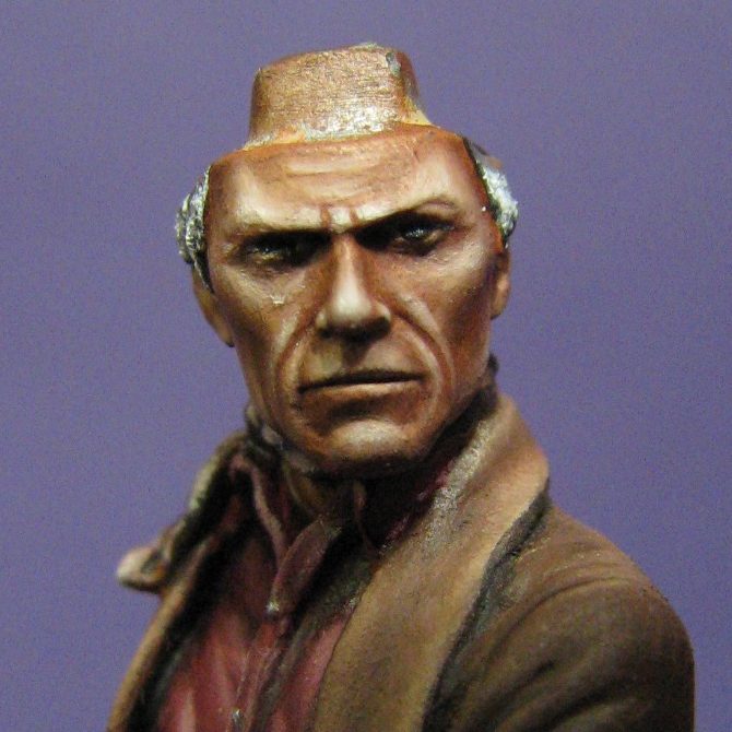
Photos #9, #10 and #11 see the model, still on its painting block, but with the hat temporarily fitted in place. I used a bit of Blu-tac, and it’s really only to see how things look and to work out how much of the face will require shadow cast from the hat brim.

Now for those hands.
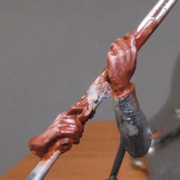
In Photo #12 you can see that the left hand has been undercoated. It’s actually had about three thin coats of acrylic paint – a mix of GW Tallarn Flesh and Skull White with just a dab of Iyandan Darksun, this latter being a sandy yellow and it takes some of the pinkness out from the Tallarn Flesh.
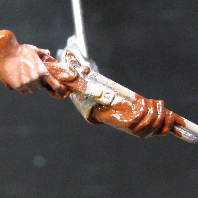
The right hand is almost complete, having had about half an hour and a couple of oil paints lavished upon it. The oil paints are Mars Brown, which is painted on over the whole hand – just with a small amount of thinner in it, enough to make it into a muddy paste.
The excess of this paint is then removed with a clean, dry brush, trying to leave the dark brown paint in the recessed detail and just get the lighter colour of the undercoats showing through on the back of the hand, the upper areas of the fingers and the knuckles.
Just whilst I’m on about this method, you might read several articles and see that although I use the same two oil paints for flesh colours, sometimes I add thinners and sometimes I don’t.
The simple fact is that with experience I’ve found that on hands it’s best to thin the paint a little so that it flows, and on faces it can be detrimental to have the paint too runny. Also, for different scales I will tend to add some Titanium White to this initial coat of paint, to lighten the brown. The rule of thumb is that large scale pieces – busts for example, don’t need as harsh a shadow as 54mm figures, particularly if the subject is female for example, so lightening the base shadow ( which is what this initial colour is ) gives the bias for how dark, or light, the finished skin tone will be.
So, with this figure, no necessity for any additional white to the base mix, just brush that Mars Brown on. Once the excess is removed, then I use a brush with a good point ( series 7 Winsor and Newton are my favourites, and have been for many years ), and gently and gradually add Titanium White to the areas that I want to build up through mid-tone to an eventual highlight.
Now through this entire process I’m constantly wiping the brush on a cloth to remove both the “dirty” paint that it’s picked up from touching the model, and also to stop paint building up too much on the surface of the model.
Basically, what I do is pick up a tiny bit of white paint, touch that and blend it in gently to one area only, then wipe the brush before moving back to that area to build up the highlight further. It’s no good going from the model back into the fresh paint on the palette without wiping the brush; you’ll just pollute the paint on the palette, and end up with a mucky, muddy mess on the model.
It does take time at the beginning to get into the habit of doing this, but once you crack that, then it becomes automatic and you’ll just keep doing it over and over.
So, once you start building up the mid tones, you’ve got to think what position the hands will be in when the figure’s assembled.
This again is very important, so I tend to hold in my memory the position I test fitted things in, and then paint the parts accordingly. In this case, the shotgun is pointed upwards, and so the hands are not level, but they too are canted towards the sky a bit.
If that’s not enough to be thinking about, there’s also “interest” to be added to the area – veins for a start off, although in larger scales why not think of skin imperfections etc ?
In this case the sculptor has made the hands pretty free of vein detail, but they can be added with a bit of care and a few glances at reference material ( God bless Google Images ! ).
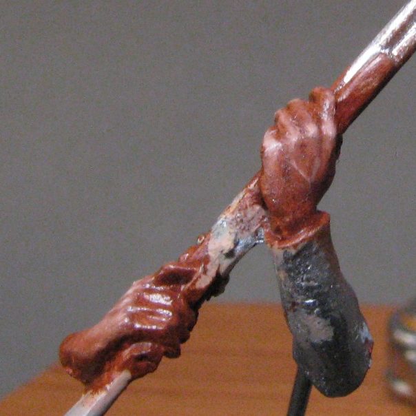
The right hand, as I said a while back, is pretty much completed in photo #12, but in photo #13 you can see the beginnings of the painting process where I’ve added the Mars Brown to the left hand,
and then moving to photo #14 I’ve positioned the component so that the arms are almost as they will be on the finished model, and you get a better idea of where highlight and shadow should fall.
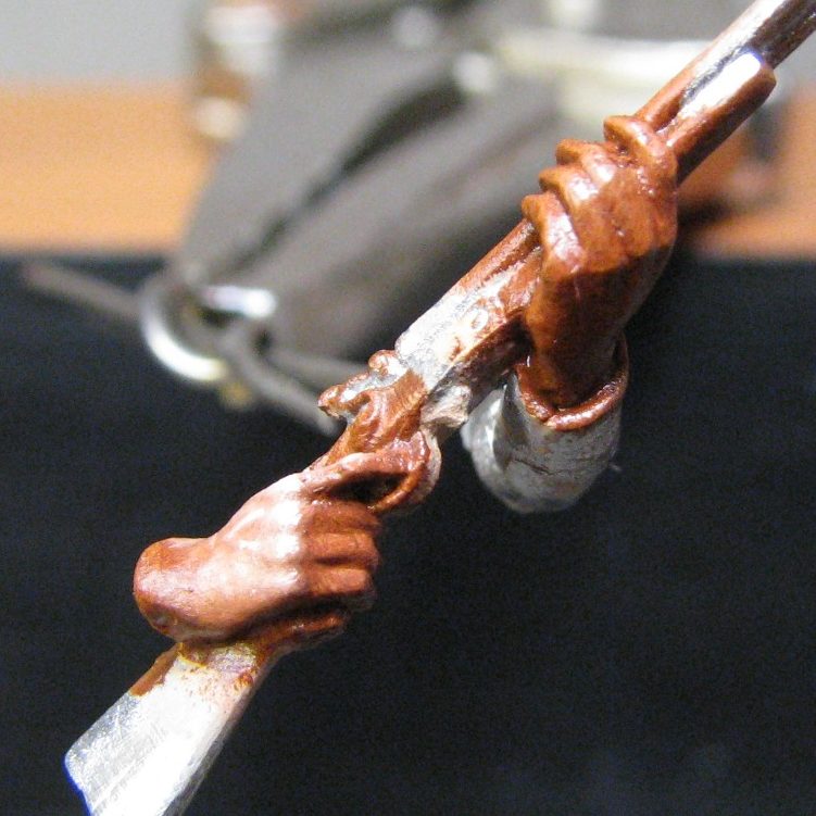
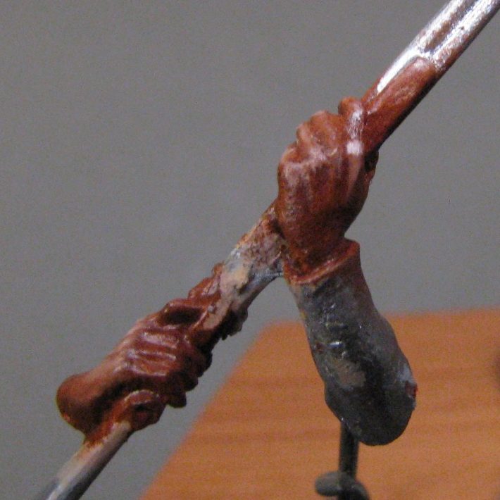
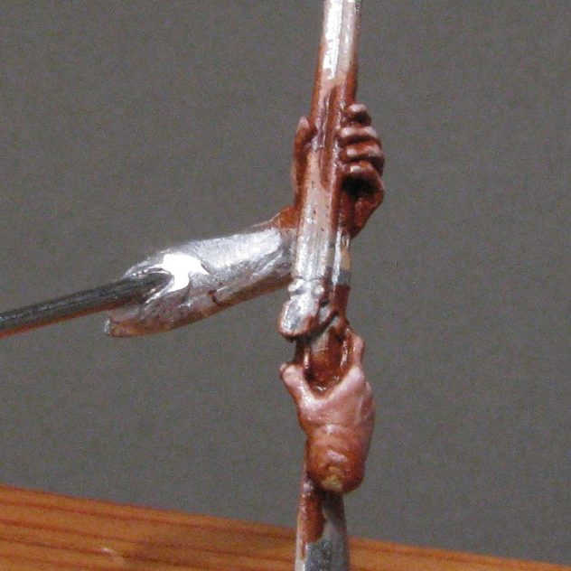
Photo 15 shows the underside ( O.K. let’s be pedantic, the back ) of the left hand. This is beginning the process of having the Titanium White added, even though it’s going to be mainly in shadow, I still want to add some mid-tone, because anyone looking at the piece will see this area very easily.
More white has been added in photo #16, and in photo #17 a vein has been painted on. With the skin stretching over the knuckles, I’ve chosen to lighten them, the blood being pushed away from the bones ( try making a fist, and your knuckles lighten the skin covering them, so this’ll be lighter than the surrounding skin, even when the area is in shadow ). There’s also two bright spots per knuckle, go on check…….yes, there’s two bright spots, so I’ve painted them with two bright spots if you look closely at photo #18.
Admittedly, it’s very tight for space in this scale – the average hand is about 5 or 6mm across, so you have to either fly by the seat of your pants, with confidence that you can put the paint exactly where it’s needed…..and risk shouted profanity if it goes wrong; or use a pale mix of the flesh tone and some Titanium White after the rest of the hand is fully dry, so that mistakes can be gently obliterated with a clean brush dipped in some White Spirit.
I’ve added some really dark shadows around the cuffs in photo #18 too, this again can be done once the paint has dried, and sometimes it’s better to do it once all the separate parts of the kit have been glued together – then you can see how light is going to fall on the model in it’s finished state, and thus where the darker shadows will actually be.
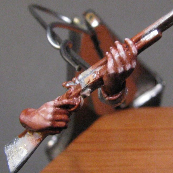
Photo #19 looks down on the hands, and shows how the highlights have been worked, but also how the veins on the back of the hands still stand out with even lighter coloured paint.
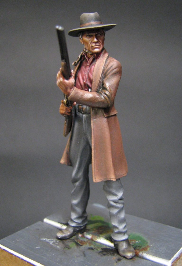
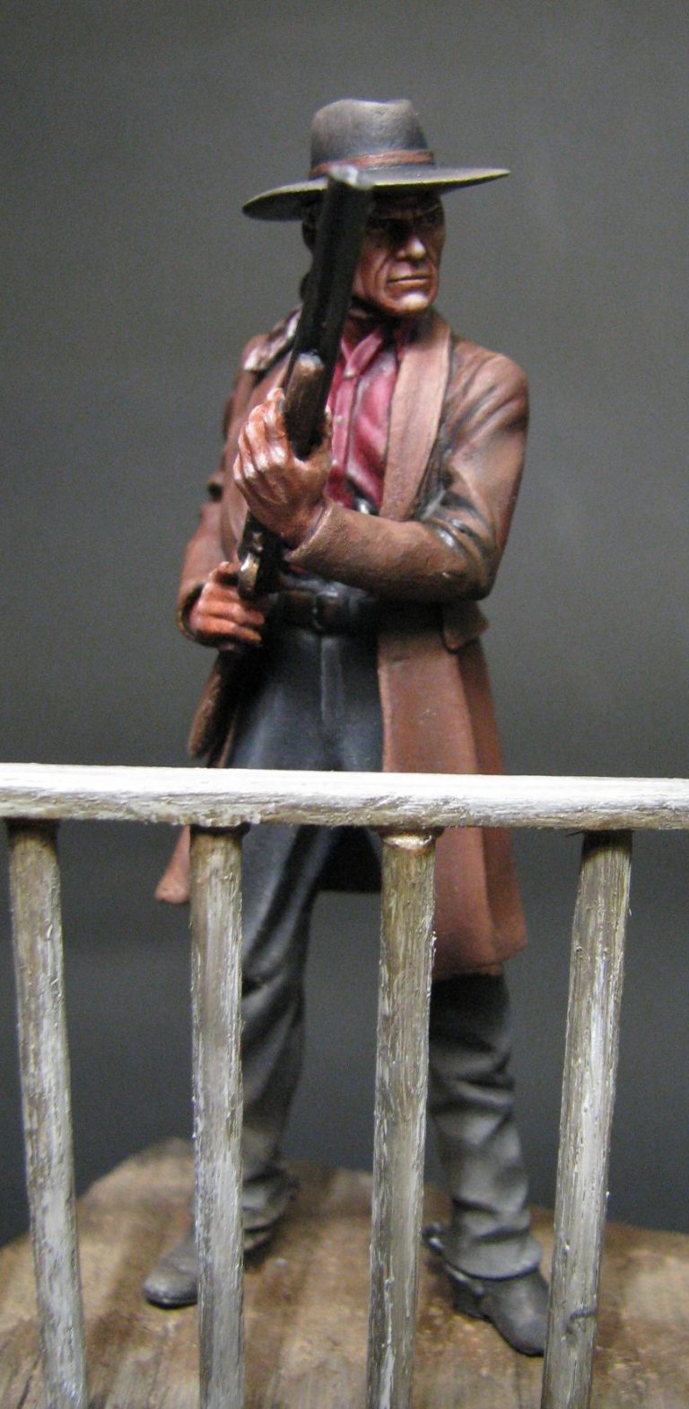
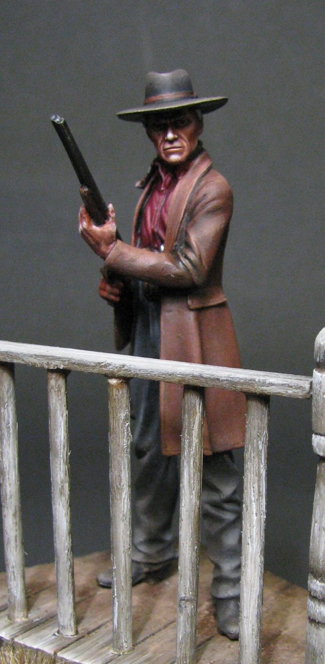
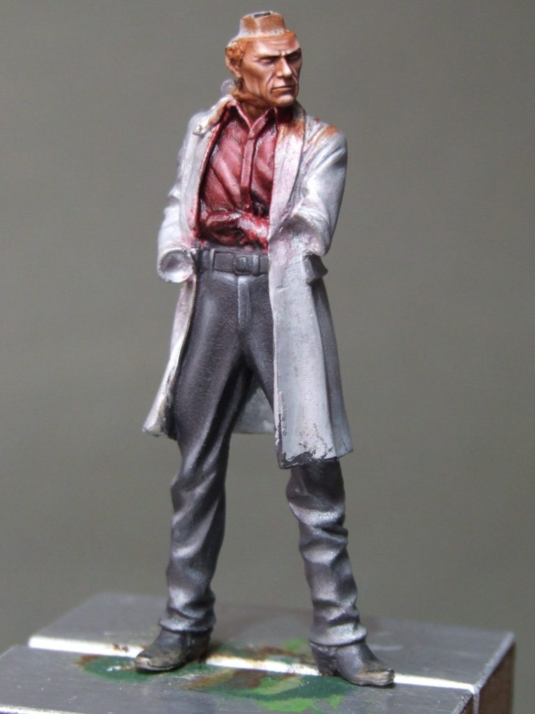
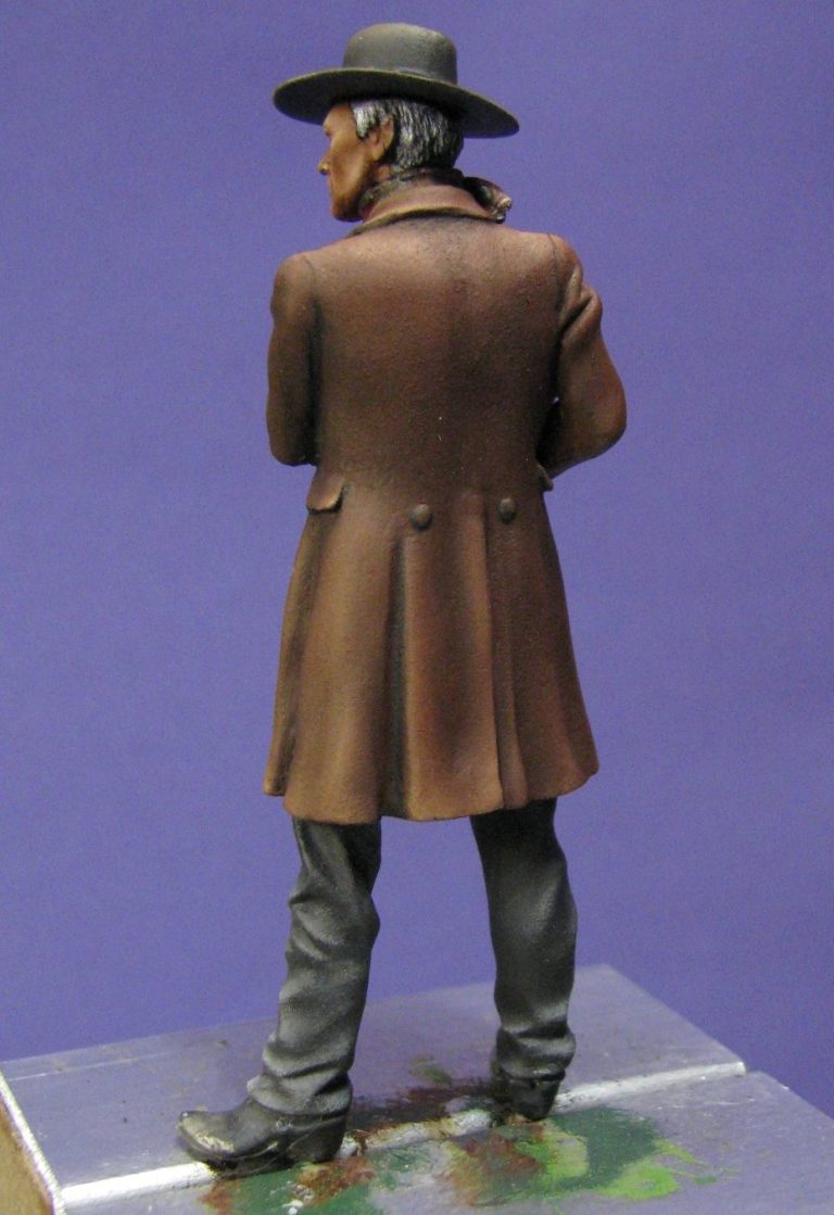
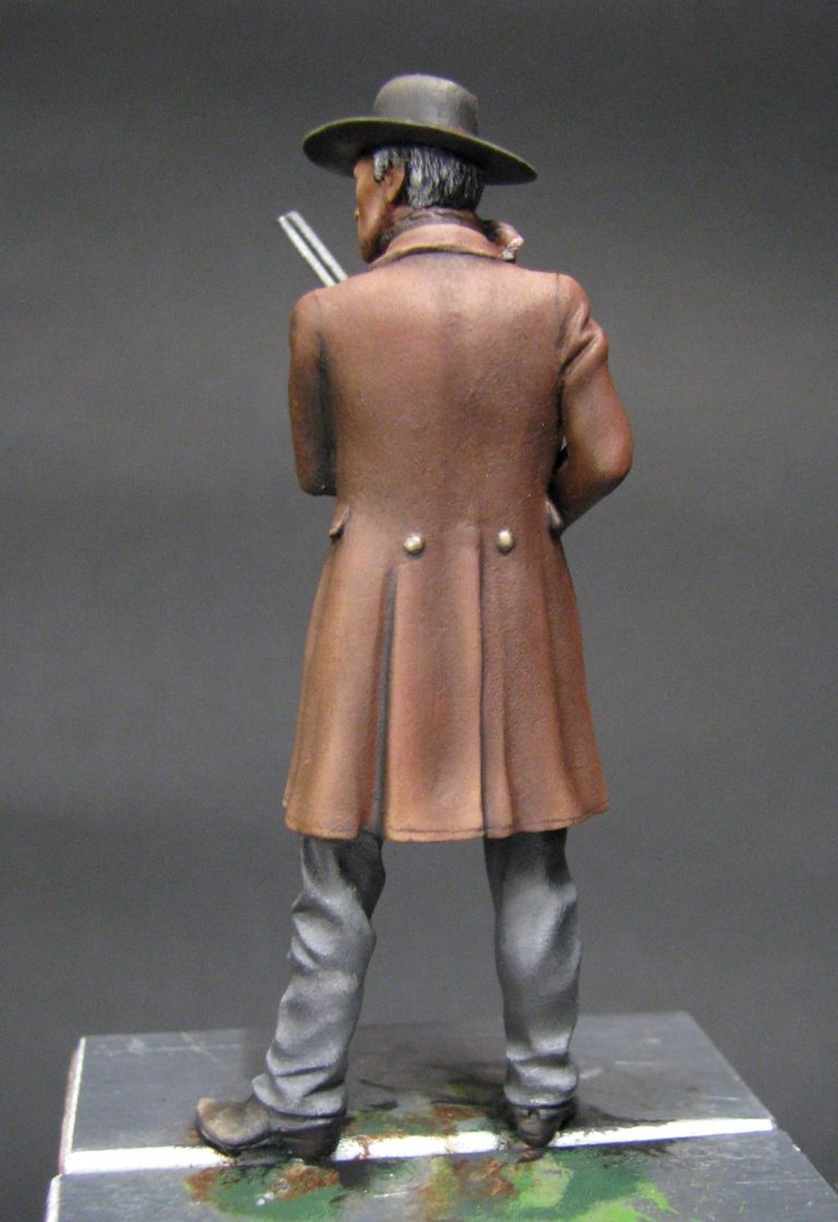
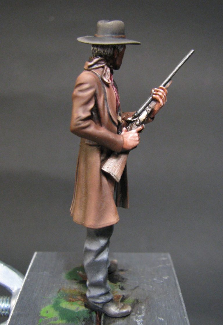
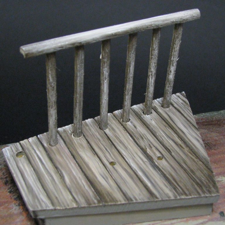
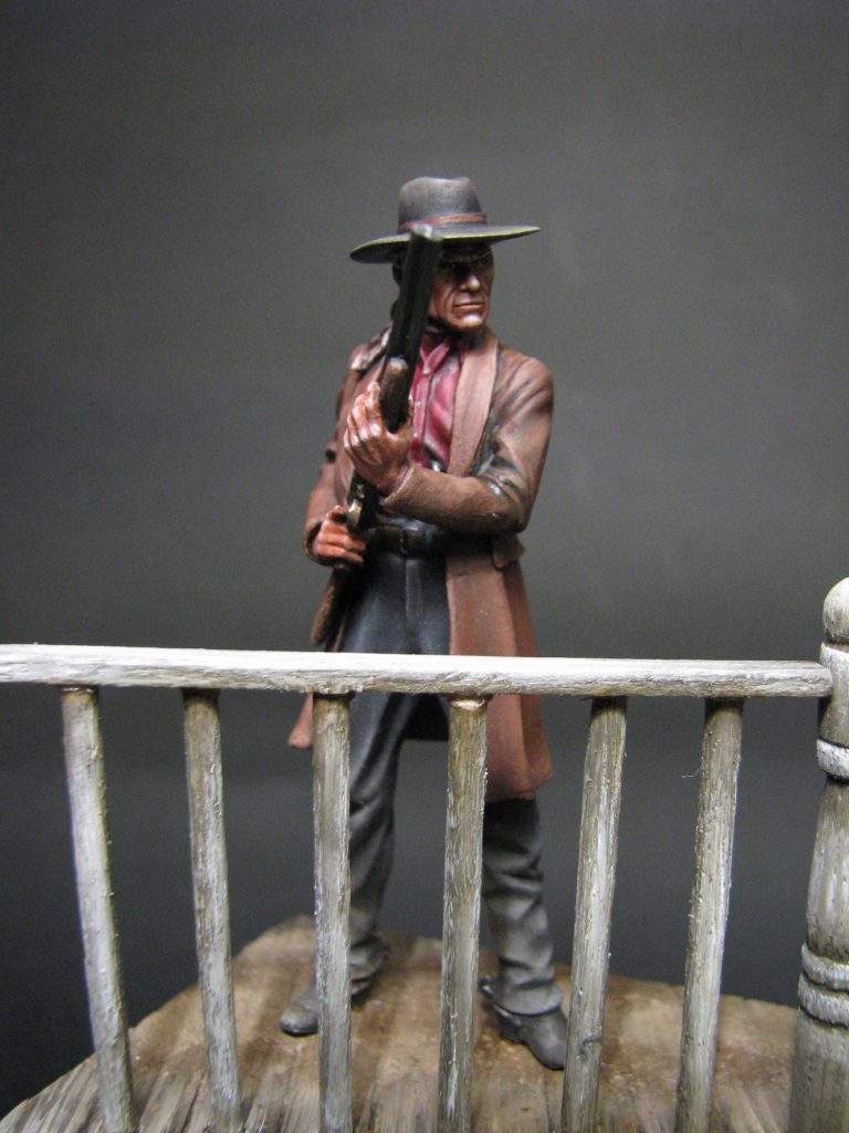
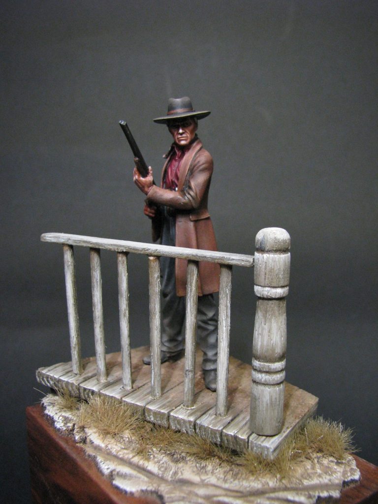
In photo #20 the kit has been glued together. The shirt and belt are no longer going to be a problem to get at – they’re finished, and the hands with their shotgun can be fixed into place where they slot into the sleeves of the coat. Photos # 21 and #22 give an all round view of the figure, but I really needed a little setting for him to stand in.
I suppose that a section of rutted ground – likened to what you’d expect for the middle of a Mid-west street back in the 1880’s would do, but my thoughts leaned towards a section of boardwalk with a little strip of handrail along it’s edge – the sort that would usually get totalled to the sound of snapping matchwood as soon as a brawl started outside a saloon !
The results of my fevered imagination can be seen in the final shots, but the making of the boardwalk section is perhaps worth covering, although to be honest, it’s pretty simple.
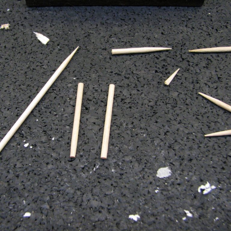
Laid out in photo #23 are some of the bits – half a dozen or so cocktail sticks were needed, these being sanded a little to smooth them off a bit more, and then cut to size for the spindles to support the handrail.
The handrail itself is just a piece of bass-wood that you’ll be able to source from almost any hobby shop worth its salt, and again some careful cutting to make it fit in with the scale of the piece.
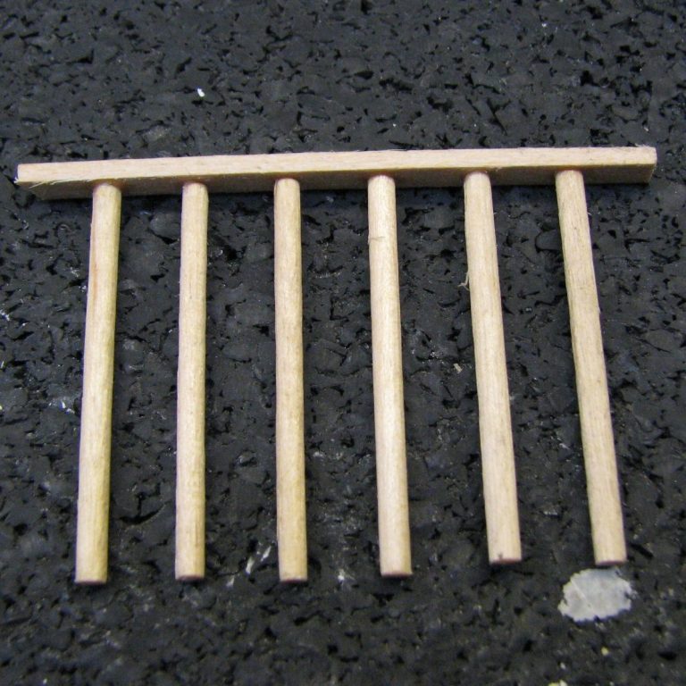
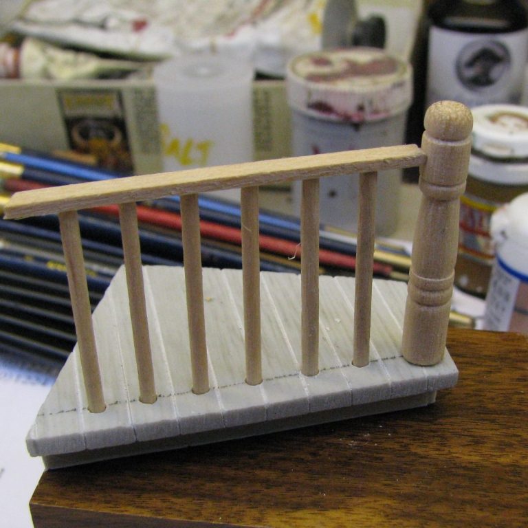
Glue added and the spindles set evenly along it’s length ( no, they weren’t pinned in with miniature dowels – this is the 21st century ! ), and the handrail is close to completion. I just needed a newel post with some nice carving on it……..Ah, not many of them around in this scale.
In fact, such is the danger of sourcing a miniature newel post, I’m probably not allowed to tell you how it was done – them ‘elf and safety folk get everywhere. Needless to say, a miniature lathe was jury rigged from a battery operated drill, a couple of sharp chisels and some round profile bass-wood, plus some glass paper for smoothing things off, and hey presto, a small newel post fit for the end of the handrail. Oh, and safety glasses – yes, you probably think I don’t use such things, but as I really, really value my eyes and their capability to see small bits of White Metal and Resin in order to paint them, I really do try to protect them from anything that might damage them.
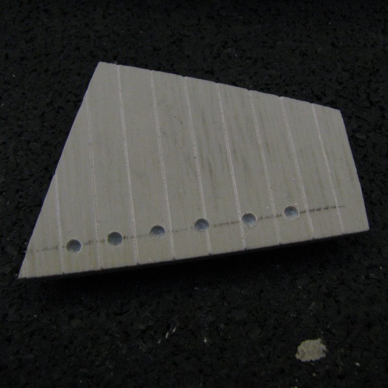
Moving along to photo #25, this shows the wood boardwalk made from Milliput. The putty is mixed and then rolled flat on an old tile, coating both the tile and the rolling pin ( not the one from the kitchen lads – lady modellers wouldn’t need telling that ) with French Chalk or Talc to stop things sticking to things they shouldn’t.
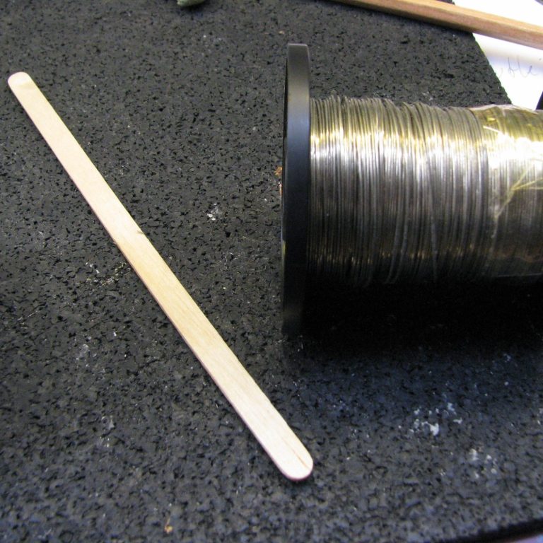
To get an even thickness of putty, I use various pairs of wires – one wire at either side of the putty to stop the rolling pin at a certain height once it’s got the putty flat. I used a wide, flat brush to add some very light grain pattern to the wood. It’s subtle and probably won’t be visible until I begin painting, but it’s worth putting in, just to give a beginning to the texture that will be painted on.
The dried putty is then marked out for the planks, cutting them in with a sharp scalpel blade, and then drilling holed a couple of millimetres deep to accept the ends of the spindles.
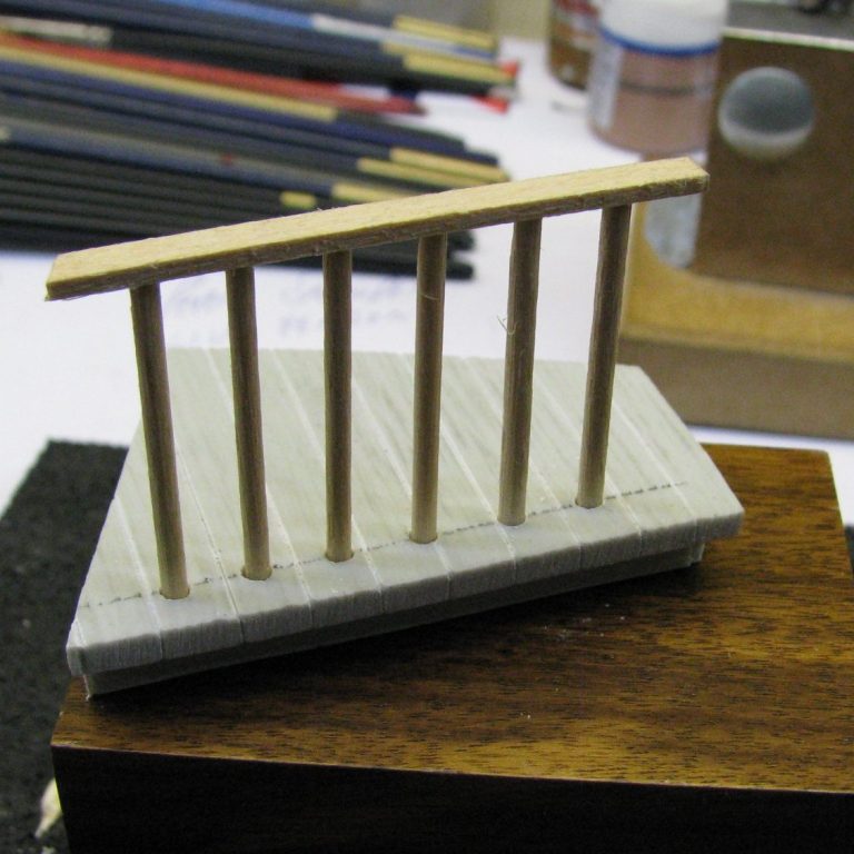
I built up a box underneath the “boardwalk” top to lift it clear of the base, and this can just be seen underneath the putty boardwalk in photo #26, along with the spindles and handrail in place. The boardwalk shape is intentionally offset on the base – I didn’t want the lines of the groundwork to follow the lines of the plinth, as this would make it all too regimented.
Photo #27 ( I think I must’ve turned the “big light” on for this ) shows that lovely newel post in position, and being tested for size. It’s not glued in place and has actually slipped a little so that the handrail is offset slightly.
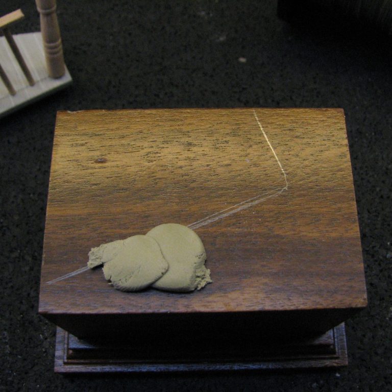
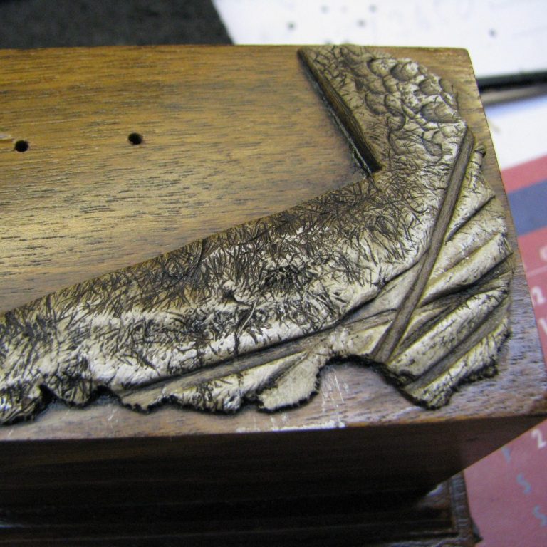
Now the groundwork. I’ve begun by marking out the edge of the boardwalk on the wood plinth, then adding some blobs of Milliput to the wood. I’m using Milliput because if you mix slightly more of the yellow stick than the grey, the resulting putty is a little crumbly – perfect for a muddy street that’s dried out.
The reason I add the putty in small blobs is so that the torn edge of the putty is outermost, and this allows me to begin with an uneven and random edge to the groundwork, rather than trying to sculpt a random edge, which I find really difficult. In photo #29, more of the putty has been added,
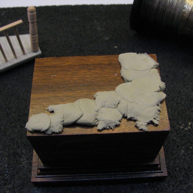
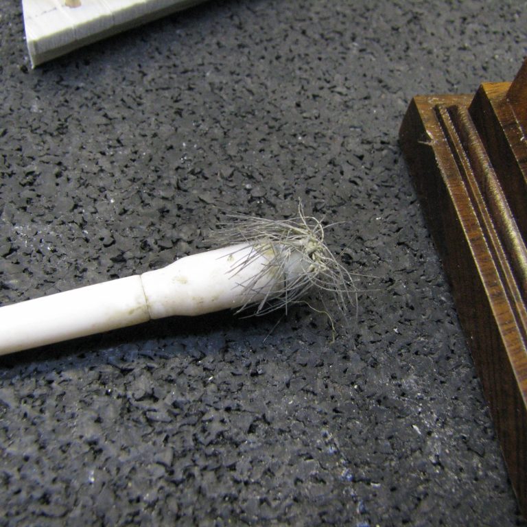
and photo #30 shows the precision tool that will be employed to texture the top of the putty……Yes, it’s a very old brush, one of those really cheap things that children get in paint sets. For applying pigment, it’s probably worse than useless, but for texturing putty to look like dried soil, there’s nothing better.
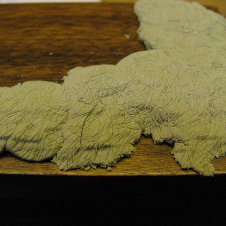
By stippling and rolling the end of the brush around, with its few remaining bristles, the texture can be built up as seen in photo #31. It takes a little time, plus there’s some marks you’ll probably need to get rid of from the brush ferrule, but the texture it leaves is really good and takes paint well.
Wagon wheels – unfortunately all the biscuits had been eaten, so to take their place I used a roll of solder and a drinks stirrer, shown in photo #32. These were pressed into the putty to make the tracks of wagon wheels as they passed over the wet mud, and have then dried in place. I realize that probably no self respecting wagon driver would get that close to the boardwalk – for fear of getting shot by Clint – but we’re in the realms of artistic license here.
Photo #33 shows the tracks in place and also some boot heel prints from people stepping off the boardwalk to cross the street. Nothing too difficult about this, just shape the end of the stirrer to a similar size as Clint’s foot, and press it into the wet putty a couple or three times.
One last thing to do before the putty dried was to cut back the excess to allow the boardwalk to sit in place. Simply press the boardwalk section into position on top of the soft putty, and then use a sharp scalpel to trim away the excess material when the boardwalk is lifted away. I also check the positioning once the spare putty is removed, just to make sure that things are all in their place.
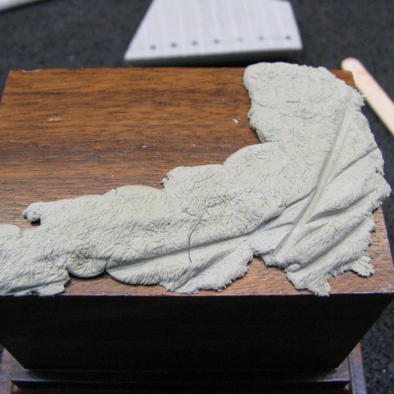
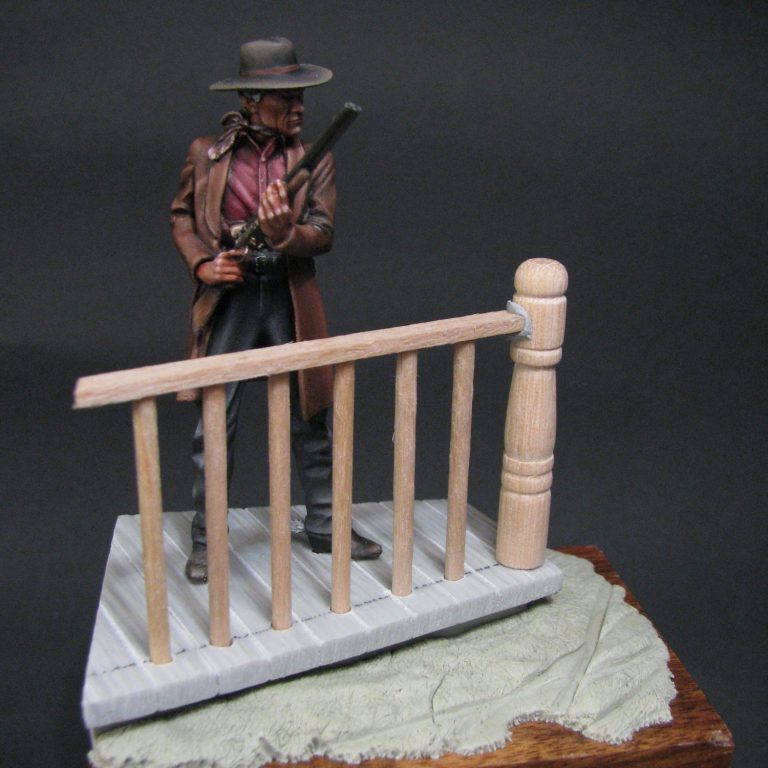
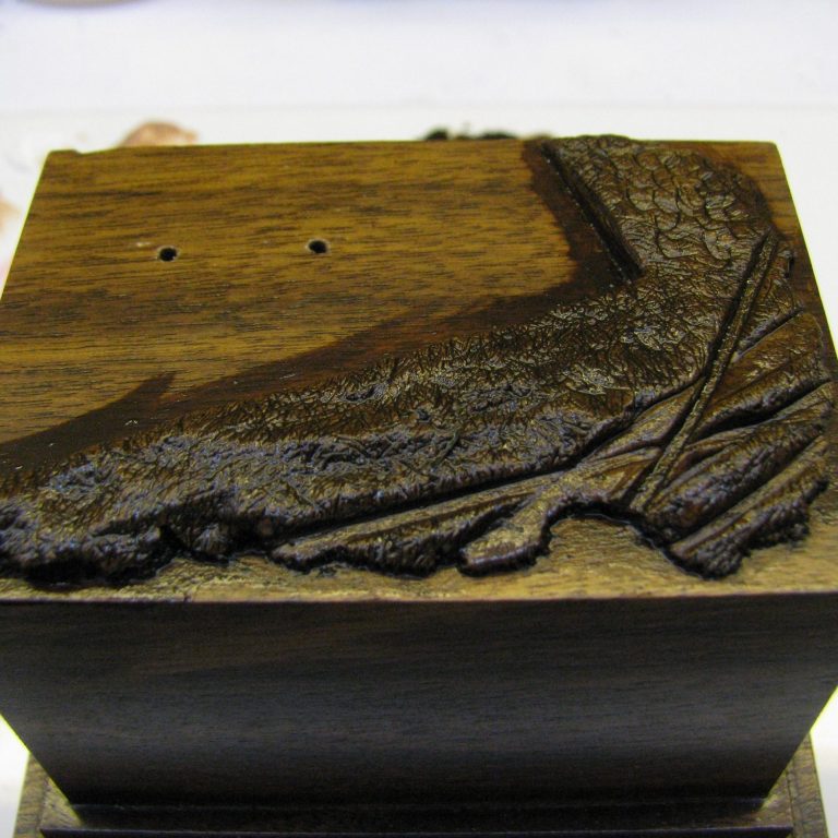
Photo #34 shows this, and all that’s left to do is to let the putty cure and then start painting - which begins with a copious amount of Burnt Umber oils, slapped onto the cured putty with a large brush; Shown in photo #35 and then using a soft cloth to remove most of the paint, the results of which are in photo #36.
Now all that detail is starting to show, and it’s a case of using some Titanium White oils to pick out some of the higher spots, blending the lighter paint with the dark brown to create mid-tones and highlights.
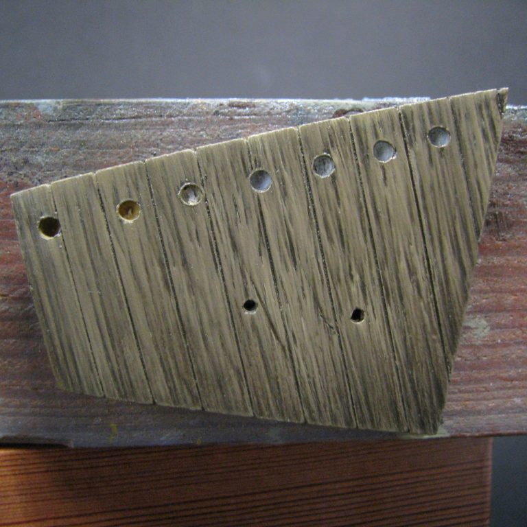
In photo #37 I’m test fitting the boardwalk again, but also seeing if the shadow area I’ve left on the groundwork matches with the overhang on the boards. It did, so I could start painting the wood sections – I wanted a used / old appearance to them, so more of a grey tone would be necessary to the wood, rather than yellow / browns of new wood.
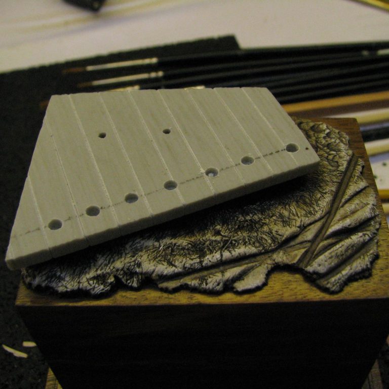
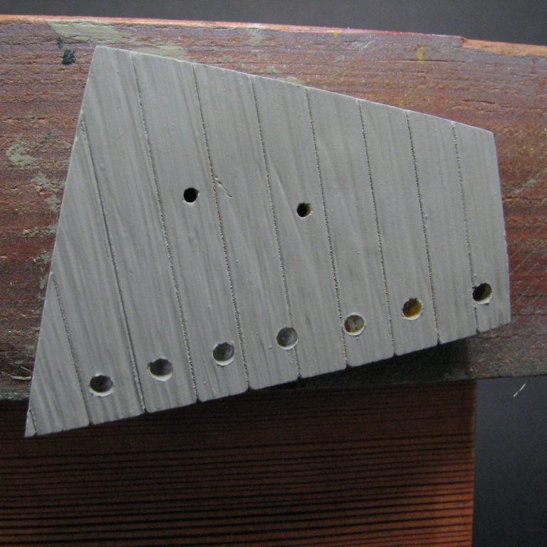
Photo # 38 shows the undercoated wood, and just visible is the wood grain texture I added whilst the putty was still soft.
This shows up in photo #39 a lot better, where I’ve added a mix of Mars Black, Mars Brown and Titanium White ( which made a dark brown / grey ), and then wiped the excess paint off to begin the process of making the putty look like wood.
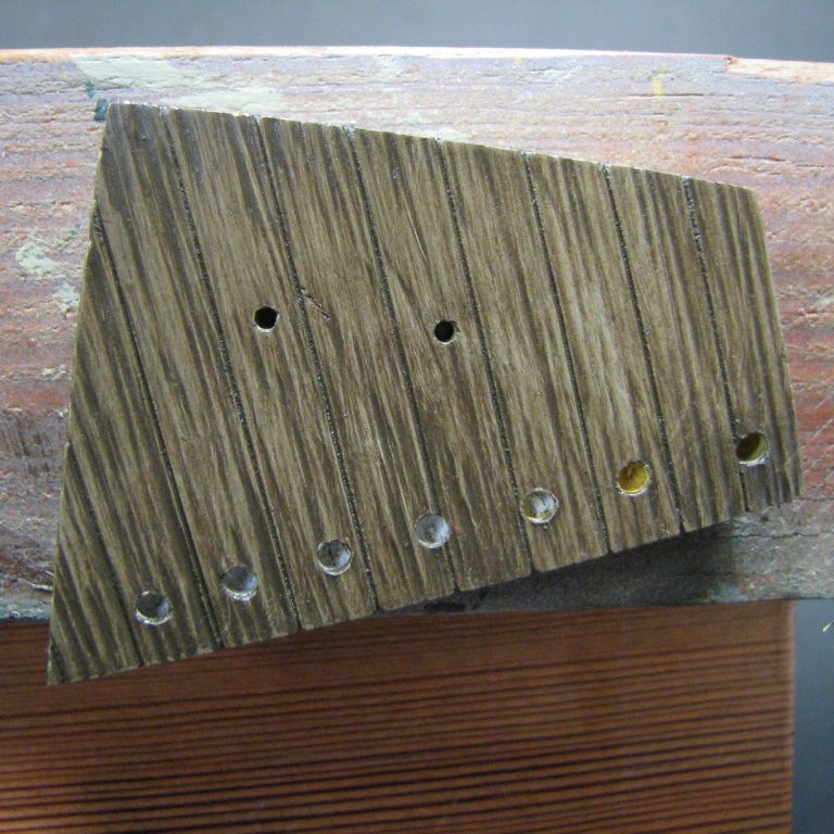
I’ve begun to add more of the Titanium White with a broad, flat brush in photo #40, the brush needs to be wiped on a cloth after each pass it makes on the boards, then recharged with a little more white before another pass is made.
It’s slow tedious work, but worth it, and I advise that you use a brush that is similar in width to the boards so that you can work on each separate plank, one at a time, building up the effect. This method also allows you to difference the colours of each plank – hence it should look more natural once finished. Photo #41 shows how I’ve worked on the plank furthest to the left of the picture.
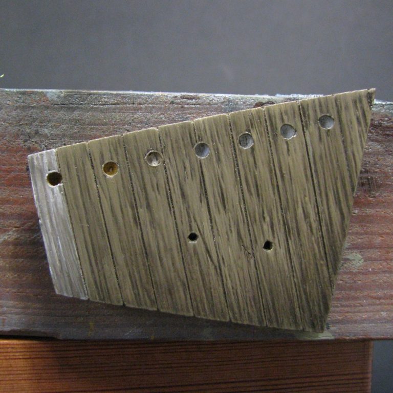
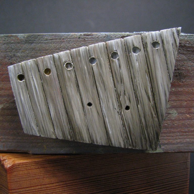
Photo #42 shows how all the planks look after painting, with perhaps a little more white added to one or two of them after this. In photo #43 the handrail has been treated to the same treatment, and is in place and waiting to dry.
The shot in photo #43 shows the boardwalk dried and finished. I’ve added just a few dark lines with the original shadow colour to denote darker grain detail that is still visible after the bleaching process the wood has gone through as its aged, and again I’ve attempted to make this random in its application.

The finished shots show Clint in place, looking very moody too, and all I’ve done is add a little static grass here and there around the edge of the boardwalk, and then a little ground up pastel chalk to add some dust onto the boards and the groundwork to connect the two areas together. It’s also brushed up onto Clint’s boots and lower trousers.
So, that’s it; a pleasant little trip down memory lane to the “Western” films of my childhood.
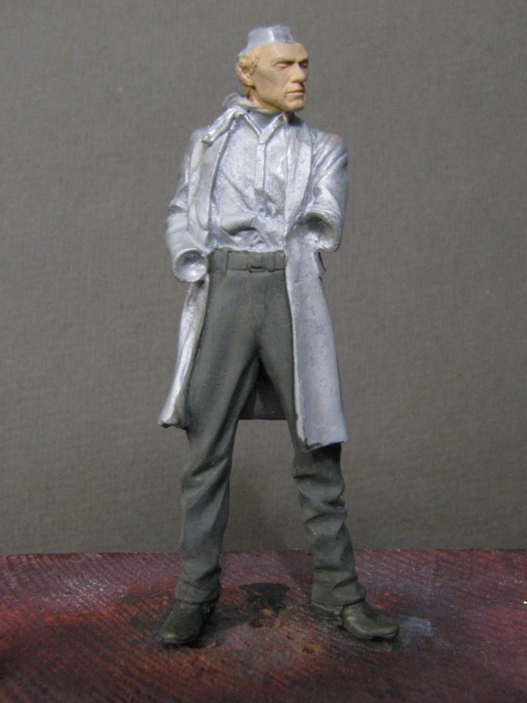
Andrea produce some superb little figures in this range – I’ve already done the Undertaker, so this one can sit next to him in the cabinet quite happily. I do wonder why they haven’t done anything in the larger scales, because this range, with its stage coach, various personalities and not to mention those Native Americans giving chase to the stage coach must mean that the subject garners a decent customer base.
Coupled with the fact that Andrea have produced some superb likenesses within this and other ranges, I wonder if they’re perhaps missing a sales opportunity ?
Perhaps, perhaps not – I’m sure they know what they’re doing.
Anyway, if you like cowboy films, then this range will bring back plenty of memories, and give you a few hours of painting amusement too – can’t be bad for what it costs, can it ?
We need your consent to load the translations
We use a third-party service to translate the website content that may collect data about your activity. Please review the details in the privacy policy and accept the service to view the translations.