Painting a Fantasy Design
Using a Games Workshop 54mm Inquisitor figure
This is not meant as an exhaustive article on how to paint a fantasy design, but merely a few words and pictures showing how simple it is to break down a more complex emblem and render it onto a model.
I don’t have any artistic training or background, as such – I finished art in the third year of senior school, so I’ve learned what’s here through talking to people, and a lot of trial and error.
The piece here is ( if it gets finished in time ), one of my two entries for the 2008 Golden Demon competition. The basis for the model was one of the Inquisitor series of 54mm figures – with quite a lot of alterations. But that’s for a different article.
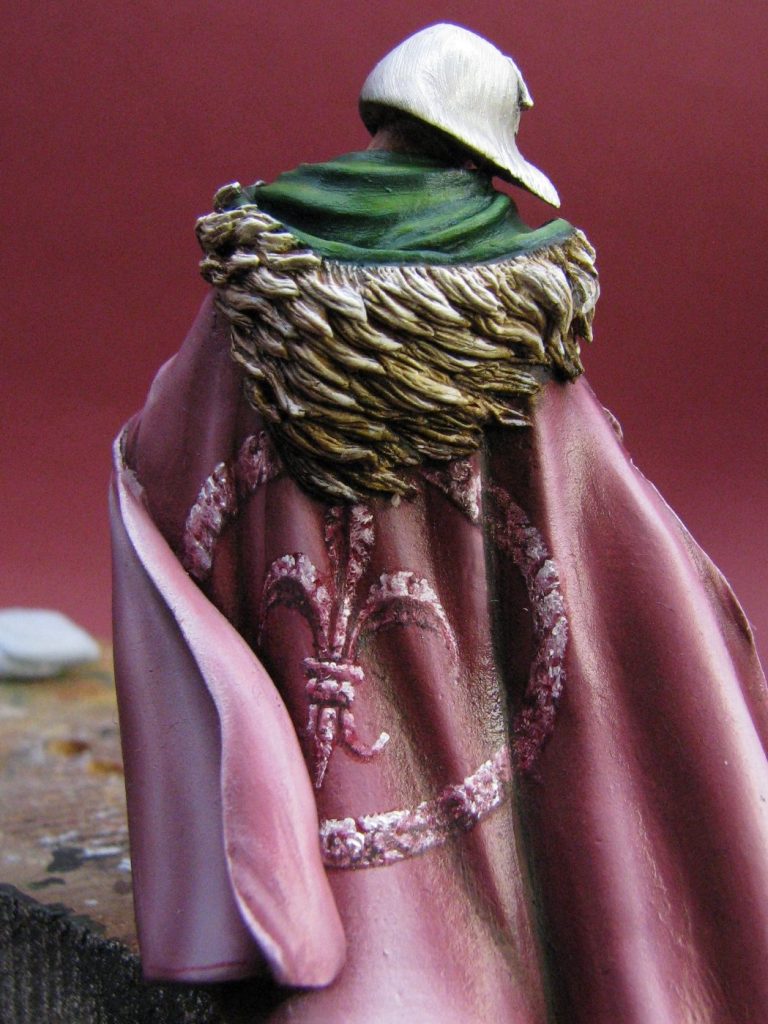
So, let’s focus on the design here and forget about the build-up of everything else.
Basically the cloak has been painted with oils so that highlights, mid-tones and shadows have already been established for the folds and billows of the material as the wind blows past the figure. This paint has dried fully for a week in a drying cabinet so that there’s no chance of any further applications of paint damaging it.
Of course, I had to find a suitable design that fits in with the Inquisitor game ethos, and I chose a portion of the artwork from a picture of Ephrael Stern in the Inquisitor section of the Warhammer 40,000 artwork book. This shows a picture of Ephrael Stern wearing a small metal medallion hanging off her belt, the design being a good old fashioned Fleur-de-lys.

I wanted to use the design, partially because I could encompass it in a circle, that would mimic that shown in this picture, but also to add a cracked effect to the one I paint, to hint at the decay of the Imperium that this figure hails from.
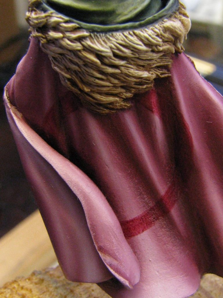
Photo #1 shows the beginning of marking out the circle that borders the design.
What I’ve done here is to add a thin line of paint in a rough circle, marking out the outer border of the design, and a corresponding circle just inside of that to mark out the inner border too. I the whole point of this is to have a starting point to begin working from. I’ve used oil paints, thinned down with White Spirit, to the consistency of a thick wash, and using the darkest shadow colour that I think will be necessary for the design. In this case – because someone will ask – I’ve used Carmine, Mars Black, and just a touch of Titanium White.
The oils are particularly useful in this instance, because they can be adjusted or even removed from the model with a clean brush, dampened with some White Spirit, and with a little practice, the paint can actually be shaped and moved around on the model to a small degree, again using a clean brush dampened with thinners.
Just in case you think that it comes “ever so easily” to the average, jobbing article writer, you can see at the top right of the circle where I’ve slipped and gone off the inner line, and this isn’t a problem, as mentioned above, it’s easy to clean unwanted paint away.
Photo #2 shows how I’ve filled in between the two lines using the dark pink mix. There’s nothing skilful in this bit, but filling in the design gives it more solidity, and it’s much easier to see if there’s any flaws that need tidying up or rectifying.
Having corrected any deviations from the circular shape, it’s time to start adding some texture.
Well, O.k. before we rush off and do that, let’s talk about brushes.
Most of the time, when I’m doing fine detail, I prefer to use a Winsor and Newton Series 7 – Size 1. It’s got a fine point but has enough bulk of bristles to hold a reservoir of paint – even with fast-drying acrylics – that allows a reasonable working time before the paint on the brush becomes unworkable.
Although I’ve got a few brushes that are smaller, I tend to have little use for them.
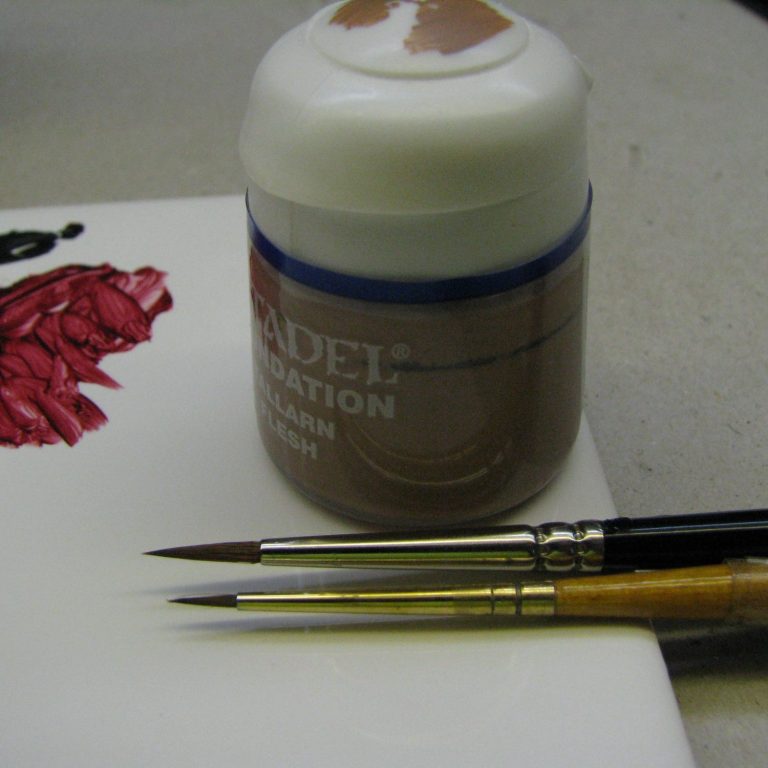
This is one of the “but” instances, where I use a very small brush. In photo #3 there’s a picture of the two being used – so you can see the difference in size. The upper brush is the aforementioned W&N Series 7 – Size 1, and the lower brush is a size 00000 Proline.
The drawing of the design was done with the W&N, whilst all further work will be done with the Proline brush.
One other thing to note – the brushes weren’t washed in thinners until each session was finished. Thinners was added to that initial mix of paint used to draw the circle, but after that, there’s no thinners involved, except when I went over the edges and I needed to clean up or refine the design shape.
O.K. then; back to the painting.

The rather messy look to photo #4 is because I used the 5 zero’s brush to stipple on a very pale pink oil colour whilst the initial dark pink was still wet. I’m quite happy that the two colours were mixing as I was doing this, but didn’t consciously go about blending them together. The rough and random look to the circle now will be capitalised on to make the textured look of the final shots.

Back to the dark pink colour, and in photo #5 I add random fine squiggles and dots to the light coloured paint. Again I’m not trying to blend the two colours, quite the opposite now, and in between each application of paint, I wipe the brush on an old T-shirt to get rid of any light pink colour that the brush has picked up.
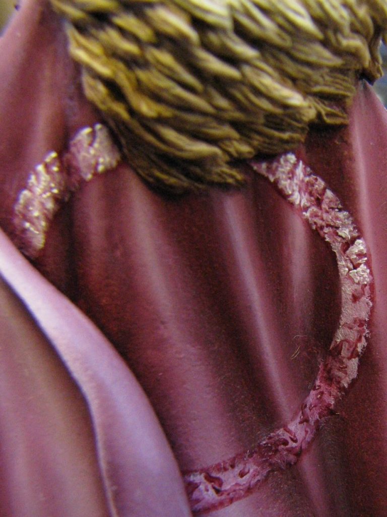
Photo #6 – if you look at the top half of the circle, either side of the fur hood, you’ll see how I’ve now used the 5 zero brush to add pure Titanium White oils, again wiping the brush between each application of paint. I do a few dots and squiggles where I want highlights to stand out – dictated really by the random effect gained earlier, and trying to make the circle look like something that’s made out of stone.
The dark squiggles of paint become fractures and pitting in the stone effect, and the highlights the upper edges of these cracks.
In photo #7 I’ve pulled back from the figure a little to give an overall view of the design, now that the first session is finished. The brushes can now be washed in White Spirit, and the model allowed to dry in the drying cabinet for a couple of days at least.
The reason I allow it such a long drying time is because of the thickness of paint. Even though the spots of white are quite small, they’re relatively a lot thicker than I’d normally apply, and will take longer, even with the heat of a drying cabinet helping, to get them so I’m confident that they won’t be harmed by further applications of paint.
So whilst we wait for it to dry, just let’s go back and have a look at the brushes – there’s something more you need to know.
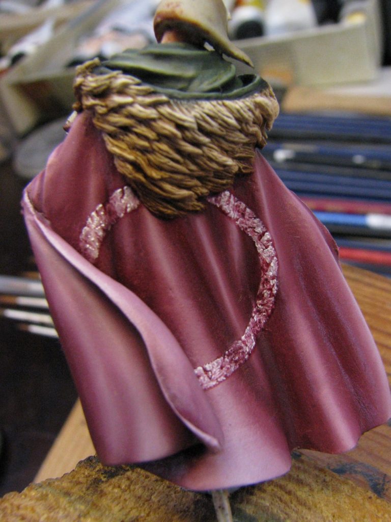
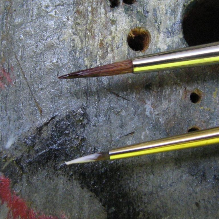
Photo #8 shows the two brushes again, but if you look really hard at the 5 zero brush, then at the tip, curling up, you should just be able to make out a little tail sticking up at an angle. This is not an out of place hair, but the glutinous property of unthinned oil paint allowing the brush to pick up the paint almost like it’s butter on a knife. The thin tail is what adds the final dots of paint that appear as really bright highlights. There don’t need to be all that many, but adding a dot from the tail of this extension of paint makes for a bright spot of colour, plus the bristles of the brush aren’t allowed to touch the surface of the model, so they don’t get chance to spread out and make the dot bigger than I need.
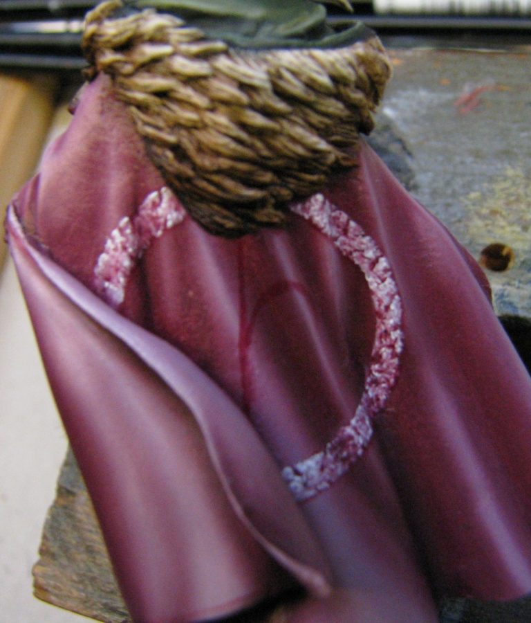
The rather blurred photo #9 shows, now that the circle is dry, the beginnings of making the trefoil design of the Fleur-de lys. It’s not a complex design when you break it down, and that’s the secret to applying anything like this – break the design down to simpler shapes.
So in this case I begin with the central leaf, which is basically a stylised spear shape. Line out this and make sure it’s central. Make it a little smaller than necessary, it can always be enlarged afterwards.
Then the two side leaves are drawn out using exactly the same method - thinned oils that can easily be removed.
Now I’d love to say that this is so easy that you’ll get it bob on first time. But let’s be honest, it’s unlikely. One side will be easier to paint; the other mirror image will be a sod. So do the sod first !
Simply put, if your right-handed, the left hand leaf will be easier to render. So do the right hand one first, because logically, it’ll be easier to match up to. Obviously, either I’m left handed ( no, I’m not actually ) or I just like a hard life ( the only other option ), because I’ve not followed this advice.
However, there is an alternative, you can turn the model upside-down to do the left hand leaf – it works for eyes. Or just get a good painter who’s left handed to come in and do the dirty work !
Again, use the long drying properties of the oils to your advantage here, and a clean brush with thinners will remove or clean up where you go wrong.
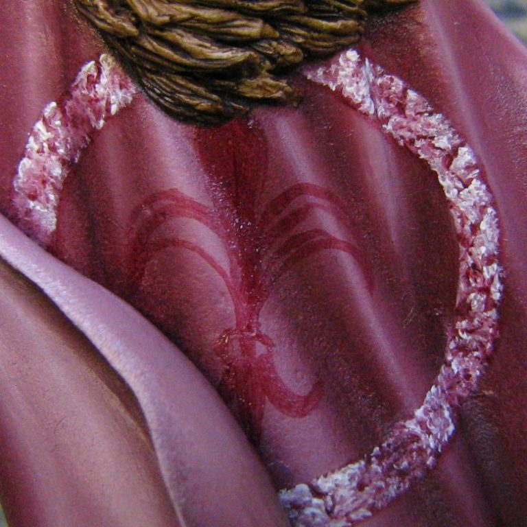
Photo #10 shows the marking out completed, and you can see that there are several lines inside the two outside leaves, which show where I initially drew the pattern, and then where I have adjusted things to how I wanted them to be.
The lower part of the design has been added two, and reference to an actual fleur-de-lys is necessary here to get the design right. Never be tempted to do something from memory, unless you want it to look different; because memory is fallible, and different is what it’ll be !
In photo #11 I’ve filled in with the light pink stippling again, following the same method used on the circle. I’ve left a dark border this time, mainly because I don’t want to step out from the shape that I’ve established already. I’ve also left lines to define the separate shapes within the Fleur-de-lys – this will help with final shadowing, certainly; but also retains the definition of the shape itself.
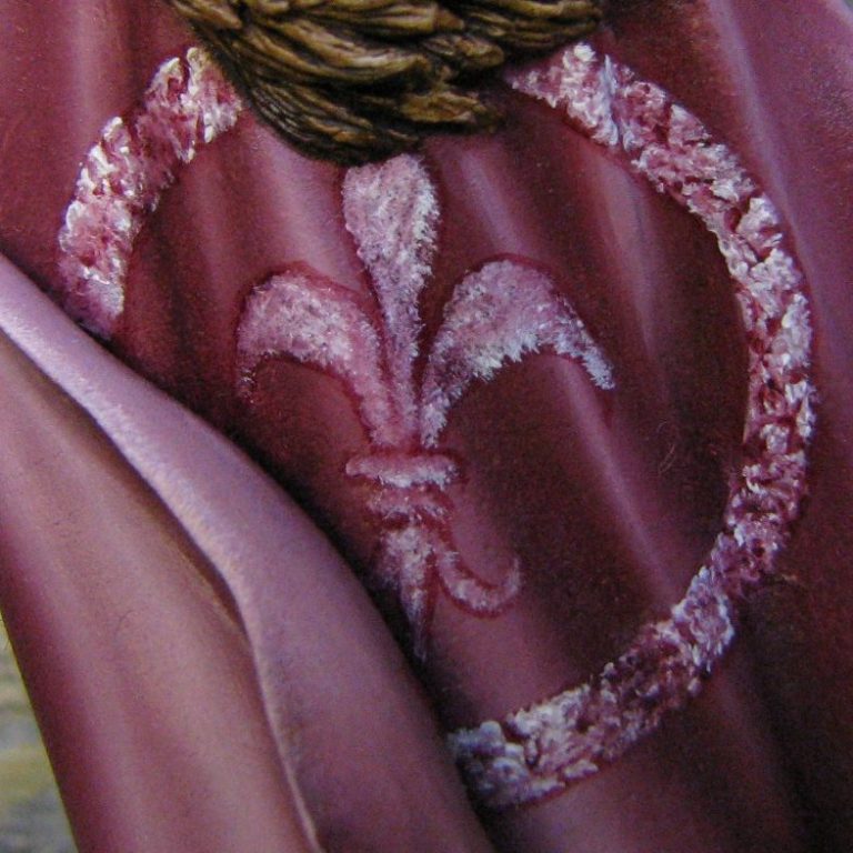
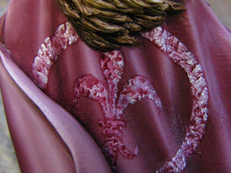
Photo #12 shows the addition of the dark pink again – more dense and perhaps a little more regimented, but there’s less room for manoeuvre within the boundaries that I’ve created for this shape, and I’m trying to lift this central area above that of the surrounding circle.
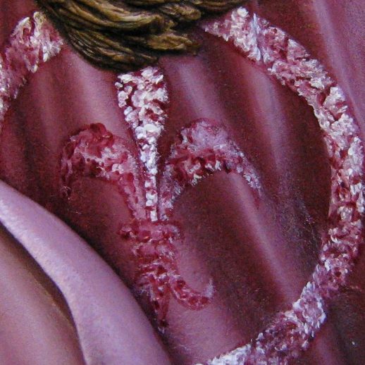
Now it gets a bit interesting, where in photos #13 and #14 I go back and forth adding highlights and shadows with the light pink and the dark pink respectively. What I’m trying to do is match up the effect to the circle, so a bit of playing around with colour density is required.


Photo #15 shows me adding some shape to the right hand leaf. The other two leaves are finished as far as the texture is concerned, I not have to regain the shape of each leaf, plus redefine the separation of each part that makes up the whole design within the circle.
Finally, photo #16 shows the shape added to all of the leaves, the only thing to do now really is add deeper shadows to make the shape leap out from the cloak, and after the Fleur-de-lys is fully dry, washes of the dark pink are used to blend the whole design so that it coincides with the rest of the folds of the cloak.
So, simple really, the key factors of getting any pattern to work are to split anything complex up into easier to handle shapes, look beyond any fancy texture or finish that will be used, and use a medium that is easy to work with and allows the painter to remove or rework the same area any number of times to refine the desired shape for the finished piece.
O.K., maybe it’s not all quite as simple as that, but it is a lot easier than it looks, and using the above method does work.


And how it looks on the finished model.
We need your consent to load the translations
We use a third-party service to translate the website content that may collect data about your activity. Please review the details in the privacy policy and accept the service to view the translations.