Painting a Leather Shield with Oils
Having already tackled a couple of faces in oils, lets move on to different surface effects. This method could be used for an article of clothing, piece of equipment or baggage, but in this case, to allow you to see what’s happening in the simplest form, I’ve chosen a relatively flat shield.
This is an old Verlinden 1/16th scale ( 120mm ) figure’s shield, cast in resin and the surface has a little bit of texture to it.
It’s been fastened to a block of wood to be used as a handle with a large blob of Blu-tac, testing it to make sure that it’s secure and won’t move about when being painted, particularly when it’s being stippled with a large-ish brush.
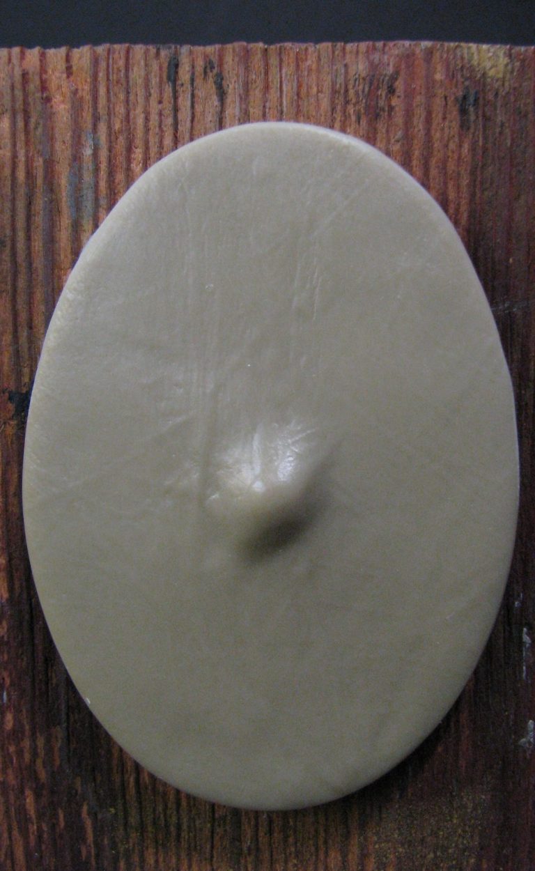
Photo #1 shows the bare resin shield, as you can see, it’s a wide open canvas for the painter to play about with, the background could be relatively simple and monotone ( OK that’s what I’ll be doing here ) but once that’s done, a design can be added freehand over the top if the artist feels like it – in my case, not today.
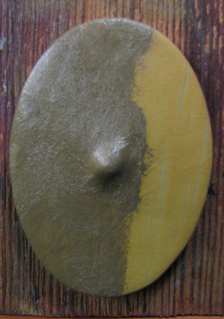
To get on with the painting then, photo #2 shows the right half of the shield has been primed and then undercoated with a sand coloured acrylic to give the oils a good base to cling onto.
One note about that, if you want the oils to be really matt once they’ve dried, add some Tamiya Flat Base to the acrylic.
This will help absorb some of the excess oil carrier as the paint dries.
The left hand half of the shield has been painted with a mix of Raw Umber oils and Titanium White, and the surface stippled to get rid of any brush marks.
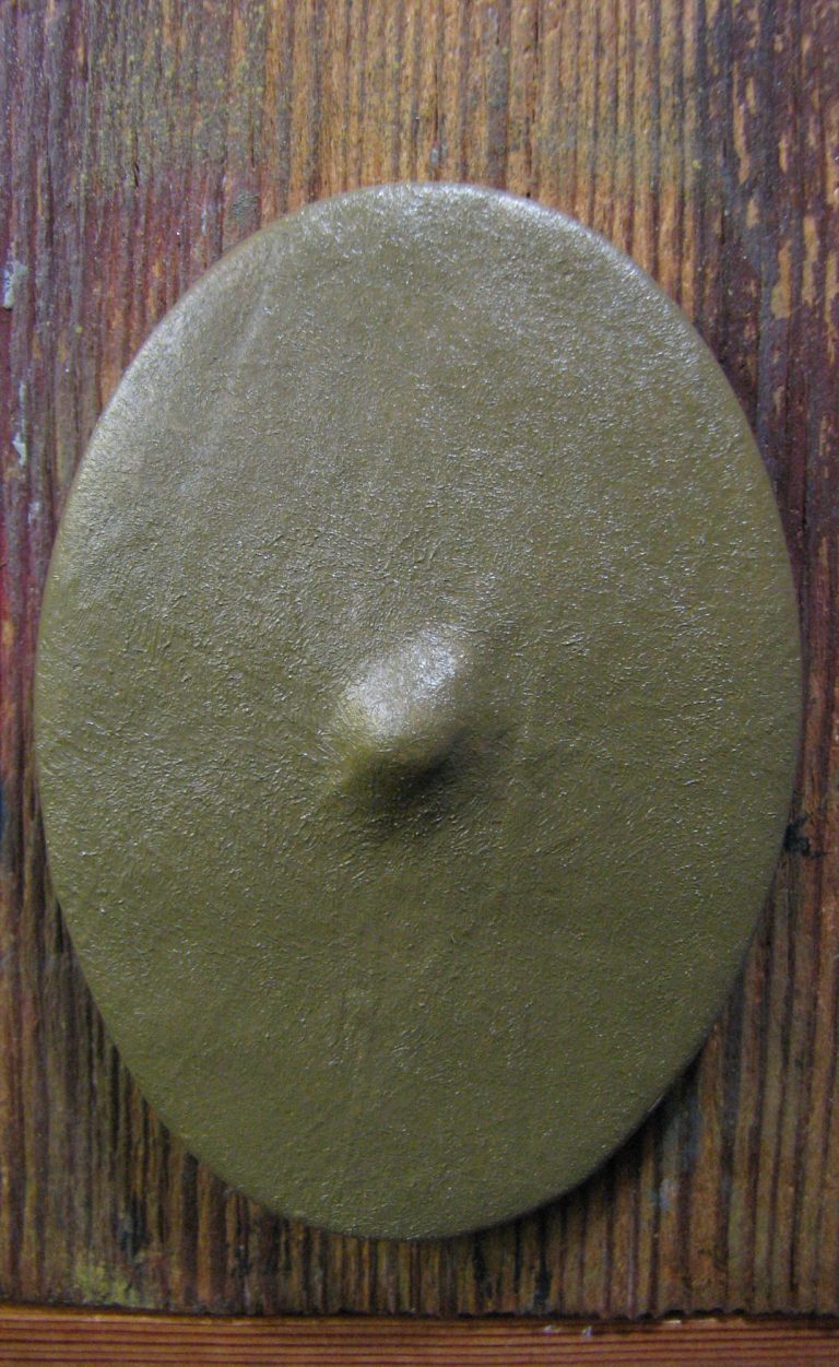
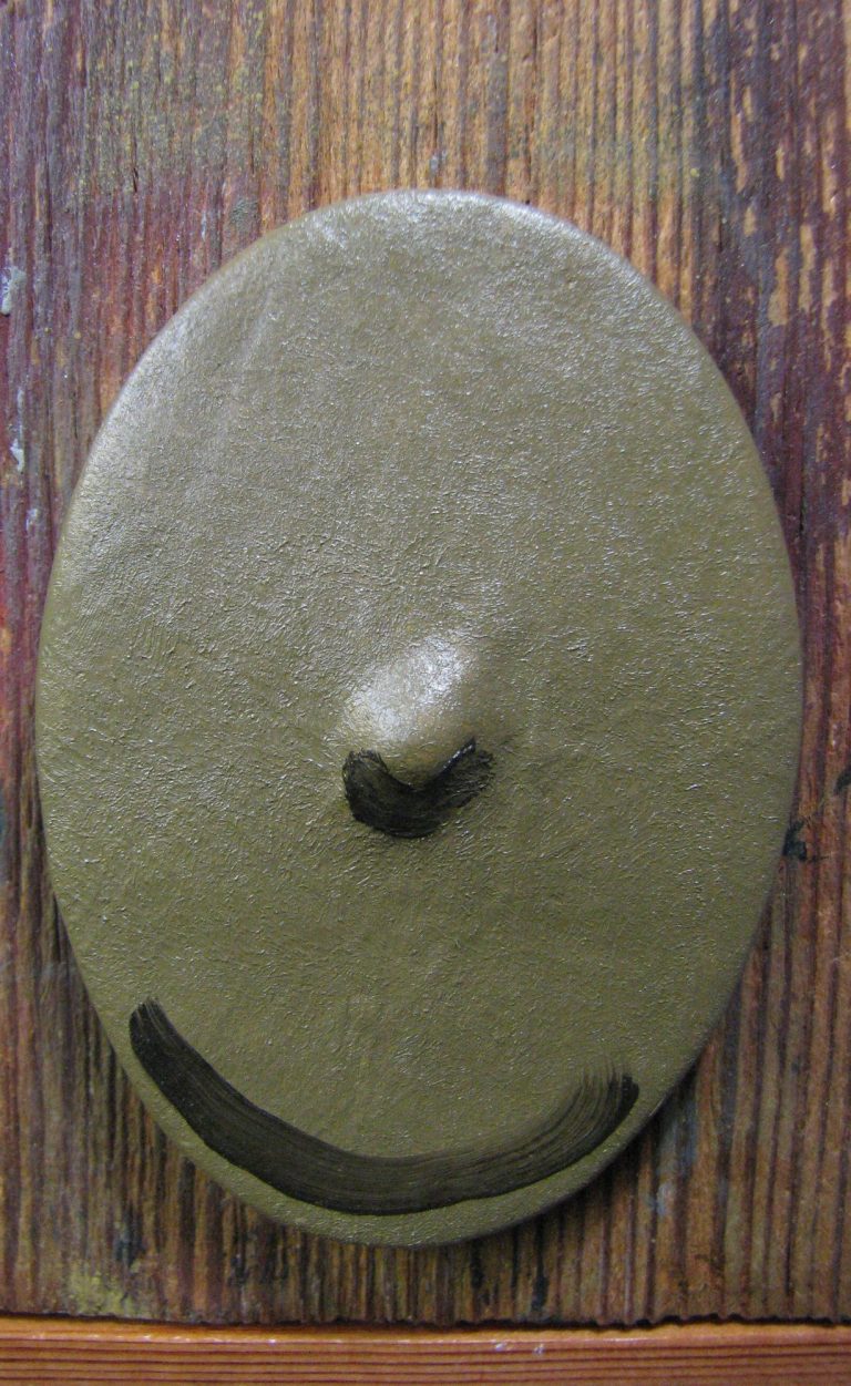
Photo #3, and the shield is totally covered, and the paint evened out with that stippling from a large, soft brush.
Don’t forget to keep wiping the brush on a soft cloth to remove excess paint. I’ll not keep saying it throughout this article, but it needs to be done after stippling each individual spot or sweep of paint.
Photo #4 and two sweeps of a no 4 brush – one under the shield boss and the other at the lower edge of the shield have been added.
Oh, best say it now, check that the shield is the right way up on the block of wood. It’s embarrassing to have done a load of painting and allowed the paint to dry only to find that you painted it upside down….
Never ever has that happened to me…..
Honest !
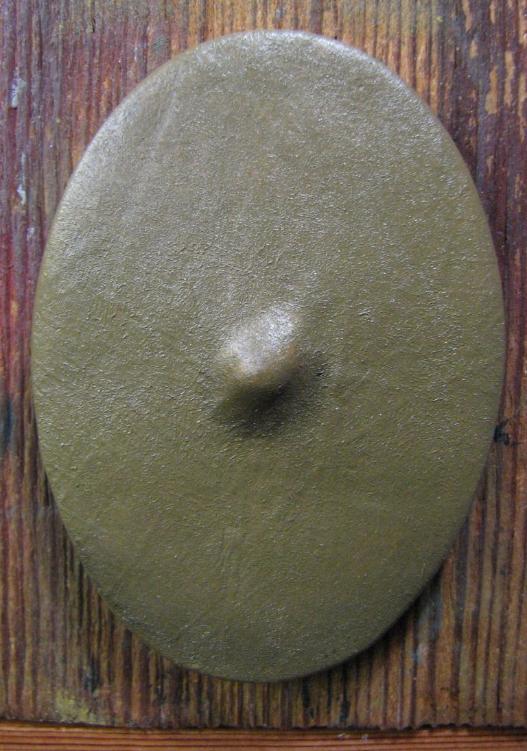
Photo #5 and those two sections of dark paint have almost disappeared. I’ve used a large soft brush to blend the colours in with a stippling action.
Raw Umber is not usually a strong pigment compared to Titanium White, so it won’t change the overall colour of the base colour that has been applied as the main colour so far. But that can be good, because it’s easier to get smooth transitions.
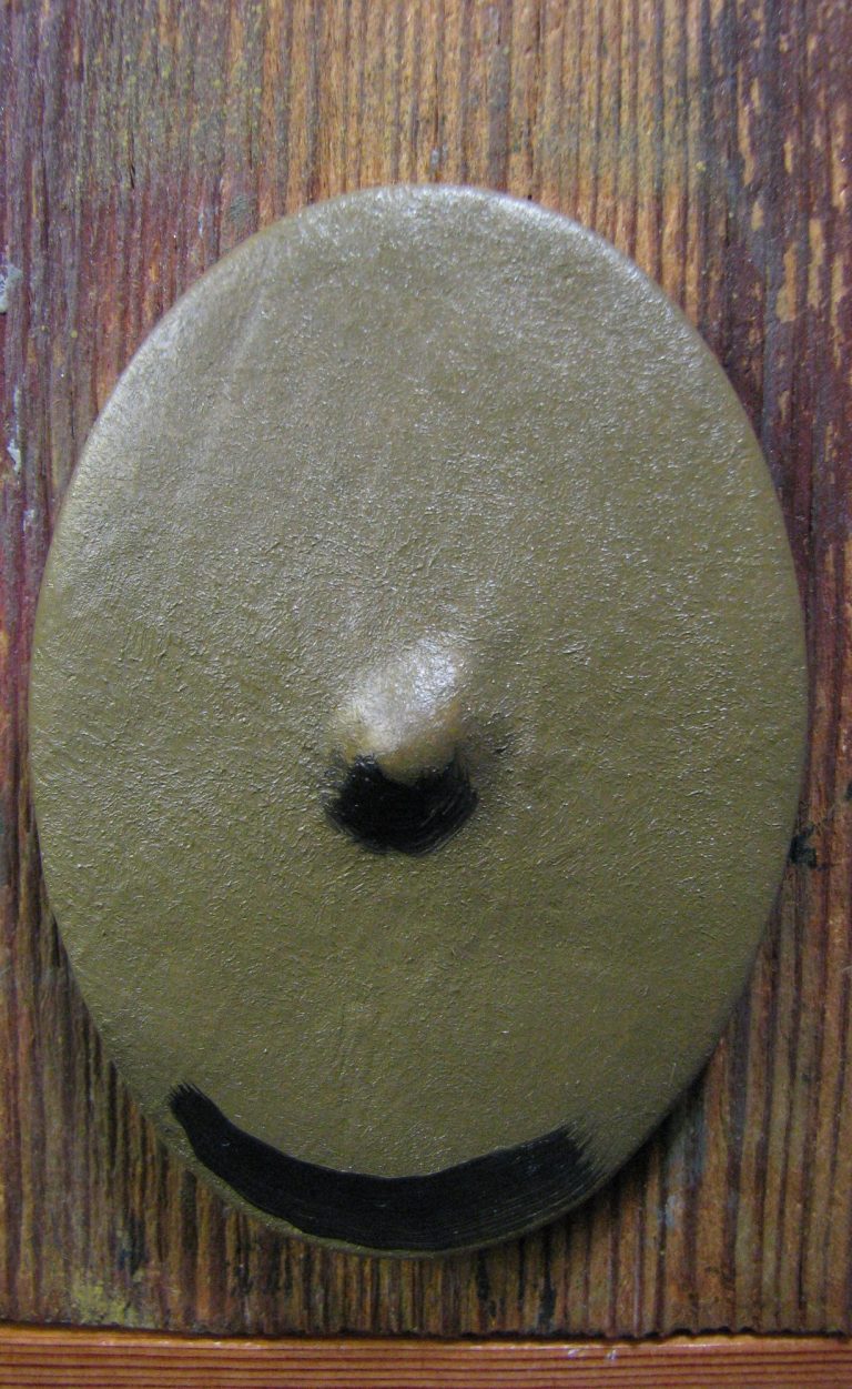
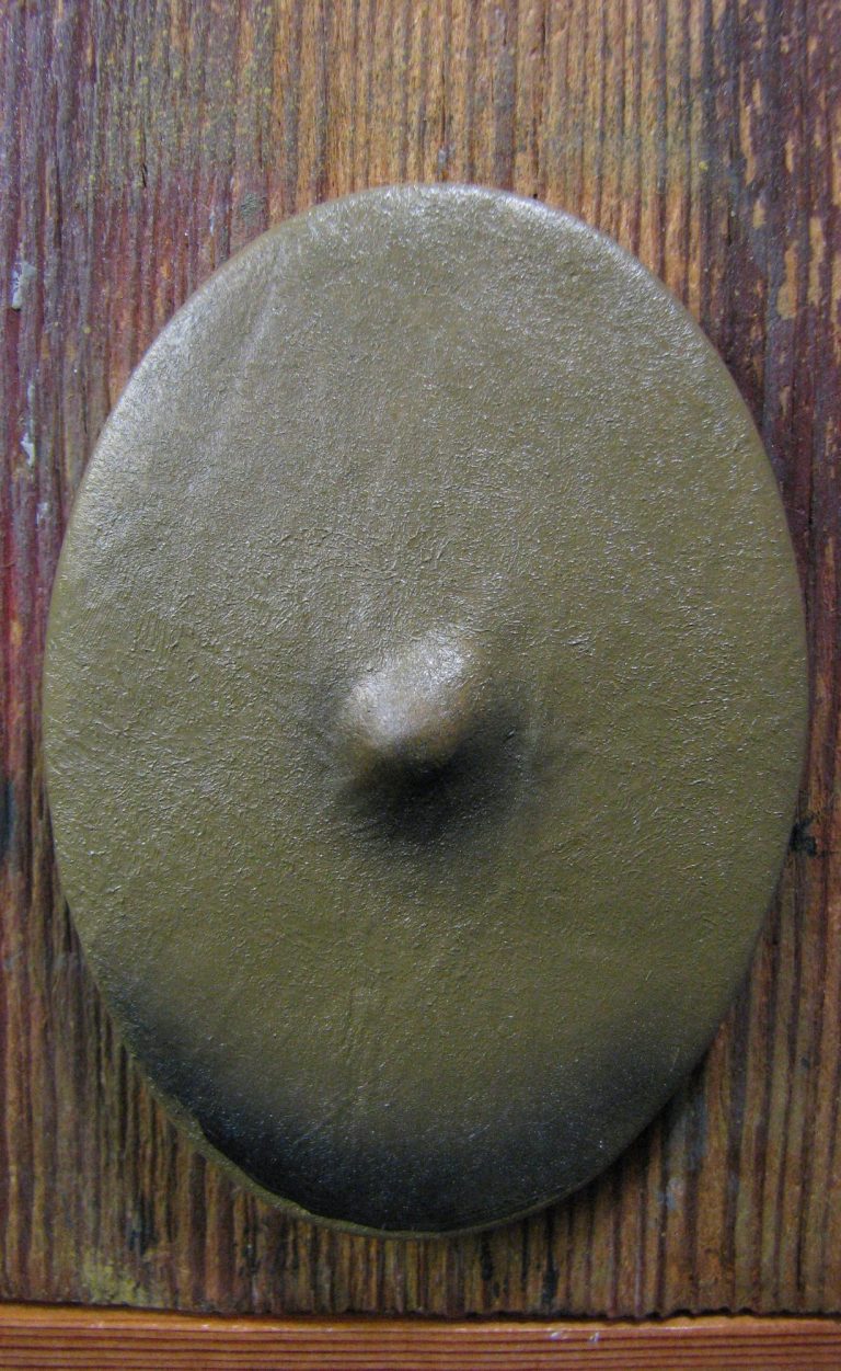
Photo #6 shows the additions of more of the Raw Umber. If you switch back to photo #4 you’ll see that the additions here are in smaller sweeps, although just as thick.
And Photo #7 they dark brown has been blended in, allowing it to migrate a little, but not too much, and the lower edge of the bottom sweep hasn’t been blended in yet.
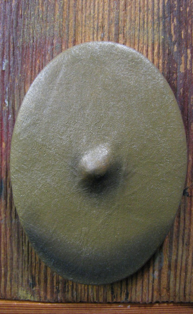
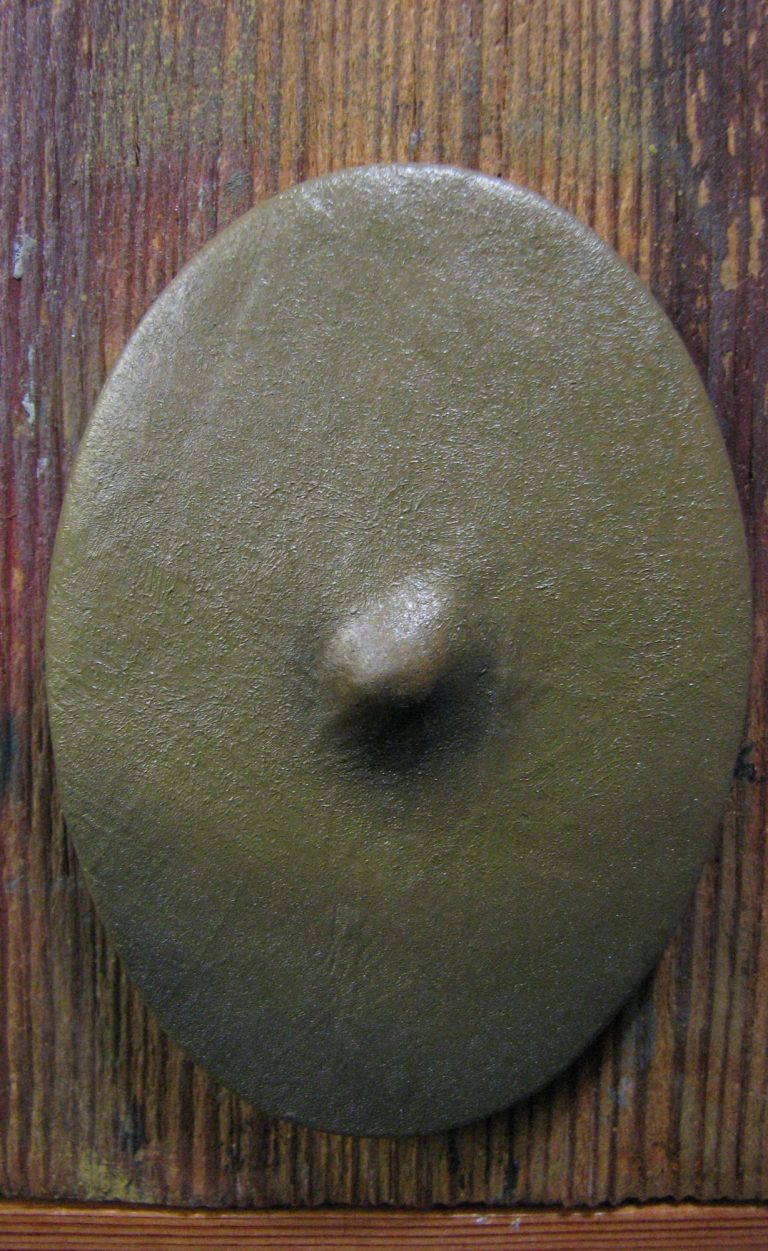
Photo #8. A second bout of stippling has blended the dark paint a bit further, softening the transitions, although they’re still fairly visible.
And in Photo #9 more stippling to fade the colour mixes back even more particularly on the lower edge that isn’t affected by a shadow being cast on it, as opposed to the shield boss, which will cause a shadow beneath it.
Now for some highlights, and in photo #10 I’ve added random spotting of a 50:50 mix of Mars Yellow ( or Yellow Ochre can be used ) and Titanium White.
The only care taken was the spot on the shield boss, getting that pretty central. Note that the other spots are not as heavy as the one on the boss, that’s because they will need to blend in to form a mottled pattern, whereas the one on the shield boss is to form a distinct highlight.
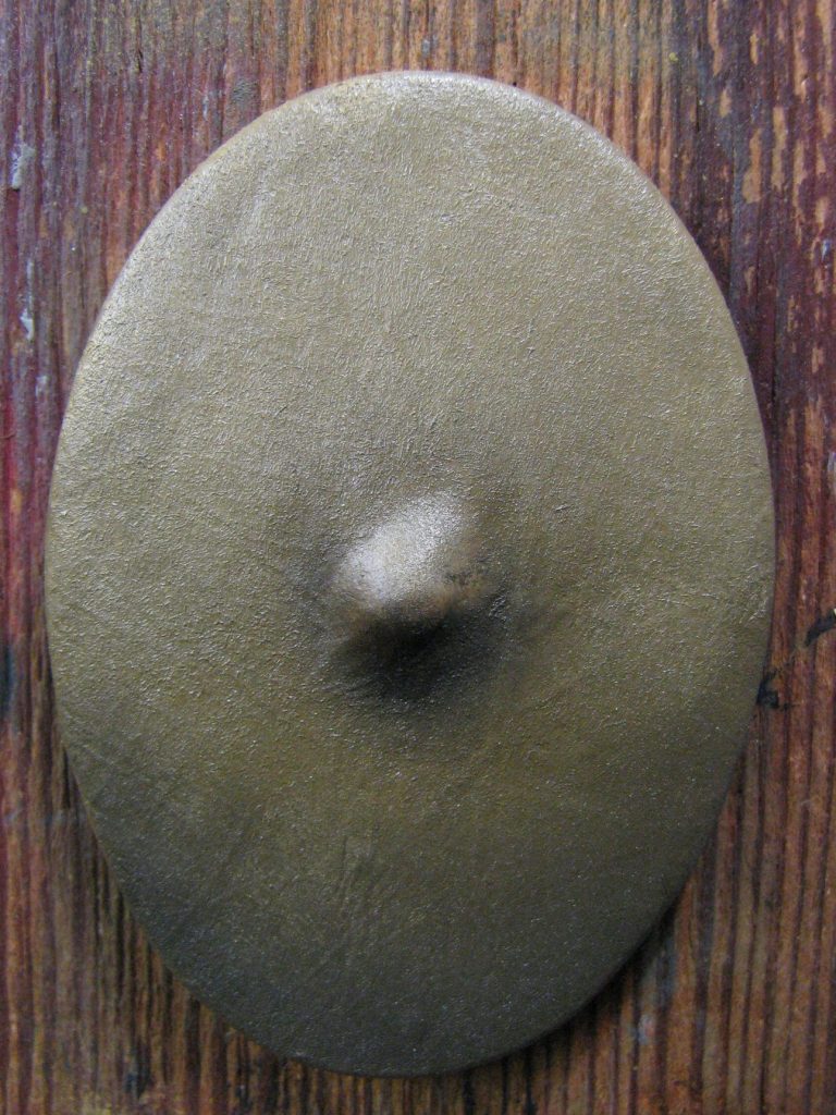
Photo #11, and like the initial additions of shadow colour, the lighter paint has blended out into an almost unnoticeable amount. It’s OK, it’s there.
Whilst it isn’t quite so obvious in this picture, and unlike the shadow at the bottom of the shield, the spots or splashes of light colour are not blended into each other if possible.
They’re treated individually, wiping the brush after stippling each one, and an effort is made not to have the light colour run into a single pale mass.
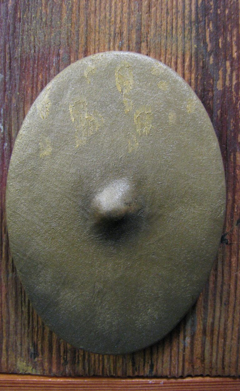
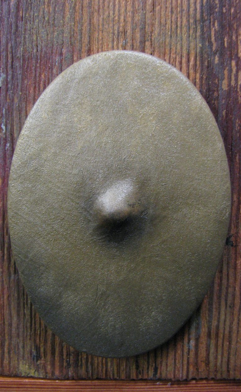
Photo #12 and more of that light yellow mix has been added, it’s not as visible, and the spots are spread wider, so it’s showing that the base colour is actually reacting to being lightened.
Photo #13, those spots have been blended in again, and the mottled, uneven colouration is beginning to become more visible.
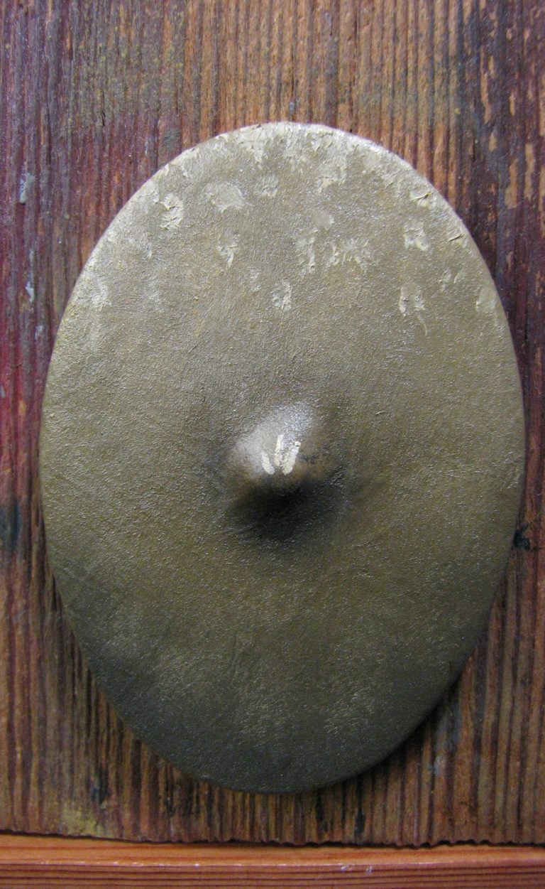
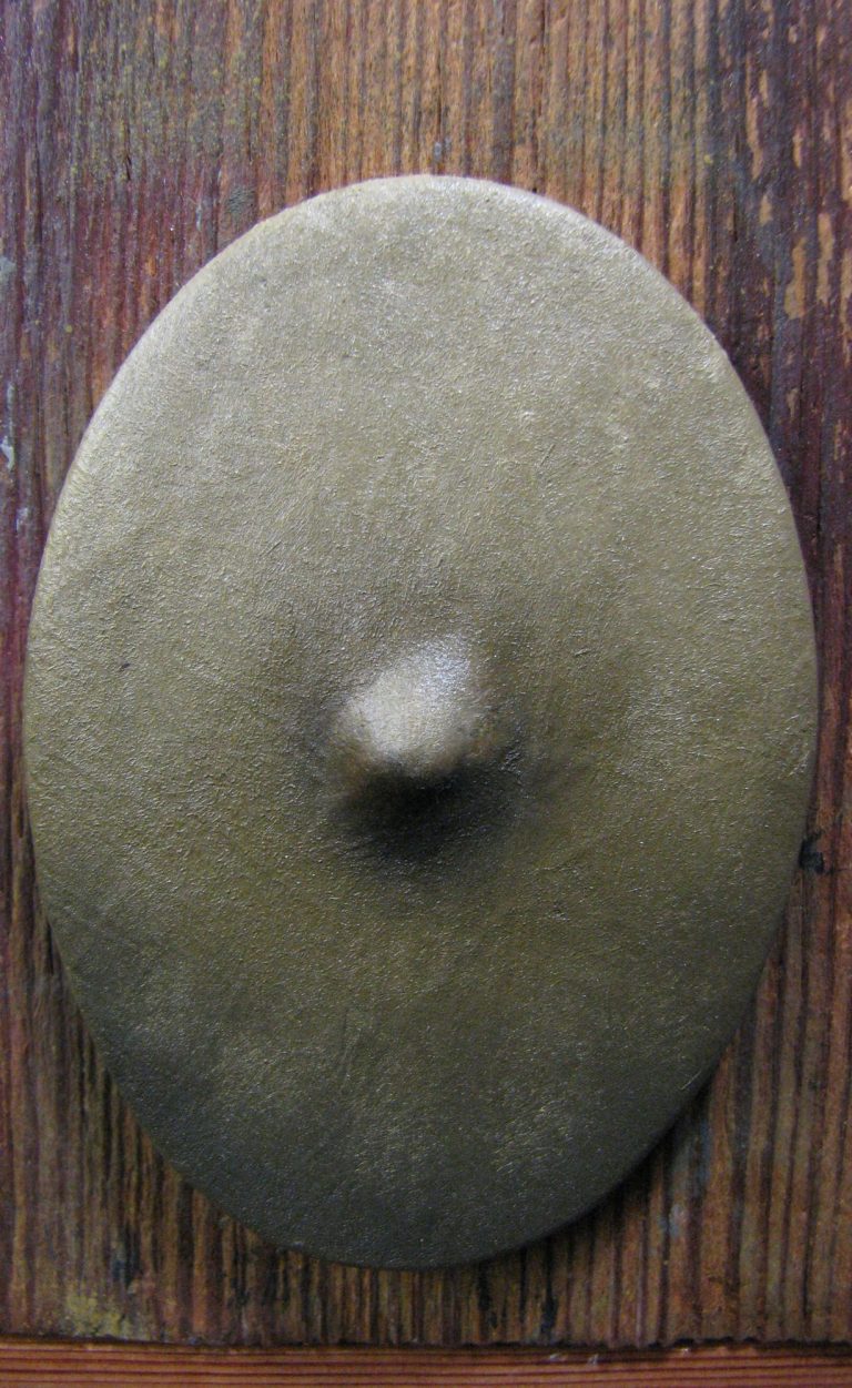
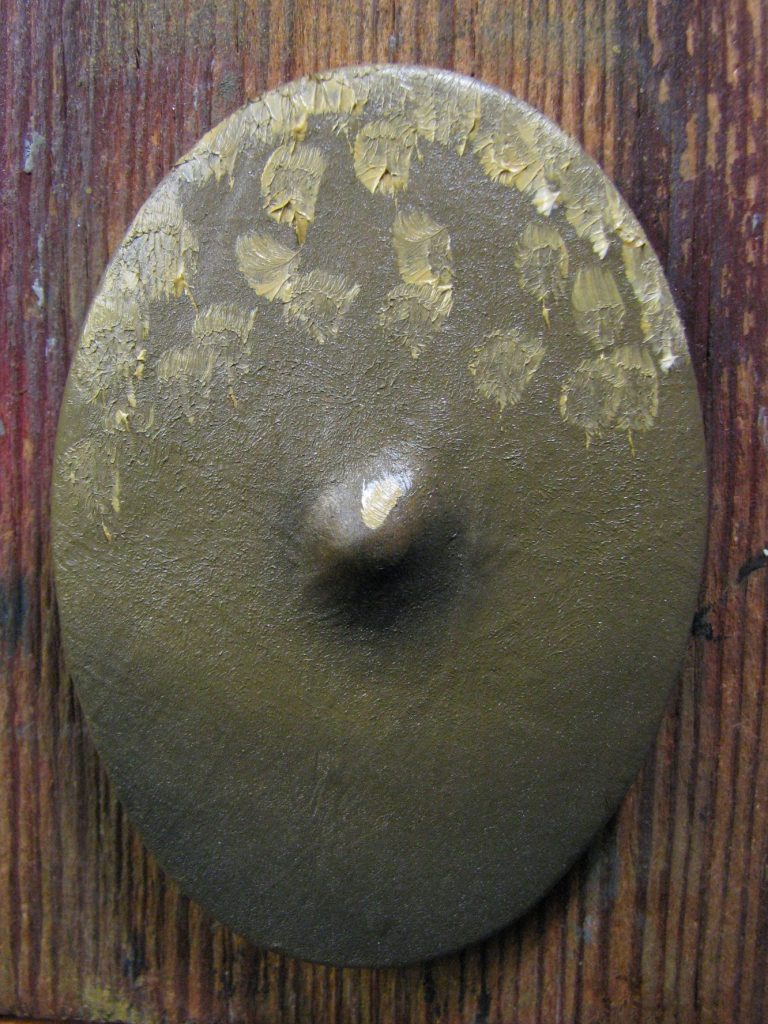
Photo #14. Having made more of the initial mix of yellow and white that wan necessary, I added more white to it, and then added smaller spots of that to the upper areas and the shield boss.
Photo #15, these spots were blended in, and although the brush was wiped on the soft cloth, it was used to stipple a bout five individual areas on the lower edge of the shield.
This continued the random, patchy look of the buckskin to the lower section of the shield. Notice as well, how much that shield boss is standing out now, it’s much more pronounced that in the initial pictures.
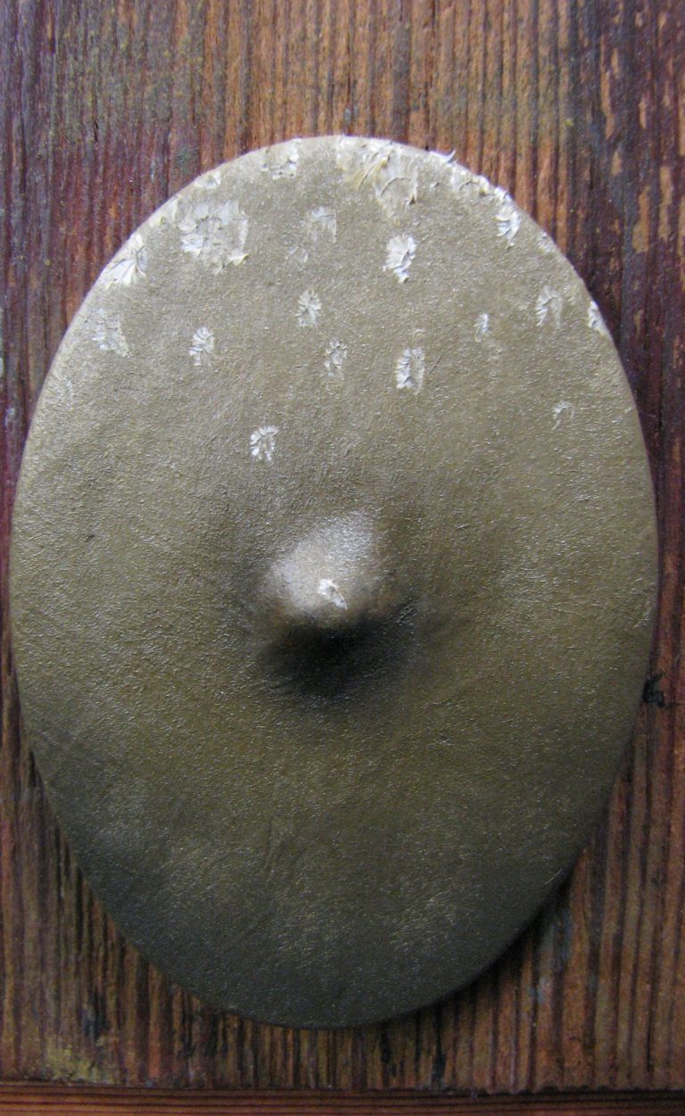
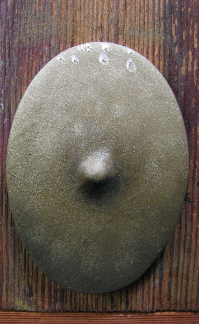
Photo #16 and the yellow / white mix has been lightened again with more white, and then spots added to the upper section of the shield and point of the boss.
Photo #17 and those spots have been blended in, and a few more added to an even smaller area at the top. These will be blended in too.
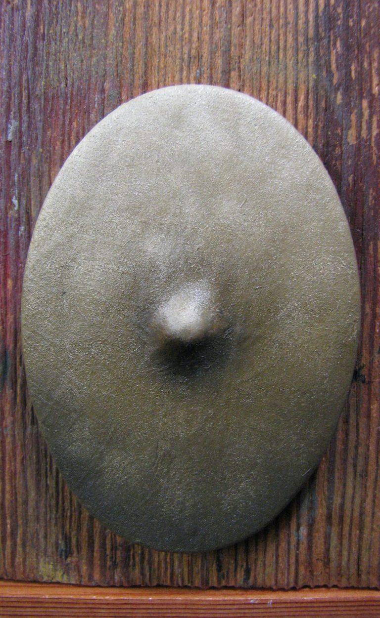
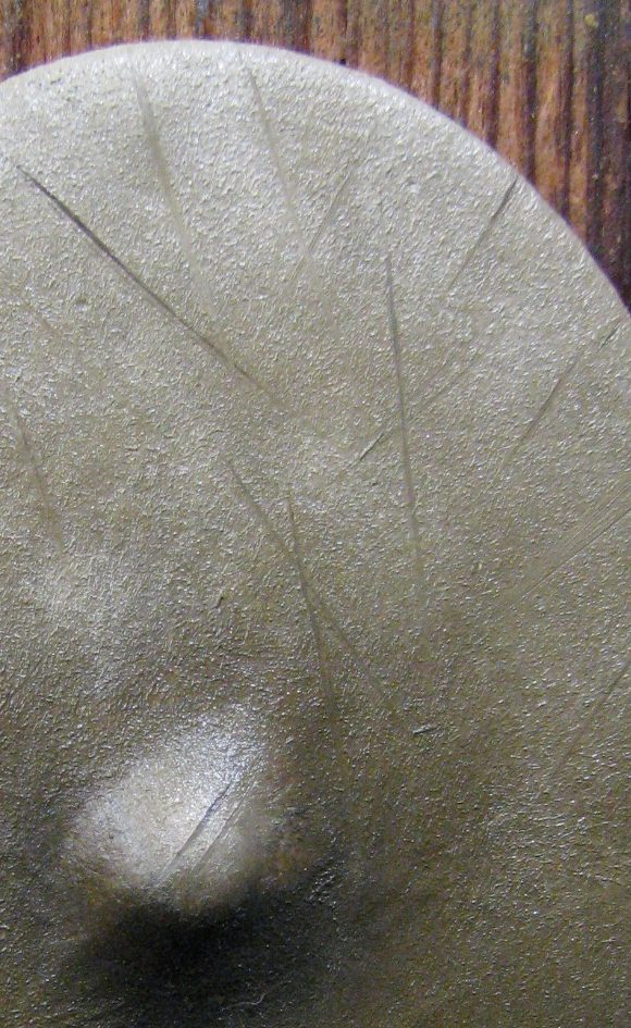
Photo #18 shoes the buckskin effect pretty much done, the uneven colouration can be emphasised more if necessary, adding spots of the shadow colour to the middle and upper section would do this, but care needs to be taken not to overdo such additions and ruin the zenithal lighting effect.
This will need about two to three days to dry fully in the drying cabinet.
Photo #19, but it’s a shield you say !
So whilst it’s wet ( if you’re confident ) or once it’s dry ( if you’re being less impatient ), some damage can be added in the form of slashes made by opponents.
The easiest way to do this is to add fine lines of a dark colour – Burnt Umber in this case – to the shield.
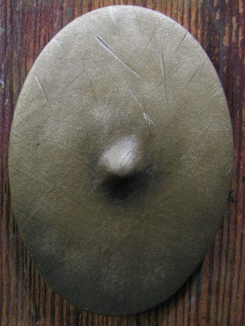
Photo #20. Deeper slashes that have more than just marked the surface can have a pale line added BENEATH them where the buckskin has split open a little and light is hitting the raised edge of the slash.
Fading some of the slashes by stippling them also adds interest, but don’t add too many of the fresh looking ones, it’ll look overdone and the effect will diminish.
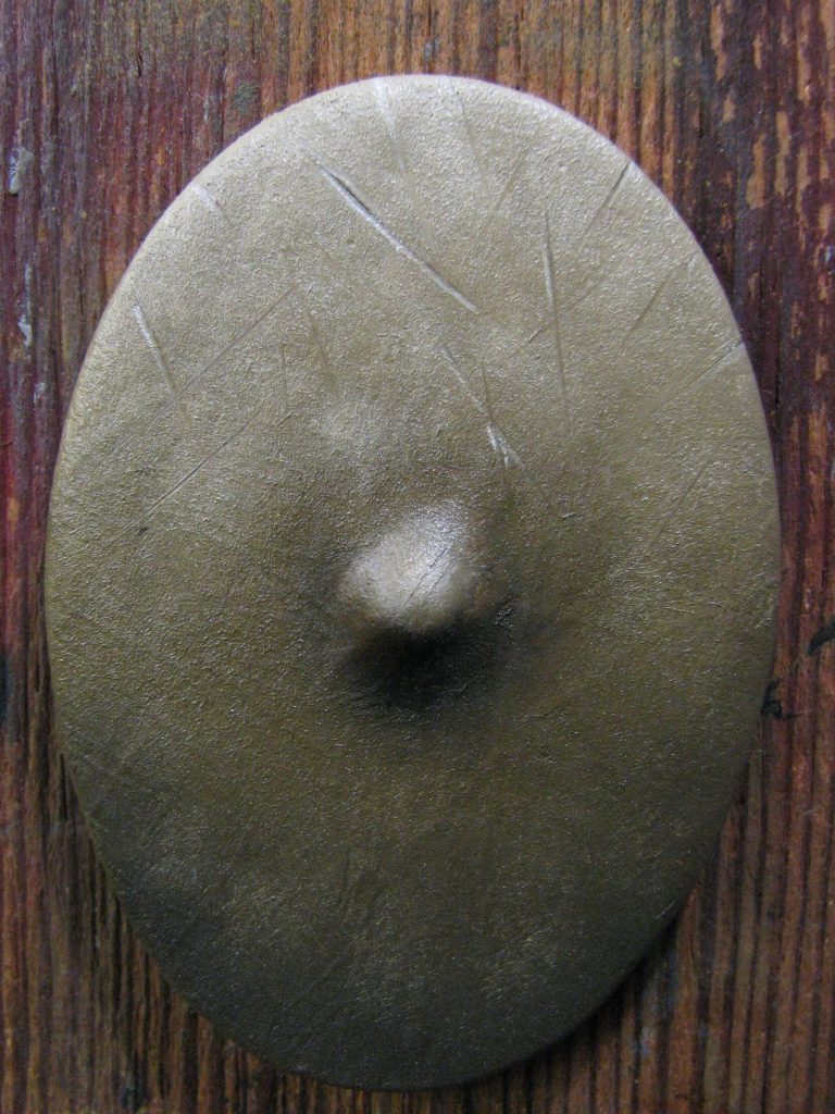
As I say, this method can be used to depict section of clothing, but there will likely be a lot more shadows and highlights where folds and creases alter where highlight and shadows form, so it’ll be a bit more complicated, but the method here is just easier to follow on a relatively flat surface, even though the shield boss shows how much paint can emphasise a particular feature, simply by placing the darker and lighter colours in the correct positions to fool the eye.
Hopefully this has been helpful, but as usual, any questions, please feel free to get in touch via the contact button on the home page.
We need your consent to load the translations
We use a third-party service to translate the website content that may collect data about your activity. Please review the details in the privacy policy and accept the service to view the translations.