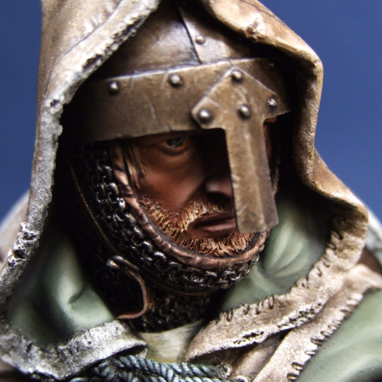
Leper Knight III
1/9th scale resin kit from Pegaso
Article in Military Modelling magazine 2011
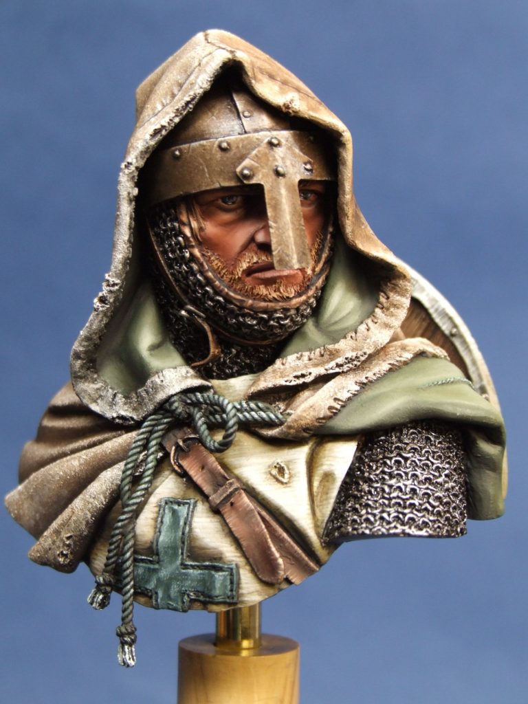
Painting patterns and textures seems to have become “the thing” these last couple of years, in fact, look at any medal winning piece these days and some form of patterning or texture will be on the model, changing an open and flat area of the piece into something a lot more interesting.
As far as a judge is concerned, it’s a way that a modeller can show off, to use the canvas offered by the kit to its greatest potential, and by doing that, show just how good a painter he or she is.
Sometimes this can backfire on the painter of course – either being too clever, or being outshone by other pieces on display – but generally, it’s a good way to catch a judges eye; mind you, holding that attention once your model comes under closer scrutiny can be somewhat more difficult.
So, to this piece. I’d actually bought it in 2010, although when or who off my memory can’t quite recall. It is a superb bit of sculpting as you’d expect from Pegaso, and the moulding has produced some superbly cast parts that require minimal clean-up. There is one small exception to this, the small white metal part that makes up the hanging end of the chinstrap for the helmet. Mine looked badly moulded – possibly a cold mould causing the metal to pit heavily and obscure the detail.
However, I wasn’t going to trouble Luca and his team over something like that, it would be simple to reproduce the small part myself. Having said that, I realize that some people are not that confident making things like this, and in the past, on the very rare occasion ( I think it’s happened twice in the last 15 years ), the chaps at Pegaso have been extremely helpful in replacing faulty parts, so you’ve nothing to worry about on that point.
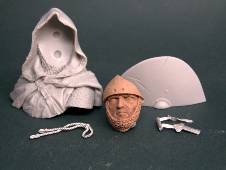
So, bought the kit, stored it carefully for a while on the Grey Army shelves, and then needed a kit that I could use for a demonstration…….This one fit the bill exactly, as I wanted to part-paint a face, and then use this to show how I added thinned down oil washes to accentuate and define areas of the skin. Before I go too far though, I did remember to take a shot of the unpainted parts – a real plus for me these days – shown in the “bare bits” shot.
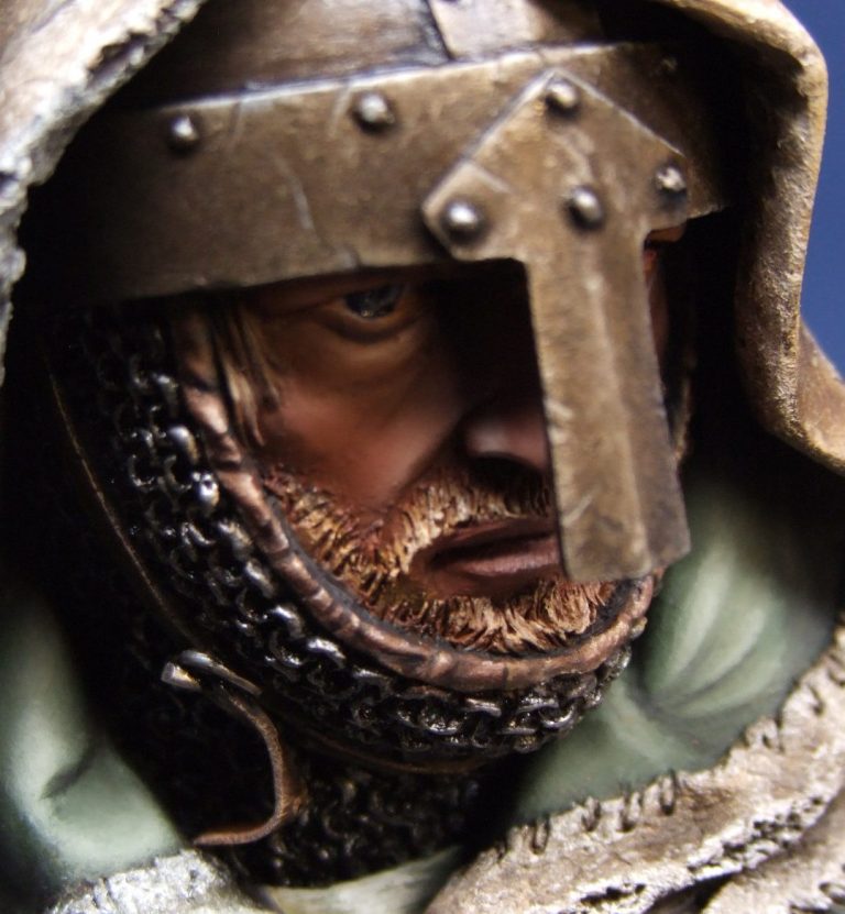
But the face was so good; I couldn’t bring myself to strip the colours off like I’d normally do after a demo. In fact it made me just want to carry on painting.
I think I’ve possibly detailed how I paint a face often enough for most of you to be starting to roll your eyes up in you heads if I start off over that again. And anyway, I’d not taken any photos of the face through the painting process, so I’d be hard pressed to do that anyway. So let’s take it that the face is done – photo #1 – and that I’m going to begin the process of painting texture with something simple like the beard.
Now in cases like this it’s very easy to say let’s simply drybrush the detail on. The problem with drybrushing is that whilst in some cases it can be very effective, for hair and fur, it applies the paint in the wrong direction – i.e. crossways to the flow of the hair, so that unless you’re very careful, you can end up with lines of colour going across the grain of the hair and thus ruining the effect you were trying to get.
Far better to use a motion similar to combing hair; so that the paint is applied in strokes that follow the flow of said hair. In the case of the beard, the hairs are relatively short, but even so, it’s best to comb the colour on gradually.
In this case I began with a thinned coat of Mars Brown oils. This was worked into the detail so that it blended with the darker shadows of the skin and allows the hair to seem to sprout out of the flesh rather than hovering over it and looking like a false beard. I let the paint dry for half an hour or so, then added some Mars Yellow to the Mars Brown and gently combed over the beard area with a small fan shaped brush. The paint was unthinned, and I repeatedly wiped the brush clean and recharged it with fresh paint as the bristles tend to pick up the darker colour at the same time as they apply the lighter one.
Once I’d gone over the area twice with that mix, I used Mars Yellow on it’s own to repeat the process. This time I worked on a smaller area, leaving the roots and the edges of the beard alone and just working on about the lower three quarters of the beard.
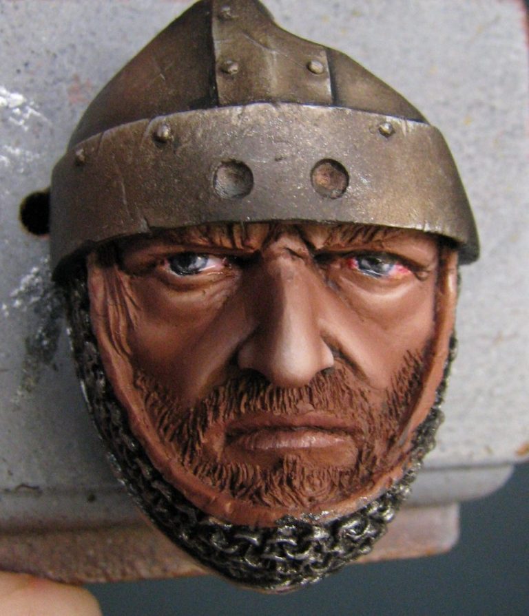
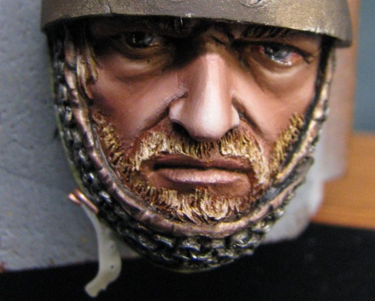
Again, two passes over each area, and constant wiping of the brush onto a dry cloth to remove excess paint.
Next I mixed Titanium White with the Mars Yellow, and then worked on about the lower half of the beard / moustache areas. The idea is to create a lightening of the beard as it gets bushier and towards the ends of the bristles. As with previous coats of paint, two passes with this lightened colour, and then finally use of Titanium White on its own to put in the final highlights on the very edges of the moustache and beard.
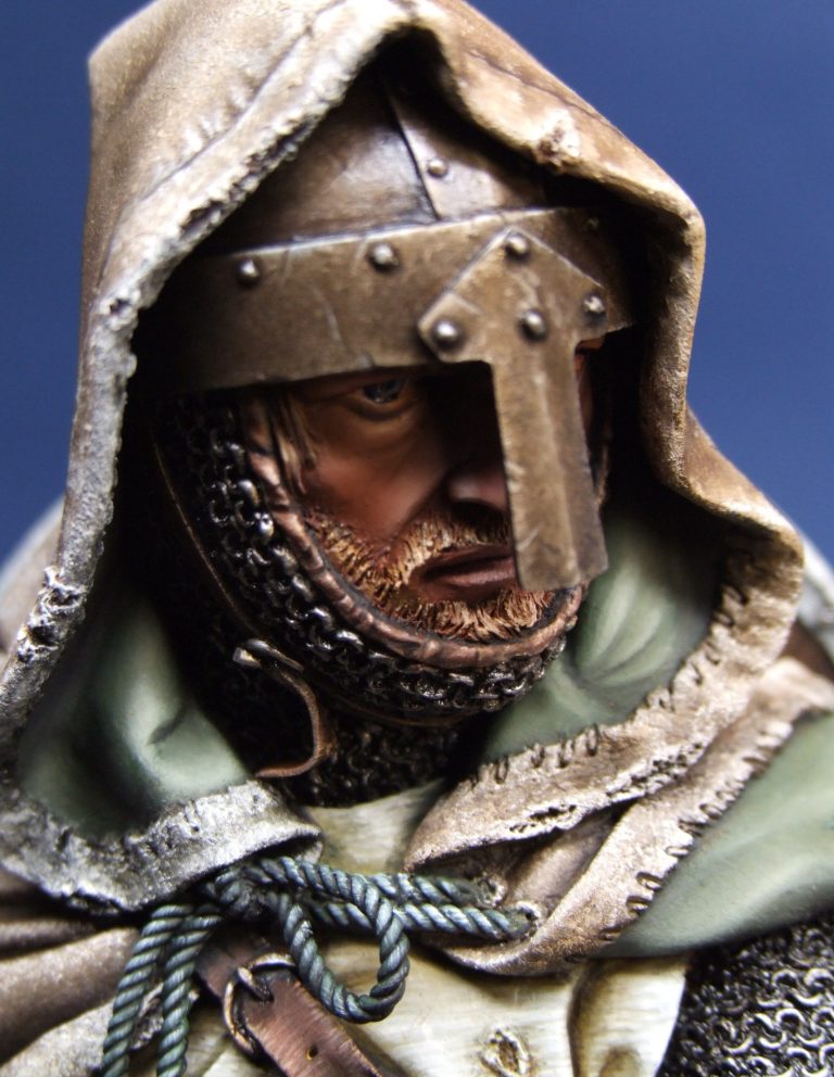
The result should look like that shown in photo #2 and final refinements with a little Mars Brown / Mars Black, thinned with White Spirit so that it flows into the deeper recesses creates a three dimensional appearance to the beard.
Moving on to the main body of the bust, again I wanted to play about with texture, and so chose to paint the surcoat the same way as I did the linen effect on my last Leper Knight. It’s a tedious process, and one that I’ll go into more detail with a little later in this article – as I had the bright idea of doing the shield face in the same manner.
Anyway, photo 3 shows the main bust component with the surcoat painted in but needing more shadows putting in ( oil washes ), and the cloak undercoated with acrylics and ready for its main oil coats. I think the bust looks odd like this, so added the face into the hood of the cloak for photo #4 ( then again this looks odd too, because the face is nearly complete, but the rest of him isn’t…….well, it’s different I guess ).
Also in these last two shots, the mail and metal areas of the helmet can be seen. The helmet is done in slightly bronzy colours, I’m working on the premise that constant applications of oil and grease would tarnish the steel, and although scratches would appear as bright slashes, the patina would be duller than a polished piece. The mail would probably look similar but for the action of the rings rubbing on both the leather backing or hauberk, and of course against each other, so although there would be some discolouration, there would tend to be bright areas unless the mail coat had been freshly greased.
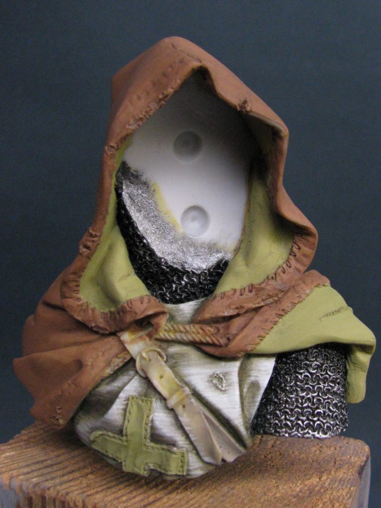
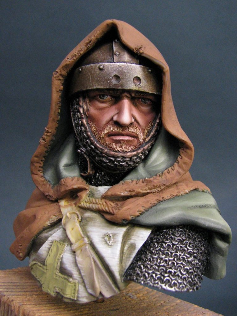
The helmet was painted in a very similar manner to the one I did on the El Greco Greek bust, but the mail is me reverting to washes of dark oil colour ( Mars Black with just a very small amount of Mars Brown mixed in ), with drybrushed coats of metallic ink added in between. I’ve used the Stormtroopers metallic inks, and whilst each coat needs to be dried in the heated cabinet overnight, the effect they give and the possibilities for blending outweigh the time taken to gain the effects. The mail areas probably took about a week and a half to do, with me eventually picking out individual rings with the brightest highlight colour – painstaking, but you can see the difference from just simply drybrushing a couple of different colours on and leaving it at that.
A final addition of pure Mars Black, thinned to the consistency of milk with White Spirit was added under the edges of the cloak ( at the shoulder ) and around the side of the neck to increase the depth of shadow in each area.
Again, this is playing with the viewer’s perception of the piece by increasing the apparent depth of the undercuts in both of these areas, and in the case of the neck, making the cloak appear to not touch the back of the neck where the helmet would cause a void of space.
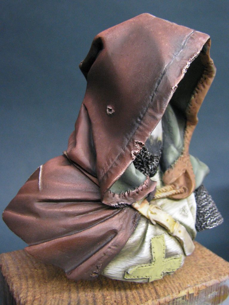
So, the cloak. This turned into a right palaver. I decided that as there was a seam already sculpted on the top of the hood, I’d continue that down the back of the cloak and make something like the Mongol cloak I did many moons ago.
O.K. not quite as complex as the Mongol’s cloak; but to I wanted to force the idea of the use of two different pieces of material so that different colours could be played about with.
Initially I’d thought about a leather cloak – oiled heavily and stained, that would allow me a fair latitude with the colours, plus textures of the tanning process……and that idea lasted all the way through to painting up the first half and about half way through the painting of the second half of the cloak.
First though I’d already painted in the lining of the cloak. I wanted to depict some kind of smooth material, to counterbalance the rougher outer covering, and as I was painting another one of my Leper Knights, I thought I’d better bring some green into this.
I used an acrylic green undercoat and then oils mixed from Oxide of Chromium ( I don’t know if you can still get that colour, but any mid-green would do ), adding some Mars Black so that I had a shadow colour, and to a separate patch of paint on the palette I added a little Mars Yellow and some Titanium white so that I had a working highlight.
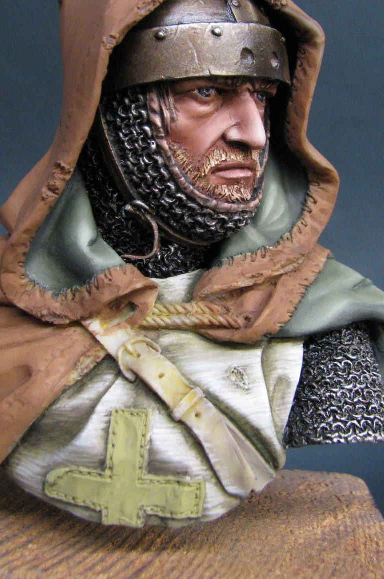
To be honest, I think this is the weakest area of the whole bust. I was trying for smooth, and got it easily enough, the blending qualities of the oils allowing smooth transitions of colour from light to dark.
The problem is that there’s so much else going on around the different areas of the model, that the smooth effect looks quite boring. It’s more difficult to do smooth too – I say that with a straight face in the hope that you believe me…….Um, maybe not then.
Photo #6 shows the work I did on the first half – working from a dark brown mix ( Mars Brown and Mars Black in equal amounts ), adding the paint with a large brush, then stippling the whole area so that a very mild texture was put onto the paint over the whole area.
After that I added more of the Mars Brown, then areas of Light Red and very small areas of an equal mix of Mars Yellow and Titanium White – working these colours to build up mid-tones, then highlights and final wear and tear on the seam edges.
All very fine and dandy, and it looked very nice indeed. I let it dry and planned to return to the area to add stains and dust as random shapes once both sides of the cloak were complete. But for now, an evening in the drying cabinet would have to suffice.
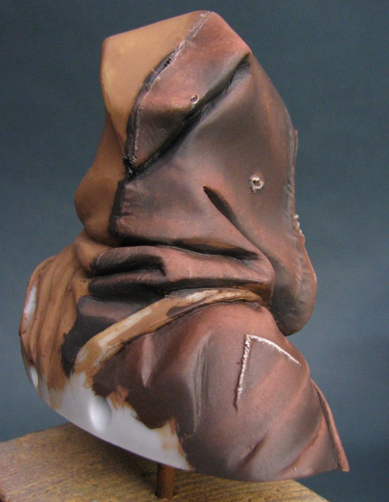
In the next session I went as far as adding some thinned down Mars Black to emphasize the main seam running down the back of the cloak ( see photo #7 ) and to make some of the shadow areas seem just that little bit deeper. I painted in the inner hem of the cloak ( photo #8 ) and if I do say so myself, the pictures look rather pleasing. That said, it was into the drying cabinet overnight to harden the paints off.
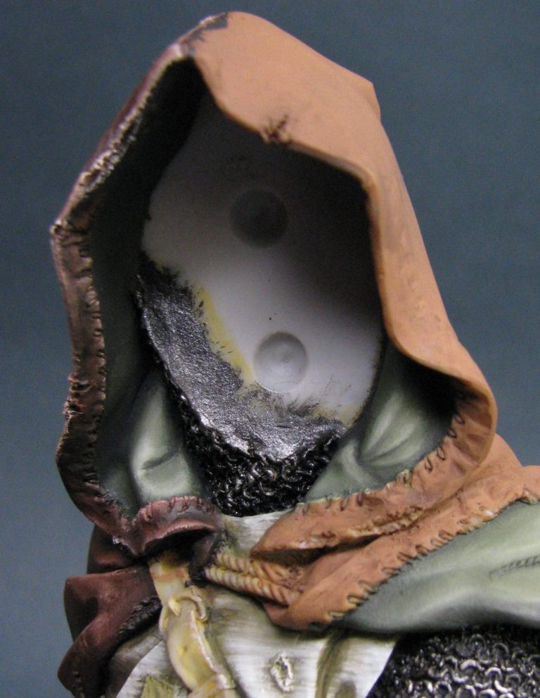
Photo #9…..This is the point at which a seasoned modeller of 30 years kind of lost the plot……just a little. Some interesting Anglo Saxon terms were given voice, and whilst it didn’t make me feel much better, it did take up the time between realizing that the second side of the cloak looked so much better, that I’d have to repaint the first side all over again, and then finally reconciling myself to the fact that I had only myself to blame for the current predicament.
My father would have mentioned someone trying to be too clever for his own good probably.
So, what did I do so right, that made the first half so wrong. Possibly not the right way to view it, but whichever way you look t it, the texture on the second side looked a lot more interesting to the viewer, the colours were a mismatch from one side to the other, and I didn’t like how it looked.
The second side was painted with an initial oil coat of Raw Umber. Following this I began adding mixes of Raw Umber just a little Mars Brown ( as the pigment is a lot stronger than the Raw Umber, it doesn’t take much to swing the appearance of the mix ), Mars Yellow and just a little Titanium White. I applied the mixes with a very old brush – something that apparently used to be a size 2 Winsor and Newton, but has now turned into a messy looking spread out mop of a brush. I used it to pick up quite large amounts of paint and then to stipple the fresh colour onto areas that seemed appropriate.
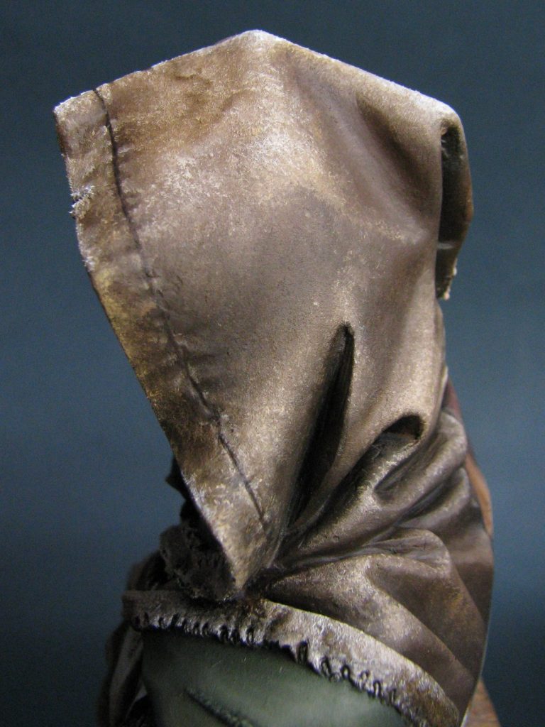
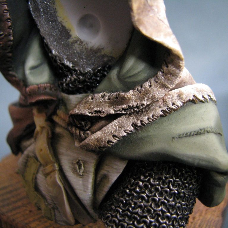
I say “seemed appropriate” because it’s this kind of random application that lends the creation of the piece its organic and natural feel – it doesn’t look contrived. I gradually added more and more light coloured paints until I was working with almost pure Titanium White. The whole point here is to keep a control of the paint build up on the surface of the model, and I can’t emphasize enough the necessity to repeatedly wipe the brush on a soft cloth to remove excess paint. This also stops the whole area degrading into a single coloured mess, as you wipe the brush after three or four dabs on the model, then recharge the brush with fresh paint. The lighter the paint that is being added, the more important this cleansing and refreshing the brush becomes.
Have I emphasized enough ? Probably you think so, but believe me, I haven’t. Look, it’s really, really important if you want to get the right effect.
So, now I’d ended up with something that looked really good, with watermark stains in it, it needed to dry – and that took about a week in the drying cabinet because some muppet with a brush had applied lots of paint in a thick gloopy manner.
Photos #10 and #11 show different angles of the dried paintwork on the hood – the best one being the close-up in photo #11 as it displays the grainy effect quite well. All I had to do was return to the side I painted first and repeat the process all over again.
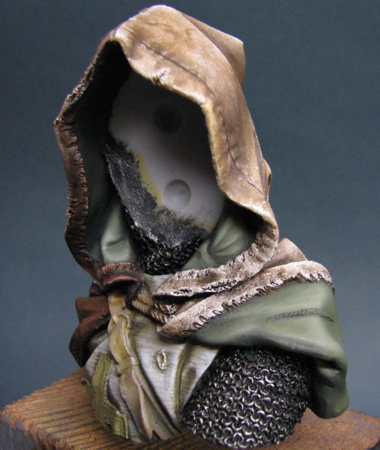
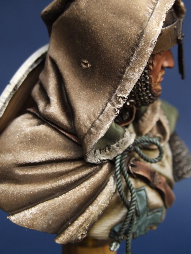
Which I did. Same process, slightly different colours ( I mixed a small amount of Mars Black with the Raw Umber and used less Mars Yellow through the lightening processes ); and ended up with the results shown in photo #12.
Again there was some amount of drying time necessary, because no matter how you try to reduce paint build-up, it does tend to be rather thick by the end of the day. I suppose that the effect is similar to how worn canvas would look, and bearing in mind that the crusaders travelled to the Holy Land via ships sailing out of southern Italy, it would give them good cause to reuse spare sail cloth or discarded sails for cloaks to fend off the worst of the foul storms that beset that region.
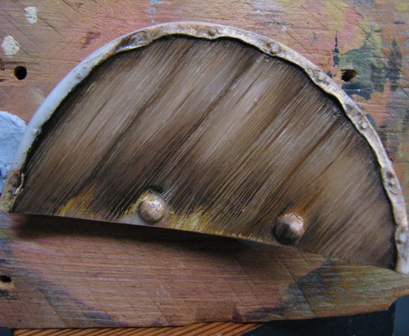
Whilst all the above took its time to dry, I could play about with the wood effect that people would hardly see on the back of the shield. I’ve actually taken some shots of this before attaching it to the back of the figure, and again it’s a relatively easy method to reproduce.
I undercoated the shield with a sand coloured acrylic – giving it three coats so that the sand colour is nice and solid. This helps because some of the sand colour might still be visible on the finished piece, so it pays to plan ahead.
On top of the sand colour, I then apply a moderately thin coat of a dark brown, in this case a mix of equal parts of Mars Brown and Mars Black. I add a little bit of White Spirit to help it flow, but the paint is still the consistency of a paste. Getting into the edges and underneath the details is the important thing, in this case there’s not much of that, but you might be trying this on something with rivets, straps or padding that’s in the way. If so, then ignore the presence of such things – and don’t bother painting them first. Get the wood area fettled before all the other bits.
So, a nice dark brown coat of oils in place, now to begin the fun. Select a flat brush, something with stiff bristles – hog’s hair if you’ve got it, but something softer will do, you’ll just have to be a thug with the brush is all.

Start off with some Mars Brown, just enough on the brush that you couldn’t dry brush with it, not so much that it’s clogged with pigment. If in doubt, just wipe the brush once on a clean cloth.
Now, starting maybe half an inch in from the left edge of the shield, make one stroke from the top of the shield to the bottom, don’t waver, don’t panic, you know exactly what you’re doing, and for heaven’s sake press on a bit. One stroke, that’s it. Wipe the brush and recharge it with paint again. If you’ve applied enough pressure, what should have happened is that you got some of the lighter paint applied, some of the darker paint removed and some lovely brushmarks running down the shield back.
Now do another stroke next to the one you’ve just done, wipe the brush, recharge with some fresh paint and do it again and again until you’ve reached the right hand edge of the shield. Once you’ve done that, go back and fill in the bit you left on the right hand side.
O.K. looks a bit like woodgrain ?
Now get some Mars Yellow and without cleaning your brush, just wipe it a bit on some soft cloth, add some of the yellow in exactly the same way. You can ease off on the pressure – no need to bully the shield all the way through – but again you want to be leaving those nice brushmarks.
Once you’ve done the yellow, try a little bit of Titanium White – same method, same effect is what you’re after.
With a little practice, you’ll gain confidence and you’ll find that the little twitch you made because the phone rang, or the children screamed that you needed to help with the homework, will actually look like natural bends and twists in the grain. I’ll refer you back to photo #13 to look at the bottom of the fourth plank from the right – nice little movement that no-one will ever see going on in that grain……But still, we know it’s there, eh ?
So, if you leave just a little space between each of the strokes, you end up with rudimentary plank separations. It helps if you plan this a little, but with practice it happens anyway, and you tend to select a brush that’s approximately the right width for the planks that would make up the shield. Photo #14 shows how to cheat a little to get plank lines straight, yes, there are people who can do completely straight lines, and on a good day I’m one of them, but this helps if you’re not one of those lucky people with a shake free hand.
Dry the shield off completely, then use masking tape – one piece or two with a very slight gap, and some dark paint to add in the lines. Move the tape to the desired position for each line, and hey presto, a nicely lined shield. If you really want to be fancy, you can add some little stretched teardrop shapes with the dark paint to look like knots in the wood – I’ve done a couple on the left hand planks in photo #14, again, probably not going to be seen once the shield is in place, but there’s always the off chance that they might be noticed.
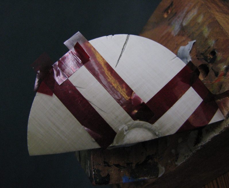
Those who are really bored with life ( that’s probably the category I fall into ) can add cracks or shakes into the ends of the planks, again with the dark paint – you can make the excuse that you’ve mixed too much paint and it’d be a shame not to use it……
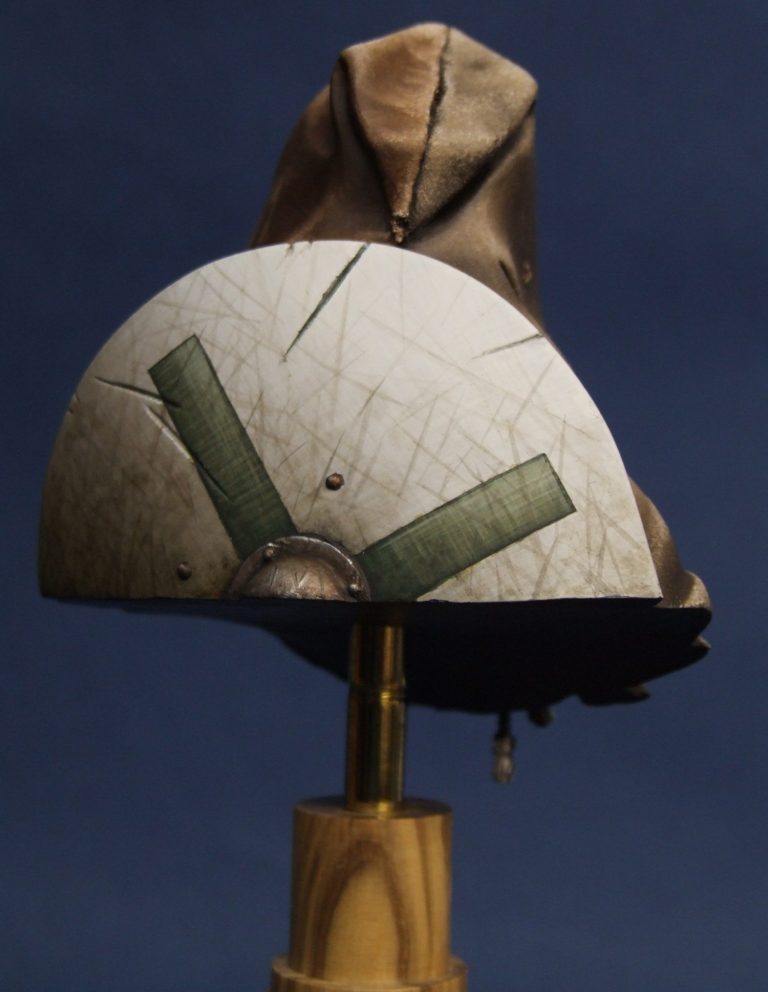
Now, I mentioned earlier that I’d return to that linen effect for the shield front. Photo #15 shows this having been done for a white shield; just ignore the masking tape for the minute. For the linen effect I began with a solid white undercoat, then added several coats of a mix of Games Workshop acrylics - Kommando Khaki, Chaos Black and just a hint of Skull White. Several thin coats established a solid colour, and then I could begin adding more Kommando Khaki, and lots of water. The Khaki lightens the colour of the paint, the water thins it so that I get a very gradual build-up of colour change.
I selected the very best brush I had with the sharpest point and proceeded to add lined of paint across the shield ( think of the shield being a full kite shaped one and I was painting horizontal lines across it ). I did probably five coats like this, before the paint actually looks like it’s changing the colour of the area and even then it’s showing a lot of little lines of colour forming up – excellent.A little more of the khaki and some more water to retain the consistency of the liquid, and then more lines, this time drawn vertically on the shield. I didn’t change orientation the last time I tried this, but thought I’d see what difference it made.
Again five or six layers before the effect could be seen.
This process of gradually lightening the colour, adding more water ( very important ) and alternating the direction the lines are painted in saw me probably coating the shield with 150 layers of paint. It’s so thin though that there is no real hint of paint build-up, plus as I got about half way through the process of lightening the colour, I also started drawing back from applying paint to the lower edges of the shield. In the end up, I probably finished up working on only the top quarter of the shield with pure Skull White.
Returning to photo #15, you can see the crosshatched, almost woven effect on the white areas. Now because I’m an awkward so and so, I wanted a nice green cross on there to match up with the linen effect on the white…..so by adding the masking tape, I could go through exactly the same process, but using green paint, that I’d just spent hours doing with white. – and photo #16 shows the results.
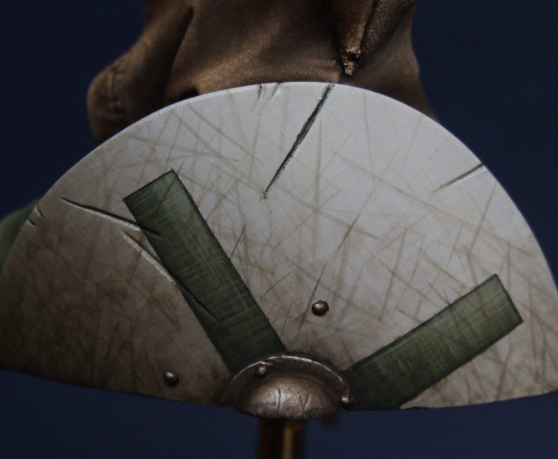
Admittedly, quite a lot of that effect is lost in these shots, especially with all the damage I’ve then added to the shield, but when viewed in the flesh – so to speak – a lot more of the detail can be seen.
The damage was simple to add too – using a very good brush again, but this time using oil paints, I mixed up some dark brown, thinned down to the consistency of milk, and then added lots of little short lines. Again, it’s the technique that matters, short swift strokes, not too much paint on the brush, and constantly putting a point on the bristles before making each line.
In this case, the more lines added ( O.K. up to a point ) the better the effect looks, because if you only add half a dozen or so, the effect looks somehow contrived and unrealistic. Daft I know, but that’s the way it goes.
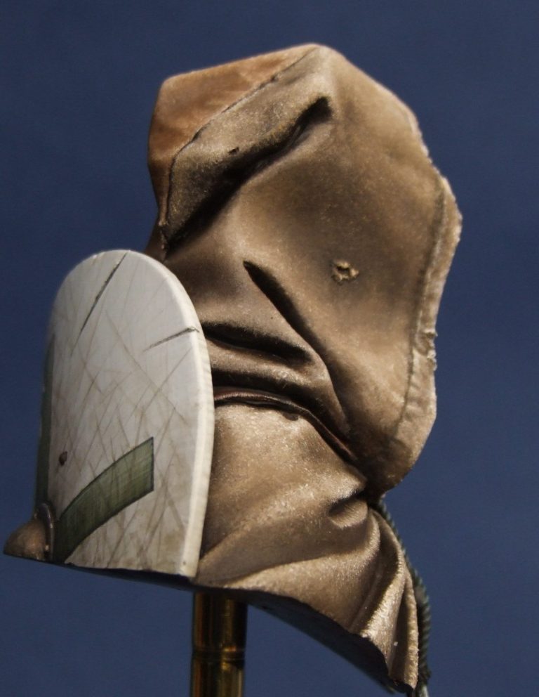
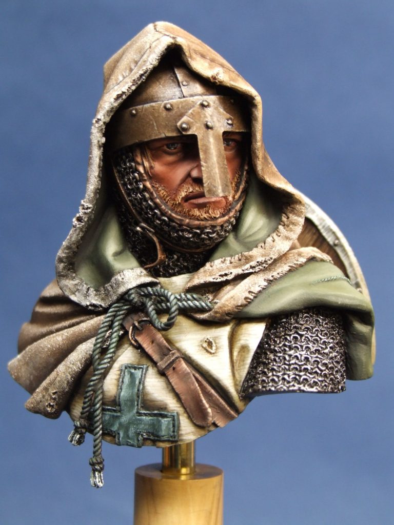
So, having waffled on for ages, I’ll let you go look at the finished shots – that’s if you’ve actually made it this far, in which case, thank you for sticking with it.
We need your consent to load the translations
We use a third-party service to translate the website content that may collect data about your activity. Please review the details in the privacy policy and accept the service to view the translations.