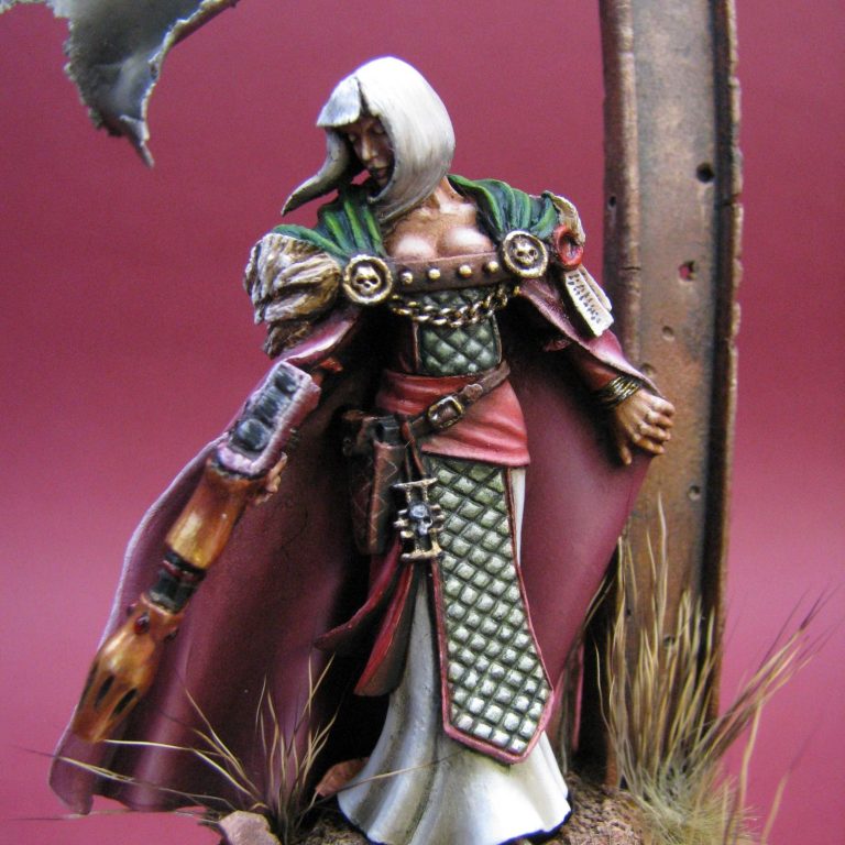
Sabella
54mm White Metal figure conversion from the Games Workshop Inquisitor range
Converted and painted in 2011
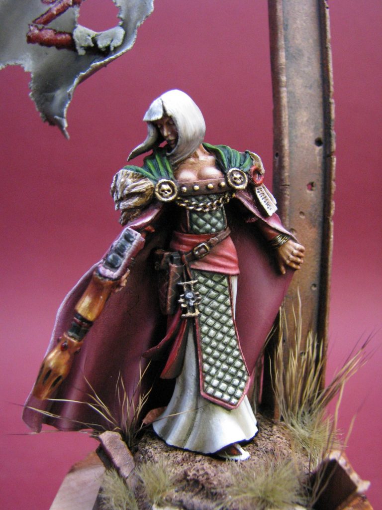
Although I’ve already covered how the design on the cloak of this figure was painted, I think it’s possibly worth writing about how the figure was altered, to make what can only be termed as a very poor sculpture, into something that got through first cut at GDUK and has held the eye of judges at all the shows she’s been to since.
Originally, this figure is from the GW Inquisitor range, and goes by the name “Lady Jena Orechiel”.
I say this is a poor figure, I feel that’s backed up by very few being visible on the Internet, and certainly I’ve only ever seen one other at a show. That other one had been painted in a structurally unaltered state.
That rendition wasn't half bad, I’ll be the first to admit; but it really is a case of whatever you do with this model as far as adding paint is concerned, you’re not going to alter the flattened mouldings, the undersized gun, the very poorly rendered sword, and a face sculpt that is a lot less than pretty.
However, this is a figure that is aimed at the game player, and although that game is character based, it’s only meant to be a three dimensional aid to play.
Or is it ?
I saw this and several others of the Inquisitor pieces in the display cabinets at Warhammer World, and there’s loads of potential for the modeller who’s willing to make use of putty and a scalpel, plus has knowledge of replacement parts available for figures of this scale.
For a start, Hornet heads – a vast range of replacement resin head castings – are just the right size to replace some of the heads on figures in this range. Hornet’s owner – Roger Saunders – is a master at creating miniature faces, not only true to one scale; but also with or without a variety of headgear, and with varying expressions. The downside is that he’s only done one set of female heads…….But I only needed one, and the set provides a selection of five.
So that was a quick start to the conversion process, with the real hard work done for me. All I’d have to do was figure out how to add some depth to the cloak, sculpt some hair, and find something weaponry-wise that would make messing with her seem like a real bad idea !
Whilst I had my thinking head on, I needed to couple what would be left of the kit sculpting, with what I was going to add, and if I needed to recognise any “outward effects” that were working on the figure, and might affect what I was sculpting.
Outward effects can be something as little as damage to equipment, direction of travel in relation to the base, or in this case the effects that wind blowing her cloak were having.
That looks to be a fairly substantial piece of material – it probably weighs a bit – and although the figure is female, the fact that its attached at the shoulders will allow her to carry it without too much trouble.

However, either there’s a strong breeze blowing, or she’s running ( what, in that dress ??? ) to make the cloth billow backwards. So opting for the strong breeze, I had to think about all the other items being added, and what, if any, effect the wind would have on them.
Hair for instance, would be affected a lot more than the cloak – it’s lighter, and unless she’s dumped half a gallon of hairspray on there, it’s going to blow about.
The cloak tips that I would add – these too would be caught by the wind and be flapping.
So, lots to think about and plan for. The good thing being that I didn’t have to make it so that it’d be detachable from a mould ( like the original casting ), but the bad news is that I’d have to attempt to make it look believable.
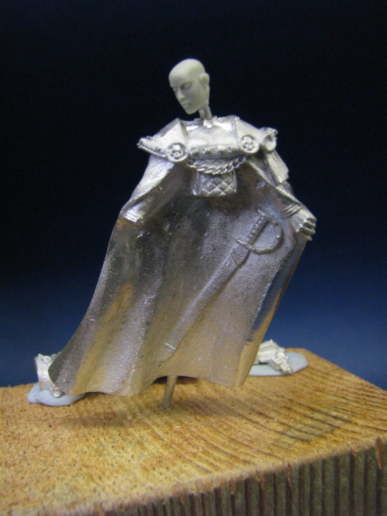
Starting with photo #1, where the upper body main casting have been cleaned up, the cloak edges pared away with a very sharp scalpel, and a short wire with a Hornet head glued to it, dropped into a hole on the shoulders.
I’ve also cleaned away the neck, as this area would have to be resculpted to marry the new head to the shoulders, plus later on the sad excuse for a scabbarded sword would disappear, along with the decoration on the edges of the cloak ( O.K. the little skulls stayed, but the rivets or whatever they are had to go ).
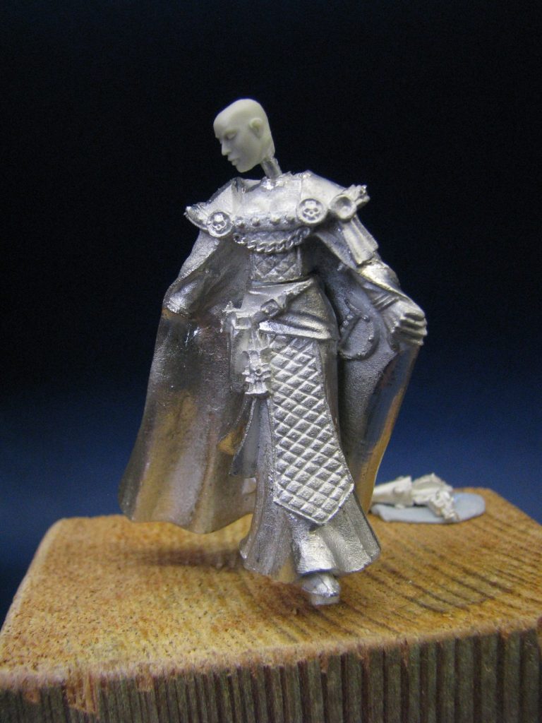
Photo #2 shows the upper and lower body castings fitted together. I made it so that the upper body would slot onto a pin glued into the lower body section. The idea being that I would be able to paint the two parts separately, plus I’d be able to check that they still fitted together during all the work being done.
Note that the “neck” wire has been bent and turned to look down. This gives the model a “mood” that allows the onlooker to interact with the model – she’s looking down, therefore is she lamenting something ? looking at something ? Whatever it is, it’s more than just a figure standing straight with a thousand yard stare.
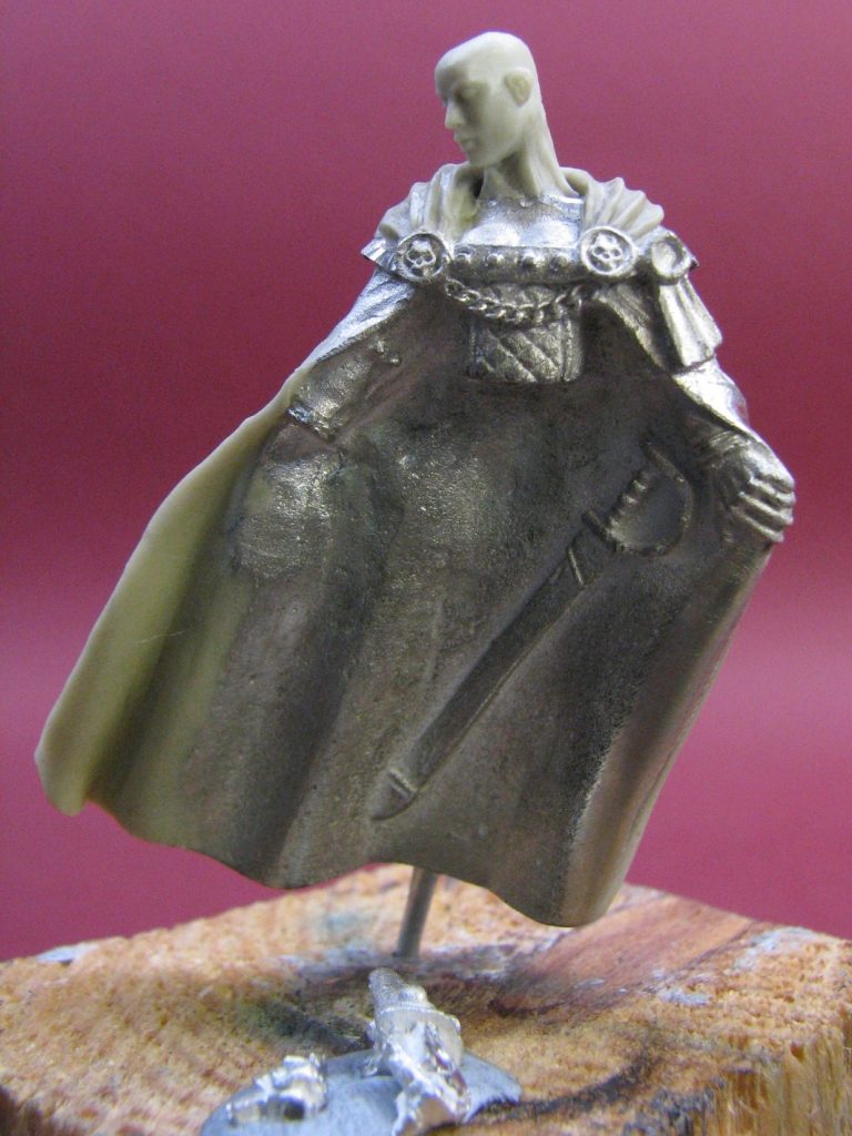
The mood would be further enhanced by the hair which would be streaming in front of the face – see, forward thinking !
In photo #3 some putty’s been added to the neck – Magic Sculpt being my choice to use, as it’s slightly waxy with a fine smooth texture that doesn’t take much cleaning up after careful sculpting.
In the same shot I’ve added in the tips on the cloak. These are more animated than the originals, which were very flat due to moulding capabilities, and this is where I had to begin thinking about the breeze affecting the model.

Photo #4 shows the same stage from the back. The putty is put onto the desired area with a small amount of superglue anchoring it in place. This keeps the putty where it’s needed, but allows the modeller the chance to push the body of the putty about, without it becoming detached and creating cracks when the smoothing stages are being worked on – nothing worse !
I try to get the finish on the putty as smooth as possible, simply because with complex curves like this, it’s a real sod to try and clean up marks later, plus I need the edges to be as thin as possible, so any sanding of the cured putty would alter the shape of the cloak’s edge. The lower edge is a different matter. To get an absolutely clean and square finish to the bottom edge, the putty is allowed to cure fully, before cutting off the lower edge with a sharp scalpel. Obviously that means that whilst the sculpting is taking place, the lower edge of the putty drops well below the lower edge of the original cloak.
Visible in this shot too is the wire that I fastened into a hole in the lower edge of one of the thicker folds of the cloak. The thickness, or thinness should I say, of the cloak is an illusion. At it’s thickest, it’s possibly 5mm thick, but that is hidden because you an only see that on the lower edge if looking at the model from below. The edges the viewer can see are all thinned out to an almost knife edge sharpness, thus creating the illusion if a thin material being worn. The fact that there’s enough metal to drill up into works for the modeller though, as it allows a pin to be inserted, which means that I could support the model without having to use the hole at the waist.
Staying with photo #4, the hood of the cloak is being added. Again, I’d thought that the original model lacked something in this area, and that rather than a collar-like mantle, I would prefer a hood on the cloak. It gave more canvas for sculpting detail, plus a cloak with a hood would be more useful. I’ll not even mention that with the hood up, the character could assume a more forbidding or threatening countenance…….

Whilst all the putty areas were curing, I got on with adding paint.
The lower half of the figure is receiving no alteration at all, so I could happily slap some colour on there. As I like painting lighter colours with acrylics, it gave me chance to mess around with those, and in photos #5 you can see the colour building up on the long skirt. There’s not much contrast really in this shot – although I was starting from a very dark Khaki colour ( Commando Khaki, Chaos Black and a little Skull White ), with washes added gradually working up to pure white. However, with the thin washes also comes the fun of seeing how the colours build up. In this case there must have been a very fine rippling at the hips ( just visible in this shot as the light colours pick it up ). I used subsequent layers to enhance this as I added more paint, allowing this puckering to look like the material was stretching and gathering up very slightly as she sways her hips.
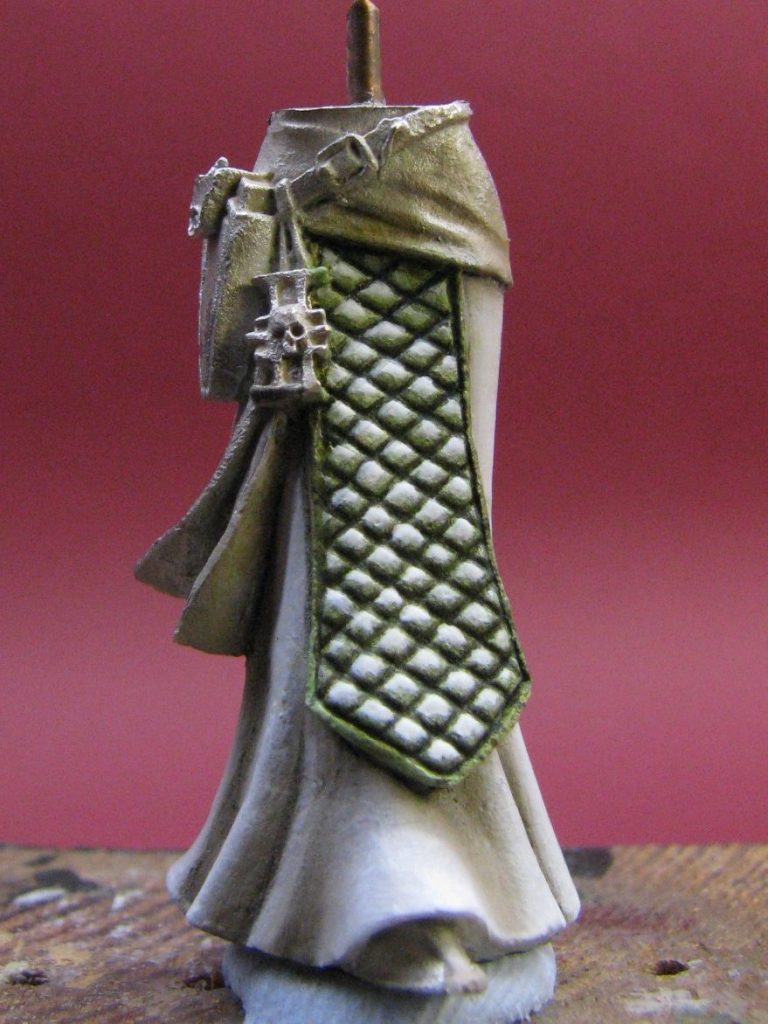
Photo #6 shows a shot from the front, the diamond effect being painted to represent a quilted effect. I had to play around with repeated washes and adjustments to the colour of this area. At one point I’d think I’d got it right, then when another area was completed, the contrast would appear to have dropped out of it. Very frustrating, and I’m not convinced that the final effort was the best attempt I’d made.
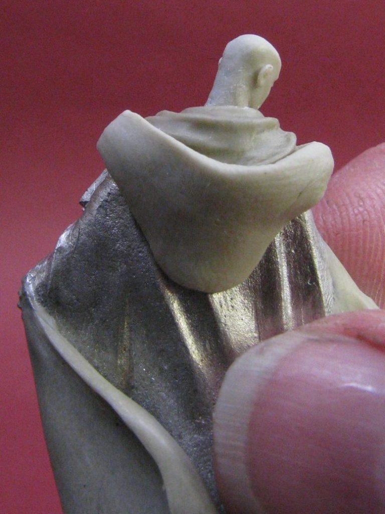
Having added the inner lining of the hood, I could then shape the outer layer. This initially was a rounded triangle of putty, pushed into shape and with a tassel added from some very fine fuse wire – see photo #7. The tassel was ditched, mainly because it would be a devil to keep in the right place as I added the paint, and I wanted to add fur to the outer skin of the hood, so the tassel might well get lost in all the rest of the detail going on in that area.
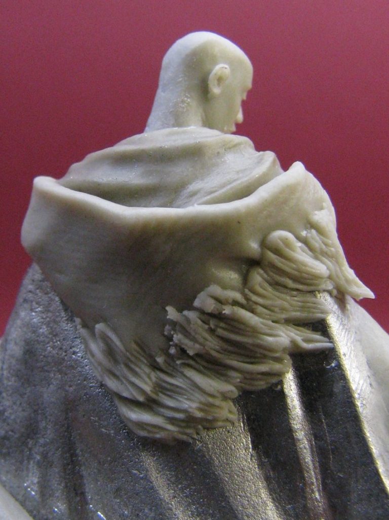
Photo #8 shows the tedious way I added the fur. A little like laying slates on a roof, in that small tear-shaped pieces of putty are added ( it has to be relatively fresh and soft, so only mix up a small amount at a time ). A fine scalpel is then used to draw out the texture of the fur on each of the tear shaped putty pieces, and then another layer can be added.
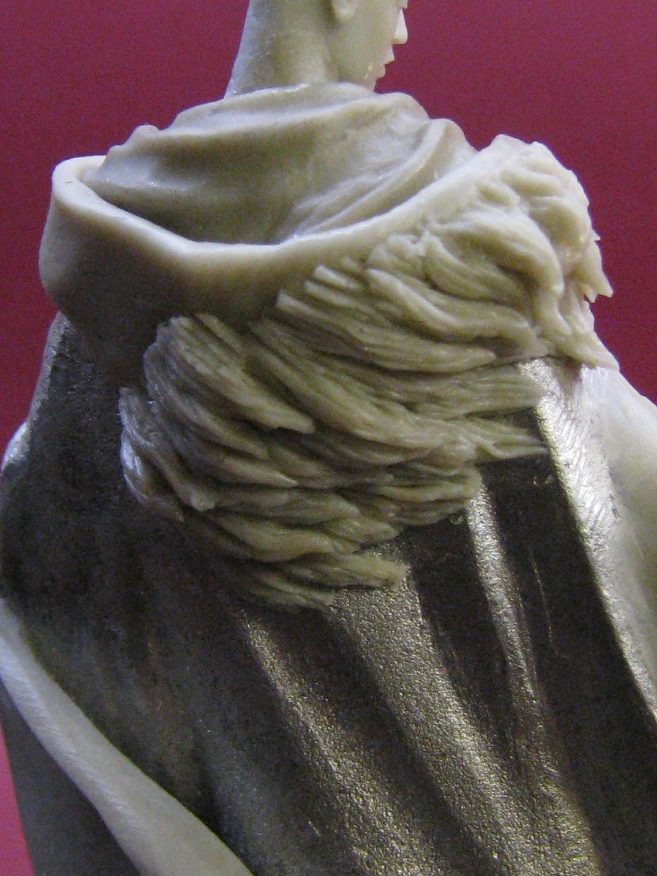
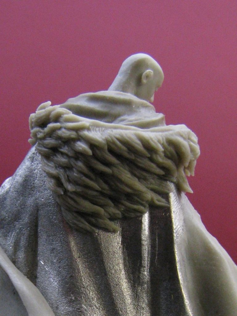
It’s a long, drawn out job, and had to be done in sections over a couple of evenings. Photos # 9 and 10 show this building up though. Note the upper edge of the hood.
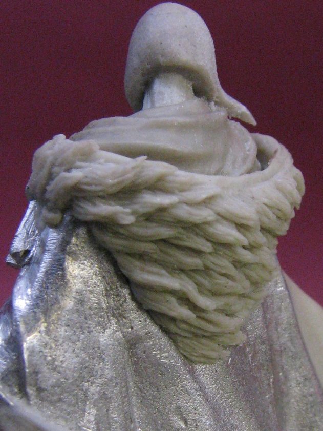
I used a sharp scalpel blade to trim a straight edge on the fur, then went back and sculpted the fur detail back to that edge, so that a band of different colour could be used to add a distinct barrier between the fur and the cloth of the hood – photo #11, #12 and #13 possibly shows this best.

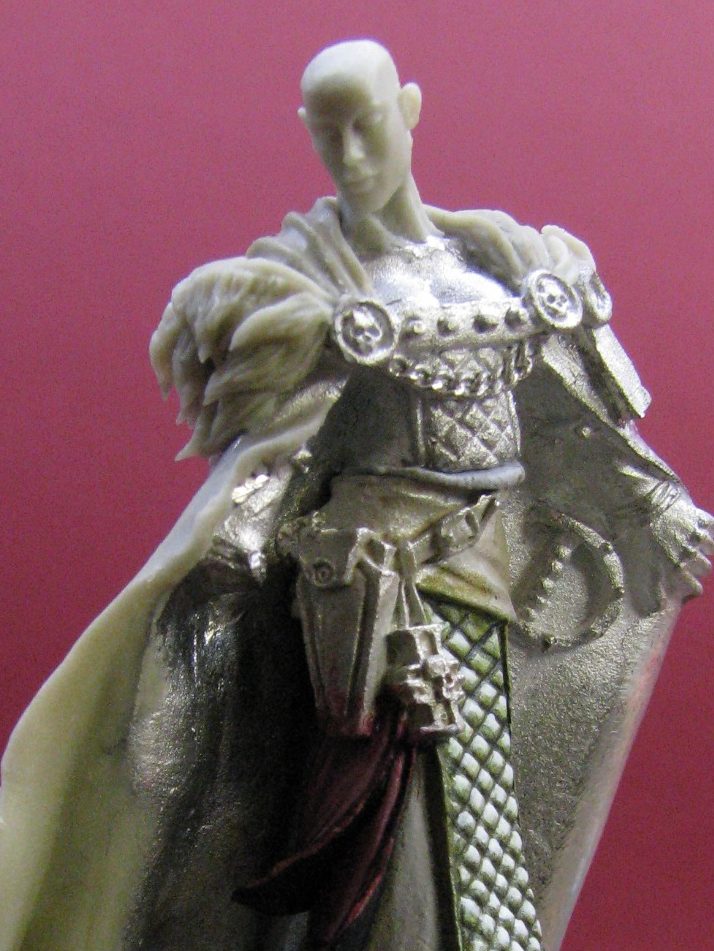
Ah, now the sharp eyed amongst you will notice the appearance of her hair during this process. But I’ll return to that in the next couple of shots. Photo #14 shows the putty being added to the bare head in a couple of large unshapely lumps.

This gave me enough material to push about, and also some to trim off to make definite sharp edges to the hair once the putty had cured. I used a curved, spoon-like dental tool to shape the hair, keeping in mind the way that the breeze would force the shaping everything I added.
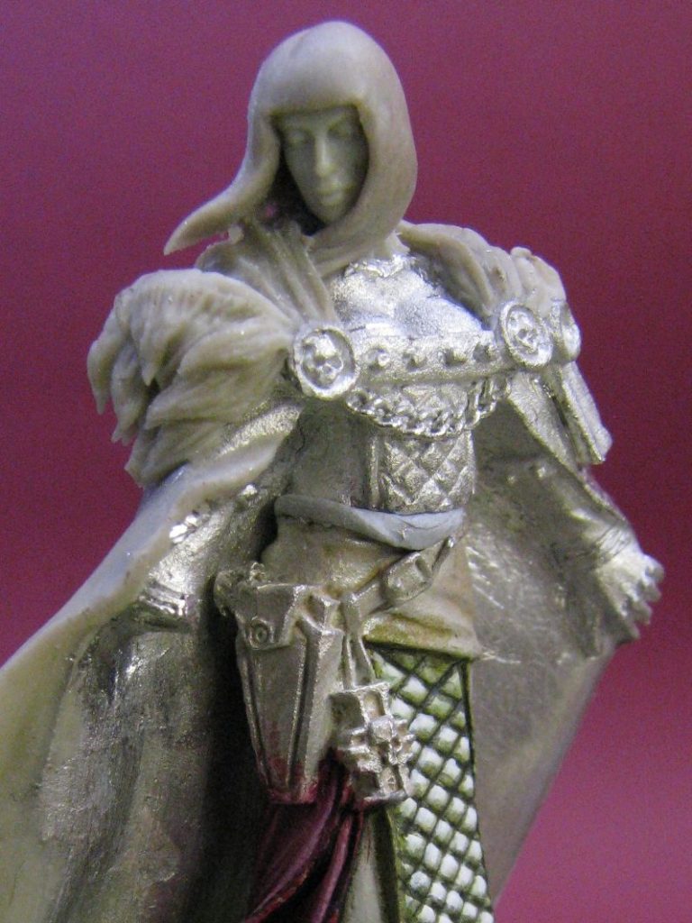
The fringe was cut whilst the putty was still soft, whilst the lower edge at the back of the neck was shaped once the putty had cured. As for detailing the hair; I’d initially tried to sculpt separate “bangs” to the fringe.
This didn't seem to work so well, as the rest of her hair was relatively flat and featureless, so while the putty was still soft I changed the fringe to match, although I did put one separation cut in it where the wind was causing the strands to split up.
With most of the sculpting complete, the main part of the painting could be contemplated, and this was the start of me using pink. I seem to have gotten it on most of the models I’ve completed in the eighteen months since doing this one – although there’s nothing wrong with that as far as I’m concerned !
The bottom section of the tunic has been done here – it’s a bit shiny as it’s still wet, but it’ll matt down nicely once it dries. Colours used are an undercoat of Mechrite Red from the GW Foundation colours set, then some oils over the top, the colours used being Carmine, a touch of Oxide of Chromium ( a green colour used to darken the red ) and lots of Titanium White to produce the pink highlights. Again, the two body halves are joined together to check that the colours on the top half match those on the bottom, and that everything still fits in place.
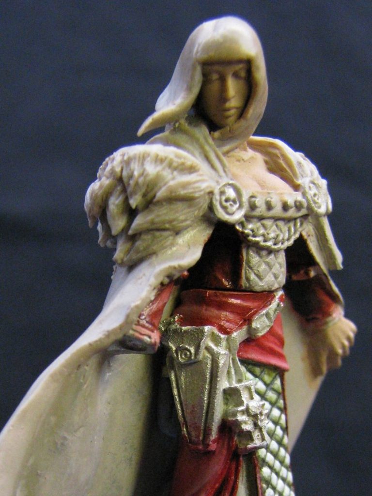
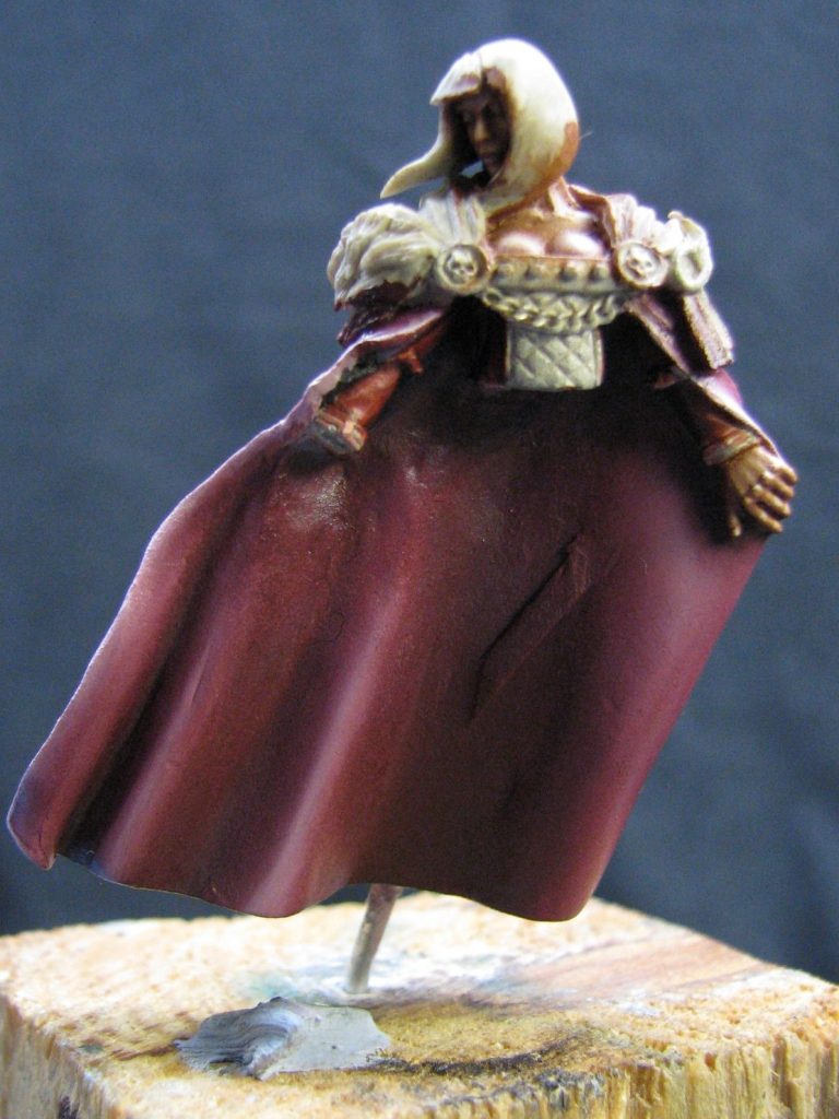
In photo #17 the parts are separate again, and this is the main reason it’s been engineered this way. Painting the cloak.
Getting behind the lower body casting was always going to be a nightmare if the two parts were joined together, so leaving them separate was the easy option. I did have to repeatedly check where the deeper shadows would be in regard to the lower body being in place, but the use of the locating pin allowed for quick easy checks to be made, and paint adjustments used to build up deeper shadow areas.
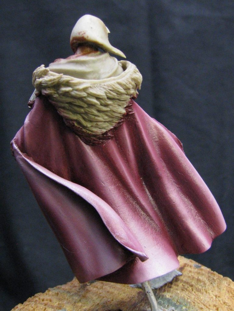

Moving to photo #19, which is a bit dark, but shows my reasoning behind sculpting the hair texture as one flat area. It allowed me to add the paint with a combing motion, and build up from shadows so that the action of adding lighter colours, plus the combing motion, actually gave the look of individual hairs. This is a lot finer than can effectively be sculpted, and looks right to the close observer. The fact that it can only be seen up close or in photos like this bothers me not at all. The people who matter will see it on the model, those who can’t see it, simply won’t see most of the other detail either.
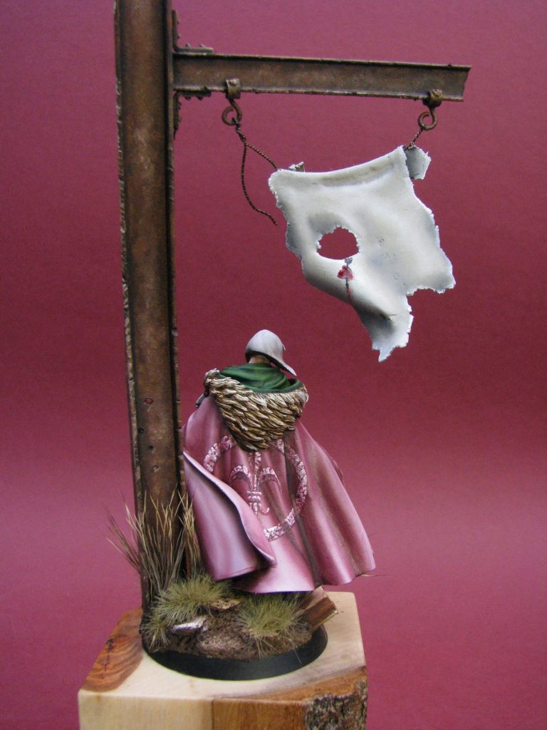
Photo #18 shows the back of the piece, and this is where the added folds come into their own and really make the figure look dynamic. Painting such areas is actually easier, because the areas that are in shadow or highlight are defined and placing the colours is not open to as much interpretation.
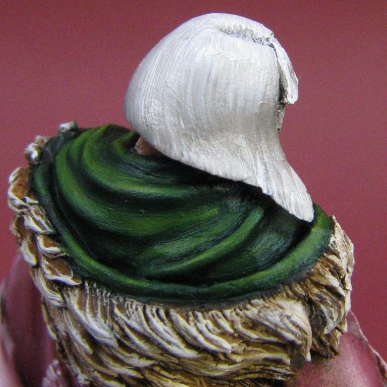
Photo #20 shows a similar shot, again demonstrating the fine texture painted onto the hair.
Photo #21 shows the figure’s major parts having been joined together, just the right hand and its gun are missing, and at this point I realized that I’d given no real thought to the firearm that she would be packing.
Oh, O.K. I had given it some thought – the single idea that’d crossed my mind was “bigger and meatier !” There, thinking done !
But what to use. I hadn’t got anything I could use in this scale, spare bits for these Inquisition figures don’t just pop up in the bits box, and anything else would look like it was distinctly military in source, or too small……..Or would it ?
I’ve got quite a collection of old GW figures from the “good old days” of lead castings. One such figure might just come in handy – an old Eldar Heavy Weapons trooper. The gun as it comes with the 25mm kit is too big, but with a little judicious scalpel work, it might just be made to look right. Certainly it’d look better than that wimpy little shuriken bolter she’s been given in the original kit !
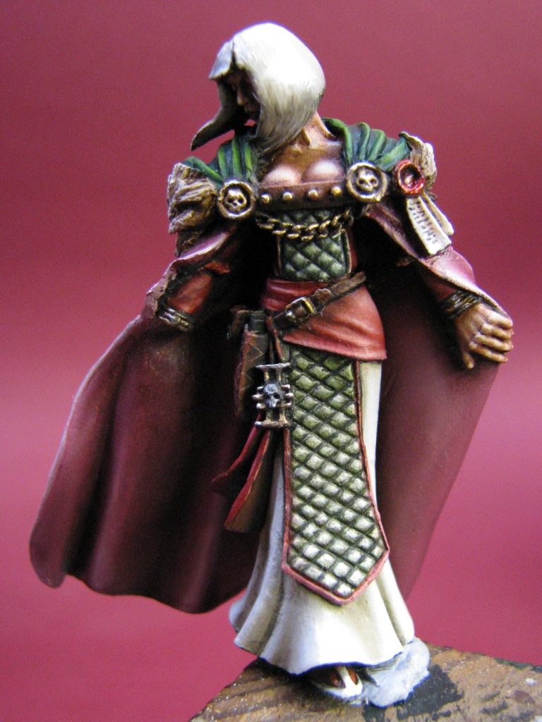

So, that’s what I did. Cut out the middle bit of the heavy weapon, join it onto the hand, having kept the lower portion of the pistol butt from the gun she had, and hey presto, something a little more threatening looking.
I painted that separate, but just whilst we’re here, photo #22 shows a good shot of the face, and why the Roger Saunder’s head sets are worth the money. Just look at that perfectly featured face – can’t get better than that, let me tell you; and because it’s sculpted right, it paints up a whole lot easier too.
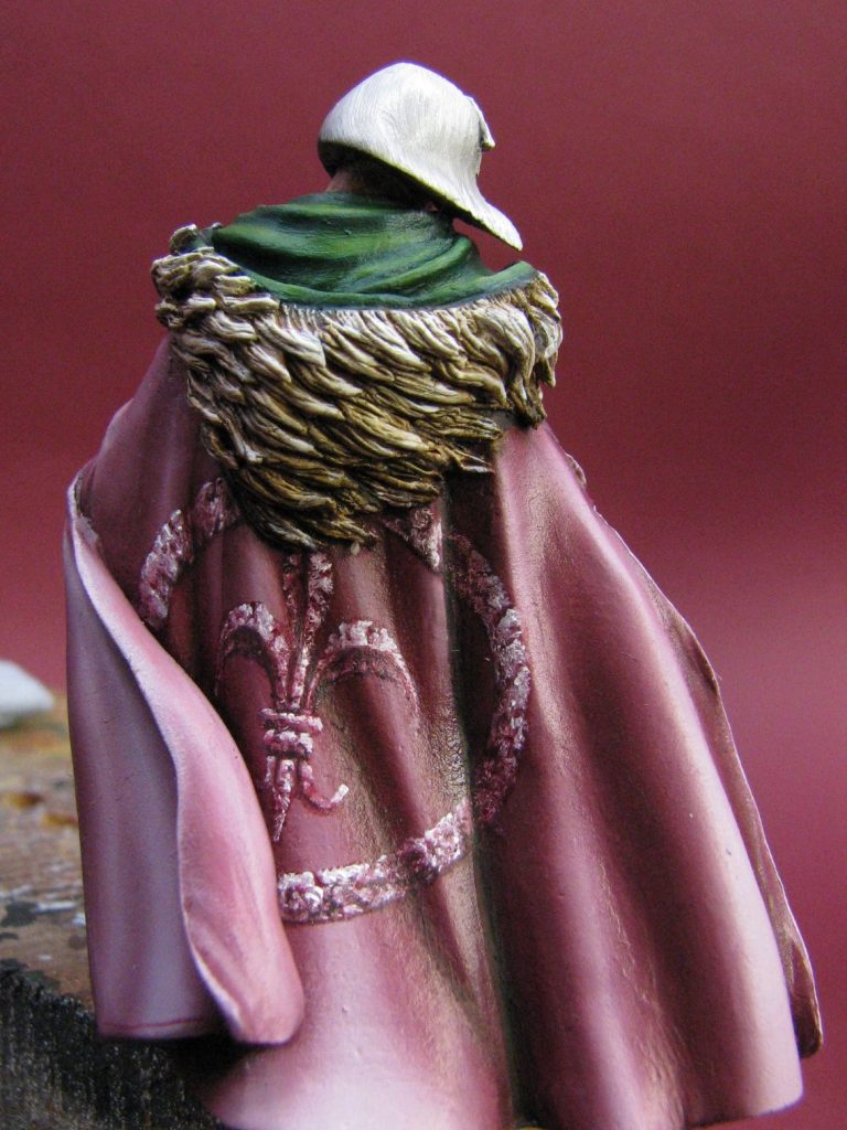
Photo #23 shows the back of the cloak. Getting judges to look at this part of her seems to be very difficult at shows. The first couple she went out to, she seemed to do O.K. but I’ve noticed her not doing so well after that. Then I started putting her on the bench sort of half turned away from the judges. Seems it promoted them actually picking her up and turning her around to look at the front.
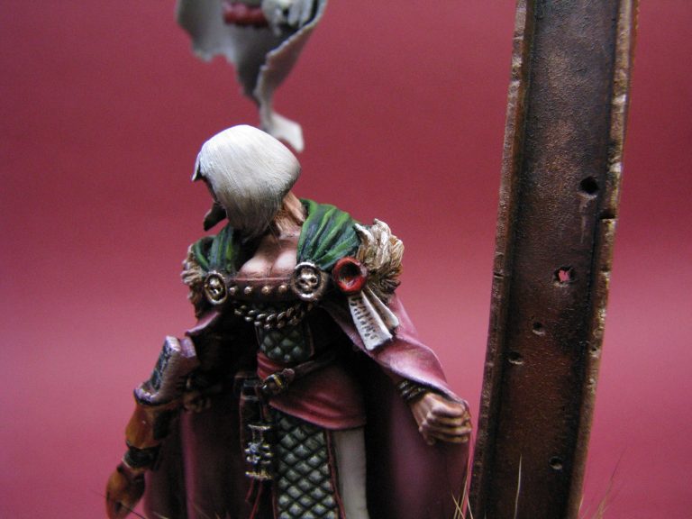
Photo #24 shows the bit I wish I’d changed – the left hand. It’s a bloke’s hand – well that’s the way it looks to me, and I just wish I’d changed it and sculpted something more delicate. The two hands are actually different sizes – difficult to prove because one is clasped in a fist around a gun butt, and the other one is open, but they are different sizes, having offered one up to the other for comparison, and I just keep saying “ I should have changed it” to myself.


And not to the base.
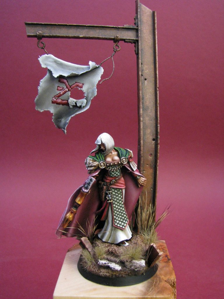
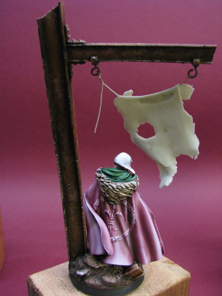
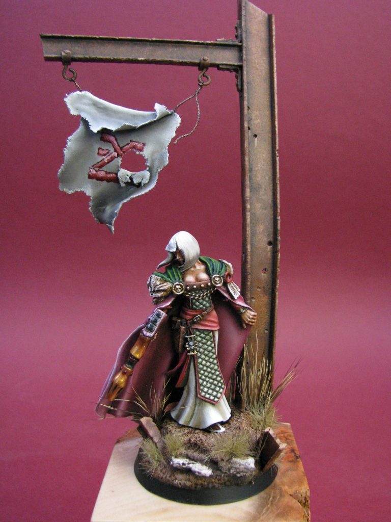
I wanted something to lead the eye around the model, the best thing for this is something tall to catch the eye of the viewer, that leads up and over the model, to drop the eye back to the top of the model.
Basically, most of us look at the fact of a figure, and then move down the body. It’s human nature to look at the face first, although some folk – when regarding female figures – look at something else first…….But most of us look at the face.
So the face has to be both good ( Personally I’d say pretty ), and well painted, then the eye moves down the figure ( hopefully the rest of it’s well painted too ), and down finally to the groundwork. Usually at this point, the eye will either be drawn to another model. To stop that happening, it’s useful to add something else to the groundwork to take the eye back upwards – in this case a piece of twisted girder, but it could easily be an arch, a tree……..Anything that’s taller than the figure.
The good thing about trees, arches and in this case, a girder, is that by putting an arm of the tree, the curve of the arch, or another piece of girder reaching over the top of the figure, you can force the observer to follow the vertical lines upwards and then across. When the eye reaches the end of the horizontal extension – in this case the side beam, the viewer naturally looks down again – dropping right back down to the figure.
I’ve aided things further by having a nice little banner to catch the eye and slow it down a little, and hence the tiny pierced heart on the back of the “flag” to just make the eye pause slightly to work out what it is, then continue down to the figure again.
O.K. it doesn’t work for everyone, but it does tend to get the viewer to linger on the model a little longer, and they might therefore see more of the details added and the high quality paintjob……I know, my confidence knows no bounds !
So, photo #25 and #26 show the beam and the flag prior to painting. Milliput was added to the round base to bulk out the groundwork and textured using a piece of stone, some static grass added and then paint applied.


Photos #27 and #28 show the girder painted with rust coloured oils and the basics of the groundwork added in. The design on the flag hasn’t been added yet, and the black edge to the circular plastic base needs repainting
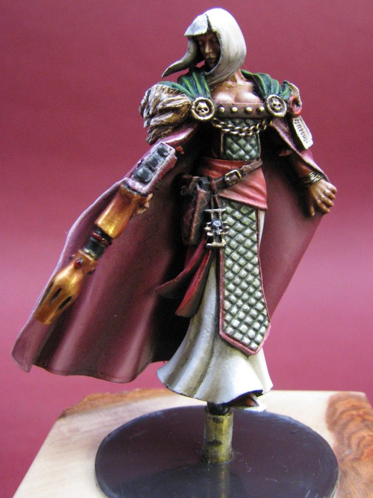
This was being entered into the GW Games Day painting comp, where one of the rules states that although you can place your model on a nice plinth, it needs to be removable so that in theory you could use it in one of their games. For this reason I stripped the magnetic rubbery plastic stuff off a fridge magnet, cut out two circles of the stuff and used one glued into the black plastic base of the figure, and the other fastened securely to an Armstrong Bases wood plinth so that the model is securely fastened on the plinth, but it’s still possible to remove it. There is a further failsafe to stop her coming off the base too easily – it can be seen in photo #29 – where I’ve used two pieces of different diameter brass rod, one glued into the bottom of the figure, which slips inside the wider, second piece of brass rod, which in turn is fastened securely into the wood plinth. Basically, after all that work, she’s designed not to go anywhere I don’t want her to !
The next few shots show the groundwork and beam getting painted, and photo #30 also shows that lovely, understated firearm she’s packing. Nice and subtle – like an air raid.
For anyone interested, the motif on the front of the flag is the sign of one of the four GW Chaos Gods – in this case Khorne – and it’s presence on the base is to signify Sabella’s hunt for the heretics and followers of chaos that worship Khorne.
Final words.
O.K. I have to be honest, this is a god-awful kit in its unaltered form. The artist that painted the only other one I've ever seen - as mentioned near the beginning of this article - did a reasonable looking job of one of these “from the box”.
In fairness though, few people can make a silk purse out of a sow’s ear, and this is definitely a kit that’s close to going “oink” no matter who tackles it.
However, the basis is there for a good conversion, something using the skeleton of the kit, but removing the worst bits ( whether it’s less than top sculpting or mould limitation to blame, it doesn’t matter ), and then adding bits from other kits. Or reverting to putty; with determination and a knowledge of spare parts, something good can emerge.
I think that projects like this come up for me once in a while, where I can see potential, and have the time ( and the bloody-mindedness ) to actually do them; but unless you’re slightly tapped, it’s probably better to select one of the many superb kits that are available these days, and just do one of those instead.
Yes, yes, I know we all want something original in our display cabinets, even if it’s only the odd one that’s got loads of our own “work” in it; and that’s why I say I like doing these occasionally. But whilst I find it fun and fulfilling, it’s still time consuming.
I have several more from the Inquisitor range, and haven’t a clue how good ( or bad ) they are to make. Thomas is struggling through painting the Artemis Space Marine, though the casting and sculpting on that are much better.
So, whilst I’m glad I did this, and it’s won me a few gongs here and there ( even got me through first cut – not bad for a return to GW’s painting competition after 20 year’s absence ), I probably won’t be doing something this involved again for a while……..Then again…..
We need your consent to load the translations
We use a third-party service to translate the website content that may collect data about your activity. Please review the details in the privacy policy and accept the service to view the translations.