Imperial Guardsman
Games Workshop 28mm plastic figure conversion
Converted and painted in 2009
This model sprang from an idea for an entry for the “Duel” category at GW’s Games Day 2009.
My idea was to have this little chap vaulting over a wall whilst in the act of nailing a large “monster” from the Warhammer 40K universe………O.K. it didn’t quite get that far.
I ran out of time, it’s as simple as that, although I did manage to have him ready and able for entry into the “Single 40K miniature” category. So all was not lost.

The figure itself is one of the ten models you get in a standard set of plastic Cadian Imperial Guardsmen “Shock Troops” boxed set. It’s an impressive little set too, as you get the whole ten figures, plus quite a few spare bits for less than twelve pounds.
I only required one though, but perhaps I might have a go at another for next year……
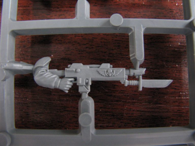
As it was, I needed to convert several of the parts for the figure, some of which are seen, still attached to the sprue in photos #1, #2 and #3. Photo #1 shows the gun I wanted to use,
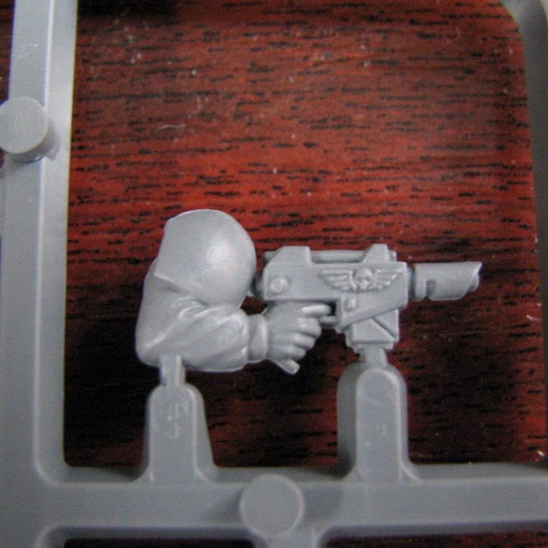
photo #2 the right arm, and photo #3 the legs that would be cut up and altered.
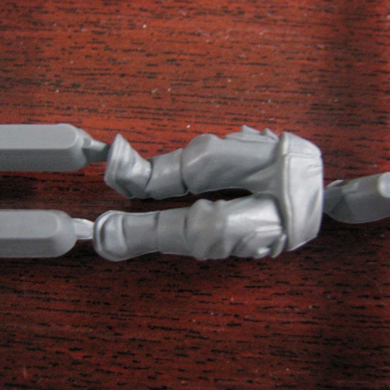
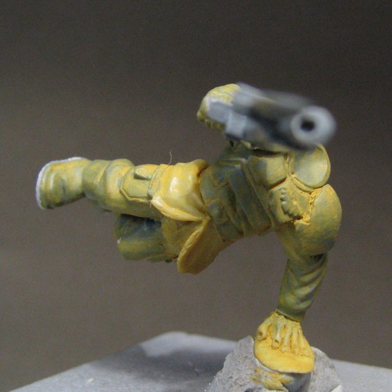
Both the guns were removed from the hands they were moulded to, and the parts I was going to use were glued back together. The legs were altered a fair bit more, the bottom of the jacket being cut away completely, leaving only a thin fillet of plastic joining the two legs. This fillet of plastic was used as a hinge to allow me to bend the legs to a slightly different position, and such was my luck that it actually appeared anatomically correct. A new lower section of the jacket was sculpted out of Magic Sculpt, and the upper body pinned and glued into position once the putty had dried.
It’s funny ( bloody hilarious actually ) the corners you manage to back yourself into when deciding to do a conversion. Probably a lot of people wouldn’t bother, but to me the lack of tread on the soles of the boots appeared to be a glaring omission.
With the feet in the air as he vaults over the wall, the lack of tread detail is going to hit viewers in the face, so to speak, and we couldn’t have that.
So out came the Magic Sculpt again, and I made very small renditions of “Doc Martin” boot treads for a fella who’s only 30mm tall. Photo #4 shows the treads, although in all honesty I did have to simplify the DR Martin pattern a bit.

I had to sculpt a new left hand for the figure, and as already mentioned, the lower half of his tunic. There’s a few other tweaks here and there too to alter folds and make stuff more animated.
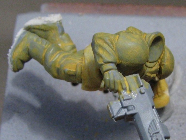
Photo #6 shows a view from the top of the figure. I had to make sure that the model looked right from all the different angles, that he had movement and that the movement flowed to make him look like he was going in one direction – i.e. over the wall !
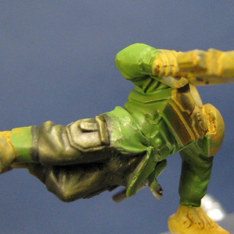
Uniform colours !
That really stumped me. In fact that’s what caused this to be a single figure rather than the Duel entry. I simply couldn’t settle on a colour scheme. I wanted something relatively simple, and thought along the lines of the Tanith First and Only, but that meant using black a lot, and my last excursion with black was a bit of a failure in my eyes. Needless to say, I didn’t fancy the “lets start all over again” scenario of having to strip the paint off if it all went wrong. So I picked the easy way out and used green.
Lame, I know, but that’s the way it was, this was going to be given a trial run at Euro, so then I’d have a week after that to tweak him if necessary.
Photo #7 shows the trousers done ( but shiny and wet ) with a mix of various green, black and white oils to make a camo-ish green.
I wanted to limit the colours too, so when it came to doing the armour and leather, the colours used were almost, but not quite the same. Photo #8 shows the tunic and trousers done and dry, and the boors and armour still wet, but just needing lining out and fine details adding.
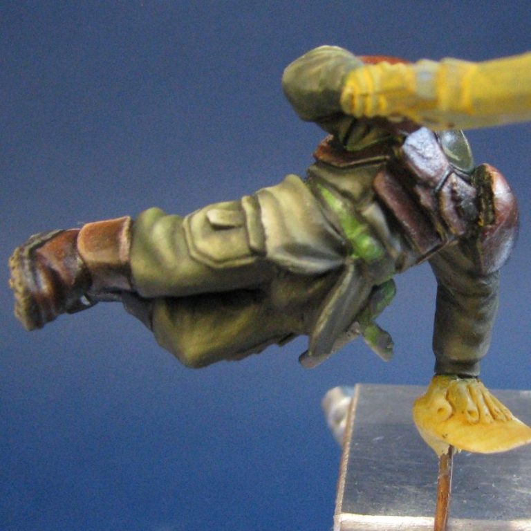
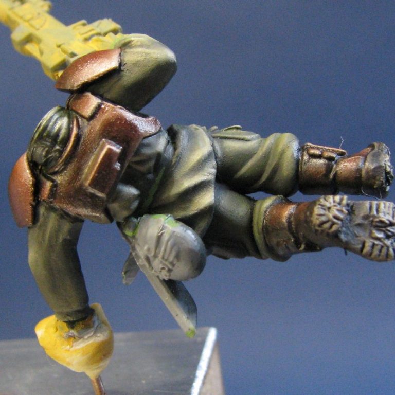
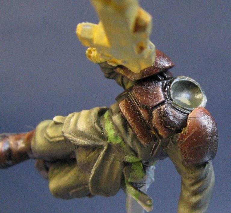
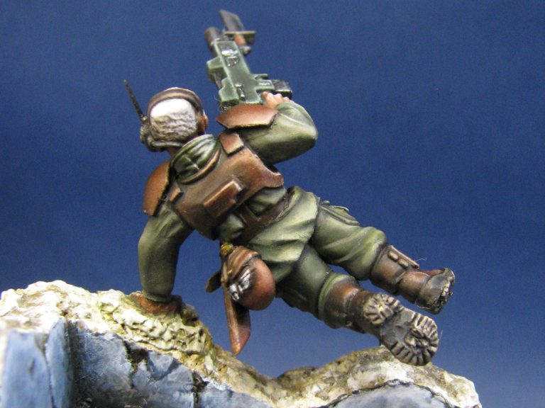
In photo #10 we have a back view to look at. You can see how the shadows have been accentuated under the shoulder pads simply by adding Mars Black and allowing the dark paint to fool the eye into thinking that there’s free space under there, rather than a moulded fillet of plastic.
Photo #9 shows a closer shot of the shoulder pads. All that damage is painted on, the lower edges lightened to hint at wear of the coloured finish of the armour.
The face – I’m rather proud of this one – it’s only about 4mm tall, but I managed to get crows feet wrinkles at the corner of the eyes. It wasn’t easy, but I think it was clever. Again, this is paint that’s forming the appearance of folds in the skin on what is a flat plastic surface. There’s no trick as such, it’s just a steady hand, the right colours mixed from the shadows and highlights and a lot of patience.
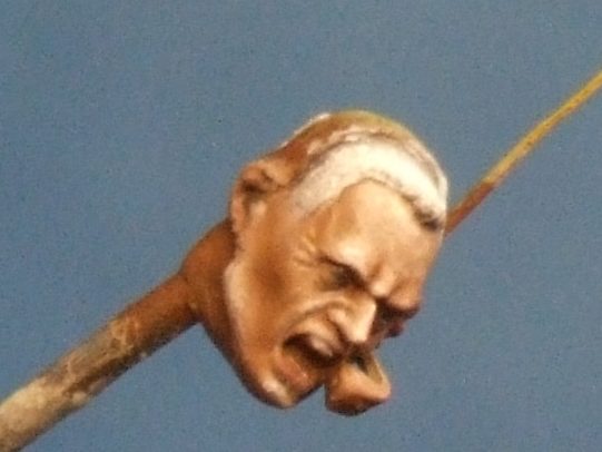
Also visible in this shot is the reworked microphone and aeriel on the side of his head. I thought the originals are a bit soft looking, so decided to pare them away and add new ones. These are bits of stretched sprue, trimmed to size and shape, and in the case of the microphone, bent to conform to the curve of the jaw.
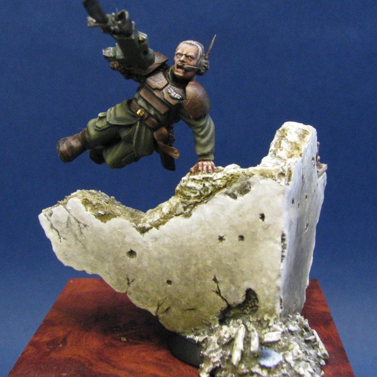
The base. I’m told that this is why it wouldn’t be considered for one of the big prizes at GD, because it overhangs the base. I’m not so sure of that, my thoughts being more that the piece just wasn’t as attractive to the eye as the entries that did win.
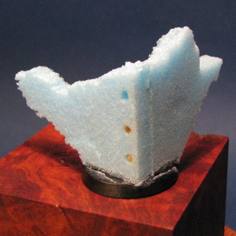
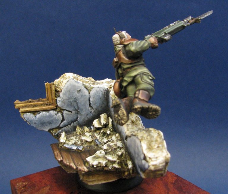
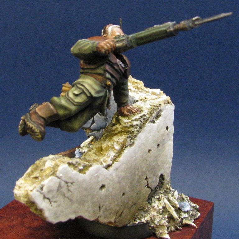
Anyway, the base. This was made from sections of foam insulation. It’s easy to cut, takes putty well, and glues together with wood glue or small amounts of superglue. I add pins of cocktail sticks too, just so that it all holds together whilst the glue dries. Photo #12 is the front view, and photo #13 shows the back. Our hero will be having one hand on the top of the wall, vaulting over the top of it to shoot……well, whatever he’s chosen to try and kill.
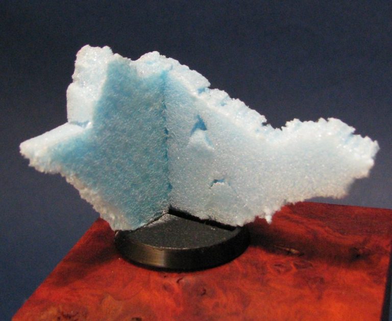
One rule I always abide by for GD is that the model is removable from the base so that theoretically it could be used for gaming. It’s probably a bit daft, but again,
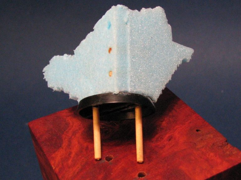
this allowed me to further strengthen the walls with some more cocktail sticks that would extend into the wood plinth – shown in photo #14.
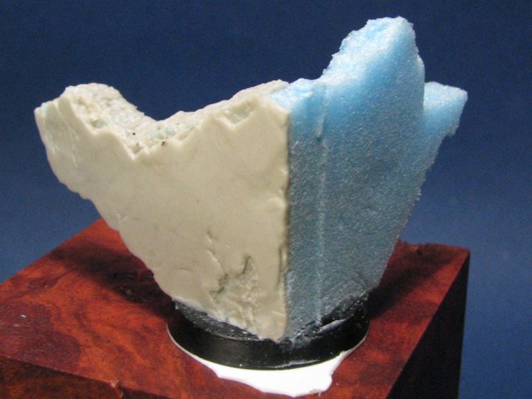
In photo #15 I’ve added a small piece of plastic card to the underside of the base. This is for two reasons – one, so that the plastic base sits flat ; two, so that I could add a very small amount of rubble tumbled down the front and onto the plinth.
So, having gotten this all sorted out, photo #16 shows the addition of more of the Magic Sculpt, this time to form the outer face of the wall. I’m planning on having some rubble at the base of this, but even so, I’ve detailed all the face, adding some cracks and fractures to the surface whilst the putty was still soft.

Whilst this cured, I made the wood beams that would support the floor – photo #17 – and also under these would be some ground up debris
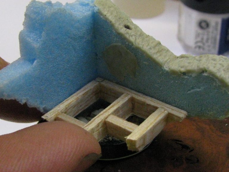
( have you ever looked under floorboards – even my mother never managed to get a hoover or duster down there ! ).
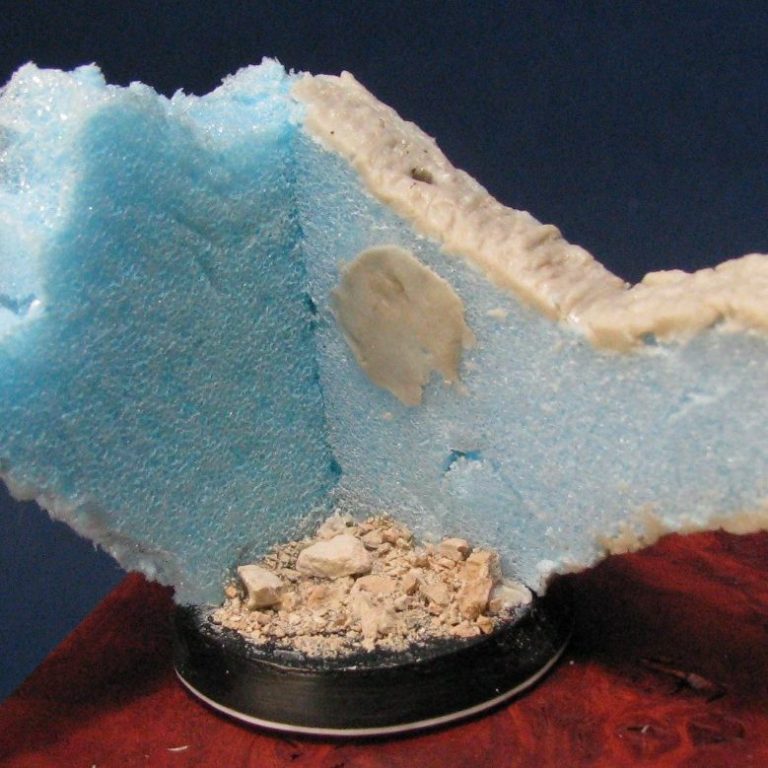
See photo #18 for the debris. This would be painted prior to adding the beams, which in turn would be painted before being glued in place.
Photo #19 – oh look, it’s been done !
You can see in this shot that I’ve textured the tops of the walls too. Both front faces – though you can’t see them yet – have been covered with a skin of putty, and it’s now a case of doing the back walls.
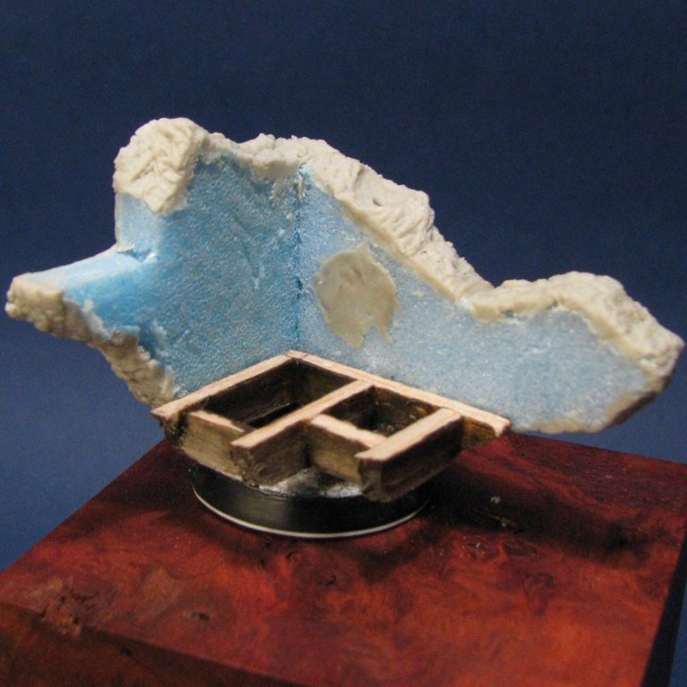
Photo 20 shows the front again, with the skin of putty having been painted. This was done with a very clever sponge technique, which I’d read in a Steve Zaloga article. This involved establishing a dark base colour to begin with – in this case a mix of Kommando Khaki and Chaos Black ( Both GW colours ).
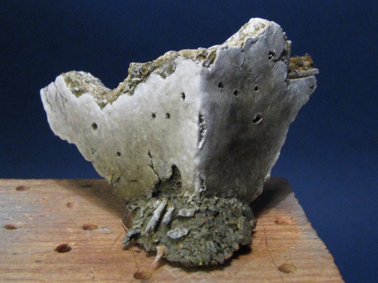
I put on about four layers of this so that a definite colour was evenly covering the whole area, then using more of the Kommando Khaki added to the mix and a lot of water, used a sponge to dab on more paint.
a.
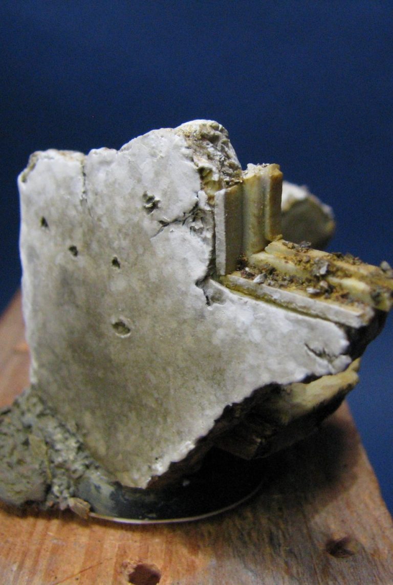
The art of the method is to use very heavily thinned colours – so that what you’re adding doesn’t in fact seem to make any difference to the overall colour of the whole thing. It’s only when layers dry, that the spotting and miniature pools of paint begin to show up, and by gradually lightening the colours further, eventually adding Skull White to the mix, the highlights can be worked onto the are
I was looking to create aged concrete with this effect, and I think it worked pretty well. The more layers that are added, the greater depth of texture is created, plus gradually working towards the edges which would become weathered and thus lighter, helps a lot.
I also painted in the rubble piles – front and back, and in the process discovered a fragment of a crab’s claw in the debris that I had added ( it’s right at the front, and I picked it out with some different colour paint to look like the tip of a Tyranid’s claw that’s been shot off.
Photo #21 shows the window frame I added – this is just strips of hardened putty, cut into square section strips or planks, and given a light texturing with a needle.
Photo #22 shows the debris that I added to the inside of the building.
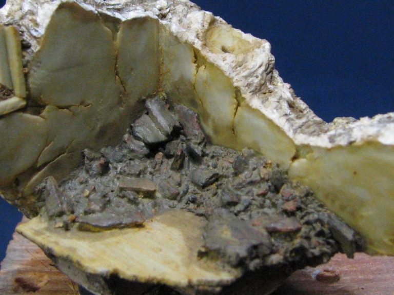
There’s got to be some amount of broken up wall, but I didn’t want to add too much, just a sprinkling of rubble in the corner.
The back of the wall I was going to do the same as the front, but it’d look wrong, because most folk, alien or otherwise – would probably want some form of decoration in their homes.
So I thought that a blue colour might look O.K. – it’d be a brighter colour to look at when the base was turned around. This was added with more GW acrylic colours – Midnight Blue and Skull White being the ones chosen for the job – as seen in photo #23.
I’ve also painted in the floorboards in this shot – some of what you see there is a light texture that I added, but most of it is simply working through from dark to light browns, and allowing the paint brush to drag a little and thus create streaks that imitate wood grain.

The rest of the pictures show the finished model – well almost. I did feel that some shattered glass would look good in the window frame, and so used some clear polythene from a freezer bag to make it look like there had been some glazing in there.

Final words.
A fun model to produce; it’s amazing what you can do with these little plastic kits, and quite easily too.
Obviously with any change in pose there’s some need to look at anatomy and how the skeleton takes or redistributes weight, plus how clothing will wrinkle and crease differently to take that into account.

But at this scale you can get away with a lot, plus with ten figures being supplied, usually in several different poses, there’s a lot that you can get out of a box full of these.
Value for money – yes, I think that’s there in spades. The fact that these little figures work out at just over £1.15 each, and there’s spares for the spares box too, is very good value to my mind.
What else can I say, the sculpting and mould making techniques have advanced a long way from the initial plastic offerings that GW began with nearly 20 years ago, and whilst all round detail is still sacrificed due to the two part metal moulding for the plastics, detail loss is kept to a minimum, plus separate parts are usually there to make disguise an easy option.

We need your consent to load the translations
We use a third-party service to translate the website content that may collect data about your activity. Please review the details in the privacy policy and accept the service to view the translations.