Samurai on the Bridge
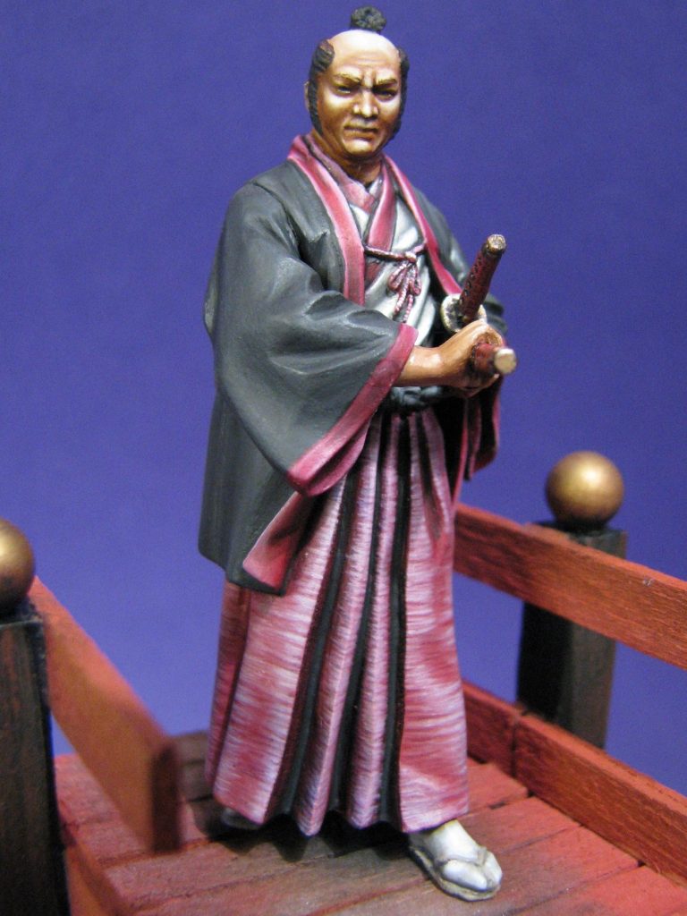
A 54mm White Metal figure from Pegaso of Italy
Published in Military Modelling Magazine in 2014
I seem to have leant towards Oriental subjects recently, this little one being inspired not by it’s box art or advert, but by a lovely little painted piece that I saw at the 2007 AMSS ( Antwerp Model Soldier Society ) show.
So stuck was I by the painting of the piece, that I rushed off to the trade hall to by one of only two that were for sale – a lucky find considering.
The model itself is everything you’d expect from Pegaso, and the fact that it’s close to 62mm tall, rather than the 54mm as advertised bothered me not at all – it just makes it that little bit easier to paint.
So what happened in the mean time then ?
After all, I’m no sloth with a brush.
Well, he got shelved. I came back from the show with all the wonderful ideas that one usually gets, and promptly lost this little fella on the “to do” shelves ( plural….. shelves is right, there’s a lot of good models screaming at me to get some paint on them ! ).
Springtime in 2008 and I was browsing through with a mind to paint something different…….and saw this little chap again. So even though I’ve done a few Oriental subjects, I thought “what the heck” let’s do it.

Allied to this, a painter I very much admire the skills of – Dave Ashby – had painted some linen trousers on what I thought was a 54mm figure ( O.K. it was a 75mm kit – I didn’t read his post on the forum correctly ). Anyway, the linen was a coarse weave, which he’d portrayed by painting the fibrous texture on the model. I thought I’d like a try at this, and what better figure to do it on than this.
But that’s getting way, way ahead of myself.
The kit had to be cleaned up – getting rid of mould part lines by scraping with a sharp scalpel, filing with a very fine file, or using a curved and wicked looking dental pick to remove unwanted and unsightly flaws. Some of these are quite hard to find, Pegaso’s metal moulding is of very high standard, and the easiest way to find such casting lines is to put the component on a flat surface and imagine a line that slices through the part about half way up from the surface it’s on. The line should be there, and it’ll run right round the part at that level.
Once you’ve found it, it’s usually easy to clean off, the only difficulty being the “”U” shaped creases of detail that it might pass through – this is where a curved dental pick comes in. I use the curved surface to smooth the area, rather than trying to carve off a portion of the model. Because the dental steel is much harder than the White Metal, the tool will gradually burnish the area of the model level. It’s not a quick process mind, but better than trying to get a blade of whatever shape into such a recess.
As you can see from photo #1, this appears to be a simple enough kit, and the parts fit is good. The many folds - particularly on the draped cloth of the sleeves - should be treated to careful inspection at the cleaning stage, and test fitted regularly during the painting ( if like me you paint the kit in separate pieces, only adding the glue once the painting has been done ). This checking will make sure that you’re aligning the shadows and highlights correctly, and it’s important that the shadows fall naturally and in the same direction for the miniature to seem lifelike.
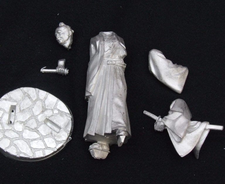
With the model cleaned up, I could add pins to all the parts to act as handles whilst I added the layers of paint.
So, the painting. I wanted to do this horizontally striated effect, and I knew it would have to be done in acrylics.
The simplest way to do it would be to start off dark, and work lighter colours over the top. Simple…..eh ?
I decided upon a fairly dark pink colour as the starting point, the colour being used is one of the new Games Workshop range of “foundation colours” – Mechrite Red.
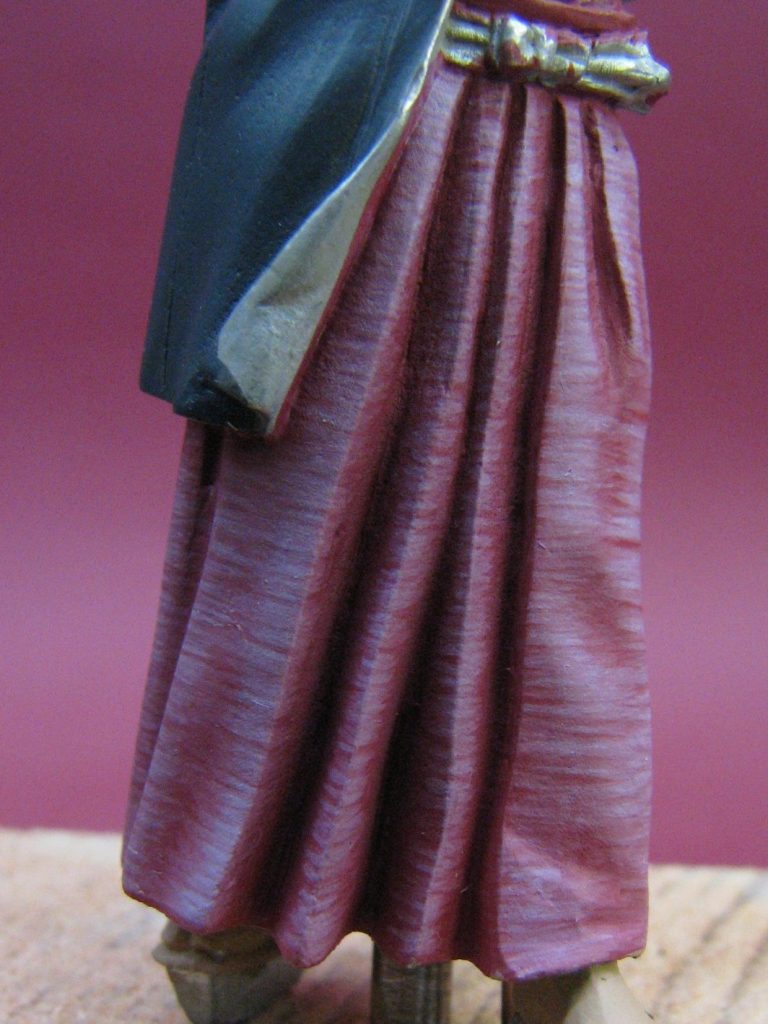
It’s a rusty pinkish colour, goes on very smoothly, and has superb density of pigment. After two coats of this over a white primer, I began altering the colour by adding white in small quantities, painting very fine lines onto the model and then adding just a bit more white.
The paint was kept to quite a thin consistency, so that individual strokes of the brush didn’t actually show up, but after three passes of the brush on any one area, a faint line could be seen building up. I began working over all of the skirt, gradually turning the model around as I added a single layer of paint, and by the time I’d gotten back to the starting point, the paint was fully dry.
It’s a very easy method, just tedious and time consuming; plus a bit frustrating, as the colour change is very gradual. I probably added around fifty or sixty coats of paint, working to build up the striations as they began to appear after the first ten or so coats, and allowing some dark areas to remain to denote the creasing and weave effect of the material. Photo #2 shows the model at about the halfway point, the individual strokes of the brush can be seen here in this close-up,
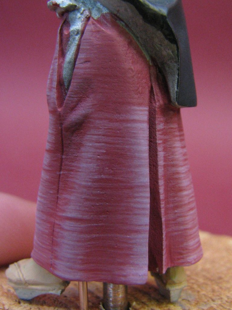
Photo #3 shows a side view where the colour change is more gradual because of the smoother creasing of the cloth.
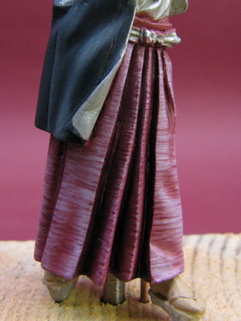
Photo #4 shows how some of the deeper shadows have been added on, one or two that need further work on the points of the crease ( about halfway down the skirt ) need blending in a bit more,
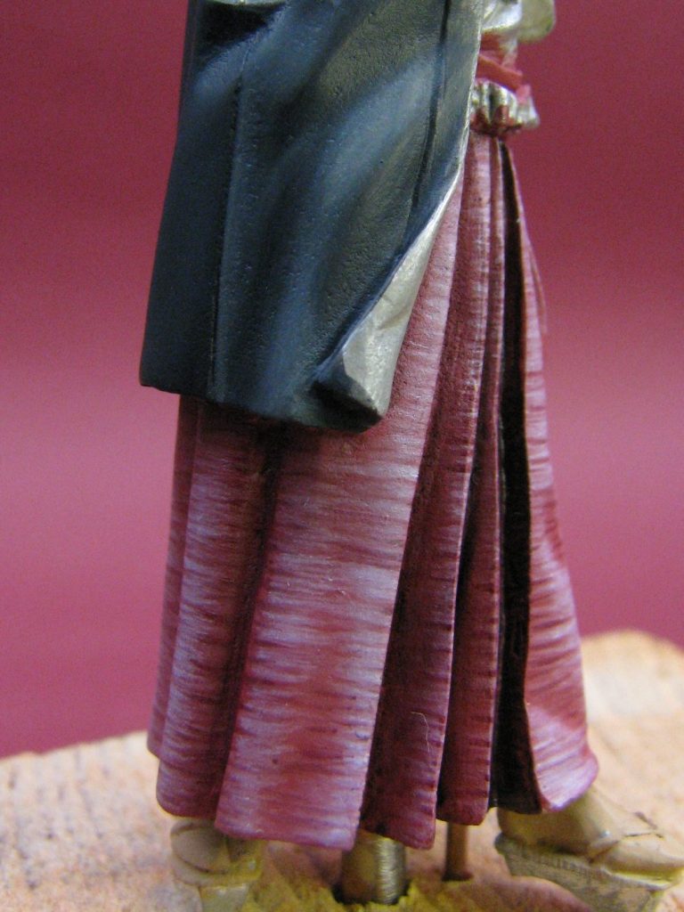
Photo # 5 showing these dark strokes a bit better and how the depth of shadow has been forced within the deeper creases at the front of the model.
It probably took around twenty hours of work to get through to finishing with the acrylics, and then adding some deeper shadows at the front of the figure with a dark red colour mixed from oils.
Photo #6 shows a shot from a little further away, and you can see how the paint begins to look smoother. This will be enhanced by adding washes over the whole area to help knock back the harshness of some of the highlights, and will make the colours balance out.
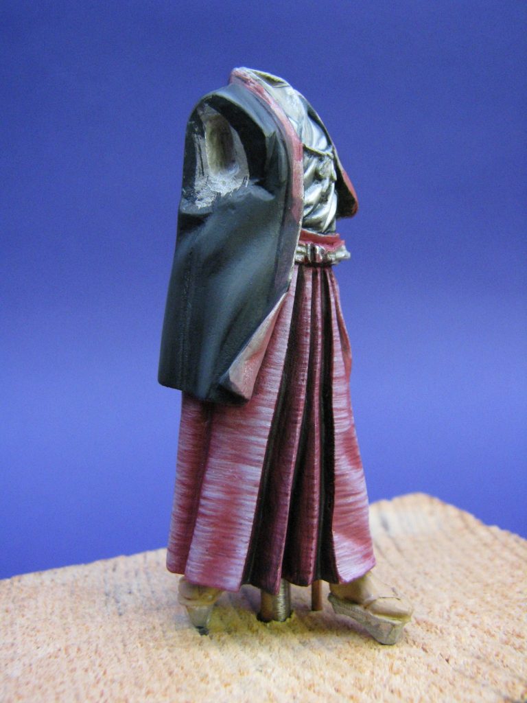
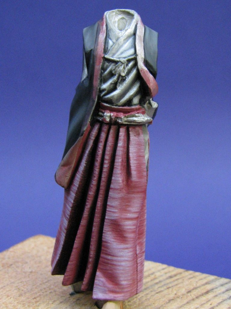
Photo #7 gives a view from the front, and it can be seen that the smoother areas have benefited from the striated highlights, the variations in the creases standing out quite prominently.
Just returning to photo #6 for a moment. I’ve begun the jacket in this shot too. I wanted a very dark charcoal grey, and used acrylic paints to render it.
The basic colour to start off with was a dark grey, mixed from GW Chaos Black and just a dab of Commando Khaki. This was painted over the whole of the jacket area, and then the mix lightened with some more of the Khaki colour, some more water added and then the process of building up layer upon layer of very thin coats of paint so that gradually the colour changed on areas that would catch the light.
Although the process is very slow and tedious, it’s satisfying to watch the highlights gradually appear; as by gradually lightening the colour and adding more water to keep the mix very thin; the illusion of smooth gradations in colour is built up.
Finally, pure Chaos Black is thinned to allow me to paint on the deepest area of shadow, and also to add very thin lines to denote where there are seam lines joining one piece of cloth to another.
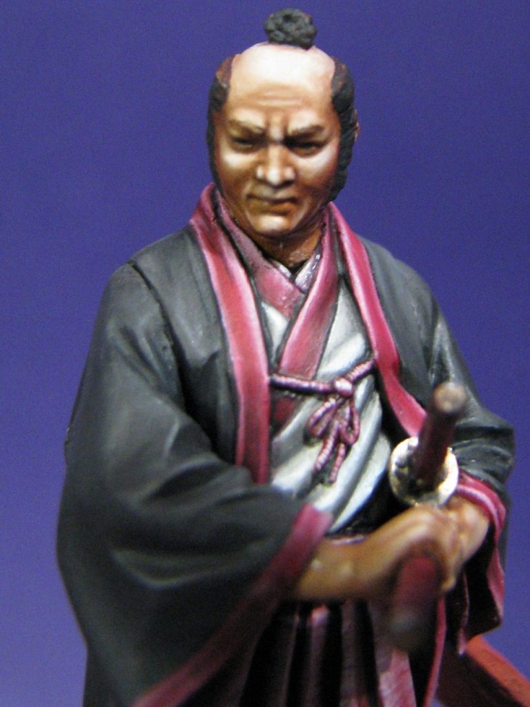
Whilst I had the colours on the pallet, I attempted to paint a light grey shirt. This worked O.K. but the harsh and deeply sculpted creases didn’t really lend themselves to what I was trying to do, and it’s the one area of the model that I remain unhappy with.
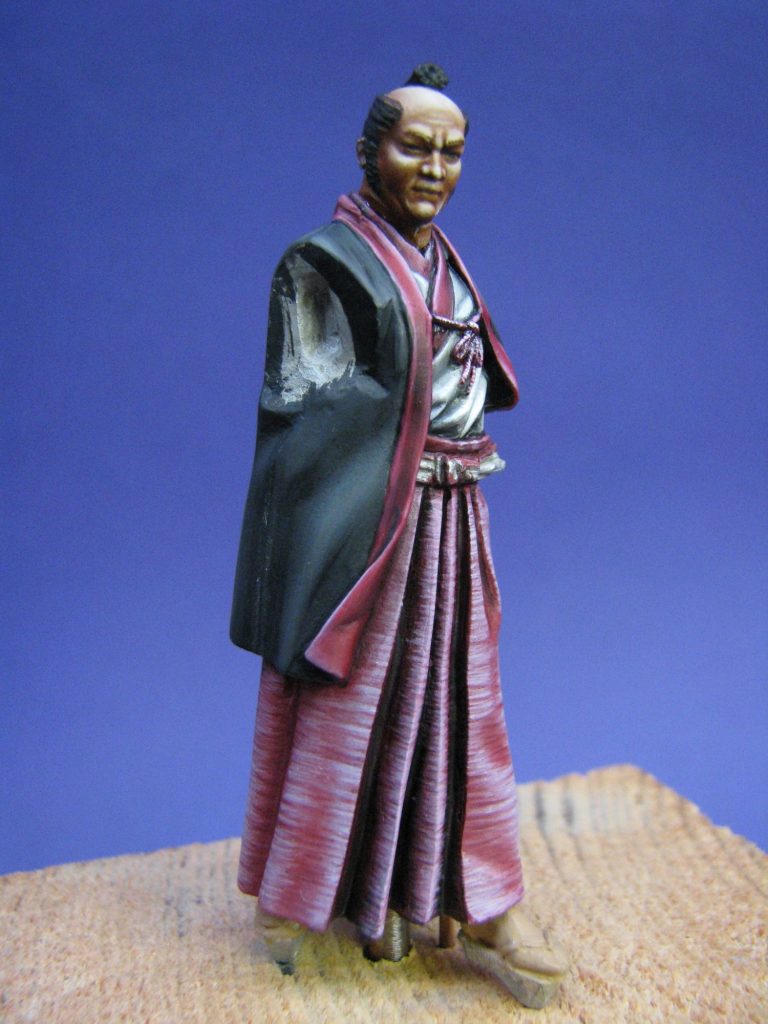
As it is, I repainted this area three or four times during the course of the model, so you might detect some slight differences through the run of photos – it’s not your eyes playing tricks, it’s me trying to perfect an area I’m not altogether happy with.
Photo #8 shows the head temporarily in place. Also in this shot I’ve painted in the borders on the jacket. I wanted these to tie in to the skirt, but have them just slightly different in shade. I used oil paints too, thinking that the slight sheen they would leave when dried would look like a silky material.
I undercoated with Mechrite Red ( GW ) but used Carmine oils as the starting point, simply adding small amounts of Titanium White to the red to lighten it and gradually highlight the areas that would catch the light the most. I also played about with the shadows and highlights to add shape to the edges – basically adding detail and flow to the cloth where there wasn’t any.
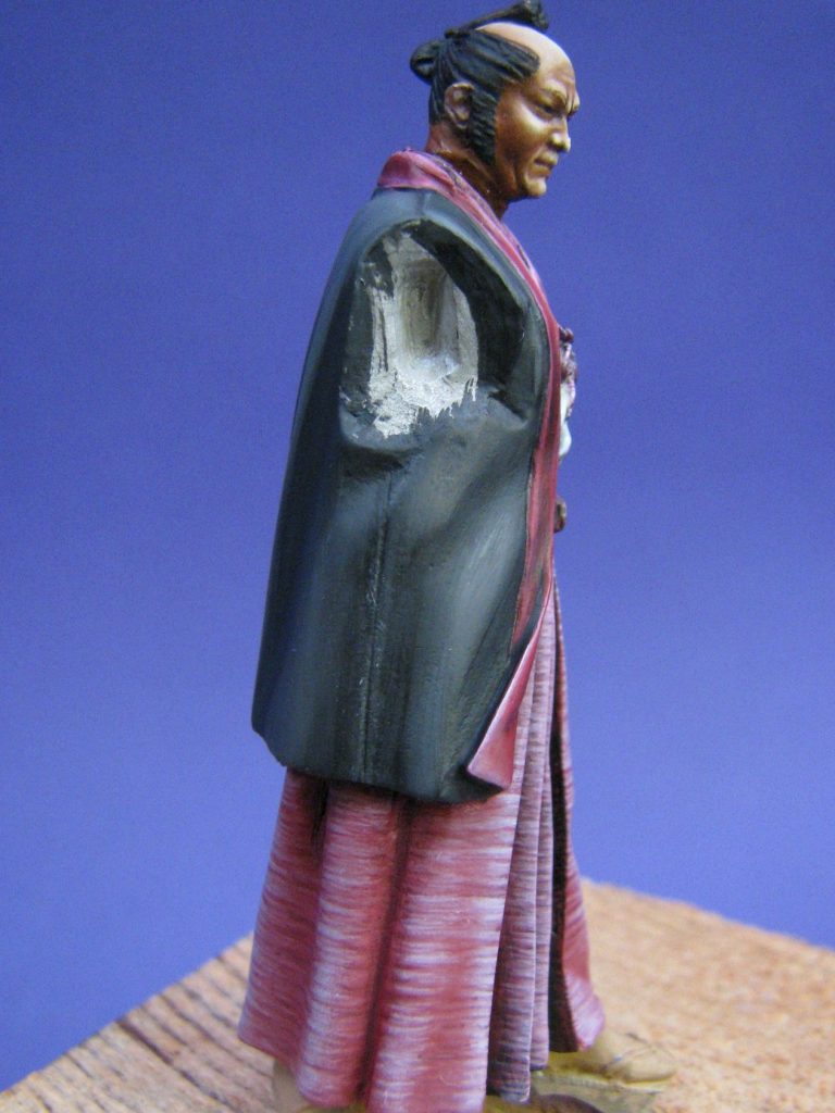
The edges of the shirt were painted in this way too, as was the small cord that fastens the edges of the jacket at the front of the figure.
Photos #9 and #10 show different views of the model at this stage, the slash in the skirt at the left hip being painted with a grey insert to denote the underwear.
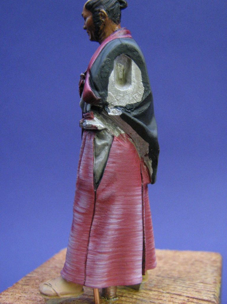

Photo #11 shows his back. I was struggling with some glossy areas near the central seam on his back, and I had to repaint this area. I think it must be some grease residue on the model that I missed when washing the parts, and I had to strip back that section of the model and start again from primer. Very frustrating too, because as I’ve mentioned, acrylics are rather a slow medium to work with due to the many layers of paint required to make a gradual colour change.
The rest of the model was very straightforward to paint; the only thing I had a problem with was the sleeve cuffs on the jacket. Whilst the edges at the front and the edges of the shirt are denoted with a sculpted line to show that there is a decorative edging, the cuffs have no such demarcation.
I’ve seen several of these models painted up now, and all have lacked a decorative cuff. I thought about this long and hard, because not only is it a complex shape to paint a straight line around, getting the two cuffs even would be fun too.
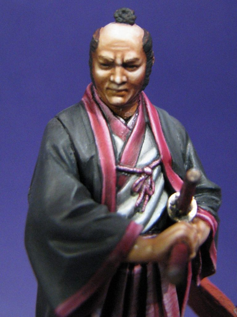
Eventually though, having viewed a lot of Japanese clothing in my reference sources, plus dabbling on the Internet for pictures of real jackets; I decided that the cuffs needed that panel of decoration, and that I’d not be happy with the model if I left it off.
Good job I decided this before the arms were glued in place, I’d not like to attempt it without the arms being separated from the body.
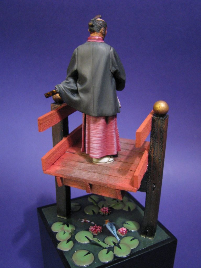
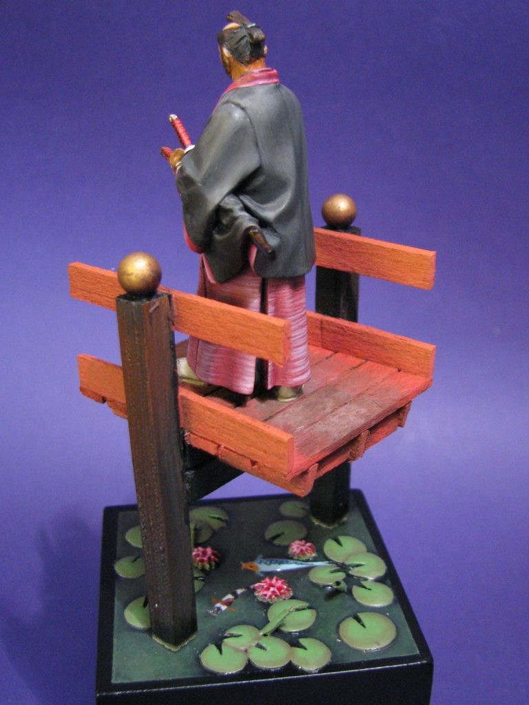
A decorative base.
I wanted something to elevate this model off the plinth he’d be set on, something that would be typically Japanese, although nothing overtly violent, because he looks threatened or wary rather than actually being under attack.
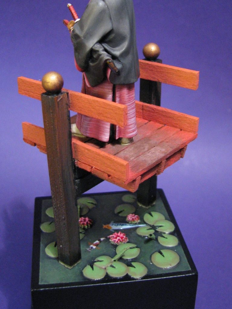
I thought that I’d like to build a pond too, with some lilies and perhaps a Koi carp or two, but as you can see, I was quickly working to having half a garden on the top of something the size of a bread board !
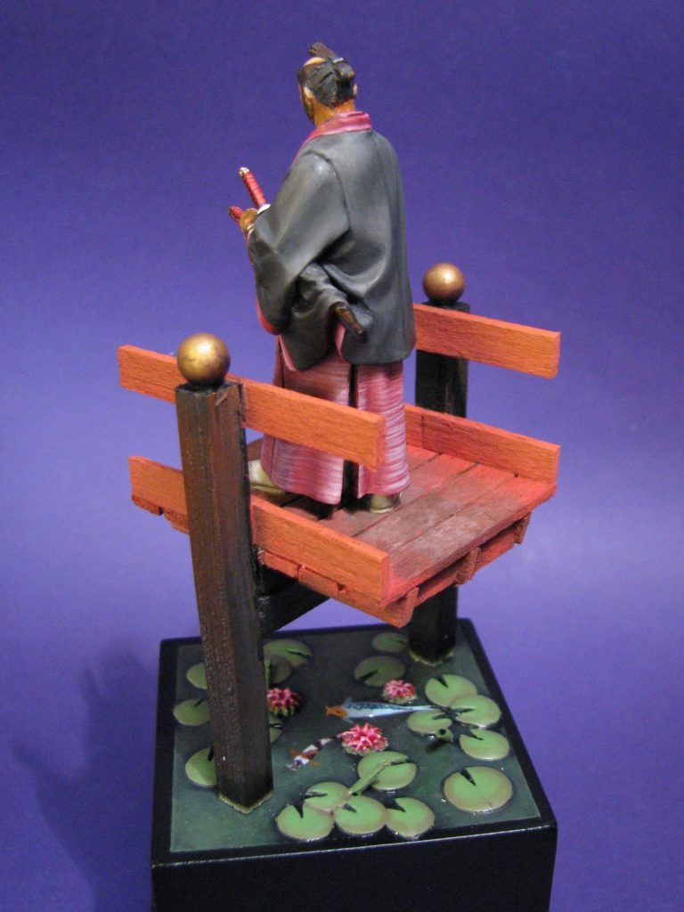
To make it more compact, I envisaged a short section of bridge above the pond; that would raise him up from the level of the plinth nicely, plus give a reason for the placement of a pond underneath.
The simplest thing to do was to make the bridge itself. This was short pieces of square section softwood pinned together and fastened with Superglue.
The round balls on the risers were metal ball bearings from a bicycle shop, and the thin boarding that he stands on was made from strips of Balsa wood.
For the pond, the flat lily pads were small balls of Magic-sculpt, flattened and a thin “V” shape cut out of each edge before the putty dried. The unfurled leaves were small quadrants of thin paper, curled around between finger and thumb, cut at an angle and glued directly to the base.
The final addition, with a bit of spare putty was a flattened sausage shape to show the back of one of the Koi breaking the water surface as it basks in the sun.
Painting the water was a case of using acrylics to build up from a very dark green to a mid-green between the leaves of the lilies, where the sun is shining into deeper water and showing up the algae bloom in the water ( Can’t you just tell I keep fish ! ).
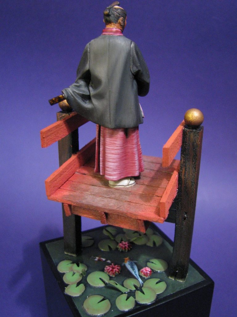
To get the Koi looking just right ( and you’re not going to believe this, but it’s true ) I actually have a very thick book detailing almost every known species of freshwater fish, which gave me around twenty pages of different recognised patterns of Koi. I personally like the Mirror carp scaled varieties, and the grey-blue ones of those are about my favourite. Hence the larger one being painted like that. Yup, I am that sad !
The gloss effect is several layers of thinned varnish applied to the surface to make the water look wet.
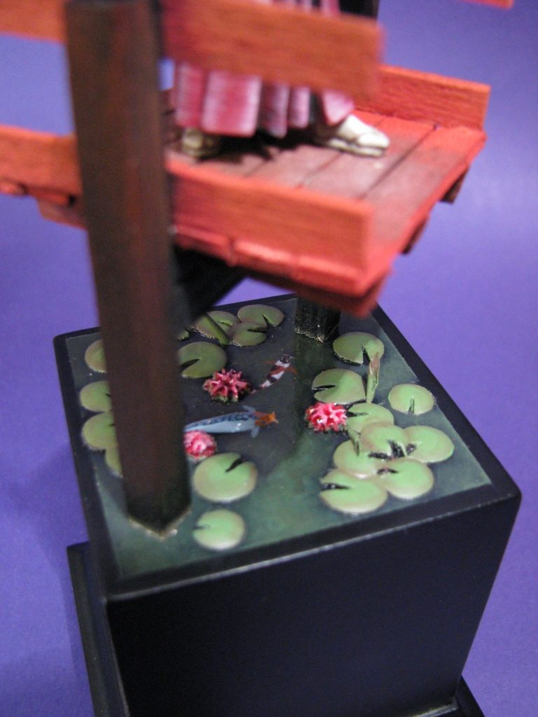
Lily leaves were painted with various greens and a red blush put around their edges ( yes, that too is something else that is particular to certain lily species ).
The woodwork was painted with some Burnt Umber oils, adding some Mars Brown towards the top, and some Mars Yellow and Titanium White to the boards towards their centre, to hint at the wear that would be caused by folk walking on the bridge.
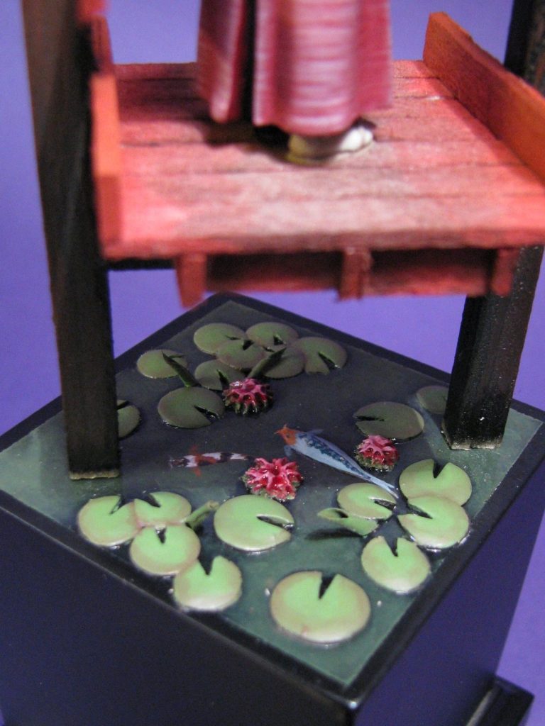
Before gluing the woodwork into position, I added some dark green staining around the lowest edge of each leg – algae that had formed on the wood as it remains in the water for any length of time.
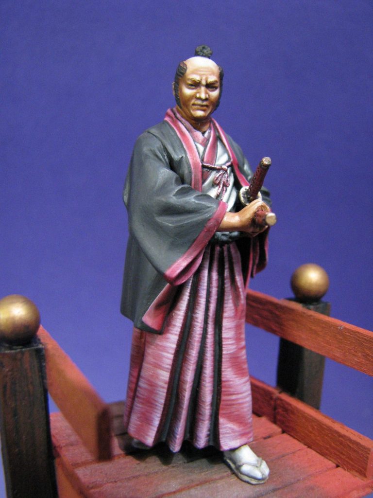
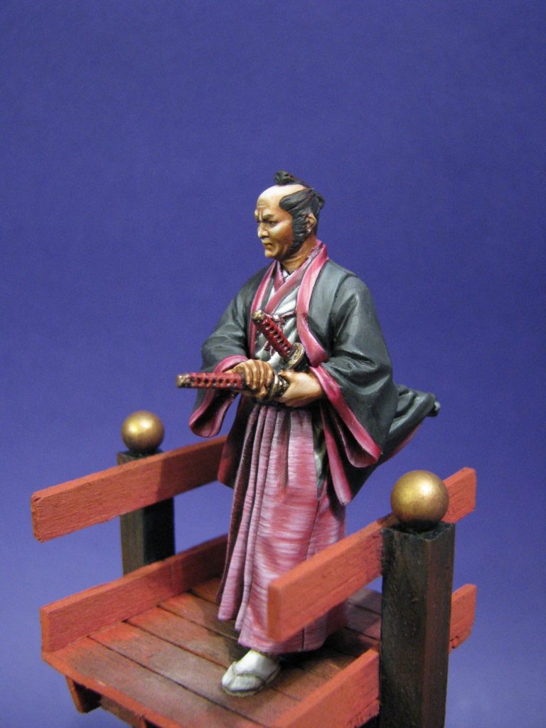
The final shots show the finished model from several different angles.
Final words.
Pegaso are probably the world’s premier model producer, and whilst many of their offerings shout to the prospective buyer, there’s the odd one like this that could easily be overlooked.
It’s not flashy, it doesn’t shout at you “Buy me!” It’s not even got an animated pose that might catch the eye.
But it’s a super little piece, and one that I’m very glad that I bought, and more than that, glad that I took the time to put some paint on.
We need your consent to load the translations
We use a third-party service to translate the website content that may collect data about your activity. Please review the details in the privacy policy and accept the service to view the translations.