Mortimers Cross
1/8th scale resin bust from Verlinden
Article in Military Modelling magazine in 2001
The Wars of the Roses were a series of bloody battles fought between 1455 and 1485. The “houses” of Lancaster and York thrashing it out for who was to be the power on the throne of England.
It was a war filled with twists and turns, not least by the commoners who, for once, were not the ones on the receiving end of the butchery. The “common’s” were fortunate in that they were of little import, the main thrust seeming to be to kill the nobility of the opposing side.
Usually the common man takes the beating in any war, whilst the generals and nobles sit at the back and sip tea. The War’s of the Roses differed, mainly because the common man became a mercenary, selling his skills to the highest bidder.
This situation came about because of the effects of “livery and maintenance” which grew out of the growing money based economy.
This meant that each noble paid money to each of his retainers for their upkeep and equipment, and in return they were allied to him and wore his badge into battle. With the influx of foreign mercenaries, the problems were compounded.
The training these men brought being much sought after, but the lack of loyalty to a cause, noble house or even having ties with one particular area must have brought into question the value of these troops and how they were utilised in battle.
The upshot of this was that the retained men had no distinct ties to any given “house” or lord, and so became perhaps less than enthusiastic towards any given cause that a lord might be following. This in itself was an headache for the nobles, who more than once had battles end in tragedy. Richard of York was killed in battle due to just such a circumstance, when most of his army defected at the Battle of Bosworth field.
The cause of the War was the expulsion of Richard of York from the “King’s Council” and then Queen Margaret, together with the Duke of Somerset, assuming dictatorial powers.
Richard drew unto himself an army and threw up a revolt against Margaret. His cause was strengthened by the presence of several notables including the Earl of Warwick, Richard Neville.
Five years of small battles and political manoeuvring saw the fortunes of both sides fluctuate. The battle of Mortimer’s Cross ( near Leominster ) in 1461 was just another such engagement. Richard of York having been killed before this, and it was his son, Edward, Duke of York, who defeated a Lancastrian army led by the Earl of Pembroke. The reminants of which were pursued into the mountains, where a number of the Lancastrian nobles were captured.
These nobles were executed, the brutality of which initiated the killing of nobles when captured by either side of the conflict throughout the rest of the Wars.
The Model
The model is based loosely on a picture in the Osprey book “The Wars of the Roses” by G. A. Embleton and Terence Wise. Picture no.2 on plate E showing a kneeling German Gunner inspecting the contents of a box.
The features and pose of the model bear no real resemblance to the picture, but rather it is the clothing that has been used as inspiration for the piece.
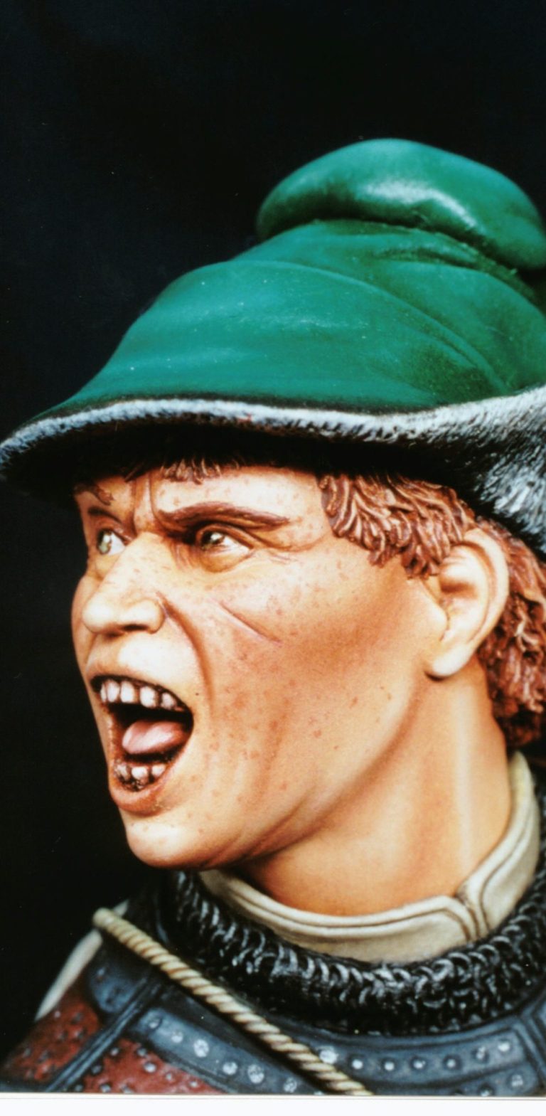
Now I know that I tend to enthuse about Derek Holmes’ sculpting, and yes, he’s a mate of mine, but I do feel that over the last few years he’s produced a cracker or three that really are worthy of praise. This is another one that I particularly liked, although it’s not as huge as the Roman Primus Pilus, nor as eyecatching as the Gladiator, it still has a lot of charm.
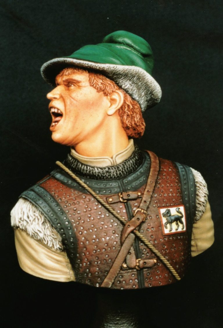
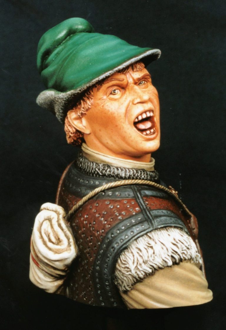
It returns us to the more usual size of the busts released by Verlinden, but still has all the character of one from Derek’s own hands. The simplicity of this piece, coming in a mere three parts - head, upper body and a stand - coupled with Verlinden’s usual high standard of casting mean that it’s an almost instant painters piece.
The complexity of the painting can be - within reason - as involved as the modeller wishes, although the tiny little studs on the hauberk do seem to multiply in number as you get on to painting them ( Akin to rabbits. I could’ve sworn that there were only a few when I looked at them the first time ! )
Cast in Verlinden’s accustomed greenish resin, the parts lack mould lines and the pour points are easily cleaned up with the use of a saw and some abrasive paper.
As is my usual habit, I left the parts separate, choosing to paint them prior to gluing together once they were completed and fully dry. The fit of parts is excellent, there’s a joint at the neckline where the shirt finishes and the neck begins, but because the neck actually slots into the collar, there’s no need for filler. With a quick spray of white primer over the parts, the paints could be broken out and the fun commence.
I used oils over an acrylic undercoat to paint the face, as I’ve detailed in previous articles - so I won’t set you snoring yet again with an in depth rundown of the method.
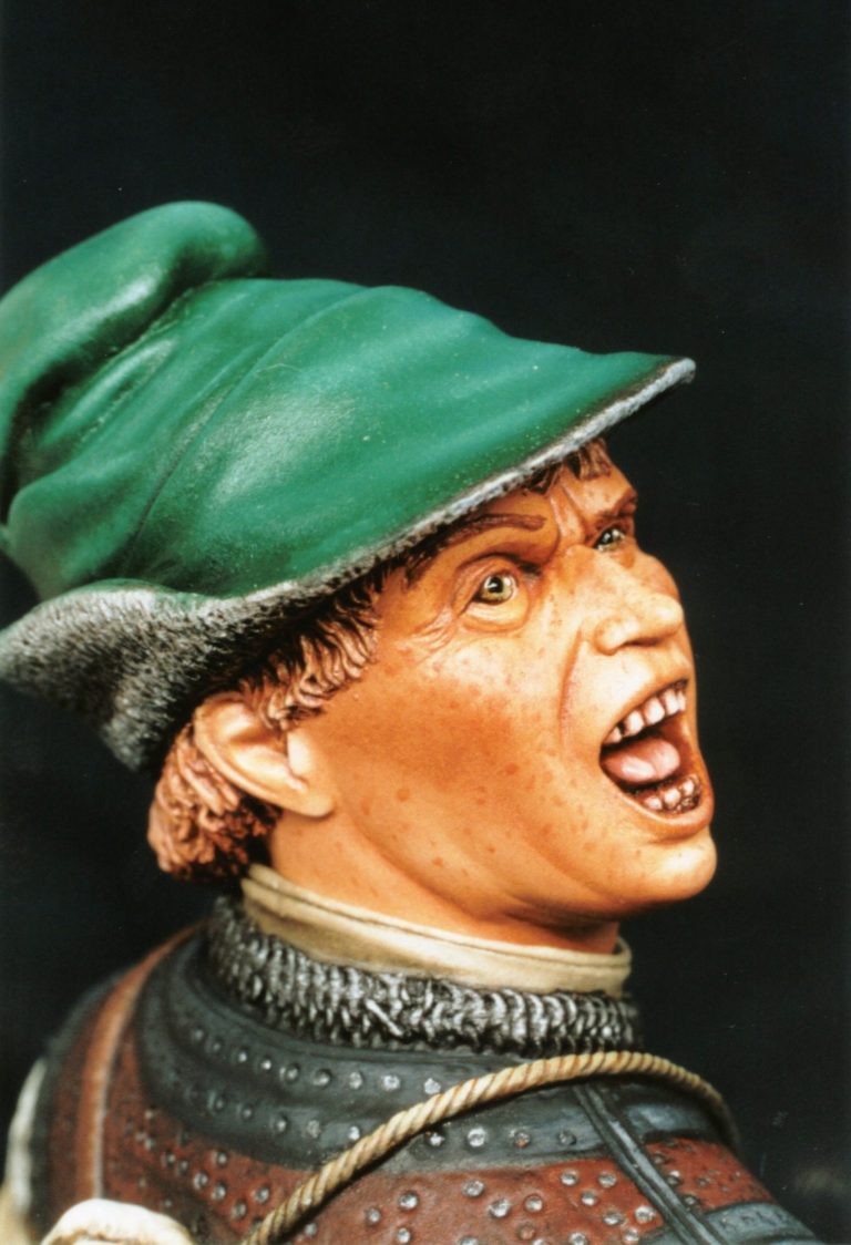
The only departure from normal was the addition of some shadows with Brown Madder Alizarin, which is a “redder” brown than Burnt Umber. I found that this worked better for the model which I was trying to do as a “redhead” with attendant freckles. Talking of which, the freckles were added after the the face had dried fully.
Then I added half a dozen small spots of “Light Red” which is a rusty coloured orange oil paint in the Rowney range. These spots were then gently stippled with a soft clean brush, fading them into the flash colour slightly. A few more spots were added, again stippling the whole face to blend these new additions in to the flesh colour. Then more spots were added, and so on, until the freckles looked relatively natural.

I did strengthen a few of the initial freckles - when they seemed to fade too much, and I also added a couple of spots of Burnt Umber too, again stippling this into the surrounding area a little.
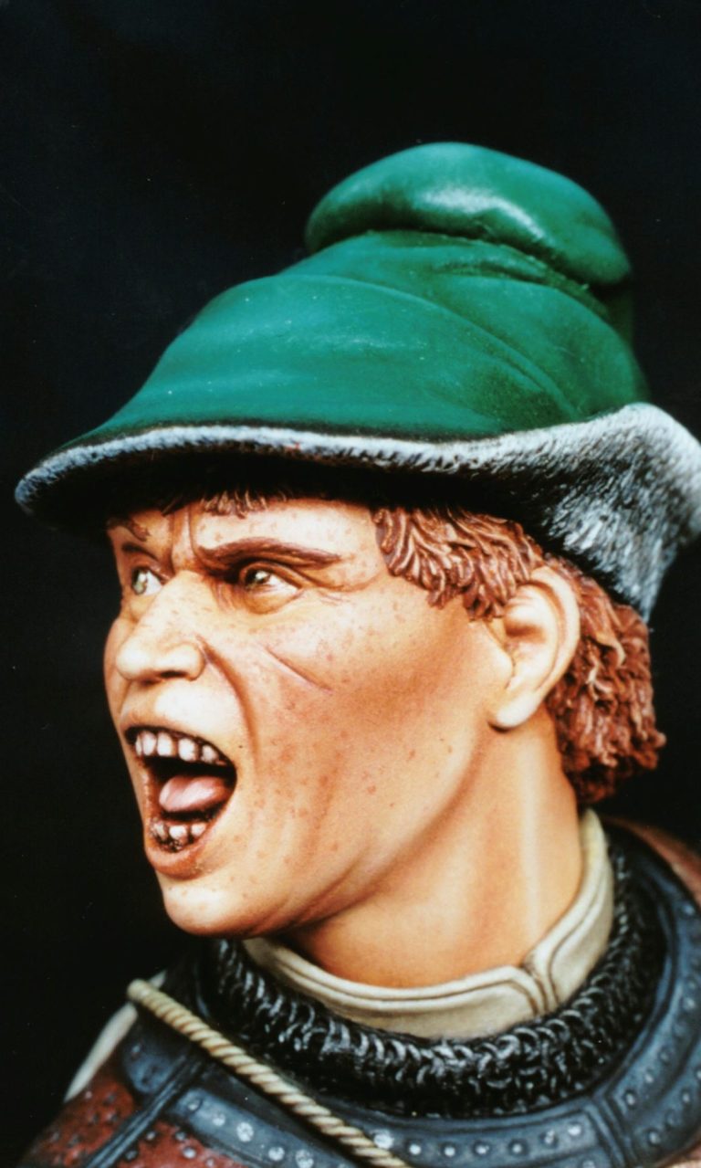
The results can be seen in the final photo’s, and you can make up your own mind as to whether you think it works or not. With the head being turned quite drastically to one side, I decided to add the eyes looking to that side too, adding to the illusion that the model is in fact turning quite swiftly to look at something behind him.
This was simple enough to do, and the eyes were added over a white undercoat. The brown of the iris being highlighted with Yellow ochre and the pupil being added from pure black.
The only other addition being a tiny white catchlight added on the edge of the pupil. Once dry, a coat of gloss varnish, tinted with Alizarin Crimson was painted over the whole eye, the mix pooling slightly in the corners to give the slightly bloodshot effect.
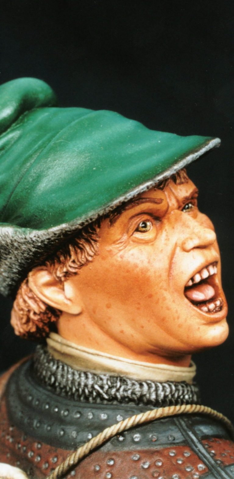
The hair was painted with a sand coloured undercoat, then a thinned wash of Burnt Sienna oils was added. The thinning of the paint was so that it got into all the detail. This was allowed to dry for an hour or so ( I began the sleeves whilst I was waiting ). And then some more of the Light Red was used to pick out the highlights. Titanium White was used to further enhance these, and then it was left to dry. Once dry, thinned Burnt Umber was used to line around the lower edge of the hat so that a dark shadow was produced in this area.
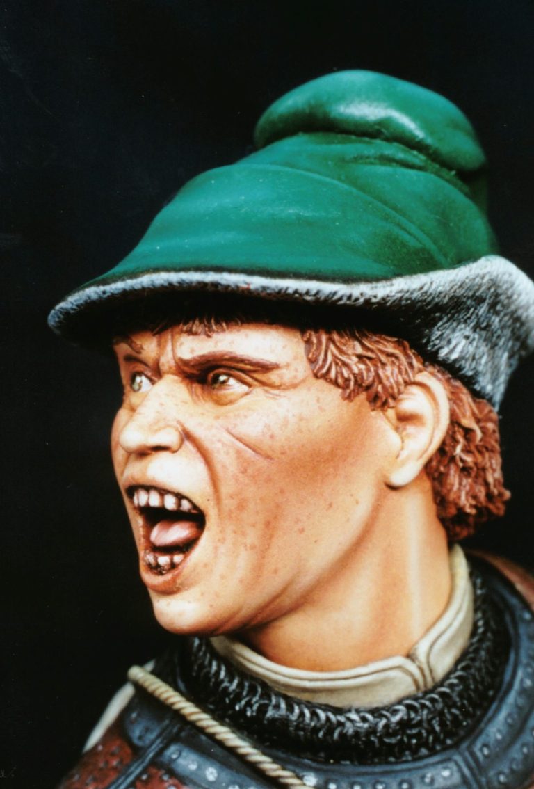
Now for the hat.
The fur colour was an easy choice. I’d read one of Phil Kessling’s articles a while ago detailing how he’d done the fur on a similar hat, and thought I’d have a go myself at reproducing the effect that Phil got. The model of his in question is the Croatian figure from the front cover of Military Modelling Vol 30, issue number 12.
Over an undercoat of pale flesh ( An initial undercoat for the face
that I’d made too much of, so I used it to undercoat the whole of the head - waste not, want not ), I painted a rough line of Lamp Black oils around the lower edge of the hat where it joins the head.
Then I added some Vandyke Brown to the rest of the furred area, blending this in to the black. White was then used to add some basic highlights to the sides of the hat. I’ve added more white, along with some touches of Yellow Ochre to try and build up a “brindle” colouration to the fur.
Now for the dyed part of the cap.
I’d decided on a deep red/brown for the hauberk, and thought that a green would look good in contrast to that. Green’s however always seem to give me problems. Getting them to matt down is no trouble, but the tube ones
I have seem to be very transparent. That’s fine I suppose in certain circumstances, but they don’t seem to mix well on the model, becoming easily overpowered by the addition of any other colours.
So I find it easiest to mix my own greens.
This in turn has its own problems, simply because it boils down to a dab of this, a bit of that and a smidgen of the other to produce a pleasing green - well pleasing to me that is.
So the green for the hat is a mix of Prussian Blue ( A colour I particularly like ), a couple of dabs of Yellow Ochre, and some Lemon Yellow too, mixed to a pleasing shade, and used as a mid-one from which to make a starting point.
I undercoated the hat in Games Workshop’s Woodland Green, a colour which, like their Orc Brown ( sand colour ) seems to cover extremely well.
Then the mid-green oil tone was added, and the shadows blended in to this using some more of the Prussian Blue. Highlights were a mix of the Lemon Yellow and the Yellow Ochre, with a dab of Titanium white, adding pure white for the edges where I wanted the hat to look a little faded.
The sleeves were painted in a dirty linen colour, this being made up from Titanium White, Raw Umber and a little Yellow Ochre. Shadows being provided with more of the Raw Umber and highlights simply from more of the white.
The Hauberk had been undercoated with a Maroon coloured acrylic that I’d bought at a hobby shop many years ago - hence the name has rubbed off the tub – sorry folks.
Anyway, with the acrylic dry, I began adding Brown Madder Alizarin to the hauberk, working this into the detail and once the whole of the hauberk was covered, used a large dry and most importantly, clean brush to stipple most of the paint back off.
Some shadows added with Burnt Umber, these having been blended in to the initial coating of oil paint.
Finally orange was added in very small amounts and again, blended in to establish the brighter areas of highlight.
O.K. you can’t see them either. But they’re there, honest, it’s just that the camera doesn’t seem to see fit to show such subtlety. I must remember to be more heavy-handed with the colour next time !
The hauberk was finished off with black edgings. These being a simple affair of black undercoat in acrylics, Lamp Black oils over the top of that, and this being highlighted with some of the left over flesh tone that I always mix up too much of.
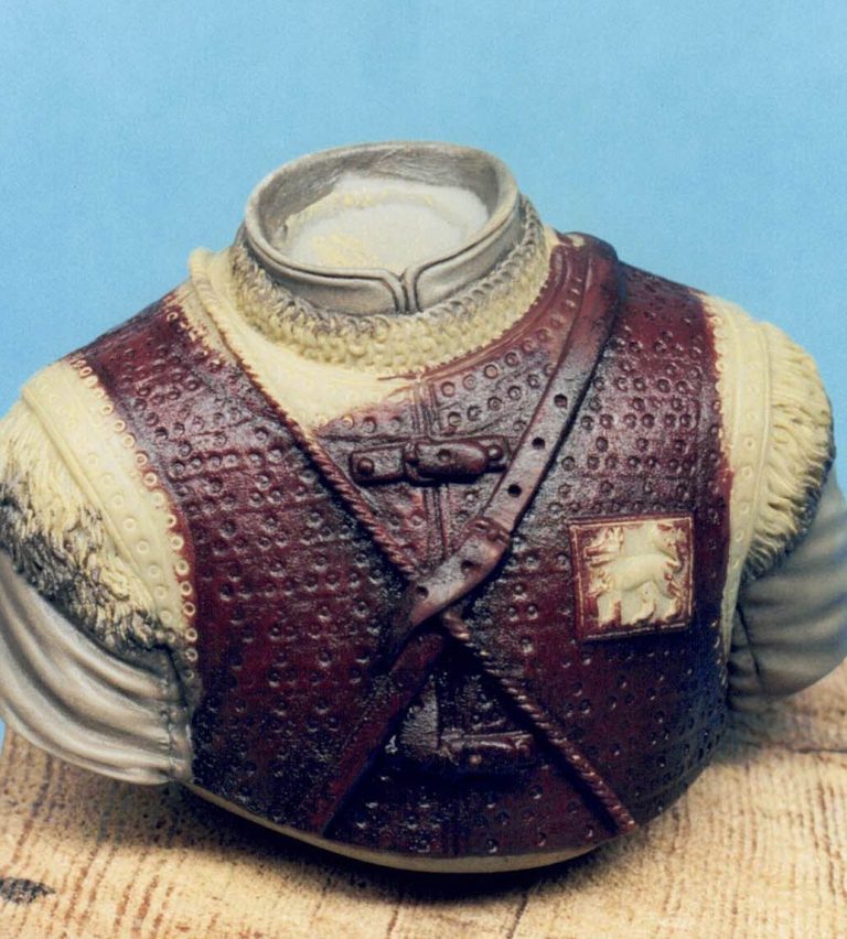
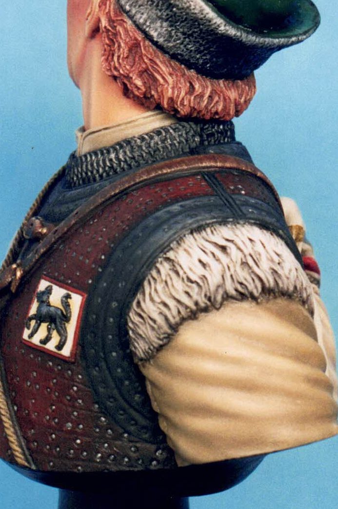
The fringes on the shoulders were white over Raw Umber and the various belts being added in Burnt Umber, Burnt Sienna and Yellow Ochre. For the bedroll I used a lightened version of the colour used on the sleeves ( Just added some Titanium White to the left over’s ) and whilst still wet, I added a couple of bands of colour, Alizarin Crimson and Olive Green, just to break it up a bit.
The mail unusually for me, was one of the last things to be painted. Mainly because it was a small area, and I didn’t fancy having to keep cleaning up the oils paints out of all the detail. easier by far to paint it black, then gently drybrush the raised detail on it with various brightnesses of silver.
Whilst I had the metallics out, I painted in all the little rivets on the
hauberk. This is one of those mind-numbing jobs that only gets put in context when you sit back and think that some foolish individual actually chose to sculpt them. Especially, if like me, you decide to paint each rivet with three colours - Black, mid-silver and a bright silver. O.K. I’m a bigger fool than the chap who sculpted the darn thing !
But, it does look good with the paint on. The good thing about the rivets is that each one is clearly defined and this does ease the painting of them. Finally, the buckles and buttons in brass - well gold really. And then the badge which I painted with the dog motif in black on an off white field. I also added a red piping around the edge, seeing as there was an edging sculpted there for me to do this.
The stand provided with the kit was used - for once Adrian actually used a base supplied with a kit, wonders will never cease ! - Painted black, with a gold trim around the indent on the stem.
This was then fastened to a decorative wooden plinth from Armstrong bases and placed in the display cabinet.
Very nice too.Yes, yet again, I’m going to enthuse about a model. But I’m supposed to aren’t I ? After all I’m at least as keen on my hobby as the next man or woman.
I really do like the trend towards having busts as something more than the top of a clothes horse, having an expression. It matter’s little whether the animation is expressive, or more muted, but I do appreciate the efforts made by sculptors to breathe life into their subjects. It makes our hobby as painters so much more fun.
There’s little I can say about this model without seeming like I’m getting too excited, I’ll let the picture’s speak for themselves, hopefully you’ll agree with me, and like the offering.
References. War of the Roses - Osprey Men at arms by Terence Wise and G. A. Embleton
The Collins Encyclopedia of Military History by R. Ernest Dupuy and Trevor n. Dupuy

We need your consent to load the translations
We use a third-party service to translate the website content that may collect data about your activity. Please review the details in the privacy policy and accept the service to view the translations.