Pantaloon
90mm Comedie del l’Arte flat figure by Roy Hunt
Painted in 2010
I guess I’ve got some explaining to do here – what’s a flat figure ? and a little history of the Comedie del l’Arte.
Both things are interesting, and have quite a history to them, so I’ll begin with “what’s a flat figure ?”
It’s basically what it says, a figure that is flattened so that the viewer has to look at it from one direction to get the effect – like a picture really. There is embossed detail to help the painter, and sometimes a flat will have such detail on both sides, so you can choose to paint one side or the other….or both.
Classically, flats were popularised on the continent, particularly in Germany, which is where most suppliers are based. Incidentally, sculptors of flats are called “editors”, although I have no idea why.
Flats traditionally were reverse carved into pieces of slate – a whole separate skill in itself – and cast in white metal. They’re usually very thin - under 5mm thick, and 2mm or 3mm is more common.
In the past ten years or so, some companies have used resin rather than white metal, and also employed different manners of making the master figure using epoxy putties in a similar manner as to how round figures ( round figures being the term for the ones you normally see kits of within these pages ) are made.
The purpose of flat figures ?
Well strangely, for exactly the same purpose as our normal figures, but there’s some amount of latitude as to how they can be displayed; boxed dioramas can be produced using different scales of flat figure using only half the depth of something with normal figures, as the flats take less space. They can be displayed within picture frames, or as I have done here, in an open manner but with a background to give the figure purpose.
Interestingly, there’s a lot that is similar to painting round figures, but also a lot to learn; and within that learning is something that can be transferred back to round figures…….I’ll come back to that comment later.
What a flat figure does give you chance to do, is to control how the viewer of the finished piece looks at it. It’s not as easy to do that with a round figure, and with a flat, you can paint on certain effects that would simply not work when a figure can be looked at from all angles – again, I’ll return to that comment later in the article.
So, basically, flats are the same as round figures….But different.
It makes for interesting painting.
Now a little about the Comedie del l’Arte.
If I mention Pantaloon, you possibly won’t recognise the character; however, if I say Mr Punch, Harlequin, Columbine or Il Dottore, then there might be more recognition.
These are all characters that sprang up from a particular form of Italian theatre in the late 15th Century, spreading through Europe as acting troupes made their itinerant wanderings across the lands.
The style of theatre will be something you recognise today – we see it on television all the time. Most comedy films, sitcoms and satire programs employ similar themes as were done back then, the sketches interwoven with news and scandals of the time, characters within them mimicking known personalities or common caricatures that would be recognised in most cultures.
Pantaloon for example, is the older man with a young wife – he’s got money, she’s married him for it, but unbeknownst to him, she befriends other, younger men and makes a fool of him.
Mr Punch, is our British version of Puncinella, a mean, vicious and crafty character.
Harlequin – the acrobat, ever performing twists and turns, with a cartwheel thrown in for good measure, his agility would add colour to the show ( as too would his costume of diamond patterned material ).
Columbine – the beautiful actress and possibly the love interest for other characters. She could be the one that is fought over by jealous lovers or two characters at odds with one another.
Il Dottore ( the doctor ), sometimes a learned man of law who listens to no-one, but sticks his nose into everyone else’s business.
Other characters developed too – the captain, Scaramouch, the zanni, in fact enough to reflect how we partition or slot people into particular character types, with a hefty dose of caricature to help define each one.
Scripts would be written to reflect common situations, or what was happening either on a local or a national scale, and acted out to audiences wherever the troupes were allowed to perform. Some of the better ones were retained by nobility, some wandered the countryside, all helped spread news of what was happening in the larger world to a populace who might never travel more than ten miles from where they were born.
From this developed theatre as we know it – even William Shakespeare based a couple of his works upon ideas begun in Comedie; and ever since, the same themes ( albeit with different twists ) have been used for entertainment of one form or another.
So why this particular flat ?
I’d like to think that Roy Hunt, the sculptor of this piece, would have classed me as a friend. It’s just over two years since he died, and in the time that I knew him, he sculpted some beautiful pieces.
Not enough of them mind, but quite a few.
I have three of his flat figures – two Samurai’s ( one man and one woman ) and was very lucky to find this piece being sold off second hand at Warboot – a car boot sale for model soldiers and wargamers up here in the north west of England.
I think I paid three pounds for this – it was a steal at anything under a tenner, because since Roy’s untimely death, these pieces have not been produced. Yes, I was feeling very lucky the day I stumbled across this.
Cast in a soft creamy resin, the refinement of detail is superb, and the only slight problems were a warp in the resin that caused a curve in the casting so that the feet and head will always stand proud of any flat base that it’s put on – I tried putting it in hot water and flattening it out, but the warping remains; and the other problem being that his left foot had broken off. Not too much of a hitch, because the separated piece was still in the bag with the rest of the flat.
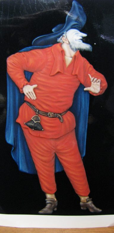
So, photo #1 shows the artwork that comes with the model – the costume is basically how the character is thought to have been, the accepted “uniform” if you like. I’ve seen this rendered a couple of different ways, the most striking being a black and white chequerboard affair by Gerry Larkin, which must have been mind-bendingly complex to paint, and a little bit like 1960’s décor made into clothing – in a good way though.
I wanted to blend a few good ideas together, so the chequerboard pattern was a shoo in, but I wanted to do something different as well.
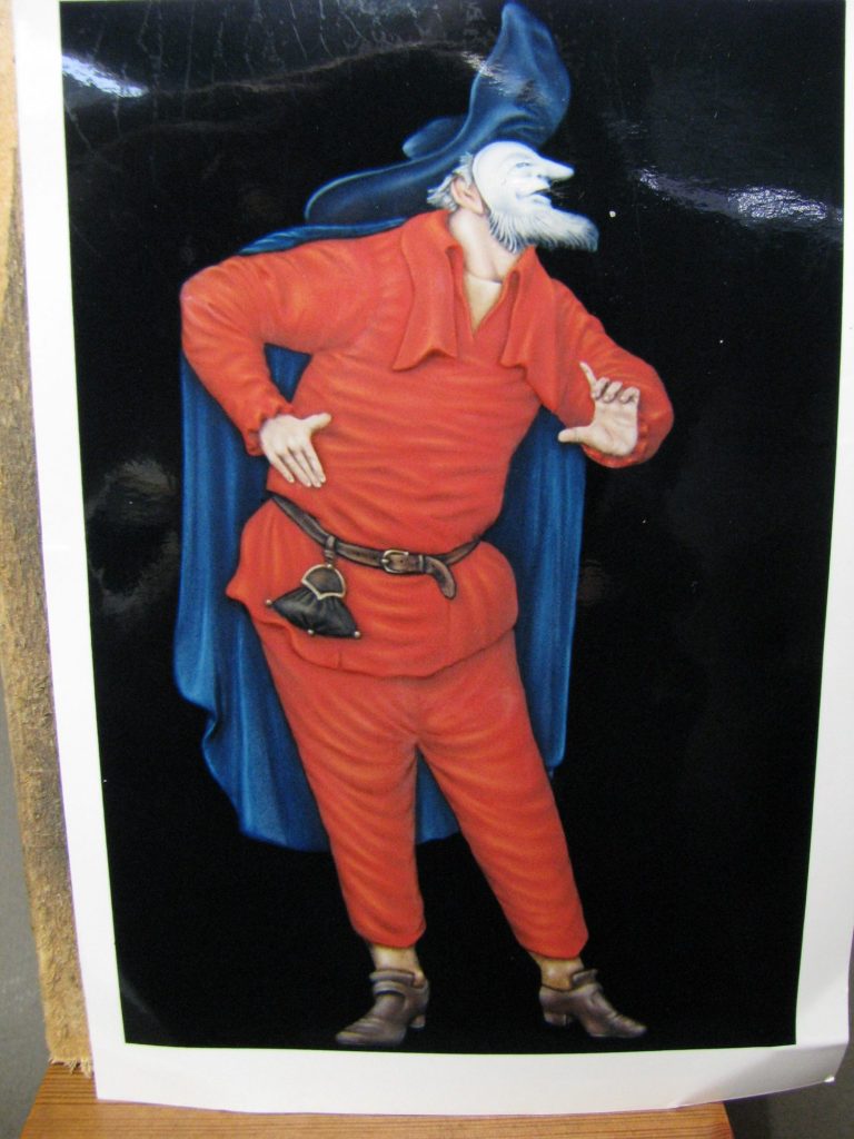
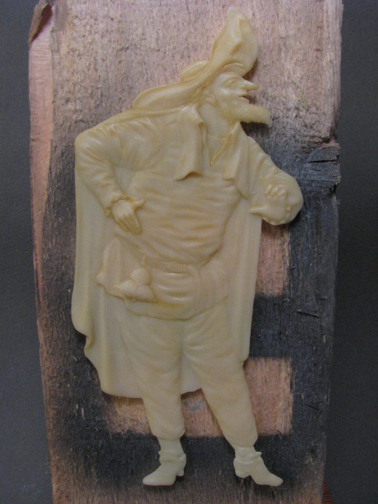
Photo #2 possibly doesn’t show up that well, but this is the bare casting. Savour this, because I’m usually much too impatient to take a picture before adding any paint – you’ve been warned, in fact, this picture might even class as a collectors piece some day – O.K. I’m joking.
So, cleaning a flat – yes, there’s usually a little work to do prior to getting the brushes wet.
Most flats will have a small amount of flash around the casting. Sometimes it’s there as the mould being overfilled, sometimes it’s just a case of the casting medium leaking out between the two mould halves, and sometimes it’s there to support a fine part of the casting that would otherwise get damaged in transit.
Resin flats tend to be “puddle moulded” which is a good description of how they’re made. The mould is one sided and the resin is poured in to form a puddle within the rubber, the flat being extracted once it’s cured. This means that unlike a lot of the metal flats, resin ones have detail only on one side.
Having scraped off and gently filed the edges of the flat to remove any flash, washed it in soapy water and dried it, I fastened it to a wood block to make it easier to hold it, and painted a thin layer of primer over the resin.
I tend to use an acrylic paint mixed with Isopropyl Alcohol as a primer. I don’t touch the painted areas once completed, except when putting the model into its final resting position on its base. So the priming method I use is enough to give the paint a good grip.
There’s different theories on what area you should paint first on a figure, a lot of people will begin with the flesh and work outwards – “dressing” the figure as the work proceeds. Others begin at the top and work down. The latter probably would work well with a flat, then you’re not reaching over areas that already have paint on them, but as is my usual wont, I try and make my life difficult, so I began with the flesh areas.
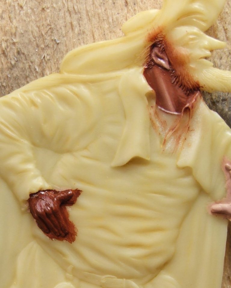
Photo #3 shows that process beginning, with the hands, neck and ankles having been undercoated with Games Workshop ( GW ) acrylic flesh, then in this shot a layer of Mars Brown oils has been added once the acrylic was fully dry. You can see the acrylic on the figure’s left hand, just at the edge of the shot, with the oils coating the right hand, and the neck areas having been worked on by firstly thinning the oil paint out, and then adding small amounts of Titanium White oils to the brown paint whilst it’s still wet and blending the two colours together.
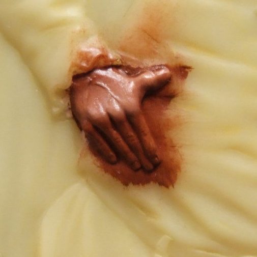
So, let’s concentrate on the figure’s right hand, and the process of adding highlights. I use a dry, flat brush that’s fairly soft, to remove the majority of the brown oil paint. There’s got to be enough paint left to leave the surface of the hand wet, but not too much that so much white is needed that there is the danger of leaving brush-marks. It’s a case of practice and familiarity, but a few goes and you should pick it up. The white is added with a good quality brush – I use Winsor and Newton Series 7’s ( pricey, but will last if taken care of ). The white is added in very small amounts – this is so that the paint can be controlled and kept to just the area that I want it in; plus it reduces the chances of paint build up. I also keep wiping the brush on a soft cloth to remove any excess paint – white will go onto the surface of the model, but brown will be picked off and mix in with what’s on the brush. The brown in this case needs to be gotten rid of, hence the “wipe the brush on a soft cloth” method.
Now, daft comment of the day – have you looked at the back of your hand recently – go on, admit it, it’s not something you make a habit of, is it ?
The problem with any art is assumption. You assume because it’s a common object – like a hand – that you know exactly what it looks like “I know something like the back of my hand…”
Actually, you probably don’t know the back of your hand all that well.
It’s sometimes useful to look at things you’re going to paint – hence we build up references.
In the case of this figure, the hands are quite important. The actor is at a time before large projection screens were invented, so his mannerisms were quite exaggerated, the hands in particular would be used to overemphasize his mood or what was happening – so I wanted to draw the eye to them and make a good fist of the paint job ( Oooooh, sorry, couldn’t resist the pun ).
So, not just a case of separating the fingers and making it look like a flesh coloured bunch of bananas. I wanted a couple of veins to be there, along with the bone structure behind the thinned skin at the knuckles.
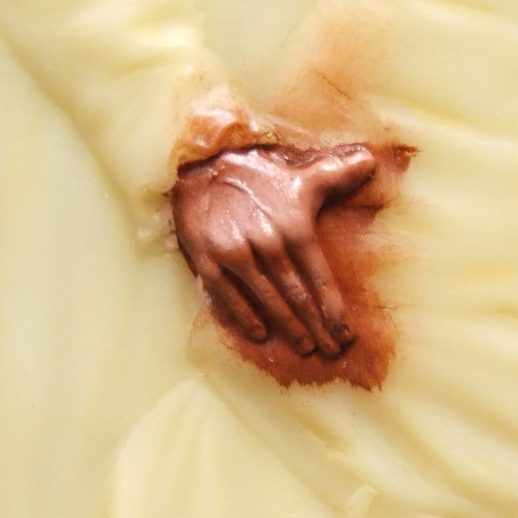
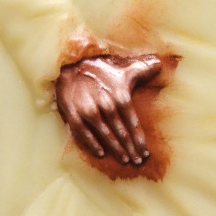
With that in mind, note that when you clench a fist, each of the main knuckles actually shows two highlights side by side, not just a single one. That’s because the bone ends in that comic-like “M” shape, and that shape is being exposed by the thin skin. So in photo #4 and #5 I am building that up with additions of white paint, even though the hand isn’t clenched into a fist, it is tensed.
Photo #6 shows final highlights building up, and whilst this will be blended back a little, it’s basically how the hand should look when it’s finished. Some shadows have been put back in – like at the top of the fingernails, and then the nails painted in with a pale flesh colour.
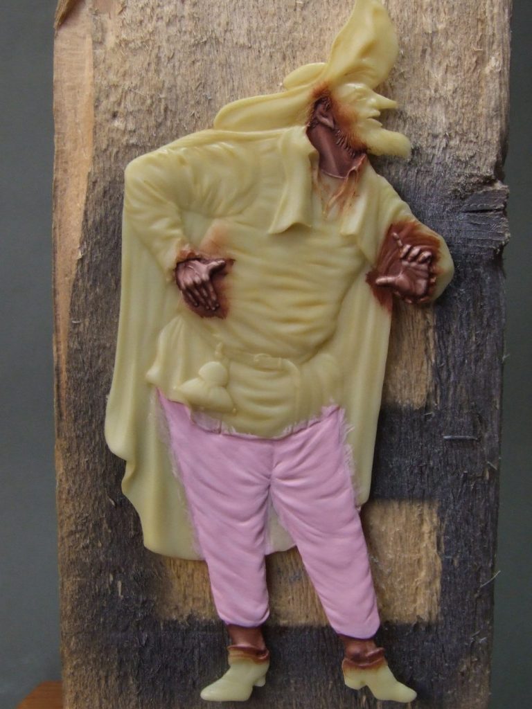
Taking a step back to look at the whole figure now in photo #7, and at this point, one of my friends ( Dave Maddox ) pointed out that he should be wearing socks – that would be remedied later, but it’s good to have helpful things like that pointed out before finishing a model, rather than after – thanks Dave.
Also in this shot I’ve undercoated the trousers…..with GW Titillating Pink. I do so love their names for paint !
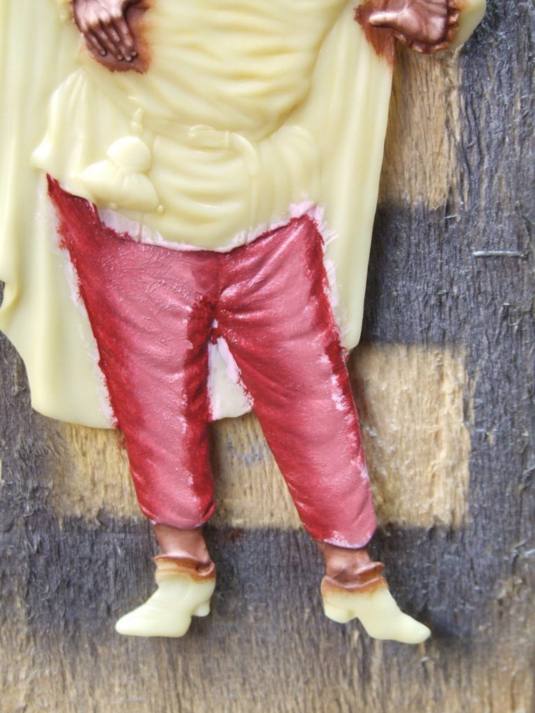
That area begins to get it’s coating of oils in photo #8, with some very vivid pink mixes, the darker colours being added to the edge, with lighter colours in the centre to try and give the illusion of the trousers being rounded. O.K. so at the moment they look like they’re striped, but bear with me until photo #9, where I begin to blend the two colours together using a stippling action. This blends the colours together at their edges, as you can see on the inner portion of the left leg in this shot.
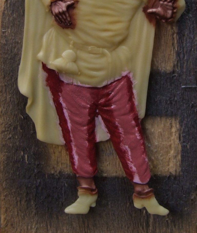
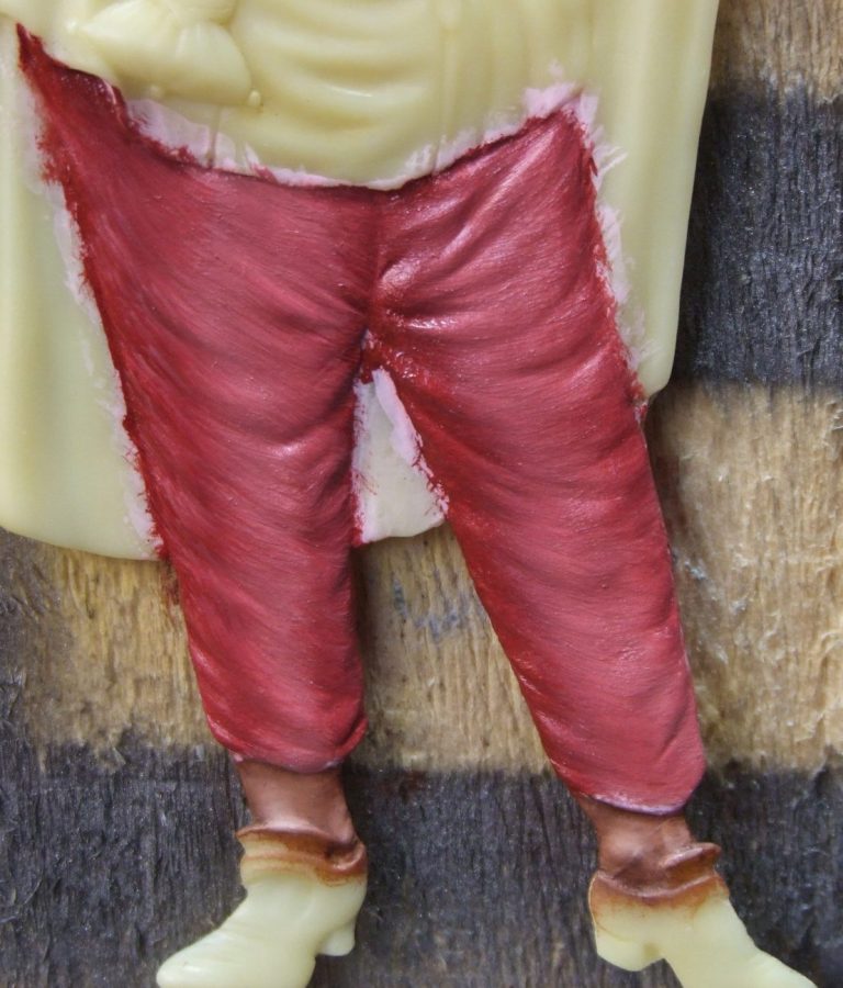
Photo #10 then moves on to using a clean, dry brush to make a gentle sweeping action, so that the lighter paint is moved onto the areas that have folds and creases on them, helping give the trousers more form.
And having shown you all that, I though that the effect was just too dark, so I cleaned it off with some White Spirit. Now you’re thinking what was the point of all that ?
Well, it shows how I got the effect, and although it was too dark for the plan I had, it worked perfectly well for the lighter colours I did use. The problem was that they didn’t show up so well on the photos, so I thought it best to use the ones that were a bit more vivid and showed up better.
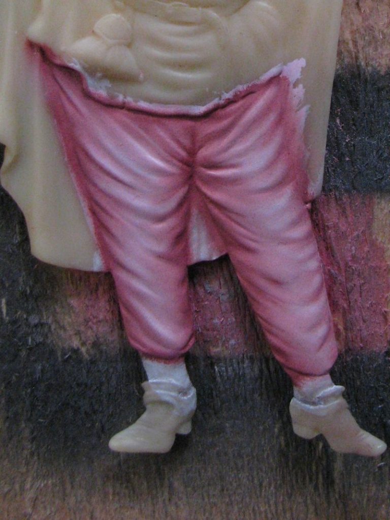
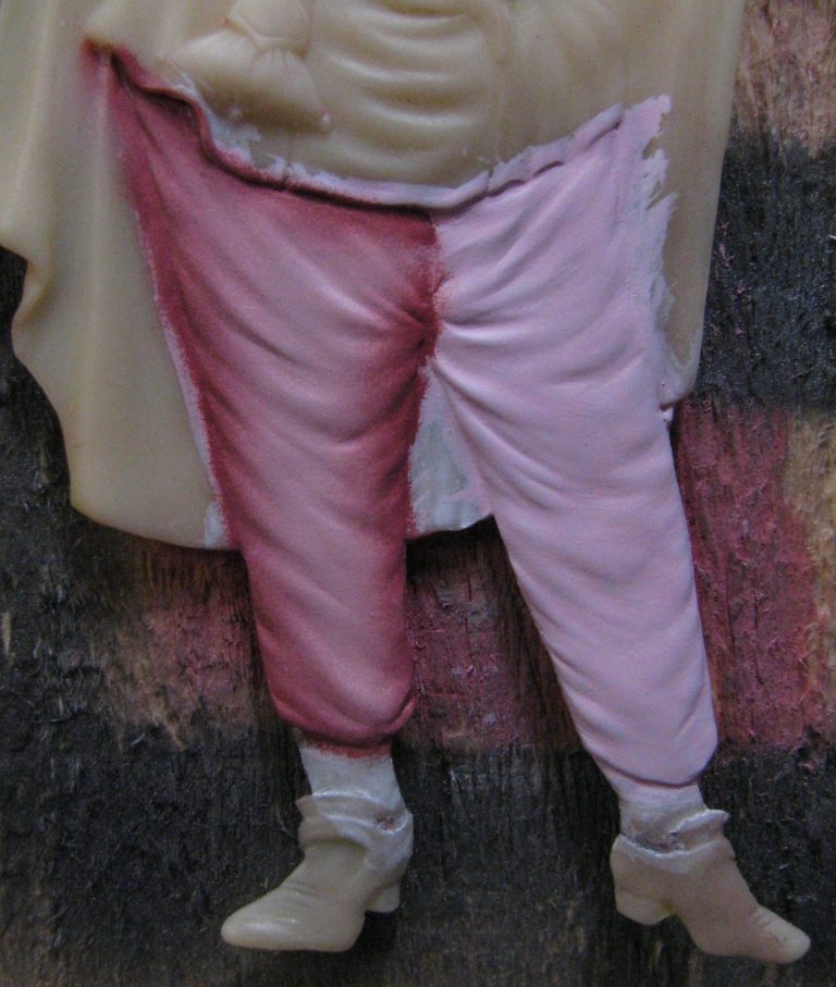
Photo #11 is one trouser leg done in the new colours, photo #12 when I got the second leg done to match.
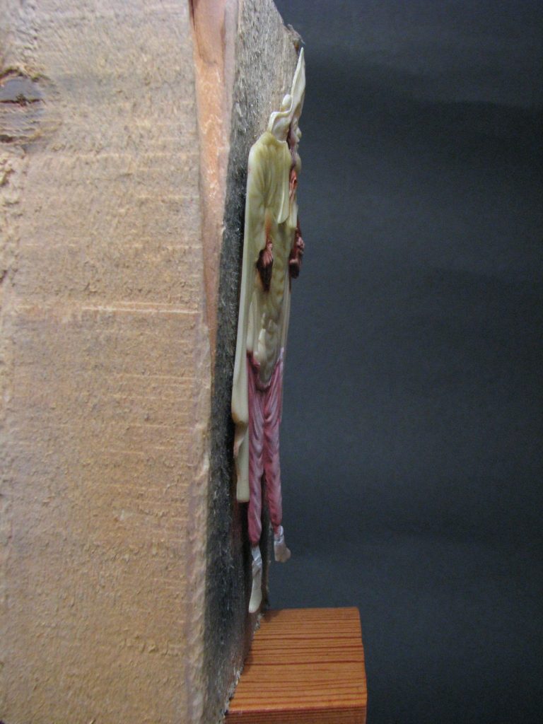
Now then, a shot you probably won’t often see, and possibly one I should have put in earlier. Photo #13 shows a side ( ish) view of the flat. Yes, that really is how thin he is.
Back to the painting, and photo #14 shows the roughing out of the chequer pattern on the trousers. This is done freehand with thinned down oils. The reason it’s freehand is that there has to be an allowance for how the cloth would fold and bend around the leg. Although it looks like there’s lots of squares; there isn’t actually a single perfect square on the whole model, it’s an illusion within the painting.
How I managed that was to paint in thin vertical lines running down the trouser leg, but allowing each line to wander a little to take in folds and creases. Also the ones at the edge are narrower than the ones that are more central.
Then it’s a case of running horizontal lines across the trousers, but again keeping in mind that the clothing deforms as it encloses the leg, so there is a little bit of a curved “U” shape going on here. The beauty of the oils is that they can be cleaned off with a little white spirit, but once happy with the effect, a stronger mix of the paint can be used to block all the squares in.
Think it’s finished there ?
Think again, there’s shadows and highlights to be added to each and every square, plus thinking about how the deeper shadows will fall under the tunic that overhangs the trousers, plus giving the illusion that the trousers travel under the groin and between the legs – all done with the application of deeper shadows.
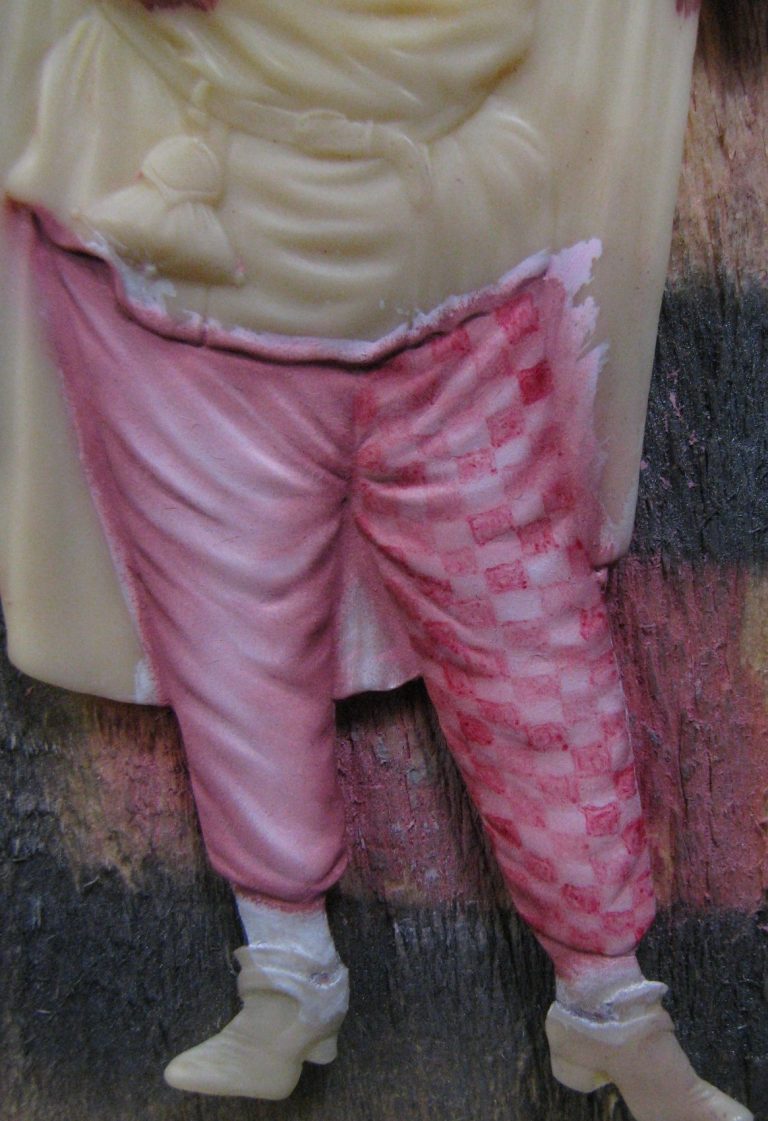
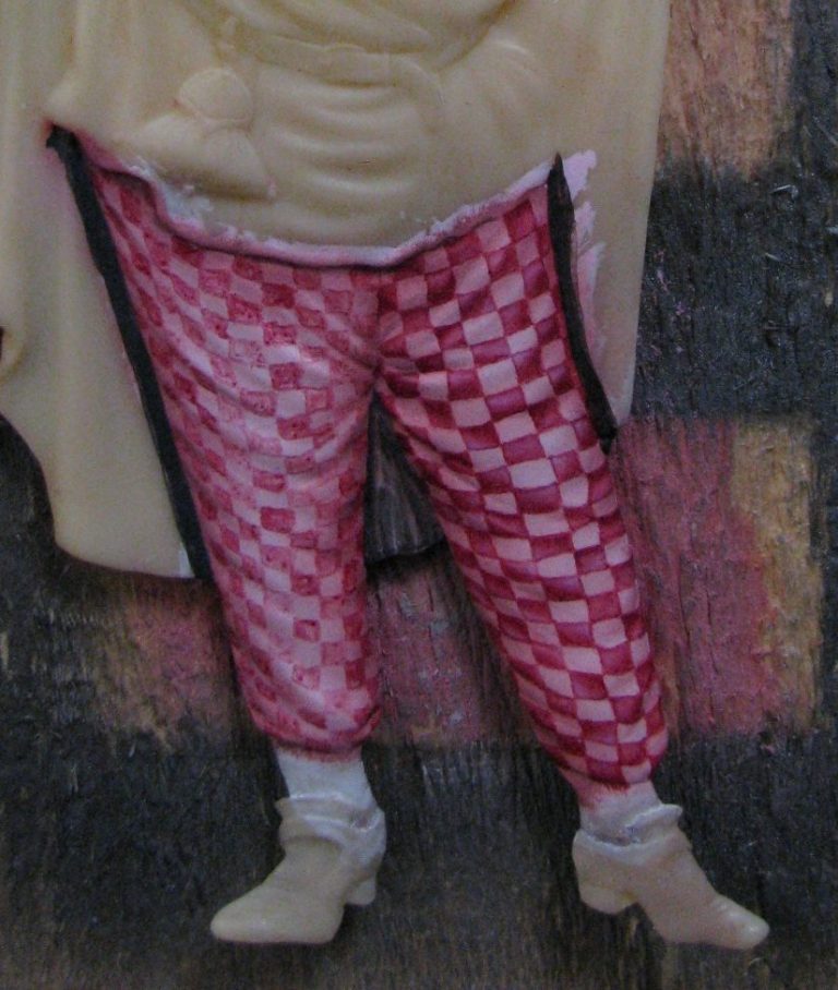
Photos #15 and #16 show how this all happens,
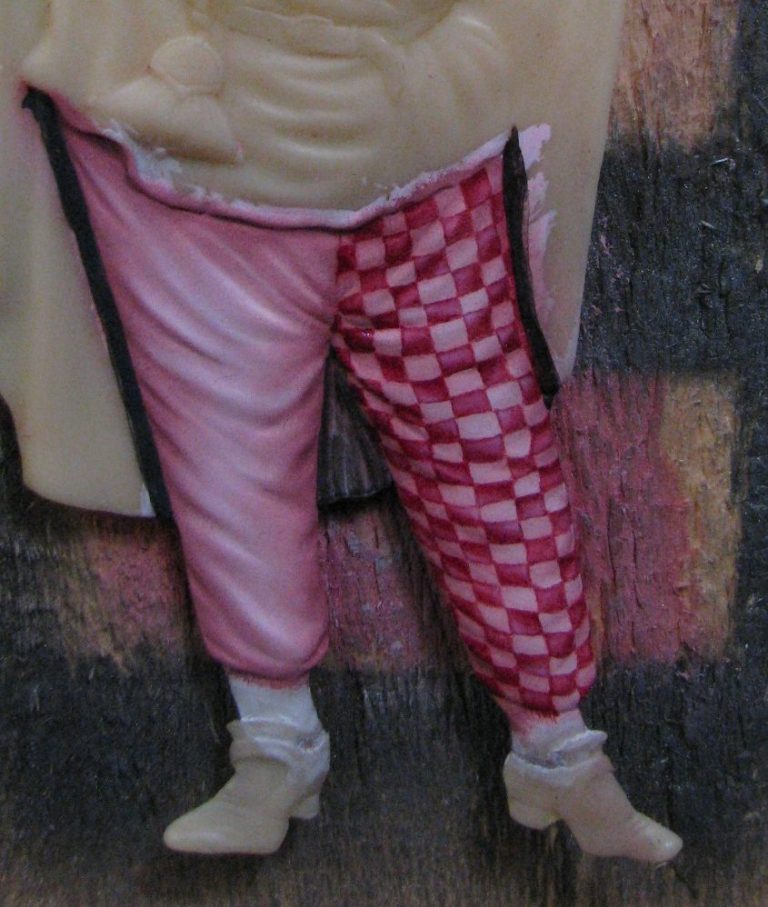
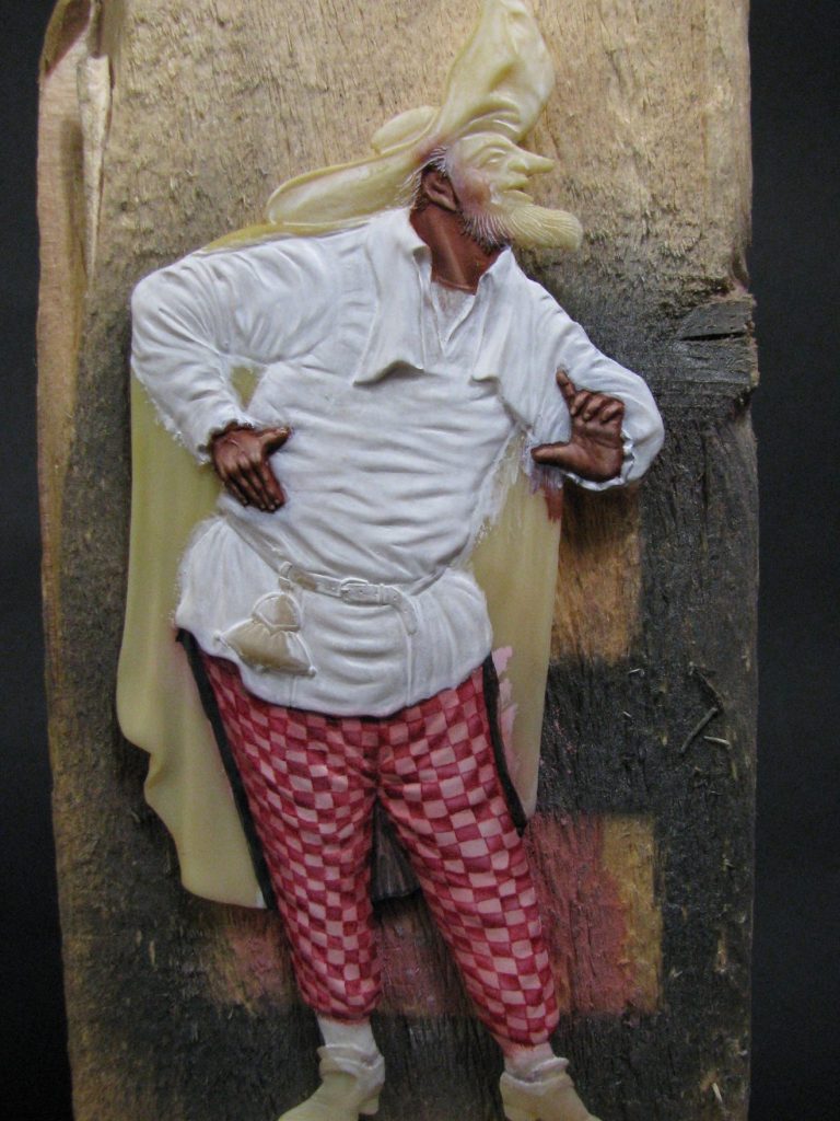
then the process continues through photos #17 and #18. One tip here – it helps to paint a darker area around the edges of anything complex like this to see if the contrast actually works. With a light colour bordering it – the primed or undercoated areas for example – colours tend not to show up properly. That’s why I’ve added a rough coating of a dark colour in photo #18.
The tunic followed the same basic principle as the trousers for the light backing colour, but I didn’t want to do more little squares. Someone really helpful on The Basement Forum ( I think I was Bob Orr ) suggested chevrons, and to be honest I couldn’t think of anything better, so decided to go with that. Photo #19.
However, it’s easier to say than to do, and I spent a good couple of weeks agonising over how I could make what, for want of a better word are a series of stripes, into something that looked like angled stripes forming clothing around a body.
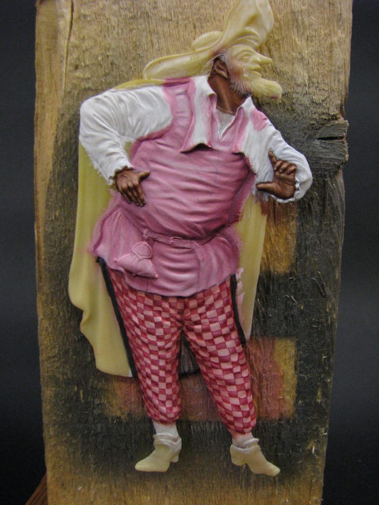
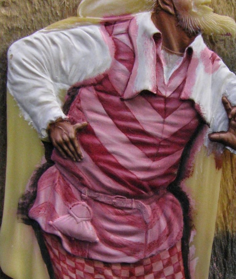
Photo #20 shows one stage in the planning. I think this was possibly the fourth attempt, and event his had some adjustments made to it before the final coats were painted on. Again I’ve used a dark colour to edge the area, and in photo #21 have committed myself ( possibly to an asylum at this point ) with some highlights and shadows on the chevrons.
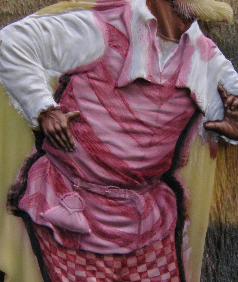
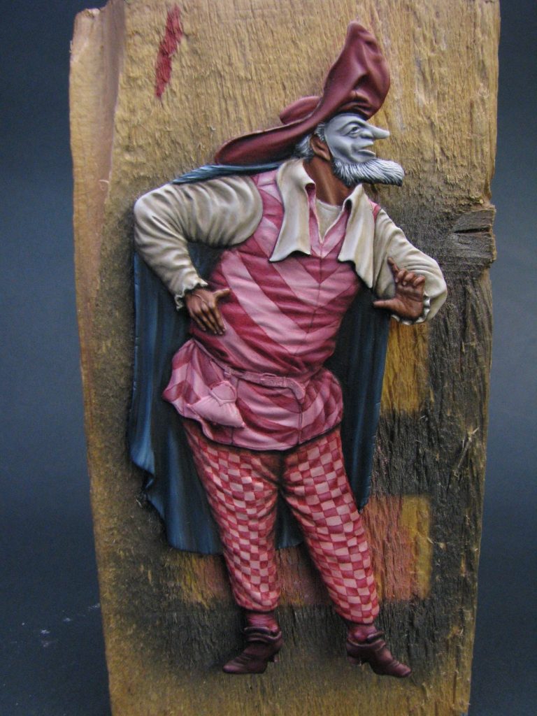
The next shot – photo #22 shows a lot of progress. The chevrons have been completed ( Phew is possibly an understatement of the relief I felt to be honest ), and then I moved on to paint the cloak, hat and face.
All the above were done with oils over acrylic undercoats.
The arms and collar were a little different though. These were done with acrylics, beginning with a middling dark grey brown mix of Kommando Khaki, Chaos Black and a touch of Skull White ( all Games Workshop colours ), establishing a solid colour with about three coats of this mix, then gradually lightening the colour on the pallet and adding lots of water so that the paint is not much more than tinted liquid. This is then painted on until a difference in colour can be seen on the desired areas, then the paint lightened again, and thinned to compensate for the addition of paint, and the whole process begun again. Think of an old fashioned land survey map where the height of the ground is denoted by ever decreasing circles of lines. That’s how the paint is added, in very slightly decreasing areas, thus splitting up the mid-tones and then moving on to highlight areas.
Some wont’ believe me when I say there could be sixty or seventy layers of paint under those highlights; but that’s the amount of time and effort it takes to build up the effect gradually and smoothly – nothing good comes easily.
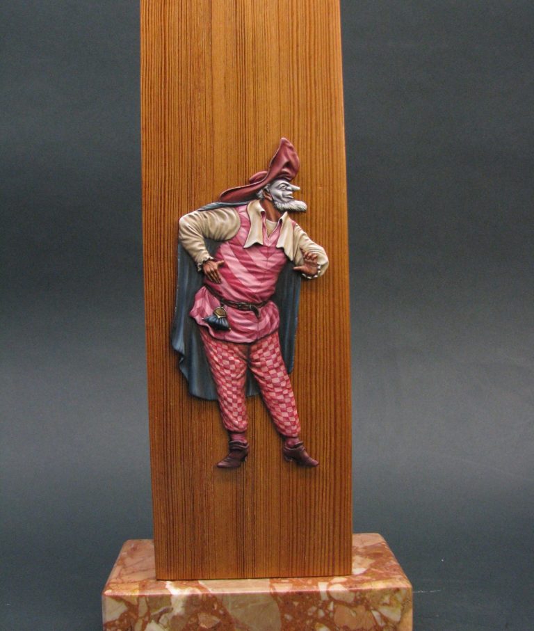
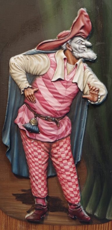
Photo #23 and #24 shows the model in it’s finished guise, the finer details of the belt and purse added in, some small refinements made to one or two areas to get things to stand out – some highlights on the beard and on the nicks in the edges of the cloak, deeper shadows under the collar edges and the back of the hat / head.
The nicely varnished piece of pitch pine stops all the confusion of the rough painting block, and lets the eye focus on the figure itself. But it looks a little strange, him juts hovering in mid-air.
I’d toyed with just a black backing, but that would tend to lose the effect of the cloak, and after some deliberation, I thought about putting him in a comfortable surrounding – that of the stage.
I couldn’t use clever computer graphics for that – I’d have to be clever to be able to do that. I’d have to rely on a brush and some more paint.
Removing the model from the stand, I roughed out some wood grain flooring planks which would have to run contrary to the nice grain detail that was within the wood itself, then painted on a curtain swag to one side.
Now at no point did my hands leave the end of my wrists, or in fact did I think to try the figure against the lovely bit of artistry that I was painting – therefore magic, but no planning.
In photo #25 you can see the two pieces of Blu-tac that I’ve used to keep the figure in place as blobs in the paint, and you dear reader will probably foresee the problem which I was blind to.
Yup, the figure’s going to be in the wrong place !
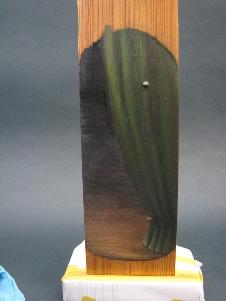
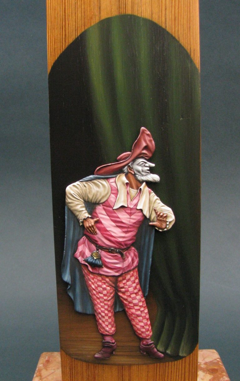
So, using the magic of the written article, photo #26 shows how I have completely removed the Blu-tac, repainted the blank areas that it left, and can now wait and see if the idea will fit the figure, or if an orbital sander is going to have to come out of the shed again.
Having sorted out that little problem and dried off the paint thoroughly on the background, I could test fit the model in place. Photo #27 shows this, with the model stuck on with Blu-tac, and looking rather cool, even if I do say so myself.
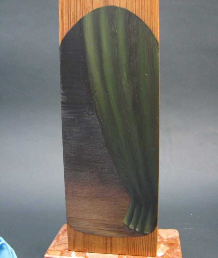
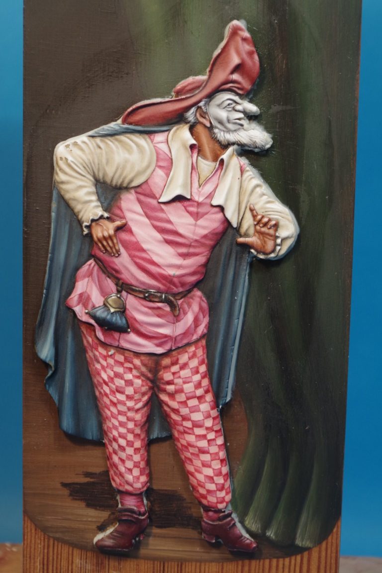
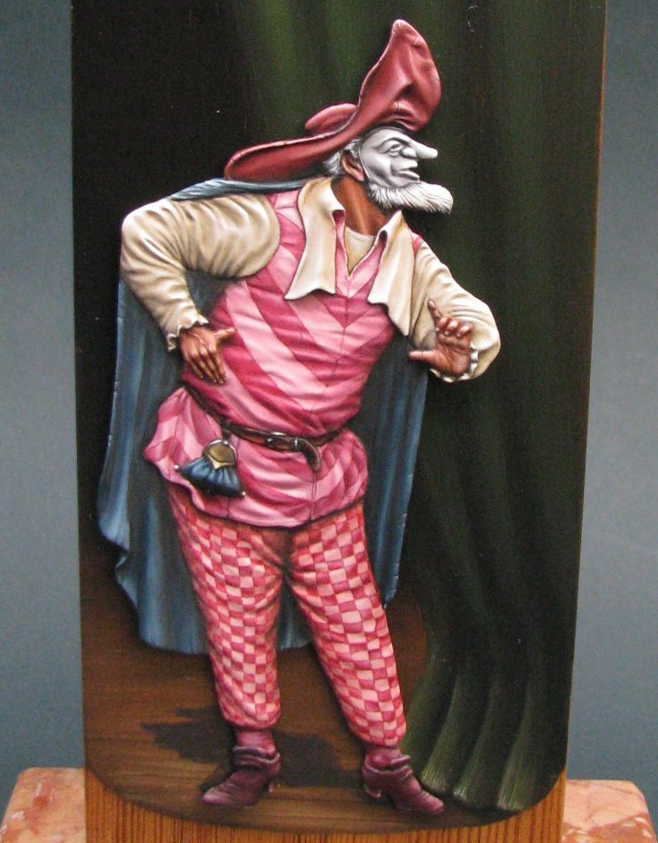
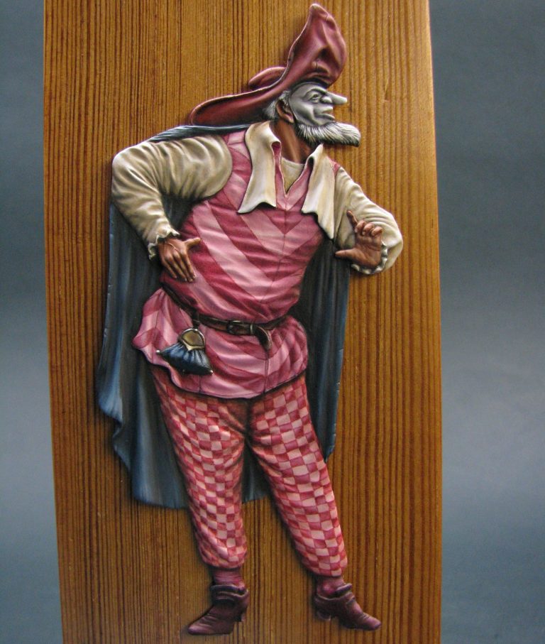
O.K. then, seeing as I’ve got the camera handy, I’ll do a close-up shot of the figure too – photo #28 – and that, you might think, would be that.
Ah, no actually. I needed a nameplate.
Now I’m not exactly a computer whiz-kid…….Um not really good with technology at all really, so printing off a lovely banner type nameplate wouldn’t be happening this side of a forthcoming apocalypse.
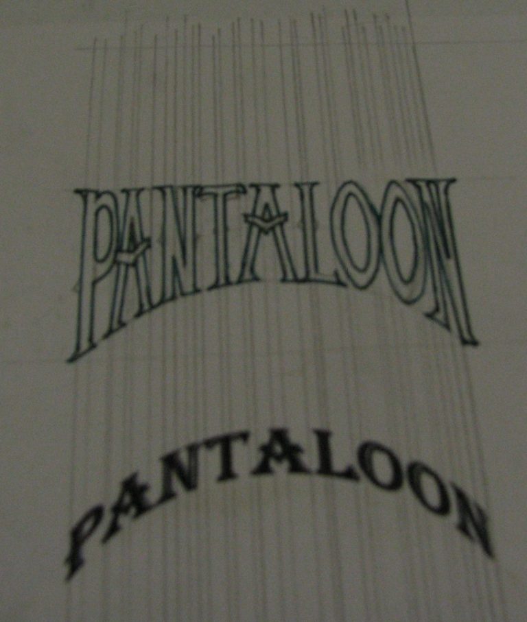
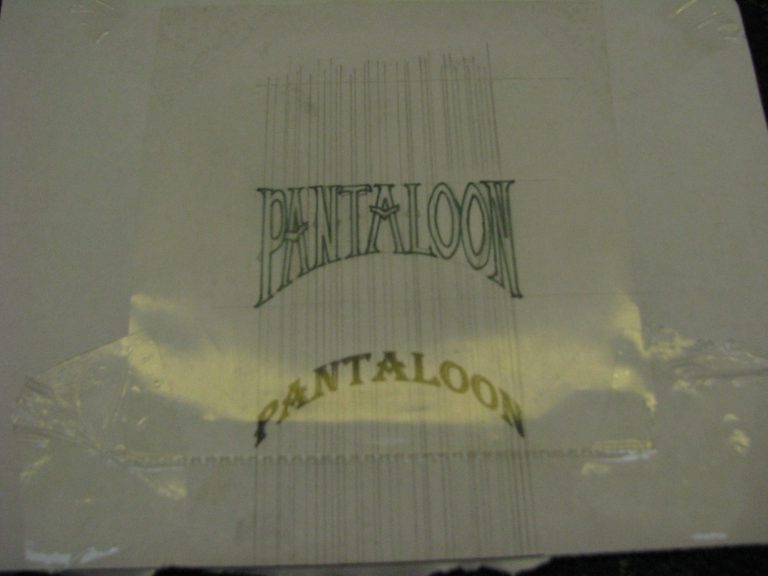
However, after much trial and error, I found a font that I liked – my thoughts running to the sort of typeface that springs to mind for Carnival or Circus sign-writing – and printed of an applicably sized set of text. See photo #29.
I wanted the text to look hand painted, a little wonky ( I would say that – I can hear you thinking it ! ), because in this case it might have been done by one of the troupe of actors. Perfection didn’t seem to be the order of the day – well in my way of thinking at least.
Because I couldn’t get the text to stretch at the ends and deform in the middle, I had to use old fashioned pencil and steel rule to draw lines vertically and do things the old fashioned way.
Photo #29 shows the construction of the letters with them being lined out in black in photo #30.

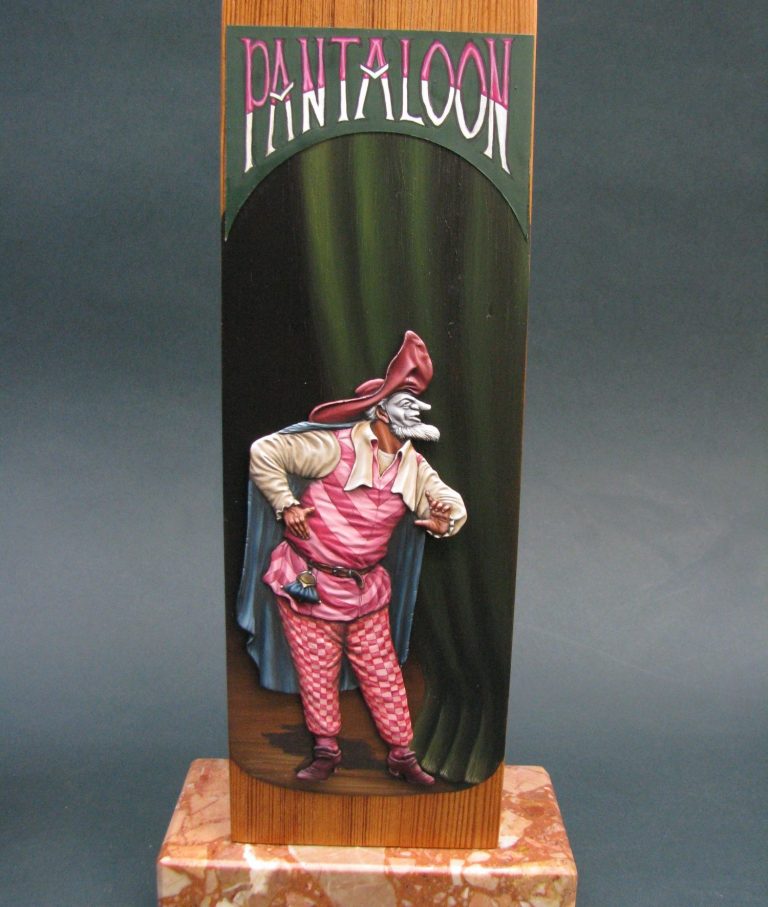
Photo #31 is a bit fuzzy, but shows a clear plastic CD wallet that’s been split in half, and taped over the lettering. This will be painted over to produce the nameplate itself.
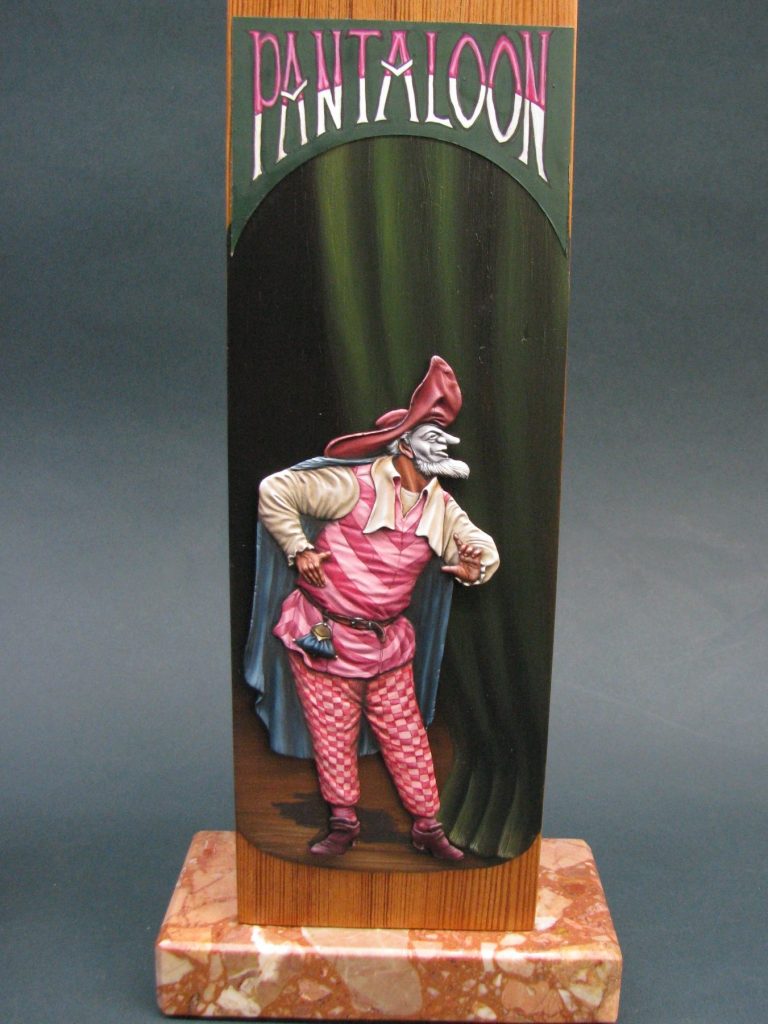
Photo 32 shows the nameplate completed and in place.
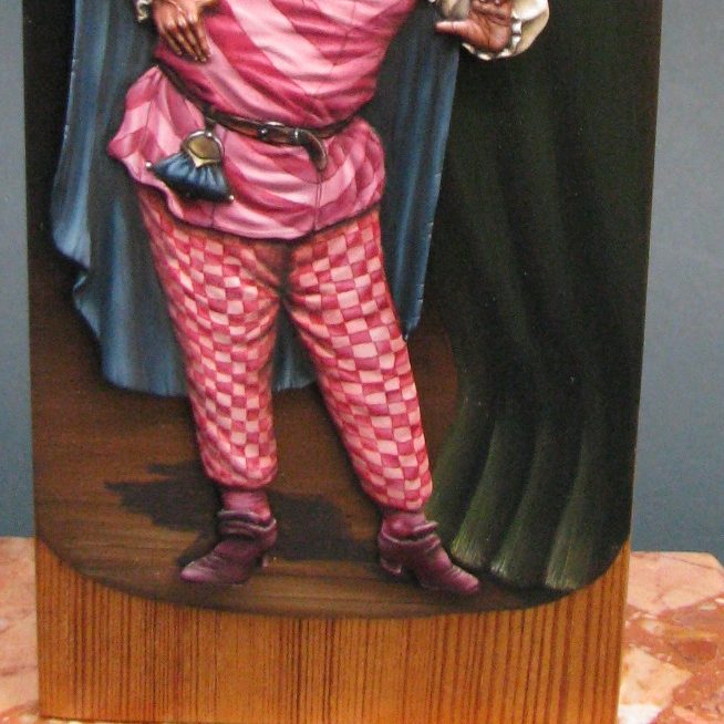
The final addition was the shadow under and behind the figure.
This started off as a deep brown coloured puddle; one that looked alarmingly like he’d needed the rest room in mid-performance. By tweaking the shape of the puddle, I managed to save the actor’s embarrassment and make it look like a cast shadow on the floorboards of the stage.
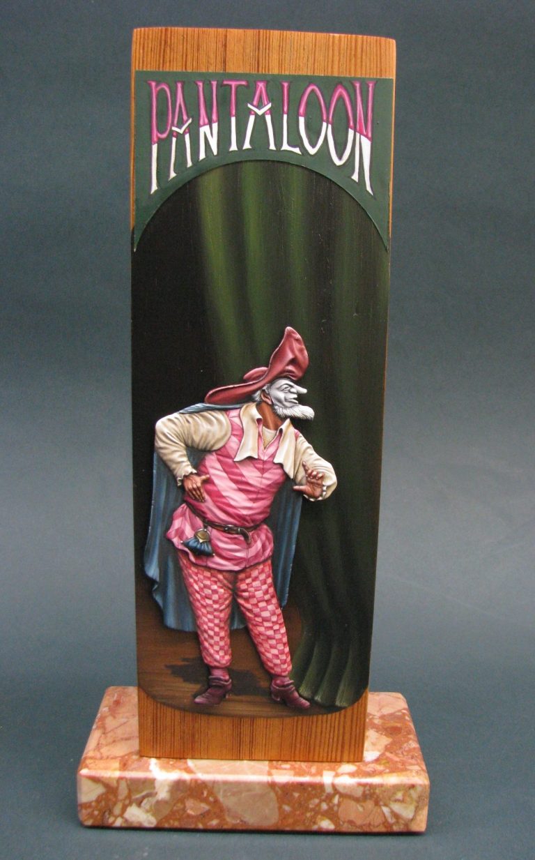
Final words.
An enjoyable project, something not often seen; and a subject that is a talking point. Painting flat figures isn’t that difficult, and the amount you learn during the process can be applied on round figures to improve your methods. Cast shadows and greater contrast are certainly one of the things that you get to play about with, not to mention setting a scene that allows you to make the choice as to where the light or lights are coming from.
I enjoy the amazement ( my amazement actually ) that I can actually make something that is flat appear three dimensional, and simply by adding coloured pigments. The way that each flat piece develops as areas are completed is really fun, it makes you want to come back to the bench and do some more when perhaps more common subjects or more normal figures have become a bit boring.
Put simply, it’s a rest, but also something that pushes you to experiment.
Oh, and they’re cheap too. Most 90mm flats will give you change out of a tenner, a lot will give you a second figure and a little change too.
The choice of subjects is as broad as any other branch of the hobby, it’s just a case of knowing where to look. A good starting point is the British Flat Figure Society (http://www.britishflatfigures.org.uk/ ) who, like other national clubs have their own website, and regular magazines about their particular niche within our hobby.
Please note, all the Roy Hunt Flat figures are available from seller ash0040 on eBay. The whole of any sale of these flats goes to Pat Hunt - Roy's widow - excluding the cost of postage.
The series of flats are:-
Female Samurai
Old Ronin
Action at Dennewitz
Chief Joseph and the retreat of the Nez Perce
Tamerlane
Pantaloon
Or simply type in "Roy Hunt Flat" on eBay and that should bring the range up.
We need your consent to load the translations
We use a third-party service to translate the website content that may collect data about your activity. Please review the details in the privacy policy and accept the service to view the translations.