Morning Coffee
1/8th s cale resin kit from PWorks
Painted in 2022
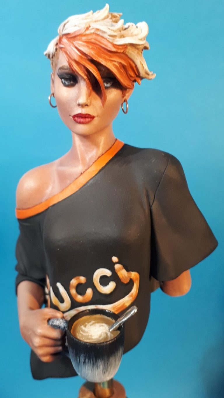
Sometimes it happens that I buy a kit and it goes straight on the bench, it doesn’t happen often I admit, but just on occasion it works that way.
This kit is one of those few, I bought it at the 2022 World Model Expo in Eindhoven, and within a week of getting home the parts were out of the box, out of the packaging, cleaned up and primed.
The kit comes from the hands of Pedro Fernandez and is marketed under his Pworks banner under the name of Good Morning Estralla. Sculpting, like a lot of his pieces is a little stylised and quirky, although this one is perhaps the most restrained in that manner, no bunny ears or Faunlike body parts. It’s just a young lass having a cuppa.
It’s so simple, and yet so well done, and I just had to have one.
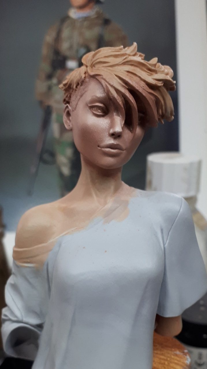
As usual, I was in a rush to get painting, so photo #1 shows the primed resin with the flesh already painted ( I really, really do need to curb my excitement when starting kits, honestly, how old am I ??? )
Just a quick run through of the flesh colours used….
Female Caucasian flesh always looks best if it’s done very smoothly, and in this case I wanted to have her looking quite pale – early morning, not quite awake, I need my COFFEE !
With that taken into account I’d undercoated in a pale flesh acrylic – MP flesh colour and MP White mixed 50:50 and then got the oils out.
The oil colours start off as usual, Mars Brown and Titanium White mixed to a medium flesh colour, and then just a hint of Carmine added. This would be the darker mid-tone for the flesh, and was painted over all the flesh areas with a large brush, then taking a clean “mop headed” brush – one that used to be a flat brush but the bristles have sort of gone mad and had better days. It’s a clean brush, no thinners added or anything, but the bristles are very soft. Oh and it’s equate to a size 3.
This brush was used to gently stipple the flesh areas, and for two reasons:-
One is to even out the surface finish, it gives a slightly matting effect – think of using a roller to paint a wall with emulsion, and the effect the roller leaves – no brush marks in other words.
Two, it takes off any excess paint and spreads the paint evenly because I constantly wipe it on a clean dry cloth.
With that done, a cuppa is required – well, she’s getting one, why can’t I ?
Now for the shadows.
Mars Brown in very, very small amounts is added in spots and short lines to areas that I need to appear to be in shadow. This is a little more difficult on a young woman’s face, the skin is smooth and doesn’t have many, if any, wrinkles, so smooth transitions need to be blended out – another soft clean mop headed brush, and more wiping it on a clean cloth.
Shadows are built up slowly with repeated additions of Mars Brown oils – at the inner corners of the eyes, and along the underside of the eyebrows, along the line of the hair where it joins the skin, under the nose, under the cheekbones and under the bottom lip. Moving onto the neck, it needs to delineate the tendons that run down from beneath the ears towards the point where they fasten to the clavicle, and the part of the upper arm where the shoulder is exposed. Oh, inside the ears too, don’t forget them.
So, shadows painted, now the highlights.
Easy, just add Titanium White in small spots and lines, blend in with a third soft mop headed brush, and hit the point and flares of the nose, the top of the cheekbones, the top lip and the section of forehead that’s visible too. Run some along the clavicle bone, the tendons in the neck and the top of the shoulder, carefully blending and regularly wiping the brush on that soft cloth to get rid of any excess paint that is picked up in the blending process.
I used the same method for the hand and arm too, just so you know.
Whilst that dried I moved onto the cup.
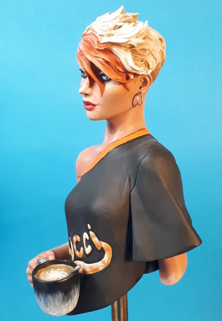
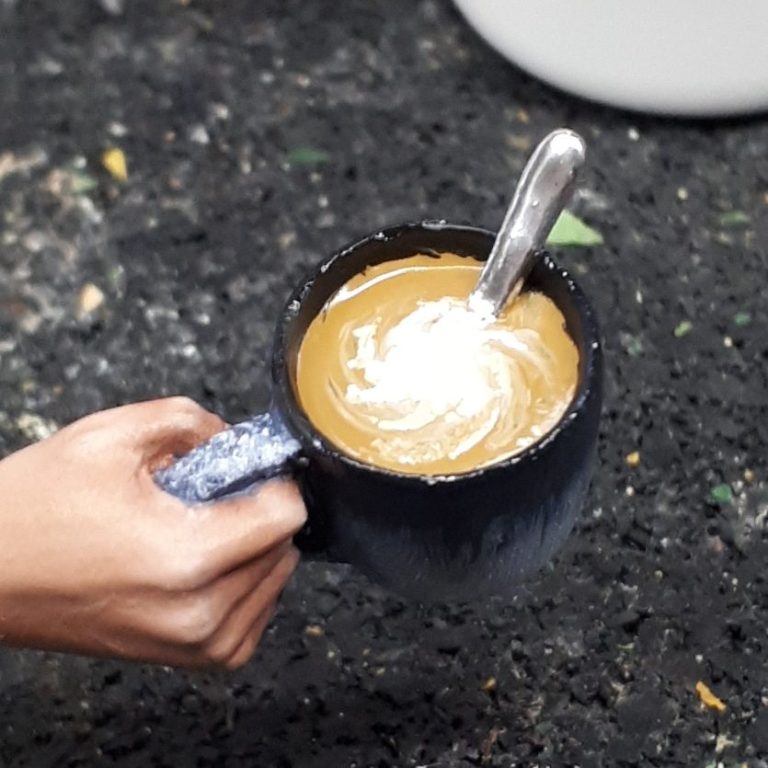
Photo #2 shows the finished cup, and it’s a gorgeous little casting moulded with the right hand and arm attached.
I wanted to depict one of our own coffee cups and the real thing along with the painted effort is shown in photo #3
It’s not a bad likeness, and was done with very pale blue oils which then had very dark blue oils added to the top edge. I used a fine brush to pull the darker colour down the sides of the cup to imitate the effect on the real one.
The coffee in the cup was painted, well, coffee colour, then a swirl of off white was added for the foam, and the spoon painted with the liquid from a Molotow Chrome pen.

Back to the main casting, and time to add the paint onto the T-shirt.
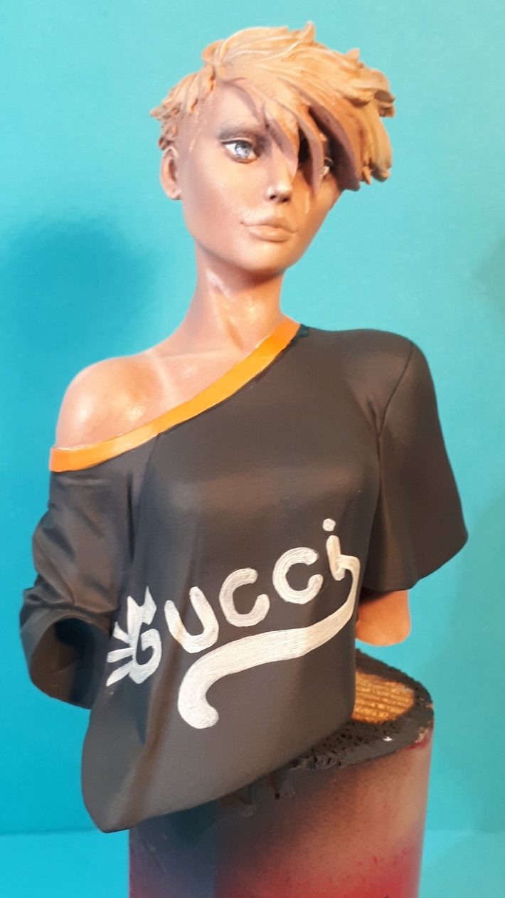
Photo #4 shows the main part of the shirt done. I used MP Black acrylics with a little Tamiya Flat Base added to make the black absolutely matt, and blended in some small amounts of dark grey to the tops of creases, shoulders and chest. But it looked a little bare and bleak. I then added the orange band around the neckline, using a couple of oil colours for this, and the shirt still looked a bit boring.
Having looked on the internet for ideas I came across two options that I liked – the Rolling Stones Mick Jagger lips, or the one I used which is a Gucci logo turned into a stylised cat.
The beginnings of that are seen in this shot, marking out the words with white acrylic and adding a second coat to get a solid covering.
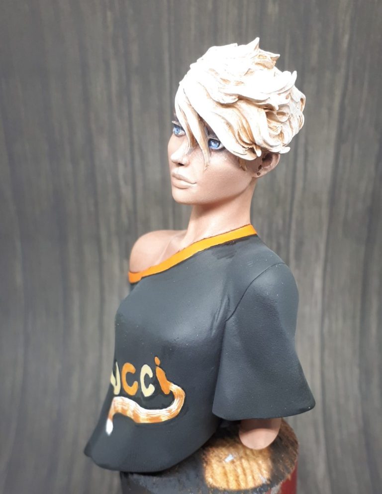
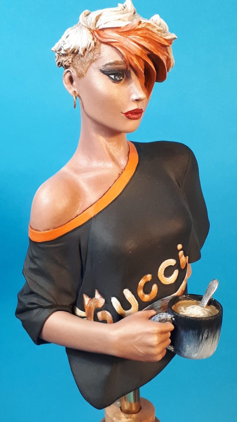
I decided on a ginger cat colouration for the logo – photo #5, adding alternate letters in an orange that matched the neckline, and the other letters in a pale yellow. The tail is the only part of the logo that had an hairy effect to it, and I painted this with bands of the two colours used on the letters, along with a white bob on the end of the tail.
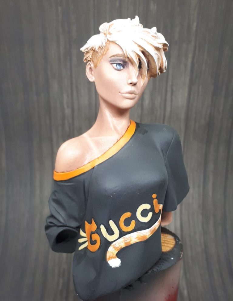
Photo #6. To match the figure’s hair in to the T-shirt, similar colours to the shirt logo were used, the tips of the hair worked up to full white, but the roots were a very similar orange to the darker logo colour.
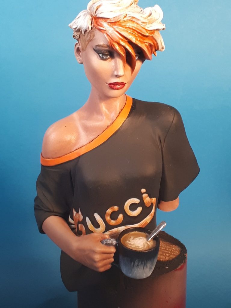
I thought that blue eyes would be striking, I know, green might have been better, but I chose blue, and these were painted with an off white acrylic for the whites of the eye, followed by adding a “U” shape of Paynes Grey to teach of the eyeballs to form the iris, inside of which I added some pale blue oils, and finally a black pupil. A line of Paynes Grey was added to the upper eyelashes to make the eyes stand out a bit more.
In photo #7 I’ve added more orange to the hair. The pale coloured paints didn’t really stand out, so I thought that a section at the front in much brighter colours would lift that area a bit. It looks shiny in this shot, and that’s because the paint is still wet.
Before the arm and cup was added I returned to the logo and gave all the letters a fur effect. It just looked better once that was done, although I still wonder if the Rolling Stones image would have been better.
I also added some smoky eye-shadow, only a hint of it to make it look like she’s tired and just got up, but she has had time to put some lipstick on – some bright red with a carmine outline.
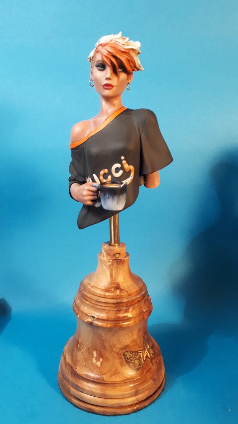
. The final shots show these, just some soft wire wrapped around a brush handle a few times, and then cut with a sharp knife to leave small rings of metal wire. These were then glued in place and painted silver.
The base is one made some time ago by Nick Tebbs. It’s a really nice piece of wood turned on a lathe with some really fine ridges in it’s surface. I think there are occasional ones available through Oakwood Studios, and whilst not cheap, they are of very high quality.
The final addition to the base was some small biscuits – McVities Hobnobs obviously, because they’re the only proper biscuit to dunk in a cuppa.
These were made with some small blobs of Magic Sculpt, with some fine sand glued to them to provide the texture.

Final thoughts.
I really do like this bust, the sculpting is spot on for a freshly awoken lass that needs her cup of coffee. It could be painted really simply, or the artist could go to town with a complex logo, and even tattoos on the exposed shoulder.
Pedro offers us some superb kits, some quite simple, others more complex, and for my sins I have several unpainted on my Grey Army shelves.
They’re a quality offering, well worth seeking out, and a joy to paint.
Unfortunately a lot of his kits go out of stock very quickly, but newer kits that area available can be found direct from him at his website :-
We need your consent to load the translations
We use a third-party service to translate the website content that may collect data about your activity. Please review the details in the privacy policy and accept the service to view the translations.