Leper Knight
90mm White Metal kit from Pegaso Models
Article in Military Modelling in 2009
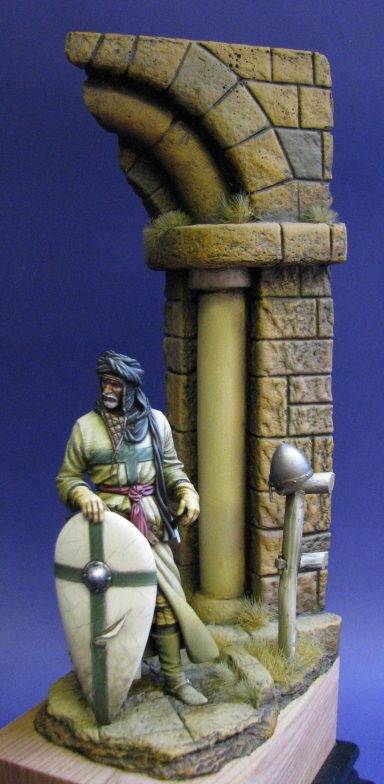
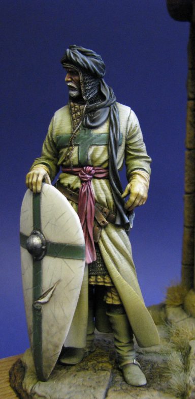
Some time ago now I found a book that details the history of the order of St Lazarus. Although I did paint a couple of 54mm knight figures to depict such soldiers during the crusades into the Holy Lands, when I got hold of this larger scale model, I felt it was time to revisit the colour scheme and review the history of a very brave band of men.
The book itself – by David Marcombe – is very informative, but a little on the dry side. It’s one for the researcher seeking information, rather than the casual reader.
It details the order’s history from the times of the first Crusades in the Holy Land - supporting the military operations of the other holy orders - right up until present day, with their good works for charity and as a non-military group.
I’m not sure I understand the way in which Leprosy was perceived in the middle ages. On one hand it’s predations were viewed as an act of god, favouring someone close to His works, and thus in His favour. On the other hand the horrible disfigurement it caused was seen as “unclean” and it’s sufferers were often shunned and forced into being either beggars, to live in closed communities or as hermits because that had been marked by the disease for their sinful ways.
The name Lazarus – for which the order was named – literally translates as “God is my help” and links back to the stories of Jesus having cured the lepers as he travelled around Judea two thousand years ago.
Whilst the poor might expect very little in the way of help if they contracted the disease, the wealthy were slightly better catered for. The holy orders in the Middle East took care of knights who became afflicted, possibly because they came into contact with the disease more and more as they pushed further east.
Leprosy had been common since Roman times and certainly when it’s sufferers reached a certain level within the holy orders, it was logical to place them together in one group, and have them cared for under one roof.
This care was funded by donations from other knights, and the first appearance of such a hospital seems to be around 1099AD.
However, not all the members of the order suffered from the disease. Some chose to enter service and were well and whole, possibly this was to support friends or family already suffering, but it might well have been for other reasons that we cannot fathom today.
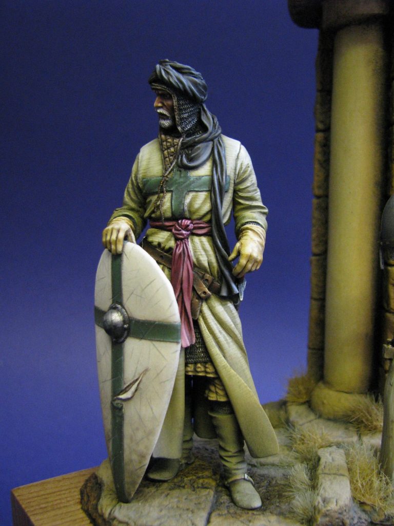
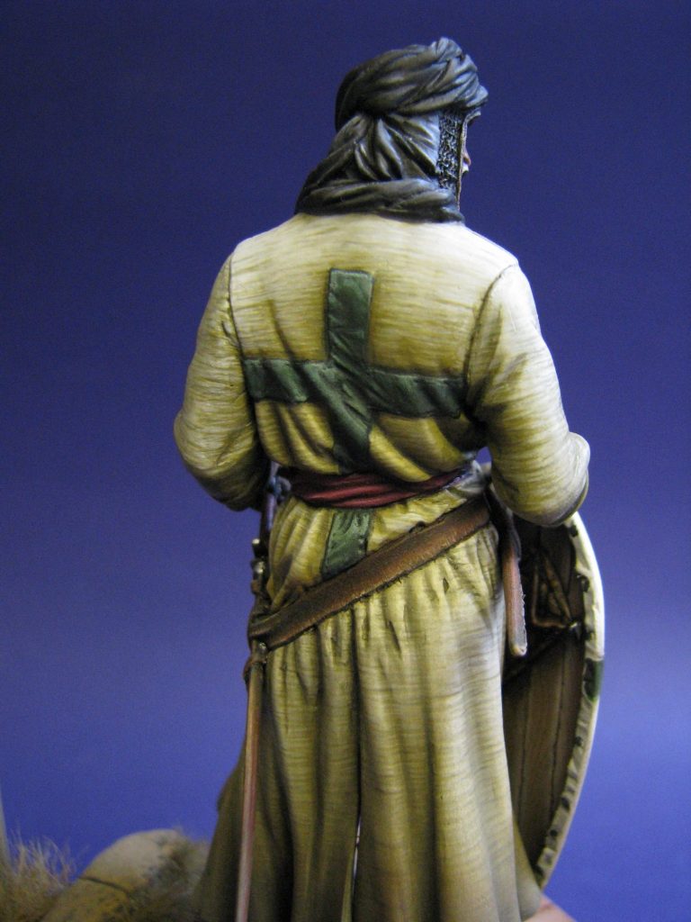
What amazes me is that knights suffering from this disease, made worse by hot and dusty conditions, could bear to go out and fight for their beliefs. Let’s be honest, faced with a debilitating illness like this, most of us today would struggle to lead a normal and peaceful life. Riding a horse, charging into battle – um, no thanks !
Having said that, in battle, the knights were not very effective. They were said, by one commentator of the day ( Nicholson ), to be “rash and almost suicidal” ( can’t think why ! ), and whilst I would never question their bravery, they seem to have been active in a lot of the lost causes and last stands that happened during the ceaseless ebb and flow of land control during that period.
The fact that they could be bothered to don armour, get on a horse or climb battlements and fight for a cause they believed in fervently is a testament not only to bravery, but the mark of some very special men.
The Model
This is a 90mm tall white metal offering from Romeo – the sister company to Pegaso – and although the box livery differs from Pegaso’s, the presentation and style of everything else is very similar indeed.
Quality to is to a high standard, although I didn’t like the rendition of the creasing on the rear of the model below the line of the sword belt, this would be my only complaint about the model. Parts fit and casting is good, and split of parts is logical and enables the modeller to paint areas before adding further layers to the figure.
There’s a lot of parts in this kit – and with the price tag being rather high now for these and matching 90mm Pegaso kits, I honestly don’t feel I could advise a beginner to tackle it. But if you’ve a few white metal kits successfully rendered and in your display case, then there’s nothing to fear from this one.
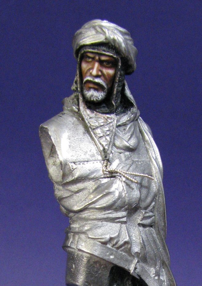
I seem to have backed away from my “Paint the face first” rule of former years, although it was done pretty early on with this particular model, the first picture here shows what a start I’d gotten off to before remembering that there was a camera close to hand – um….Sorry.
I’d just finished off the little Pegaso Samurai that I’d placed on a small bridge section, and I really wanted to have another go at the textured cloth effect that I’d painted on that. So getting to the stage where I could play with the acrylics on the cloth areas was a bit of a race.
This first shot shows the face having been done – not my usual mix of oils, there’s more Burnt Umber being used in the initial mix to darken the skin a bit – thus giving a sunburned appearance to the skin. To hint at the brightness of the sun, there’d be painted shadows at his feet and on the ground under that surcoat, but that would be getting ahead of myself now – so I contented myself with some very harsh highlights on the face, working to almost pure white so that the skin appears to be reflecting the light more.
The metal areas of the mail have been undercoated and given an initial wash of Mars Black oil paint to bring out the detail. More Mars Black would be added once the lower areas of the surcoat had been glued in place; again this was to hint at the bright sunlight that the figure is standing in.
The boots – actually a pretty pointless exercise in painting an area, as the dusty effects almost completely blot out the effects I gained there. I used an initial coat of a very dark brown acrylic – Chaos Black and a little Vermin Fur ( Games Workshop colours ), and then gradually worked through half a dozen different brown colours to a final to a mix of Orc Brown and Skull White.
Rather than use a brush though, I used a small corner of the sponge that comes as packing material in the Romeo box. This tends not to get into the creases of detail much, but does add a speckled effect very similar to cracked and creased leather, and looked very, very effective once I’d finished. In fact the photos can’t possibly do the effect justice, you’ll just have to believe me…….full in the knowledge of course that the dusty paints applied after have completely masked the truth of the matter.
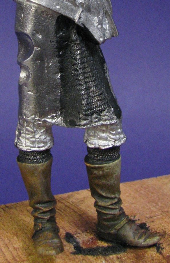

Oh, it’s O.K. I can hear you chuckling about it out there dear reader. The truth of the matter is that it did look very good. The most irritating thing being that the very best area of the effect was hidden by the bottom of the surcoat as I test fitted that in place ( on the back of his left boot actually ), so I knew I was on a losing streak even before I got the airbrush and the dusting powders anywhere near him.
Never mind…..
Photo #2 shows the quilted areas at the lower legs getting painted. I began these with an undercoat of Vermin Fur ( GW ), you can see this on the figure’s left knee. On the right is the same paint with a coating of Burn Umber oils applied, and on top of that I’ll be blending in small amounts of Light Red and Titanium White to build up mid-tones and highlights.
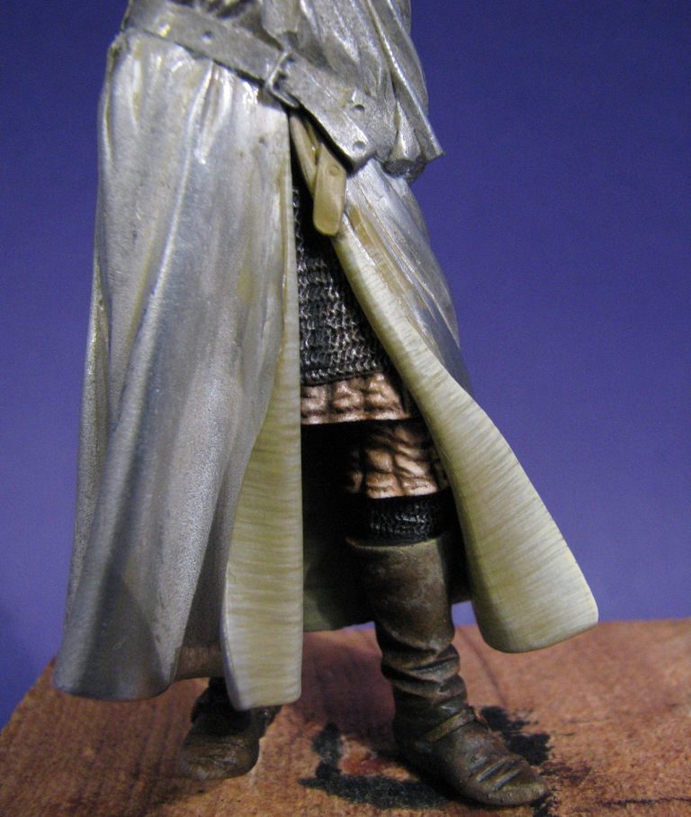
The end result in seen in photo #4 ( yes, I know I’ve jumped past photo #3, don’t worry, I’ll sort out that in a minute ). Once the quilted area had dried, I returned with some thinned Burnt Umber and added the deeper shadow detail for the stitching and some of the deeper creases. This all had to be done before adding the lower sections of surcoat, although those pieces were test fitted to see where the shadows would be cast onto the quilting, then removed so that those shadows could be painted in with the dark brown.
Now for photo #3. I’d done a little bit of thinking as to how the surcoat of a moderately well off knight might be made, and thinking that the cloth would probably be decent quality, but was going to be worn most days, and on top of greased armour, it would most likely be durable and coarse, but also fairly workmanlike. So, no silk linings here my friends.
I tried for a darker colouring than would be used on the outer areas of the same cloth, and began with a mix of Kommando Khaki ( GW again ), and a little Chaos Black acrylics. I built the solidity of colour up with three thin coats of this, then began adding a lot more water and a little more of the Kommando Khaki to the mix, and with a fine brush, began adding very thin horizontal lines.
The paint to water ratio is really small, the pigment wants to just about be adding colour to the surface of the model when you’re adding the third coat of it to the area being painted. To be honest, this is a method for the miser with loads of time on his hands, as the amount to paint used out of the pot is miniscule, and each area would probably account for ninety coats of paint ( probably more as I gradually lost the will to live ! ). So if you’re one who possesses small amounts of patience, then you’ll just have to learn to curse interestingly…….or use a different method. Because honestly, this will eat up your time.
The whole surcoat was done in this way, and I’m no slouch with a brush – I can do a decent face in half an hour – an hour and it’ll be really good. The whole surcoat took me six weeks, working 20 hours a week on it in an evening……….Now d’you see what I mean ?
On balance, I like the effect, the final touch is to bring the colours together with the addition of two or three very thin washes of a fairly dark mix of the original colour; and to be honest this is stressful, because if the mix is too thick, or those unsightly pools of paint that dry with a watermark ring appear, then it’s a paint stripper job and start the whole thing again. Hence thin washes from a brush that is only slightly more than damp.
So, having completed the surcoat, all the wind had gone out of my sail. It looked good, but to be honest I’d only really wanted to see if it could be done, and if the effect looked better on something that was a larger scale.
The figure spent a couple of weeks in the drying cabinet…………What for ?
It was acrylics and was dry before it went in there ?????
Anyway, I’d better run through those numbered shots for you – well, they’re there for a purpose. Photo #4 shows the inner surcoat completed and in position over the legs. The mail areas have been darkened as mentioned to give the effect of shadow areas being cast by a bright sun overhead. Can you see that lovely cracked leather effect on those boots too. It was better at the back of the right boot, but make the most of this, it’ll be hidden from view soon !
I’d also painted the back of the surcoat that can be seen between the figure’s legs. Although not perhaps obvious when looking at the parts in the box, this area is very easy to see on the completed figure, but it’d be a real beggar to get a brush to once things are assembled and glued. So it’s better to get a brush to it before that happens, and can also be seen ( barely ) in this shot.


Photo #5 shows the upper body being painted with the acrylics. The transition from dark paint to lighter colours is very gradual, but as it builds up, it is used to not just show the weave of the cloth, but also to mark out the creases of the material as it folds around the body of the model.
The very bright undercoat for the green cross is in place here too. It was the only green I had to hand, and would be covered by a few layers of oil paint.
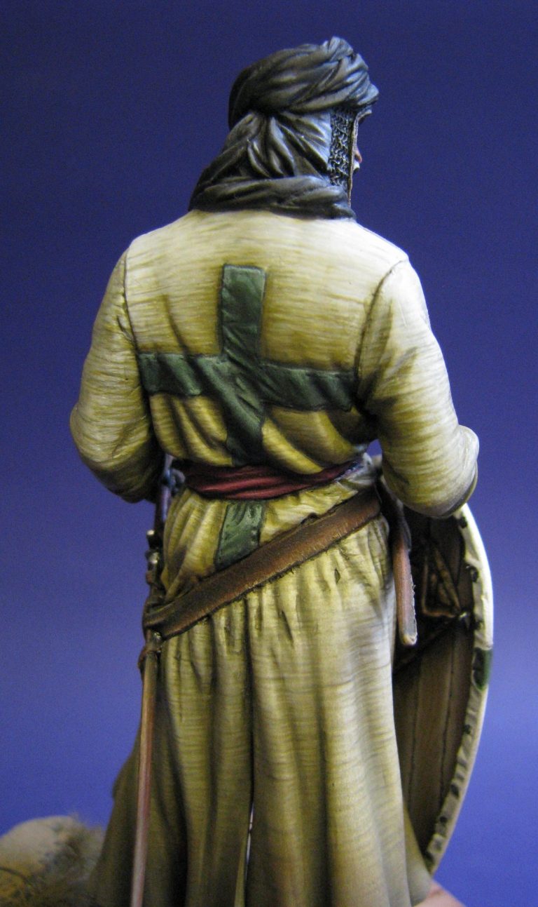
Photo #6 shows the back of the model – more lines of colour……Lots and lot’s of little lines in fact.
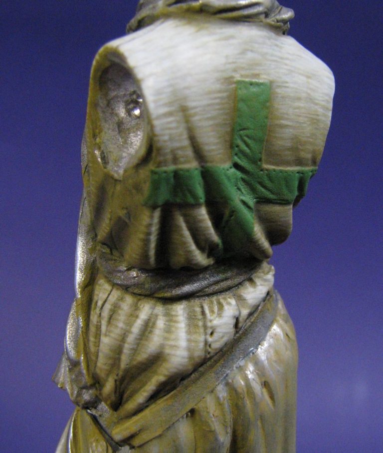
And more little lines in photo #7. It takes you a lot less time to look at it that it did me to paint it, but the different shots do ( hopefully ) show how the paint is being built up to give both texture and contrast to a relatively flat area. At this point on this area, I’m about half way through adding the paint. The colour used is still relatively dark and you can still see a lot of the basecoat colouration. The reason for doing this in such a laborious way, rather than just doing it on the last couple of coats ( as suggested by one modeller trying to get his head around why someone as relatively intelligent as me – or perhaps just a good actor – would go to so much trouble ), is that even in the shadow areas, the cloth appears textured to the same degree as on the highest highlight. For that to happen, the texture effect has to be painted on right from the beginning, and that means working from the darker shadows, right through mid-tone to the brightest of the highlights.
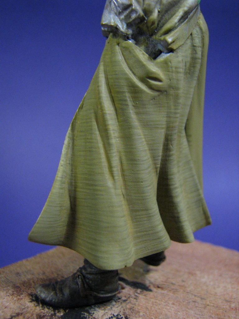
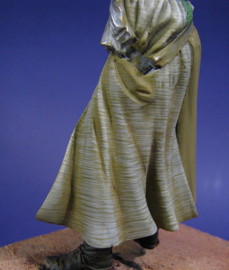
In photo #8 we’re getting to those highlights, and although the colouration now looks too bright, this will be toned down with the finishing washes of a dark mid-tone. You can see this has happened if you compare photo #8 to photo #9, where although the bottom edges of the surcoat have been darkened with Burnt Umber for a muddy / oily effect ( see the thoughts on greased armour earlier in the article ), the upper areas have a more blended look to them.

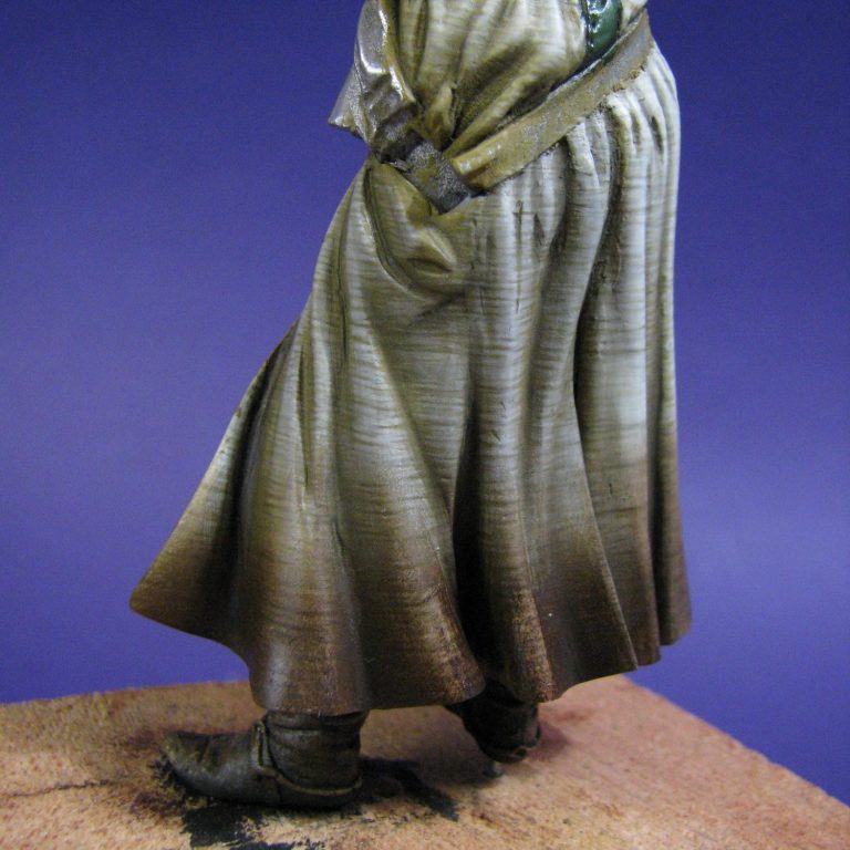
Photo #10 might show this better, although I agree that the Burnt Umber is a bit overdone ( Once the arms were added, jokes about him looking like a Quad-biking Crusader abounded from a couple of friends ), but again, I was merely thinking ahead of what other paints would be added, and that this layer of dark paint would probably be lost, or at the very least heavily toned down, once the airbrush and weathering powders came out to play.
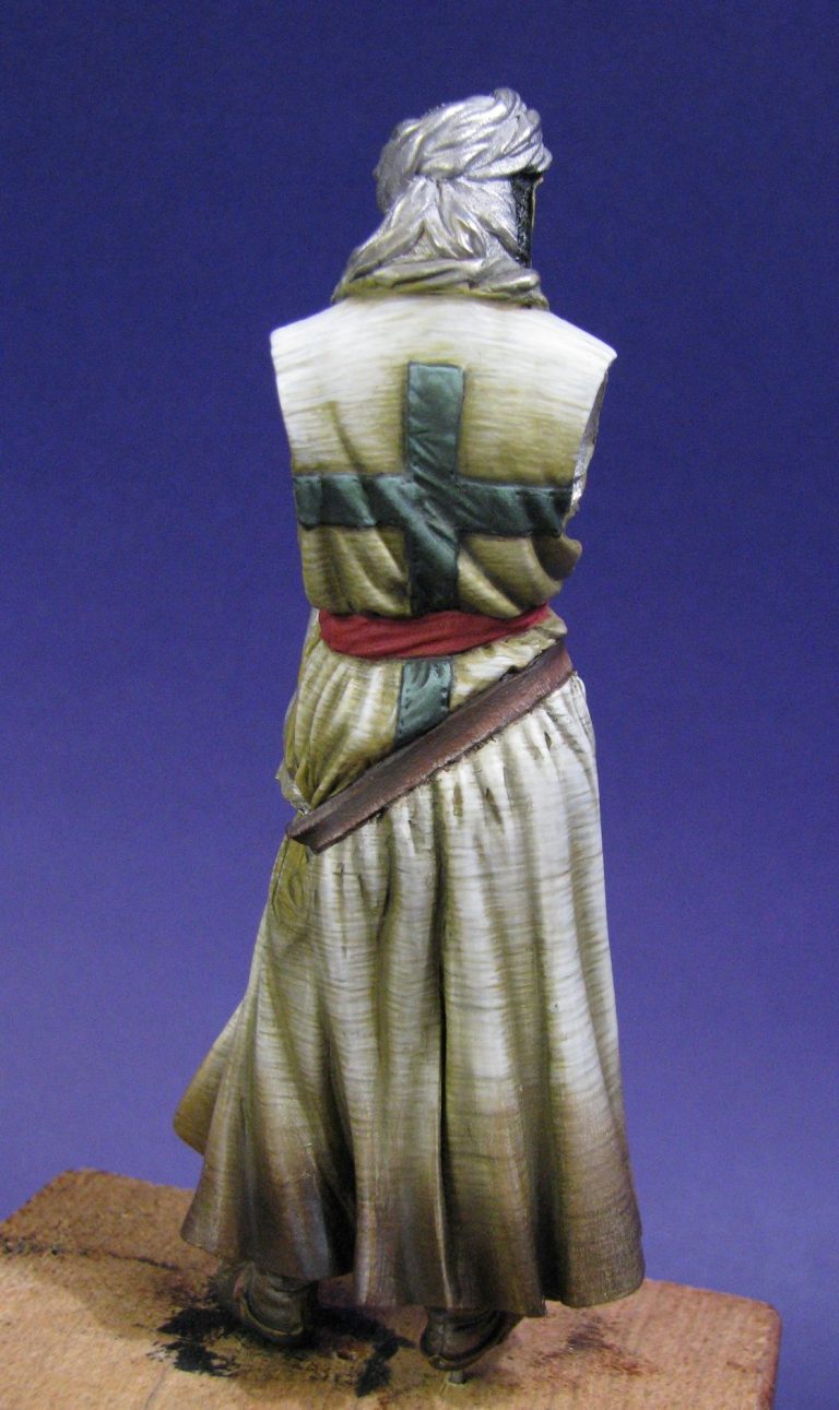
In photo #11 the Burnt Umber areas of weathering don’t look quite so bad – certainly with the rest of the clothing being light - the dark colour of the brown gets toned down a bit. Also shown here is the cross on the back – finished in oils over and undercoat of acrylics. I’ve emphasized some of the creasing that passes through the cross itself and is continued on the surcoat. This is sometimes difficult, as the sculptor might not have managed to put the creases in accurately, but in this case, I’m happy to say that the sculpting helps the painter, and that the folds and creases flow naturally through the raised design.
Having so far managed to stay away from any bright colours on the model, I felt that he was looking particularly dull. I knew that I would struggle to use anything but very dark or very light colours for the head cloth, because at the end of the day, the item has a function – that being to keep the head cool. So it’d have to be either a pale cream or white; or go to the other extreme and paint it brown or a dark charcoal grey.
In this I saw a problem looming. The figure was going to look rather dull. There was no colour to him, and no matter what else I did, if I didn’t add one splash of bright colour, he’d fade into the background, both in the display cabinet or on the show bench.
My production levels in the last twelve months haven’t been as high as they might, although I do feel that the quality has risen. However, looking back at a lot of the models I’ve painted, particularly fantasy ones, I seem to have a bit of a fixation with pink………Not very manly I admit, but as a bright colour that catches the eye of the observer, it does seem to work.
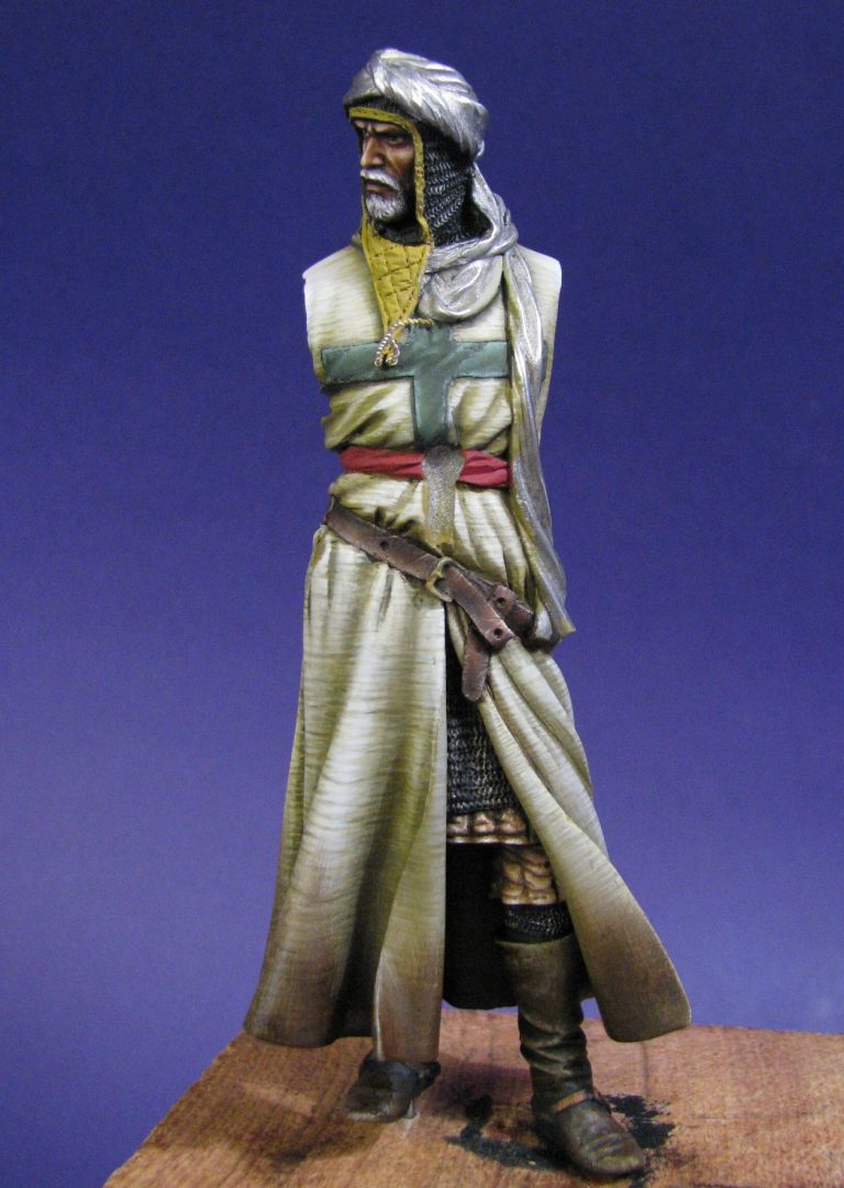
So the last possible area that I could use a bright colour on was the sash. This I’m afraid was going to be pink……Sorry, ( and changing to a gruff, manly voice ), I mean a light red.
It doesn’t really matter what you call it, because it begins here in photo #11 as an undercoat of those wonderfully useful GW foundation paints. Acrylics with such dense pigment that they cover evenly within two or three thin coats. Over that – in later shots would be an oil coat of Carmine ( with just a dab ofOxide of Chromium – green to you and me ) added to darken the red.
To build the mid-tones and highlights I would then add Titanium White in very sparing amounts and blend this in to the red paint whilst both were still wet, so that the colour change was gradual and smooth.
No, it’s not happened yet in photo #12. That’s just showing the front view of the figure at the same stage as in photo #11 !
And photo #13 shows the shield. It’s photo #14 you’re needing to look at for the nice pink….sorry, light red, sash.
The shield. Yes, I’d better go back to photo #13.
I had made a couple of changes to the shield prior to adding paint. These ran to putting a couple of cuts into the front surface and adding a little putty to form the cloth flaps where a sword or axe has damaged the covering and it’s come adrift from the wood. Bearing in mind that the cloth would probably be applied to the wood with some form of animal glue ( probably derived from boiling the bits that aren’t edible – sometimes reference gets a bit rank and one just has to say “don’t go there”. For me, the rendering of animal fats and bones to glue is one such point ), so if glue had been used, damage would be limited regarding the cloth pulling away from the shield face and the flaps wouldn’t be all that large.
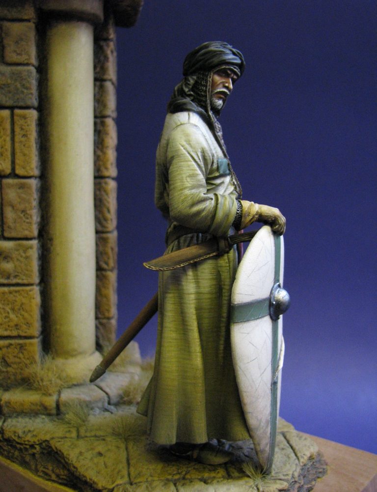
Basically, the shield was painted along the same lines as I usually paint clothing – using oils over acrylics and gradually blending one colour into another. The mix for the white areas was Naples Yellow and Titanium White for the mid-tone, and by adding Raw Umber a shadow colour was built up. More Titanium White was used to get the highlights, adding this whilst the mid-tone was still wet, but also going back to the shield after it had dried fully and touching off the highest highlights with pure white.
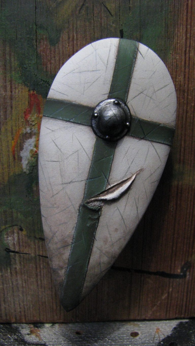

Once the final highlights had been added to the white areas, I used some very dark brown – Burnt Umber and Mars Black mixed 50:50 ) and a fine brush, to add very thin lines to the shield front. These were made to look like the damage from an edged weapon that has hit the surface, but not made a heavy impact. I added these in logical sweeps that would come from predominantly right handed opponents trying to slice our man with sword or axe, and working on how the shield would be held to best defend our intrepid knight.
Now the back of the shield.
This was one of the best I’ve ever done ( I think, if you’ve read a few of my articles, you’re probably well aware of what’s coming next……). But to continue…Yup, one of the best, if not THE very best limewood shield back I’ve ever rendered. And now it’s in place, it can’t be seen by anyone…..And I forgot to take pictures……D’oh !
Seriously, it was rather good, and I was pleased with it. I was hoping that it would be a little more visible – which is why I spent a reasonable amount of time putting detail in with the paint, but unfortunately the lower half of the figure hides it very effectively.
So there’s not much point in me telling you how it was done, other than it was with a relatively large brush using oils, followed by putting the finer grain detail, along with knots and other imperfections into the “wood” with a good quality, fine pointed sable brush. It’s a fairly quick method too. I’ll just have to do a little article about painting wood surfaces sometime…….And apologise profusely here for my complete lack of memory regarding pointing an pressing a button to take a shot at opportune times.
Photo #14 we’ve dealt with, and photo #15 just gives a different angle of the figure at the same stage. This shot however got him dubbed “The quad-biking Crusader” simply because he looks like he’s holding the handlebars of a bike, and the lower hem of the surcoat is still that strong brown colour.
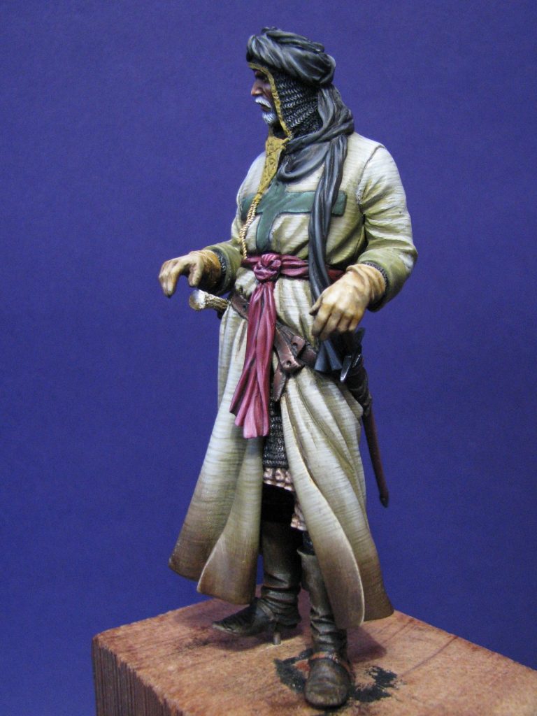
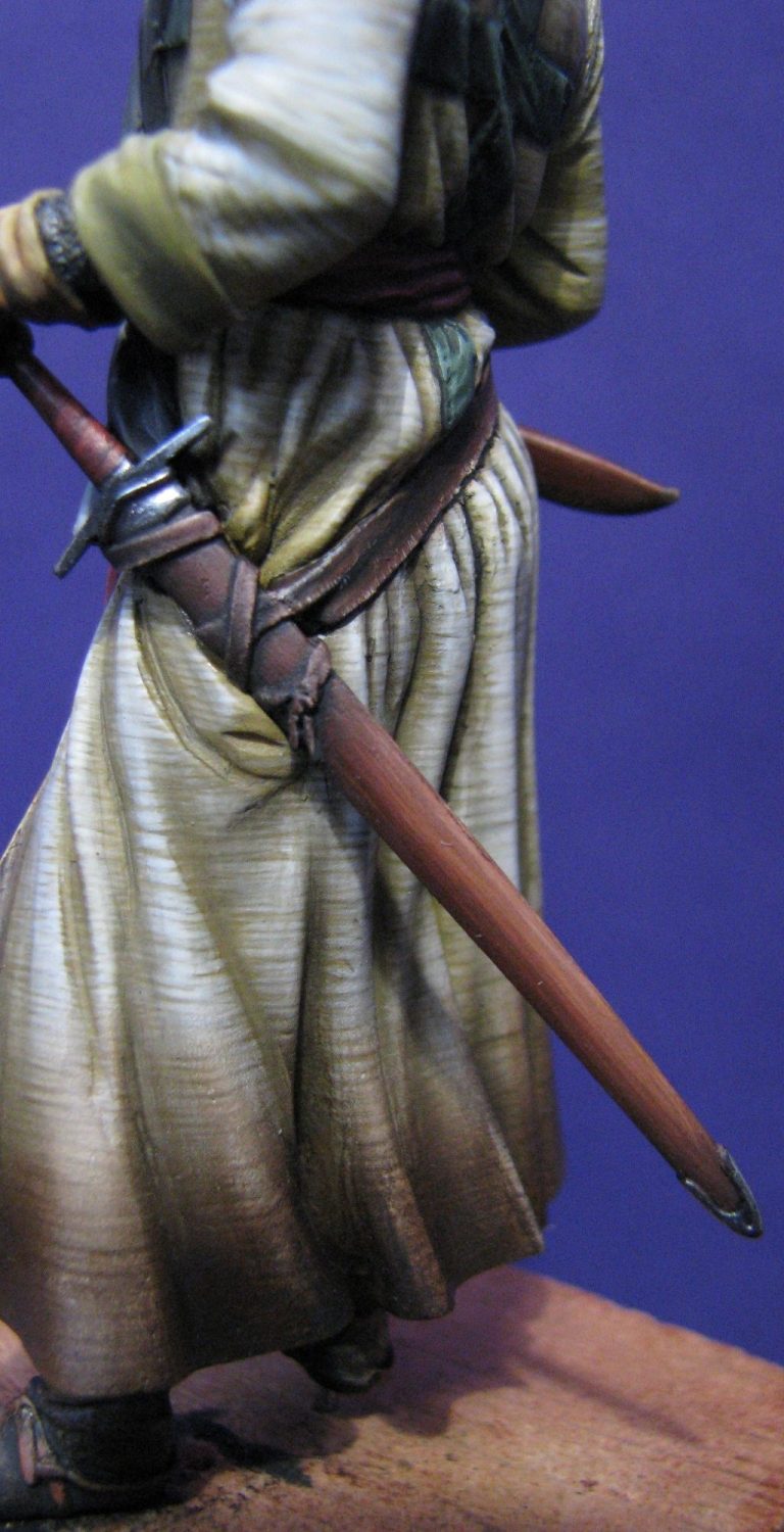
For something different, I thought I’d paint the scabbard to appear as though it’s made of wood – photo #16. I’ve seen lot’s of fancy leather covered ones rendered in model form, but odds on, the scabbard was formed from two pieces of wood, either held in place with glue, or bound in place with leather strips or a leather cover.
It’s not often that model painters show one made of wood, in a very basic form, so I thought our man would have something just that little bit different. The colours begin with an undercoat of sand coloured acrylic ( three thin coats of this ), followed by a coat of Mars Brown and Mars Black oils, undiluted, and brushed on so that only a little of the sand colour undercoat is visible. Rather than trying to form mid-tones and highlights, Light Red, Yellow Ochre and Titanium White are used to build up the appearance of wood grain. This is done by using the different colours in undiluted form, and applying them with a good quality sable brush and allowing the individual brushstrokes to remain visible to the eye.
There is some necessity to leave the darker colours on lower edges and around the places that the leather belts cross the wood, and in contrast to have the lighter colours on the upper edge, but the method’s most important ingredient is to use few strokes of the brush, and be confident. The more you try and “paint” the area, the more the colours on the part will mix; and it’ll just end up a mess. The good thing is that washing the area gently with some White Spirit will get rid of mistakes, and by the time you’ve made a cup of tea or coffee, the part will be ready for another try with the oils.
With the model nearing completion, it was time to consider the scene. I imagined our knight on guard duty at a gateway, but finding something of applicable scale seemed nigh on impossible. In fact I couldn’t source a reasonably priced gateway or arch anywhere.
So I thought I’d have a go at making one.
With plenty of pictures of medieval gateways, I considered what size I should begin to plan for, and then saw one of the reasons as to why no-one is insane enough to make such groundwork accessories.
Bearing in mind that lots of knights tended to ride horses, and dismounting to ride through a gateway is impractical, not to mention a pain in the rear after a couple of goes, gateways would tend to be tall narrow affairs, or tall wide affairs…..take your pick.
I watched Kingdom of Heaven a couple of times too – look, the mechanics of getting a chap on a horse work, whether he’s wearing the right clothes or not !
So, a big arch.
Photo #17 shows the pieces of foam-board I’d cut to rough shape and glued together. It’s not pretty, and blue is probably not an accurate colour for medieval stone – in the Holy Land, or anywhere else for that matter. But with a covering of Magic Sculpt……..And some paint……
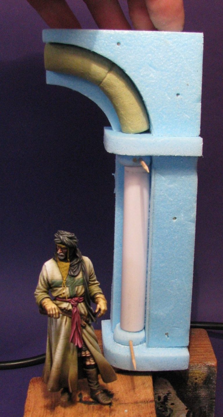
Now people watching this process, possibly peering in my workroom, might at some point have seen a little light bulb come on above my head. No, I didn’t need the extra illumination !
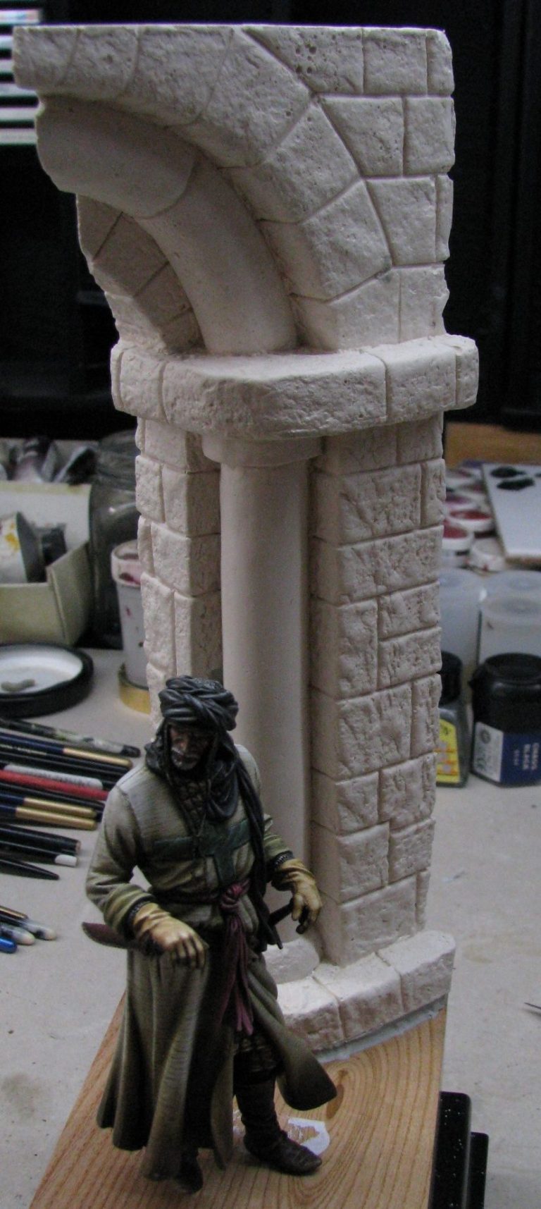
If I’d struggled to source an arch in this scale, then maybe others had done the same in the past. Maybe they’d still be doing that in the future…….Maybe, if I was quick, and could restrain myself from adding paint onto the Magic Sculpt arch, maybe I could be patient enough to make moulds of the arch, and cast some from plaster, or resin, and, and, and…..
So in photo #18 you see a nice white Dental Plaster arch – how wonderful is the magic of article writing, because it makes such things seem simple and quick.
Also, Malcolm Cuming ( He tells me he’s a friend, but he comes up with some ideas that make me work darn hard………), suggested that an opposing half arch would be splendid - not least because you’d be able to join the two together and make a full arch. ( You see what I mean, he’s a harsh taskmaster ! ). So, yes, an opposing arch section was made, and moulded. Both now are for sale under the Bash Models banner at El Greco Miniatures – address at the end of the article.
Because the half arch here was now made from plaster, I could cut it to alter how it sat on the wood plinth, trimming off two faces of the back of the arch, so that it allowed the figure to take centre stage, but at an angle to the front face of the plinth.
I used some Milliput and some 2mm thick wire to fasten the arch in place and bed it down onto the wood plinth, then made some rough ground at the front of the arch, and some damaged paving going under the arch itself.
The damaged paving was necessary, because the figure is posed on a slight slope. Well that’s the reasoning behind him having one foot slightly raised compared to the other foot, so I had to make a depression in the road to take this into account.
Photo #19 shows the putty being formed up, I used a small stone to add the texture, and the brown speckled paving slab, just of centre and towards the back is the lowered area for the left foot to locate in. Also visible are the holes where the wire pins in the figures feet will slot through the putty and into the wood plinth.
See, he fits !
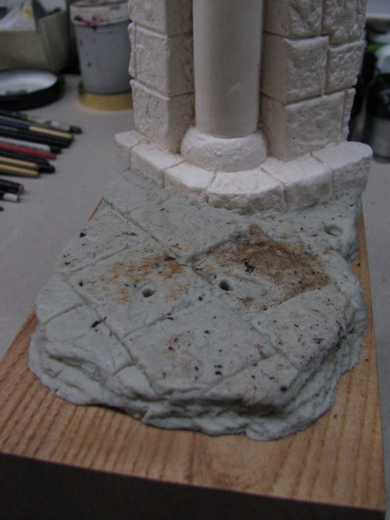
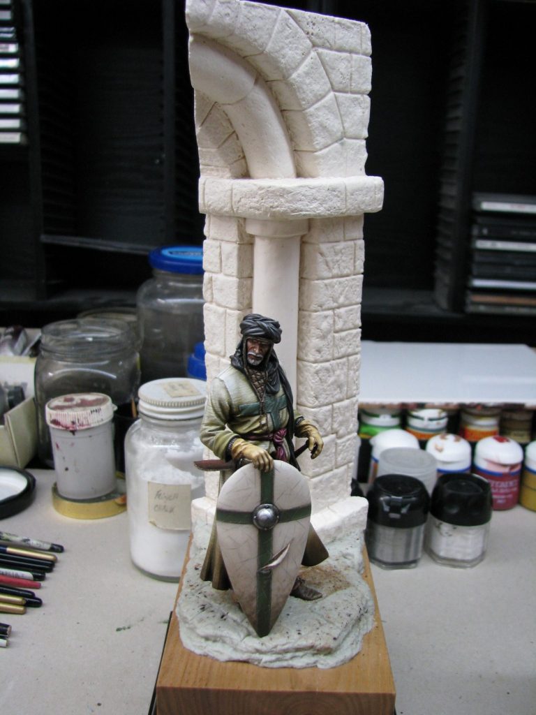
Always worth checking as the putty cures, is that the figure still fits in place – photo #20. Perhaps not so much of a problem with smaller figures, where the putty doesn’t shrink quite so much, but at this scale, it’s worth checking about two or three hours after the putty was mixed, to see that the feet still locate well with the groundwork, and that there’s no gaps.
Regarding this figure, it’s important too, that a very slight dimple is made for the bottom of the shield. It wouldn’t cause a depression in solid stone – neither for that matter would our knight, but getting a good solid location is worth losing half a millimetre of the bottom of the shield tip.
In photo #21 I’m undercoating the arch. I’ve primed it with three coats of White Glue, mixed with water so that the liquid is somewhat like milk in consistency.
You can tell when the plaster is sealed, because it has a slightly glossy appearance, and a waxy feel to it when you pick it up.
This stops the paint soaking in, and gives a better finish to the overall model.

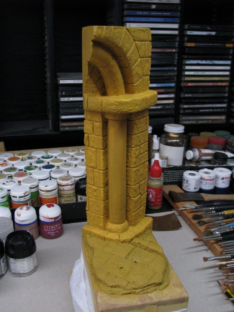
Photo #22, and the whole arch is covered. There’s three coats of acrylic been applied here, and you can still see a difference between the colour of the putty groundwork, and the arch itself. This would be hidden by subsequent coats of paint; but for now, I added different colours to the individual blocks on the arch and on the paving stones – again using acrylics.
These different colours can still be seen in photo #23, although a coat of Burnt Umber oils has been added ( undiluted ) to the archway, and then the excess paint removed with a soft cloth. I use a dabbing motion to remove the paint, and different areas can be brought out by removing the dark paint from the lighter undercoats.
It appears very shiny, and very bright still, but as with the weathering on the figure, I was planning on using MIG powders and some Tamiya paint ( airbrushed ) on the model to dampen any glossy finish and kill some of the more vibrant colouration.

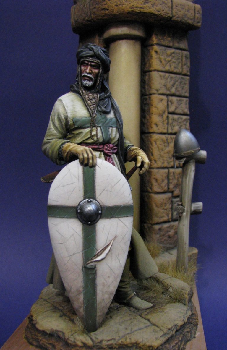
That’s what’s happened in photo #24, the sandy, dusty colours being used to layer the model with grime, and to give a dry, dusty feel to the whole. It also ties the model to the base, the pale colours transferring from the groundwork to the figure itself, and hopefully giving the onlooker the feeling that it’s hot, dusty and dry, and I’d really like a cup of water please !
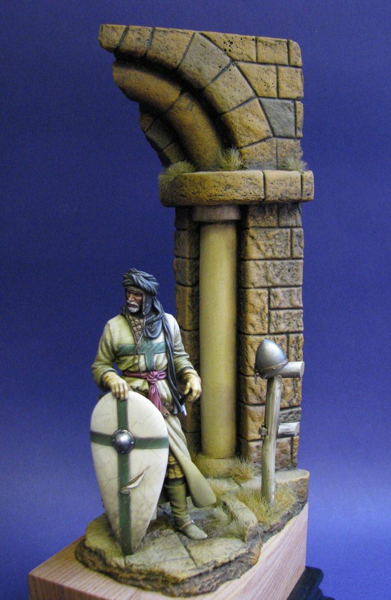
I’ve added some tufts of grass to the groundwork around the base of the archway and in between some of the cracks, plus I used the original post / fence from the model with his steel helm atop it on the figure’s left hand side.
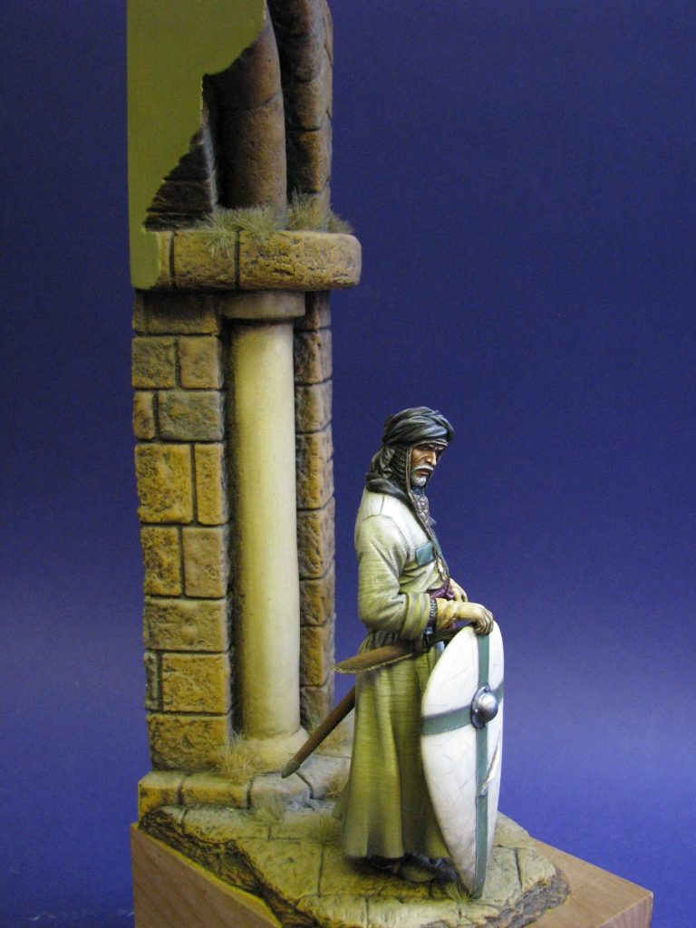
The rest of the shots show a “walk-round” of the figure and arch from different angles ( hey you might just catch a glimpse the back of that shield !! ), and showing just how much of the work gets hidden or lost by the final application of dust.
It’s a pity to lose such work – the boots for example just look dusty now, rather than the finely spotted and worn leather effect that I’d painted, but I know it’s there, and if the observer looks really carefully, it is just visible below all that dust and grime.
Conclusion.
I really liked this piece when I started it, but the method of painting the fine lines did wear me down somewhat – upwards of ninety coats of paint on that surcoat, and six weeks to paint just that one area of clothing, it’s a tad much to be honest. But I like the effect.
Unfortunately, I think it shows up some of the shortcomings of the sculpting though, the area at the back of the figure under the sword belt, and the folds on the arms, particularly the right arm, could have been better. They’re not awful, but not as good as on the rest of the figure.
Although this is a complex kit; the pieces slot together well, but will have to be painted in a certain order – if you’re going to make things easy for yourself – to be able to get a brush to all the visible parts.
So possibly not a piece to be tackled by the beginner, but one worthy of consideration if you’d like a nice, time consuming project that’ll look good when it’s finished.
I’m pleased I made the arch; for all that I’ve heard comment that it’s too big and overpowers the figure.
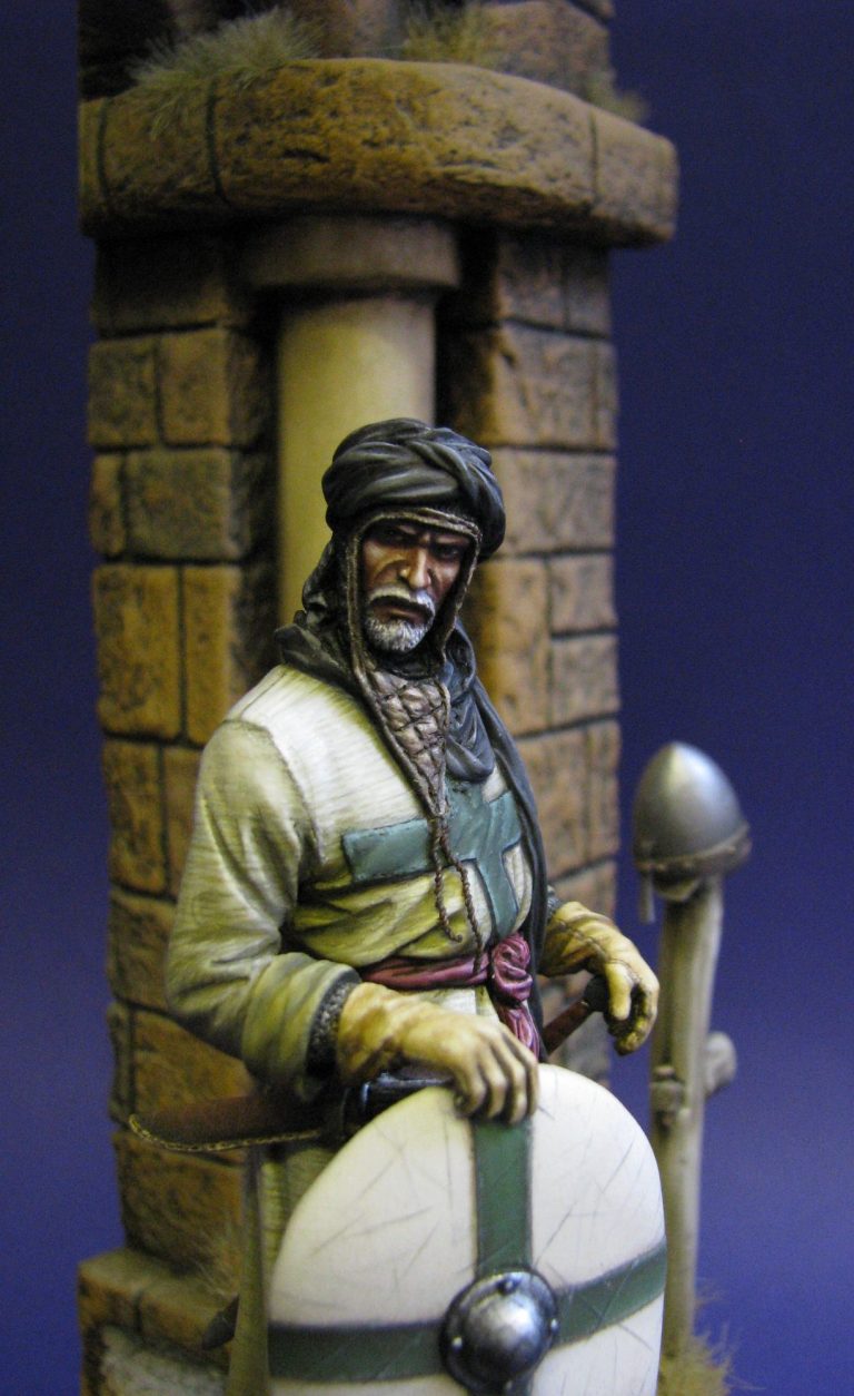
Artistically, that may well be true; but Medieval architecture tended towards big thick walls, big thick gates, and windows designed for the egress of an arrow, more than for allowing light to enter. Well on castles and city walls at least.
The usefulness of having a mounted man be able to enter or exit would tend to have the obvious advantages and disadvantages, but making this to a scale that a mounted figure could pass under it, albeit that he’d have to duck a little ( I saw it done on Kingdom of Heaven ), does make it of a manageable size whilst retaining it’s accuracy.
So, a pleasing figure; with a large lump of groundwork. What’s next……..
References : Leper Knights – David Marcombe ISBN0-8115-893-5 ( in particular the references about colour for shields on page 27 ). Also the Order of St Lazarus website – www.stlazarus.net/
Kingdom Of Heaven ( Directors Special Edition )
Figure available from
Historex Agents. Wellington House, 157 Snargate Street, Dover, Kent. CT17 9BZ U.K.
Tel. 01304 206720
E-mail Sales@Historex-Agents.co.uk
Website www.Historex-Agents.com
Half archway ( Plaster ) available from Bash Models - ( ebay seller ash0040 ) priced at £19 each plus shipping.
Right or left handed archways are available, or a full archway for £35 plus shipping.
Also available here - please use the contact button.
We need your consent to load the translations
We use a third-party service to translate the website content that may collect data about your activity. Please review the details in the privacy policy and accept the service to view the translations.