Nakano Takeko
90mm Flat Resin Figure from Roy Hunt
Painted in 2007
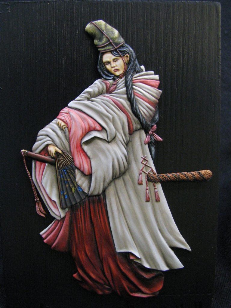
If you've been in this hobby for quite a while, then you probably heard about Roy’s death at the end of July 2007. He was much too young and talented to be leaving us, and truly a gentleman within this hobby.
This is one of the models he sculpted some time ago, a lovely little flat figure, and one that I managed to finish just before he passed away. I hope he had chance to see it, but I know he didn’t get to see how it was displayed – a shame, because I have tried to get around years of my own frustration as a photographer with how flat figures are placed in frames behind glass. But more of that later.
The History Bit.
Although Roy didn’t specify whom this flat depicted, I’ve picked perhaps a lesser-known martial arts woman who died during the defence of a castle in the latter half of the nineteenth century. Nankano Takeko was one of several notable female warriors in Japanese history. She lived relatively recently, being born in Edo in 1847, and daughter of Nakano Heinai – and Aizu Official.
She received very in depth training, and was adopted by her tutor – Akaoko Daisuke. She worked together with him during the 1860’s as an instructor of martial arts, and she entered the Tsuruga Castle – the seat of the Aizu domain - which was soon to be besieged by the joint forces of the Satsuma and Choshu domains.
This was part of the Boshin War, and the siege of Tsuruga castle took place in 1868. The Aizu had been abandoned by their allies, and were fighting alone, their withdrawal to the castle the final death-knell of their impending fall from power and grace.
The Aizu were noted for their training and having a standing force of over 5000 men, it’s army being used to quell uprisings in the northern territories. They also had a force within Kyoto, the commander –Matsudaira Katamori – was given the office of protector of the Kyoto area, and this caused the rift with the Satsuma and Choshu
With power changing constantly in Japanese politics, Katamori had to withdraw to Aizu when the Satsuma / Choshu gained control of the Imperial Court, and “punishment” of the Aizu peoples was deemed necessary by the affronted Satsuma / Choshu ministers.
In autumn of 1868, this culminated in the siege of Tsurugu castle where a month long siege took an awful toll on the defenders, with their eventual surrender to the attacking forces.
The surviving samurai were sent away to prisoner of war camps, and the Aizu domain, as it had been known since the mid 17th century, ceased to exist.
In amongst this battle, Nankano was known to have actively fought with the defenders, using her preferred weapon – the Naginata, a long-bladed spear.
During one attack, she received a serious bullet wound to the chest, and rather than have her head taken as a trophy, begged her sister to decapitate her and bury it somewhere safe.
This was done, and a monument was built in Nakano’s name at her burial site in Hokaiji, where even today at the annual Aizu festival, a group of girls clad in Hakama and with white headbands take part in a procession to remember and celebrate the actions of Nakano and her band of female warriors.
Worthy of note – the term “Female Samurai” is a misnomer, because “Samurai” is a gender specific male term. The correct term to describe a woman trained in martial arts would perhaps be “Onna-bugeisha” – a woman of the Buke class who had been trained to use weapons. This terminology also carries over to the “Onna-Bushi” which again is using “bushi” incorrectly because that word is male gender specific too.
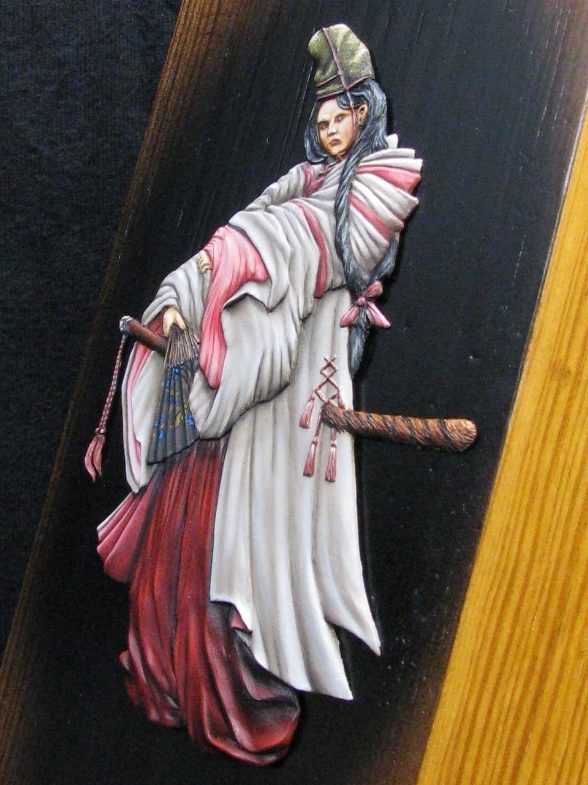
The figure.
Flat figure subjects are, whilst being very similar to round figures, also a world away - from a painter’s point of view. Initially the painter might think that being able to force the viewer to look at a model from one angle only would make life so much easier – that painted effects could be forced and played around with, and that this would make rendering any subject a doddle.
O.K. think again.
Because to be honest, that’s what you really have to do with any flat subject. You really, really have to think about what you’re doing.
For a start there’s the light source that will be illuminating the model. I’m not talking about the lamp you’ll paint under, nor the spotlight you have in your display cabinet. No, it’s the direction an imagined light-source will be coming from that will cause the shadows and highlights on the subject – and basically this starts the process of you thinking like a picture artist, rather than a modeller.
Once you start painting, you have to constantly think in three dimensions, and get what you paint in 2 dimensions to mimic this. So for example where an arm disappears up a sleeve, you have to force a shadow to depict the depth of space into the tube of cloth……..sound’s easy, but I don’t think it is.
So that’s all going to be discussed. I’m not going to even go towards the subject of cast shadows – I haven’t mastered them yet ( Oooooh admission from Hopwood that he can’t do something ); I’d really like an expert to submit an article to Ken to show us how it’s done.
Let’s look at the figure now – it’s a beauty.
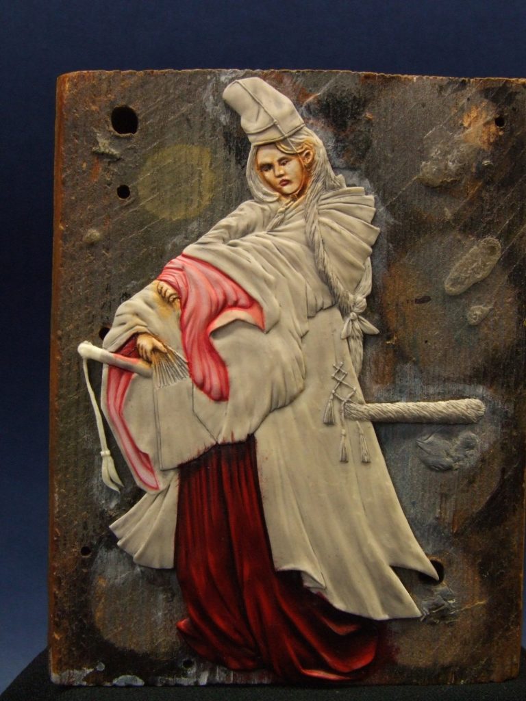
Photo #1 shows the resin casting having been fastened with Blu-tac to a wood block. The Blu-tac is enough to hold it securely during the painting process, and the block of a comfortable size to hold in one hand, with enough space around the edges of the figure so that she doesn’t get knocked or scratched accidentally. I’ve primed her with some acrylic paint – a mix of flesh tone and some white which will give a good base for the flesh colours later.
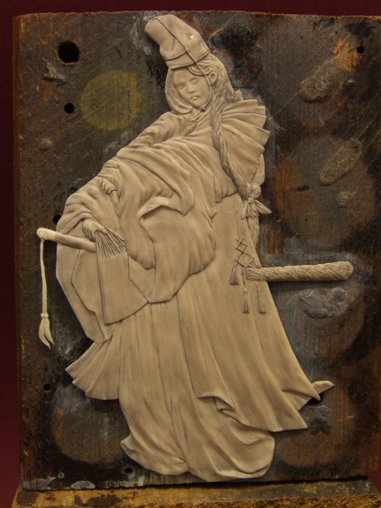
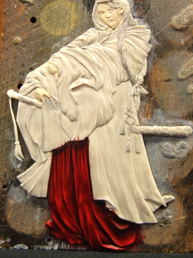
To just step back and decide something first, the light-source for this flat will be to the top left of the piece ( as you view it ). It’s not quite overhead lighting like we’d use for a round figure, but gives a slight bias to the highlights on the front of this piece. Sometimes it helps to put a mark on the block of wood that’s holding the flat, just to remind you of where the light-source is coming from.
I seem to have moved away from getting the face done first with the last few figures, this one being no exception. I’ve no idea why this should be, but I felt comfortable starting off painting the trouser, rather than the face.
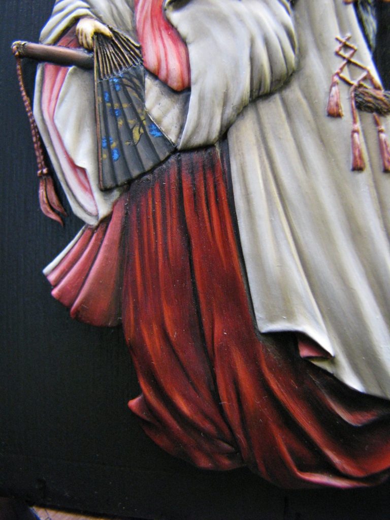
Photo #2 shows this with the trousers completed. I used an undercoat of Humbrol acrylic Crimson, followed by A shadow mix of Alizarin Crimson and Olive Green oils. The highlights were built up by using a soft clean brush to thin out the shadow colour on areas that would catch the light; then I added more of the Alizarin Crimson, and on top of that, used Rembrandt Scarlet for the extreme highlights.
I was trying to keep the red area fairly dark and rich in tone, to hint at an expensive cloth befitting her station.
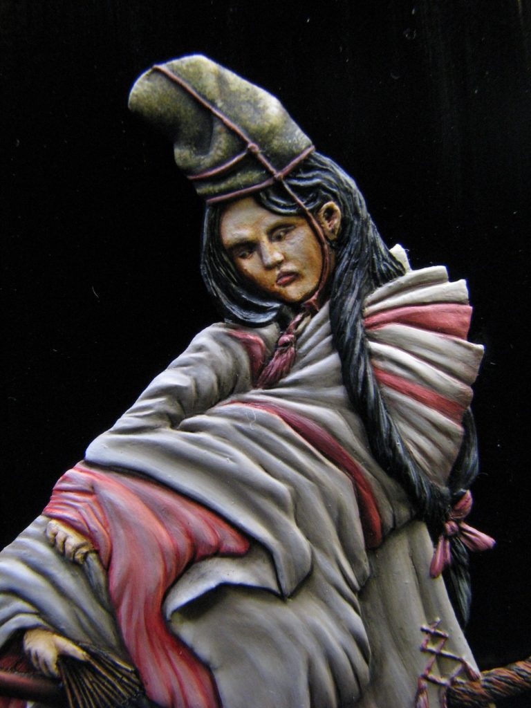
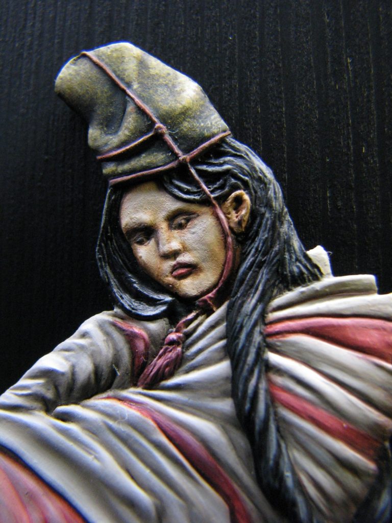
Photo #3 shows that I’ve painted the face and the hands. The colours used are basically what I’d use on any round figure, but placing the shadows is perhaps even more important, and figuring out how to force the idea that the face is half turned from the viewer. I did this by adding the highest lights to the side of the face that is facing the viewer, gradually shading the other side of her face so that although the difference is minimal, the viewer is then struck by the lighter colours, which make that side of the face seem closer. It’s fun to play about with this because all the time colours are being tinted and altered to take in the need for shadows and highlights.
The hands are perhaps less than helpful in the way they’re sculpted. There isn’t much of them on view, and what’s there is only hinted at. It’s a small area to get paint on, and still add in the highlights and shadows, plus get the form of knuckles etc.
In honesty, the hands probably took longer to do that the face.

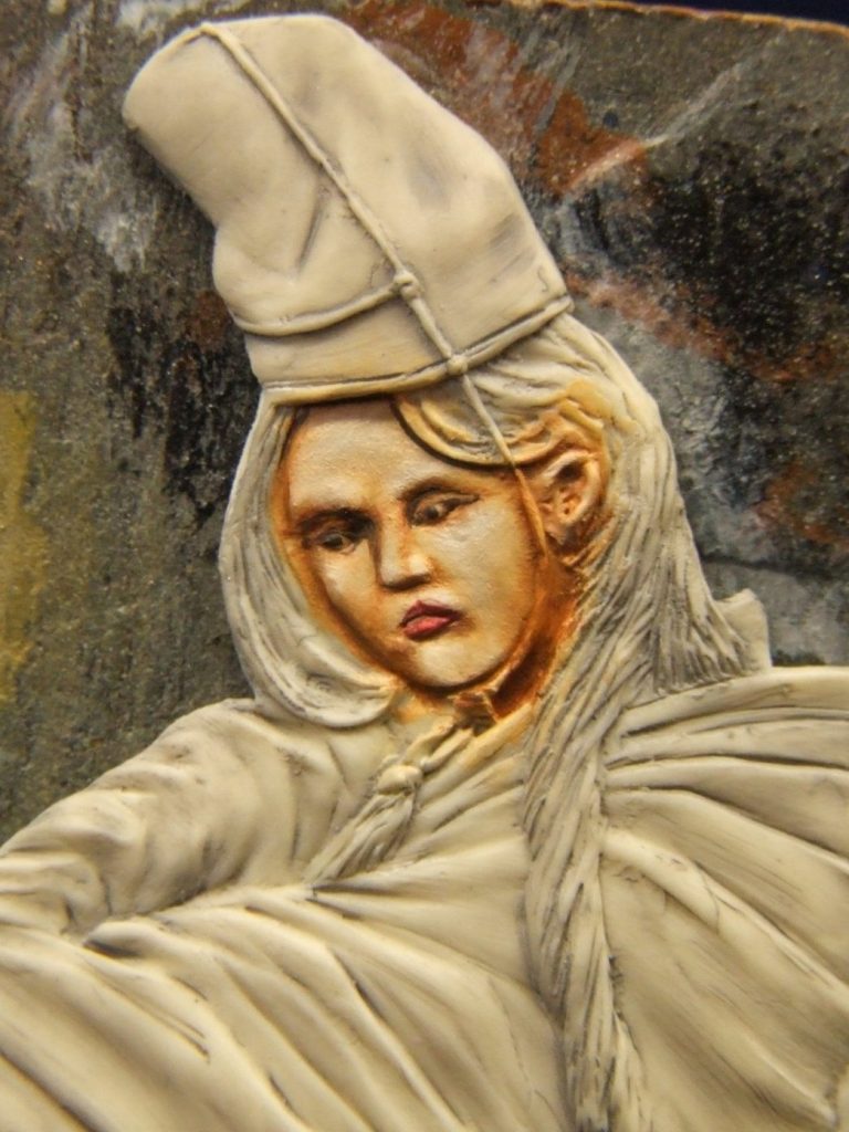
The next shot – photo #4 – shows a close-up of the face at this point. There are two small imperfections below the eyes, and I tried to hint at them being tears ( O.K. maybe I didn’t try hard enough ), thinking that she would have enough martial experience to know that once the castle was under siege, she and the other women warriors were unlikely to come out of there either alive or free.
Although the face appears pale in this shot, I was wary of making any adjustment now – I’d rather get the hair colour in place to frame the face so that there is more of a reference given to the colours.
Photo #5 shows the inner sleeves painted in. This is where the brain really has to kick in and start wondering how to fool the viewer. The pink colour used was Alizarin Crimson with a lot of white added gradually to build up mid-tones and highlights, but once dry, some black had to be added so that the shadow area inside her right hand sleeve seemed to disappear deeper into a nonexistent distance.
If you look at the top of the red trousers in this shot I’ve tried a cast shadow ( from the sleeves ) by painting in a much darker red colour. I’m not convinced that it works, but most painting effects tend to look less magical once you know how they’re done.
The rippled effect on the figure’s left sleeve was repeated on the right sleeve – Roy had actually sculpted form to the folds and billows on her left, but there was virtually nothing on her right to help the painter – so a bit of artistic license there then.
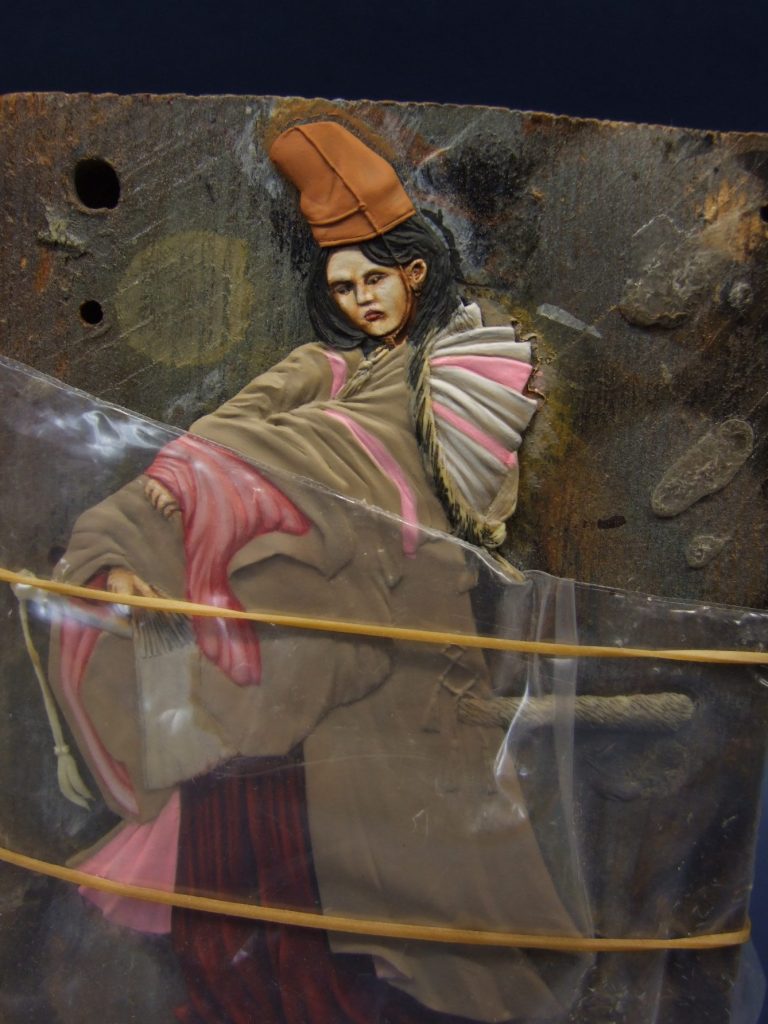
Now then, photo #6 shows me getting a little bit protective of the paintwork. Basically I liked what I’d managed so far and didn’t want to damage it. In order to paint the cloak, I needed to rest my large and ungainly paw on the painted areas ( Aaaaaagh – cardinal sin of painting – NEVER, EVER shall finished areas be touched – well apart from when you have to remove the piece from it’s painting base to the finished display base – and that’s what cotton gloves were invented for ! ).
So to protect the paint that is in place and dry, I wrapped the block and the flat figure with some soft polythene and held that in place with a rubber band.
The other thing here to note is the use of “The paints of the devil”……sorry, I mean acrylics, to paint in the cloak.
I know, I’m noted as using oil paints in all I do, but it’s a fallacy and an untruth. I use acrylics for lighter coloured areas, they’re easier to work with and don’t leave brush-marks if you know what you’re doing.
So what’s the secret – plenty of water. Acrylics are the perfect paint for a miser, because if you want to get very gradual colour change, you’ll only use a tiny amount of paint, and thus save a lot of money. Oil paints always seem to leave 90% of what’s squeezed out on the palette.
I have a preference for Games Workshop paints, and for the cloak I used Commando Khaki as a basic mid-tone, darkening this with Chaos Black very gradually, and adding very thin washes in decreasing area size to make the shadow areas build in intensity. I can’t be exact, because I’m too busy with the brush, but there’s probably thirty coats of paint on the deepest shadow areas for them to build up to the required strength. There might easily be more than that, but the idea is to go around the area being painted and add the paint in very thin sweeps, any difference of colour not really showing until the fourth or fifth coat is added.
For the highlights, the same method is used, but adding Skull White to the Commando Khaki to gradually lighten the colour, and then lots of water to thin it down to become nothing more than tinted water.
The photo shows how I’ve begun with the upper arm and shoulder, and this will be continued down the arm and onto the body of the cloak.
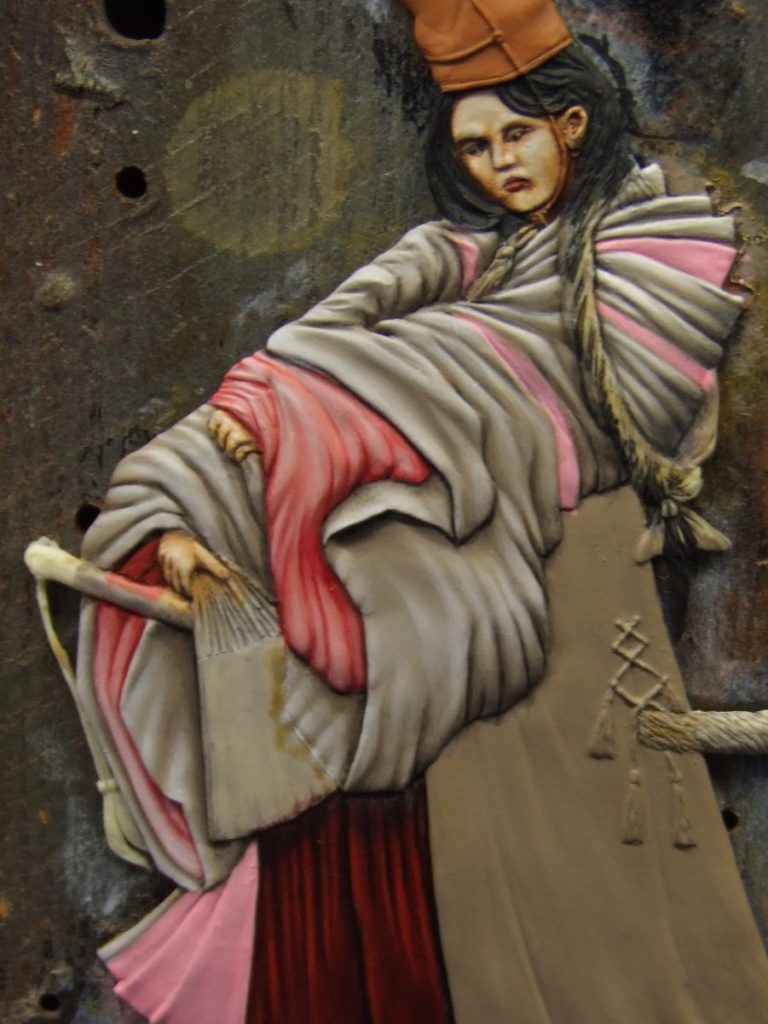
Photo # 7 shows the polythene having been removed for a clearer view of the initial area in it’s completed form, and then photo #8 shows how the whole sleeve comes to life when the depth of contrast in the paints being added begins to work to fool the viewer that this isn’t a 3mm thick piece of resin, but appears to be a three dimensional figure.
Certainly the sleeve looks a lot better than the body of the cloak, which still appears quite flat in comparison.
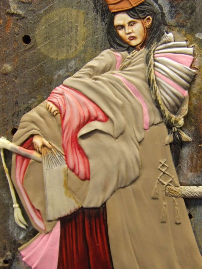

Photo #9 shows a close-up of the sleeve cuffs. On her left sleeve you can see how I’ve added highlights and shadows to the flat inner area, and although not too noticeable now, will show up better once the fan receives its finishing colours to border the end of the sleeve.
The whole piece is coming together now in photo #10, the rest of the cloak having been finished, although with a little less contrast, because of the way it hangs away from the figure and it has fewer folds and creases in it, plus light is blocked from it by the upper body and sleeves – so no intense highlights.
Also in this shot face has been framed with a coat of black acrylic for the hair, and the hat undercoated in Vermin Fur – yes, you guessed it, another interestingly named acrylic from Games Workshop.

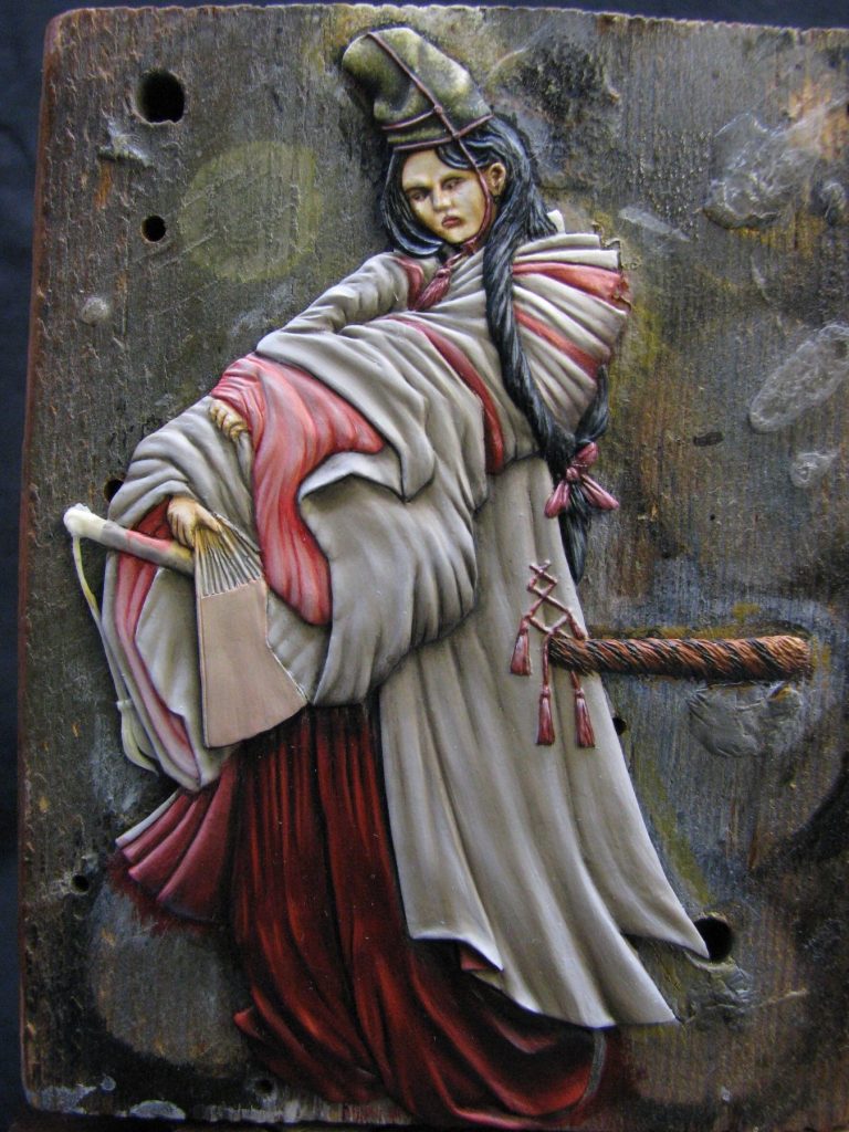
In Photo #11 the hat has been completed, and although it appears to have a green colouration about it, the paints used are all browns, yellows and white. I used a piece of foam packaging to paint the hat, starting off with a very dark undercoat – almost black, and then using the foam to stipple on various brown and yellow acrylic colours, working lighter and lighter in shade until I was adding white to the lightest yellow for the final highlights.
Once the hat had been given half an hour to dry, I used thin washes of the very dark brown to re-establish the shadow areas, building these up gradually with the same method I used for on the sleeves.
The sword scabbard is the only part of the figure that I’d change, given half the chance, because I really don’t like the fur effect on it. However, I thought I’d just go ahead and paint it, and if I really did want to change it, then I could do that as a last resort. I used Mars Black, Light Red and some Mars Yellow ( all oil paints ) to lay out a tiger stripe effect on the fur; working from a shadow colour underneath to highlights on top. I can’t say I’m happy with this; it’s o.k. but I really wish I’d changed it for a smooth lacquered scabbard.
Final touches on this shot are the cloak flare on the figure’s lower right hand side, and the knotted cords to gather the cloak at the base of her back. I tried to get the cloak flares to hint at even more depth to the figure, using extremely dark shades of red and very light pinks to fool the viewers eye.
The cloak ties are very small, and a lot of the detail is only hinted at in the casting, I painted shadows below the tassel heads to define them, and used light and dark colours to detail the tassels themselves.
All this time, in honesty, I was trying my best to avoid that fan. I’ve seen some very decorative ones painted, but all the ones I’ve seen had one major failing – they were flat.
Fans are not flat – even when fully extended, there is still the definition of the different angles ( if they’re of a concertina type ), or the different sectors ( if they’re a series of slats that slide over each other to form the semi-circle shape ).
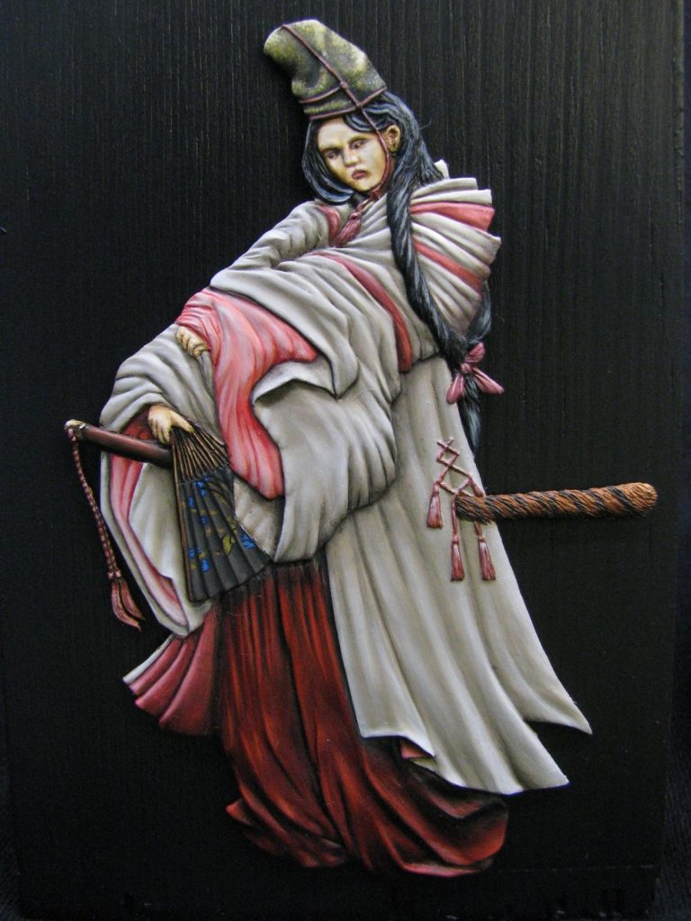
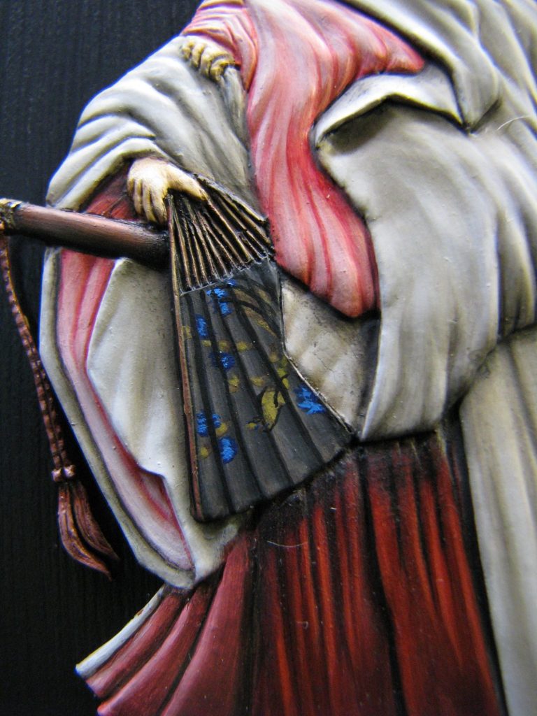
Although the casting has no detail to it, I wanted to show a concertina type fan, and this would, I know, create interesting problems when coming to add a design.
You see, the problem is that the different angles of the concertina shape would hide and break up the design; so even the most obvious shapes become broken and hard to make out. I could see why so many had opted to paint a flat design on, no matter how wrong that might seem to anyone studying the piece.
However, having avoided the area for so long, there was nothing else left to paint, so I would have to bite the bullet and just get on with it.
I began by painting the whole of the fan with a black acrylic. I then gradually added small amounts of Commando Khaki to the black, adding plenty of water and building up the individual areas of each sector so that gradually the fan took shape.
Once I’d reached a point where it was obvious that the fan had a concertina shape, I stopped to consider the design that I’d use.
I’ve used the design many times before – one of a peacock on a branch with flowers. The design is rendered in gold’s and blues and whilst quite complex, can be simplified for smaller areas.
Ah, the other thing I’d not mentioned – the design on all the real fans I’ve seen is printed so that the holder of the fan can look at the design. That means that the top of the design is to it’s curved edge, and the bottom of the design is to the place where all the spines of the fan join. In this case, on this figure, the design needs to be upside-down.
Can I make one comment at this point, with reference to the above revelations…..
“Oh joy !”
Because to sum up - I needed a design that was easy to make out, due to it being broken up, upside down and bleedin’ tiny ( did I miss anything ? )
Anyway, I turned the model upside down and went to work.


Anyway, I turned the model upside down and went to work.
If you’re careful, close one eye and squint, turning the close-up shot of the finished fan might allow you to see a very small peacock perched on a branch with some flowers. It is there I guarantee you, but it’s perhaps not as clear as something simpler might be. Look, the phrase I’m looking for with this is that “To a blind man, galloping past at midnight, there won’t seem that much wrong with it !”
The display base.
Usually, flat figures seem to be displayed in photo frames with a glass front. This I admit protects the flats from dust and unwanted finger prints, but makes life awkward for a photographer. Plus it means that many really, really nice pieces of art don’t get considered for such publications as the Euro Special, simply because getting a picture of them that is of a good enough quality, is nigh on impossible.
I like flat figures, I’d like to take pictures of them too, and I’d like to see them featured in magazines and on the Internet.
But simply put, no photo taken, no option for the editor to use the shot – simple as that !
After many years of trying to photograph some absolutely beautiful flats, and mainly getting fuzzy pictures with a very well focused reflection of me with a camera in them, I wanted a way to display the flat without putting it in a frame and having glass in the way of anyone who wanted to take a picture.
The other thing I wanted was to show off the model for exactly what it was, a piece of very thin material, with a well sculpted figure on it.
I stumbled on the answer quite by accident – o.k. I thought about things for a bit and was just trying an idea out.
I’d cut some wood for use as risers on the display stand for the Basement forum for when we turn up to support a show, polished several pieces up and placed most of them in a box for taking to shows.


One piece was surplus to requirements, and this I’d decided to use as a decorative riser when taking photos of models.
The ends were angled, and I put the flat on the bottom face and stood the piece of wood on its angled end so that I could take a “finished it !” photo. The wood grain got in the way, and being that it was the underside of the wood block, I thought I’d just run some black paint over it to get rid of the interference from the wood.
The thing was, this looked quite good, if a little boring. But something similar would look very good, unusual, and might just work.
Out to the shed then, look for some more of that wood ( Pitch Pine ) and get out the workbench and saw.
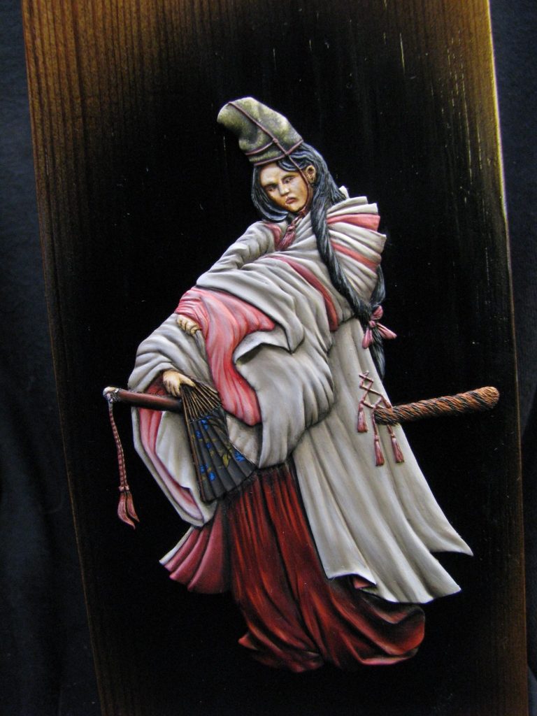
Now cutting angles in wood is not my forte. But I did my best and cut across the wood at a seventy five degree angle. This would be the bottom of the base. The second cut, making sure that the face would easily encompass the figure, was cut at around twenty five to maybe thirty degrees.
Again, I had planned ahead, and thought I’d look on my shelves for a flat decorative wood plinth that this pine section could be fastened to after it had been treated to several different grades of glass paper.
On looking through my stock, I came across a piece of black marble that was just the right size. I drilled through that with a masonry drill, fastening the pine to the marble with two screws.
With the pine varnished and a black area sprayed on to encompass the figure, I could see that this really was going to be different, but would look good.
And that’s what you see in the final shots – a base specially made to hold a flat that is both sensible and photographer friendly.
I’m not presuming that these bases will meet with everyone’s approval, but it might be worth considering that if a photographer can get a good shot of a flat without glass reflections in the way, then it might be that we all get to see a lot more of the beautifully painted pieces that turn up at shows – well, it’s a thought.

Final words.
I took my time painting this flat – to tell the truth, she looked so good that I was happy to have her on my workbench where I could look at her, rather than downstairs in a cabinet on display.
So this piece has been receiving a small amount of attention from my paintbrushes over the course of the last sixteen months.
I’m pleased to say that I finished her before Roy Hunt died, although I don’t know if he saw pictures of the finished flat. I do know that he didn’t see or know of the display design that I’d thought up, and that saddens me. I think he’d have been pleased that his sculpting had enthused me enough to think laterally as to how to show it off.
Roy is a sad loss to this hobby. Many, many people – myself included – were lucky enough to know him and share a little time in his presence. I’d like to think I encouraged him half as much as he encouraged me, because I thought that his design concepts and sculpting skills were monumental.
The greatest loss must be felt by his family – his wife Pat and nine children – but I’m sure that all who knew him would wish that he rest in peace, and that his family gather some solace from the knowledge that so many of us respected and were glad to have the chance to call Roy our friend.
Please note, all the Roy Hunt Flat figures are available from seller ash0040 on eBay. The whole of any sale of these flats goes to Pat Hunt - Roy's widow - excluding the cost of postage.
The series of flats are:-
Female Samurai
Old Ronin
Action at Dennewitz
Chief Joseph and the retreat of the Nez Perce
Tamerlane
Pantaloon
Or simply type in "Roy Hunt Flat" on eBay and that should bring the range up.
We need your consent to load the translations
We use a third-party service to translate the website content that may collect data about your activity. Please review the details in the privacy policy and accept the service to view the translations.