Beauty and the Beast
120mm flat resin casting from Mil Mart.
Painted in 2014
I know these flat figures are probably not very popular over here in the UK, but there are more and more of them becoming available, and new ones appear all the time.
The convention of them being double sided metal castings seems to be lessening too, and single sided resin offerings are becoming more common.
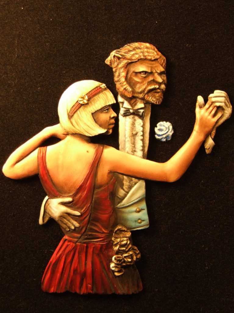
This is a relatively new release from Mil Mart, and steps away from a predominantly military range and into fantasy. It’s a flat resin casting that at its thickest is 2mm and is embossed enough to see the details.
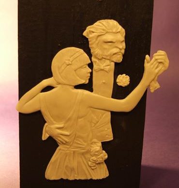

The raw casting can be seen in photo #1 and the idea for the piece is possibly a painting titled “Man and Woman Dancing.” Oil on canvas. Circa 1923. by J. C. Leyendecker. The flat has been altered somewhat, the most obvious things being the beast head substitution for the man’s and the change of hairstyle for the woman.
The idea though, the clever idea that is, is still present. That’s the fact that the man’s jacket doesn’t exist in either the painting by Leyendecker, or in the flat; the jacket becomes an illusion supplied by the onlooker........ And that my friends is the really clever bit and usually puts a smile on people’s faces once they realise the wit behind the picture.
Would it work for my rendition of the flat when it was painted and framed though ?

That I guess is for you to decide, but whilst you have a think, I’ll ramble on about how I painted it.
Photo #3 shows the beginning of the skin areas on the woman and the face of the beast. I used a mix of Mars Brown and Titanium White oils over an undercoat of pale flesh acrylics, lightening the oil colour with more white and blending the colours whilst the paint was still wet on the surface of the flat. At the point that the picture shows I was really just trying to get the shape of the woman’s back and arm, work out what areas would have some shadows and where the highlights would fall of the lighting was acting on a three dimensional figure with the light source directly overhead.
In photo #4 the flesh is complete for the moment. I’ve added in a beauty spot and painted in the lips and eyes of the woman. The face and hair of the Beast have been done too, and I was aiming for a tiger fur effect with a darker skin tone for the flesh areas of his face. For this I used a lot more of the Mars brown in the flesh mix and added a little bit of light red for the fur with Mars Black stripes.
I started messing about with the shirt too, undercoating in Kommando Khaki ( sadly Games Workshop don’t do this colour anymore, but they’ll have something else pretty close I’m sure ). I then began to use Skull White to build up highlights on this area in very thin washes of colour.
Which brought me to think about the direction of the lighting. I hadn’t seen the Leyendecker picture at this point ( Thanks Mario Delgado for finding it though ), but when I looked at the flat casting it suggested to me that the light source should probably be coming from the top left as I look at the piece. This made me alter and adjust the skin on the woman slightly and also would affect where shadows and highlights would fall on the rest of the model.
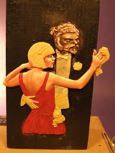
Really I should have thought about the lighting before painting – it’s my impatience showing that I’d not planned that far ahead.
So, with the light direction sorted, I could begin with the dress.
I like red, dunno why, but I like painting it; and so that’s why her dress is that colour.
Photo #5 shows the process of painting the dress beginning. It’s amazing the things we modellers pick up that don’t necessarily have anything to do with anything of importance.
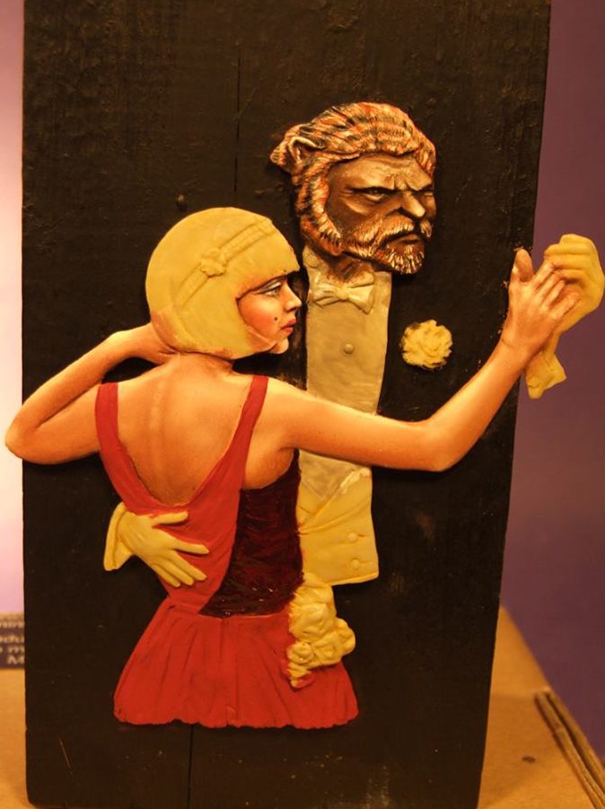
Paint clothing for long enough and you automatically think where joints in the material will be, what texture and weight different cloth has and how it will hang on a subject.
In the case of her dress, I’m betting that there’s either a zip or button type fastening following the line of the spine down the back of the dress to the level of the waist, or if the join is to be disguised, then it’ll be down the side of the dress beginning under one of the armpits, and again down to waist level....... See , you knew that too, you just hadn’t realised it.
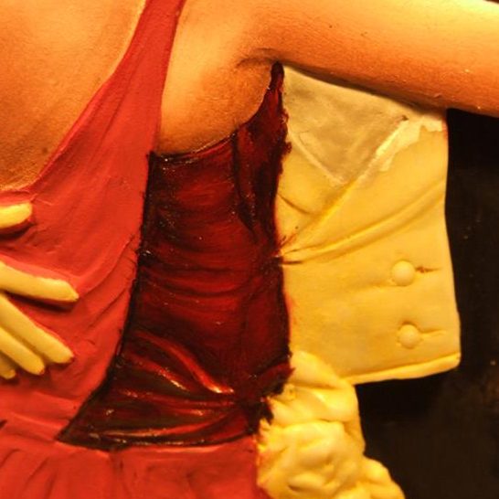
With that thought in mind I consciously left a line of shadow running down under the left armpit on the dress and painted bit of a highlight where the cloth would thicken to take in the sewing of a zip fastener....... OK, a bit extreme, but it’s there and it’s there because I’ve thought about it.
There would be some highlighting and very distinct shadows in the area that’s been painted, so I began with Carmine oils darkened with just a little Mars Black, adding more Carmine to make the mid-tones, and then topping of slight highlights with some Crimson. There are highlights and shadows where the hand of the Beast cradling the woman’s body is causing the dress to stretch, and again, I’m emphasising what the sculptor ( Ken Farrer ) has added, but also adding on to that with “painted on” detail.
All this becomes visible in the close up shot in this shot.
In photo #7 I’ve completed the dress and am starting acting on the thought that the lighting is coming in from the upper left of the flat. The dress over the woman’s left hip has received a lot more of the Crimson highlight to build up the idea, and I need to go back and add shadows over the face because of the hair’s fringe and also on the lower back and right arm.
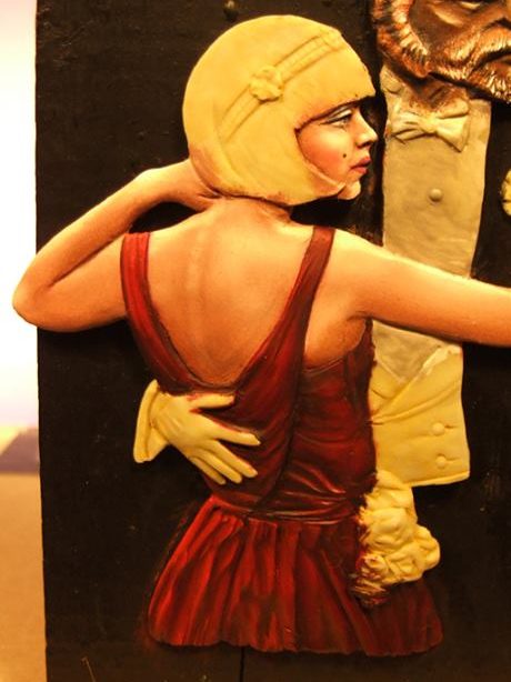
But first the shirt and collar of the beast’s clothing. I began painting the shirt front as a fairly flat area – being as that’s how the casting is. Then the thought that I could add a decorative ruffle down the front of the shirt dawned on me, and as I was using acrylics to build up the lighter colour of the shirt, I could also use darker shades to build up the illusion of the ruffle.
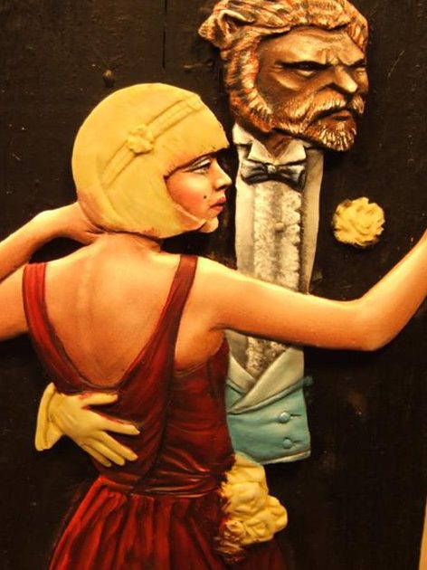
This is the thing with flat figures the temptation and ability to add detail to the piece on flat areas and if done well, then the onlooker won’t even know it’s not been there all along. I forced a shadow to the right of the ruffle, making it seem to stand out from the flat casting even more, and worked on the waistcoat again trying to make this seem to have a rounded profile as the material stretches around the Beast’s midriff.
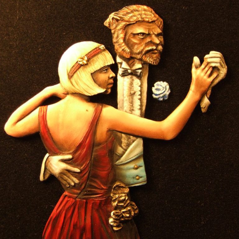
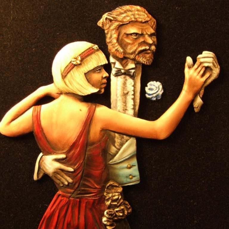
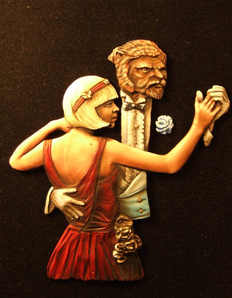
So photos #9 and #10 show the finished piece. I’d added shadows to the waistcoat and lower area of the shirt to bring in the illusion of the area being rounded, and that the woman’s body is casting a shadow over a part of it. I’ve added darker colours ( Sepia oils ) to the woman’s lower back and a cast shadow from the material running up to the shoulder from the main body of the dress. I’ve subtly darkened the back of her right hand too as this would be tilted back slightly as she holds the Beast’s left hand, tinted the face to throw all of it into shadow ( again both times using Sepia oils ), and painted on the Beast’s gloves using the Kommando Khaki and Skull White acrylics, making sure that the cuff detail on the Beast’s right hand seems to be deep and that his wrist and arm extend up there somewhere.
With all the details – hair-band, waist ruffle that look like bunched flowers etc, it’s a case of thinking where light will fall and making the flat figure have that illusion. This is much more like planning out a conventional painting that would hang on a wall, rather than producing a three dimensional model, but it makes you think about how and where light falls and causes shadows and highlights on a model and will make you think more about what can be done on “round” models.
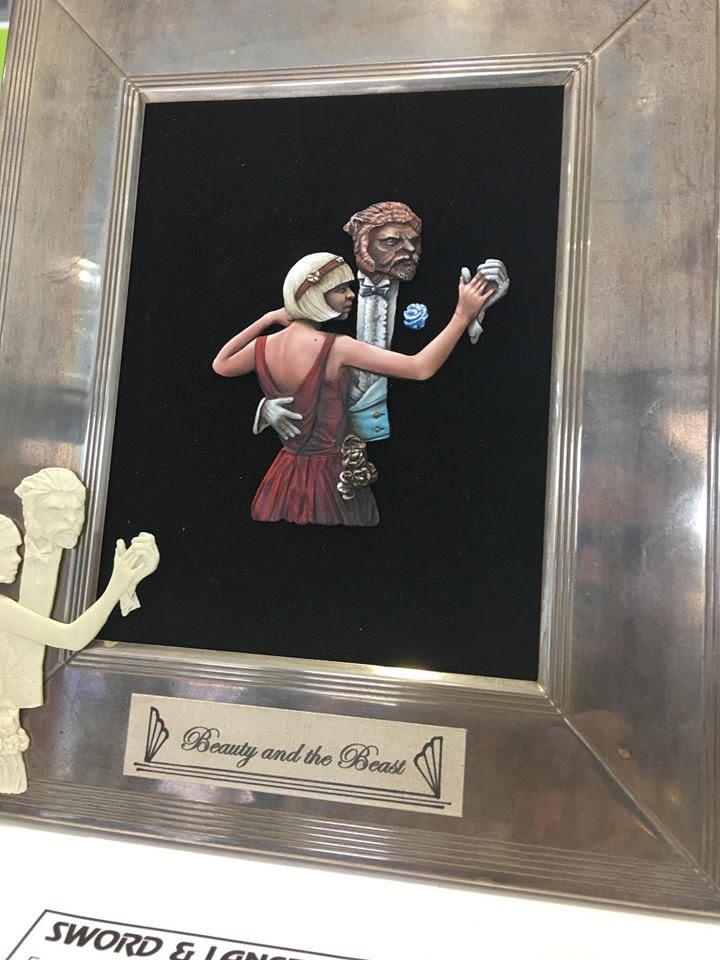
And to finish things off, a frame. Now initially I’d thought about an Art Deco frame - one of those with a long flat plinth with an upright either side to hold a couple of sheets of glass that you’d then put a picture in....... Couldn’t find one the right size anywhere – antique shops, second hand shops, flea bay, you name it, I looked.
Just by chance I had a spare hour or two in Ormskirk, which has several charity shops and came across a very nice silver frame that looked quite old fashioned, a little dented and with a distinct patina on the silver. For the princely sum of £3.50 I had just what I wanted. S’good what you find when you find a bargain, especially if you’ve had to search around a bit. So that’s how they ended up in the frame that’s shown in the last of the photos.
All that for £7.00, plus the price of the frame...... Did I mention how cheap these things are ? No ? well, honestly, they are cheap. This isn’t small either, it’s about 90mm high, so the figures would probably equate to 1/16th scale.
Worth thinking about perhaps, just for something different, something to mess about with regarding light direction and forced perspective.........
We need your consent to load the translations
We use a third-party service to translate the website content that may collect data about your activity. Please review the details in the privacy policy and accept the service to view the translations.