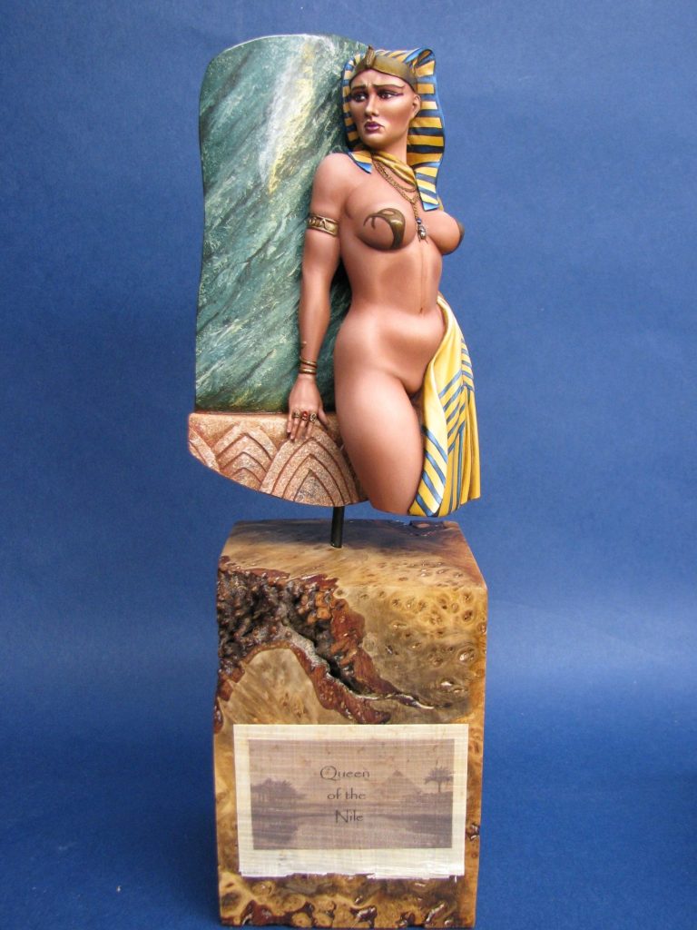
Queen of the Nile
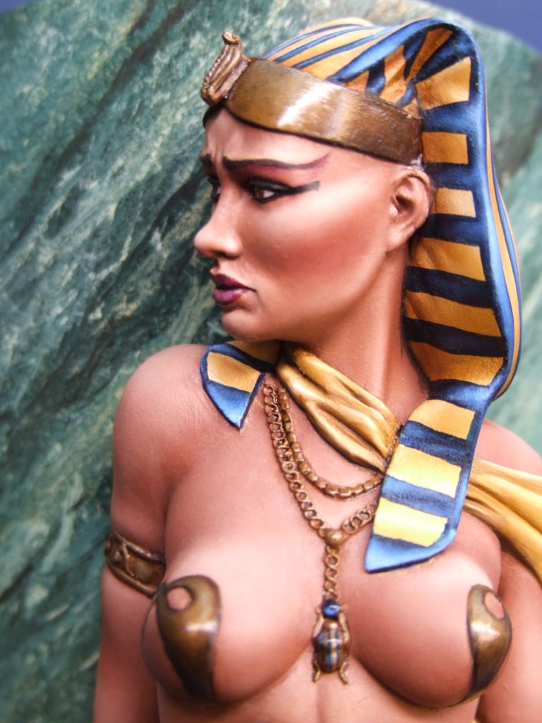
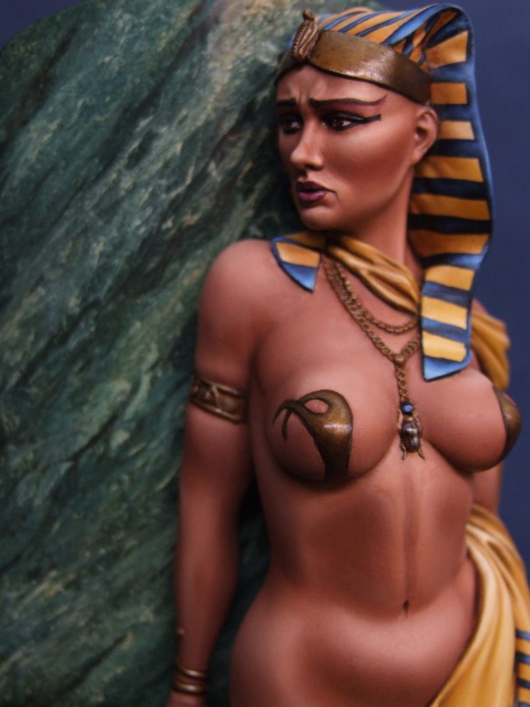
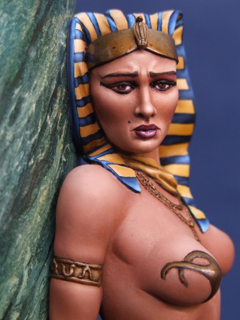
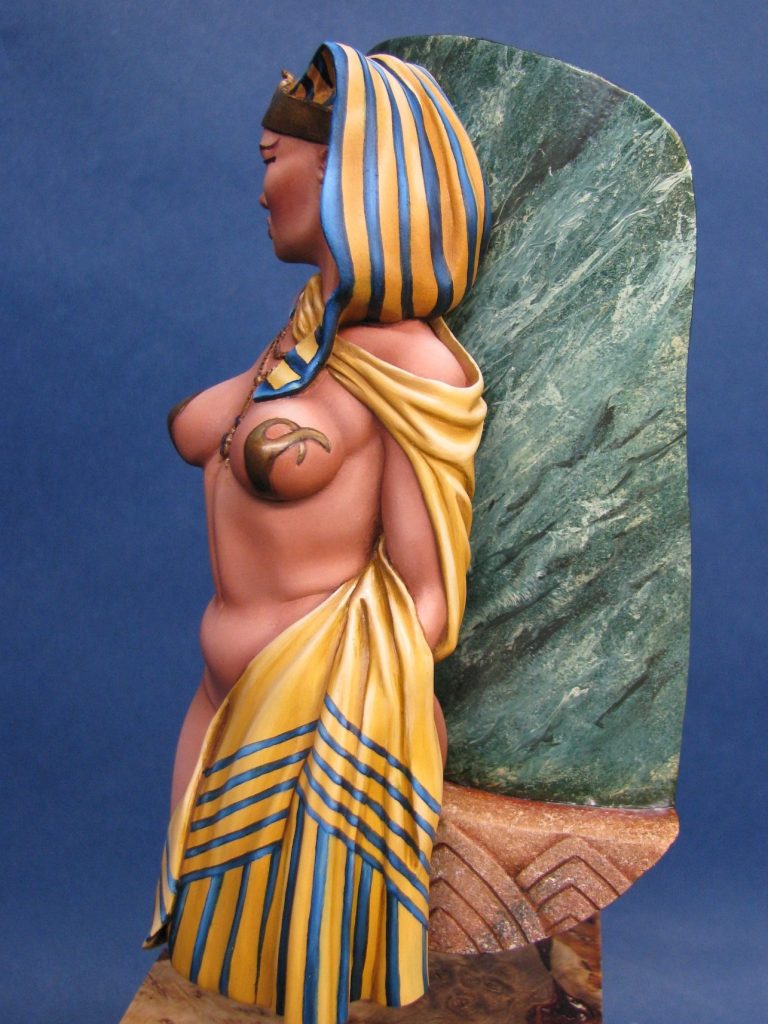
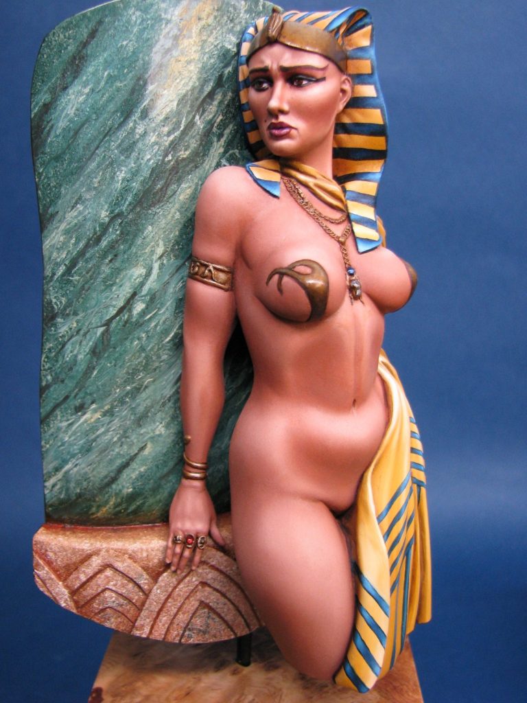
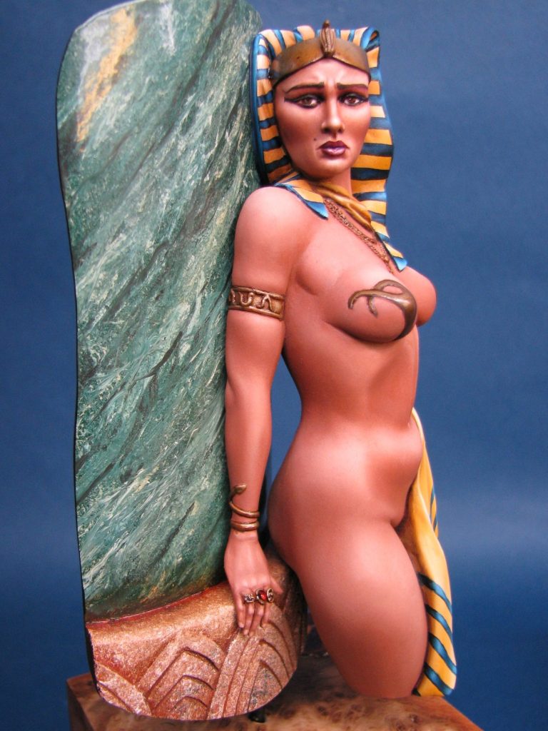
A 1/8th scale resin half figure from El Veijo Dragon.
Painted in Summer 2011
Of all the female figure model kits I’ve painted over the years, this is one of my favourites. Along with Chris Clayton’s Hush bust and the Goddess in Alloy,
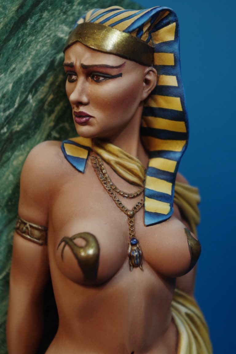
there’s just something about how the female form has been captured, in either an idealised way in the case of the latter two, or more realistically in the case of this piece, that I find goes beyond what my wife terms as “bums and boobs”.
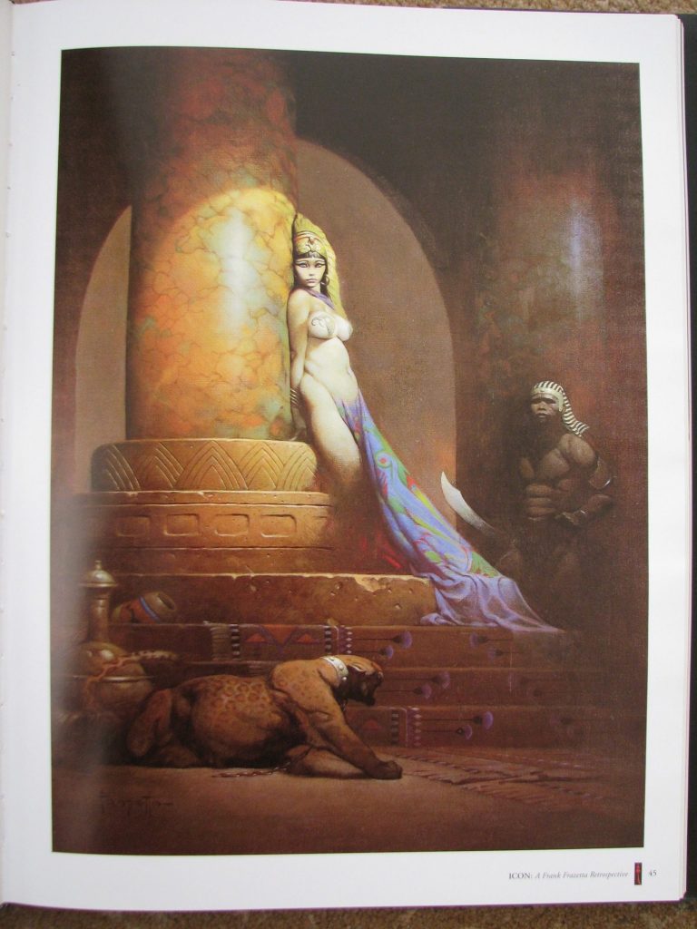
I think this kit is based loosely on the Frank Frazetta artwork ( shown in photo #1 ) but has been sufficiently changed to make it into an individual piece, and also to sort out some of the angles at which the female figure stands.
The problem with translating 2D art into a 3D model is that the picture can play with angles and perspective, and these same things don’t necessarily look right when translated into a round figure, which you can then turn to look at from different angles.
The picture depicts a somewhat unclothed young lady leaning at a rather impossible angle against a stone pillar – must be in a warm country, otherwise I’d be suggesting she put some clothes on, her bum must be terribly cold against that marble !
Enough to say that the angle she’s leaning a just would not work in a model, it would look unbalanced, and so the sculptor has changed that.
The face and body proportions have been changed to reflect a change in the perception of beauty regarding the female figure, but pleasingly have retained some reality in that there’s still a bit of bulge to the stomach and some weight on the thighs – no catwalk skeleton here.
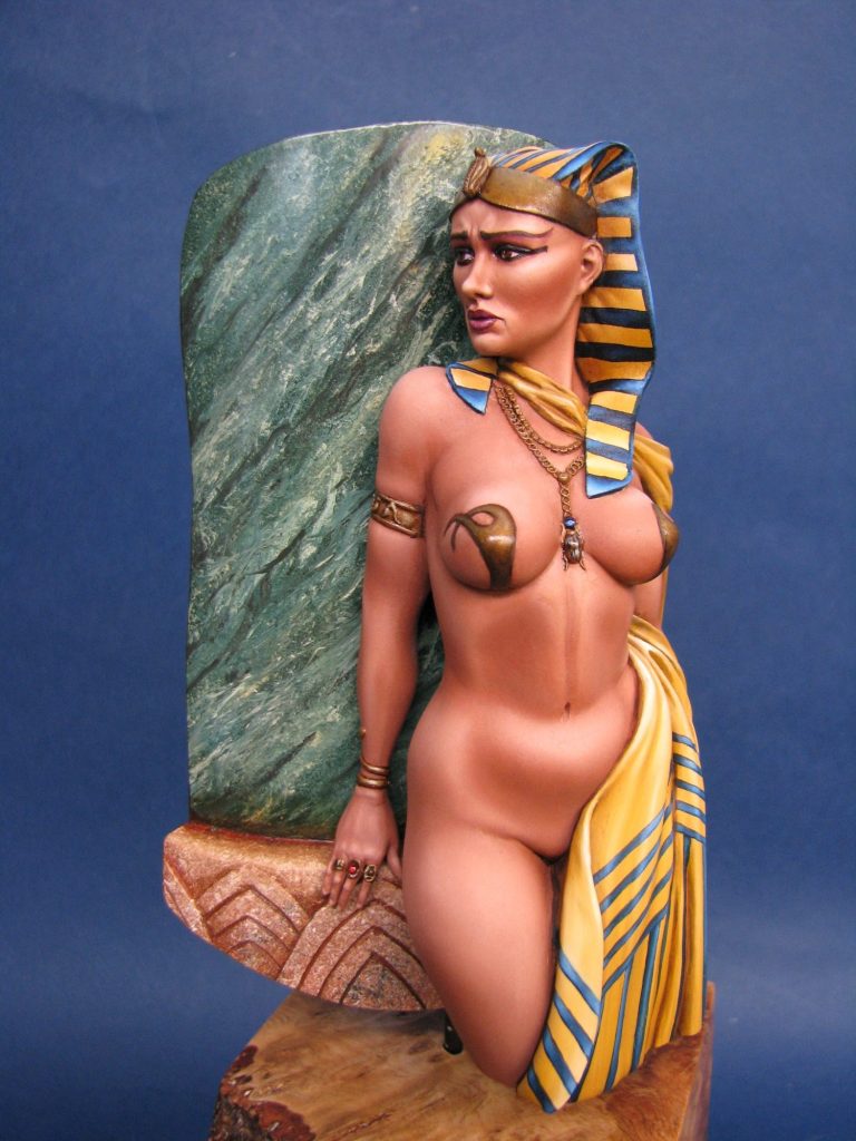
Other alterations take in a more recognisable Egyptian head-dress, and the left arm brought into play to support the swagged cloth that comes around from the back of the figure.
The breast decoration does seem to retain its form from Frazetta’s picture, although any hint that the model has any hair on her head has been lost.
The model does also go somewhat further than Frazetta’s picture, in that the lower body is totally unclothed ( I’m going to be touting this round the competitions, so I’m afraid that’s gonna be altered ). However I do think that the model is still recognisable as being inspired by Frazetta’s original artwork.
So, the kit – the components are laid out in photo #2 with my subtle and gravity defying Magic Sculpt addition to the clothing that hide the naughty bits. The resin is soft and easy to work on, and the moulding is very good, leaving the modeller only a few casting lines and over-pour plugs to remove. The worst casting line on her right flank did need the help of some putty to hide it, but with such a large piece, it’s not surprising to get a bit of a step in the area where the mould splits.
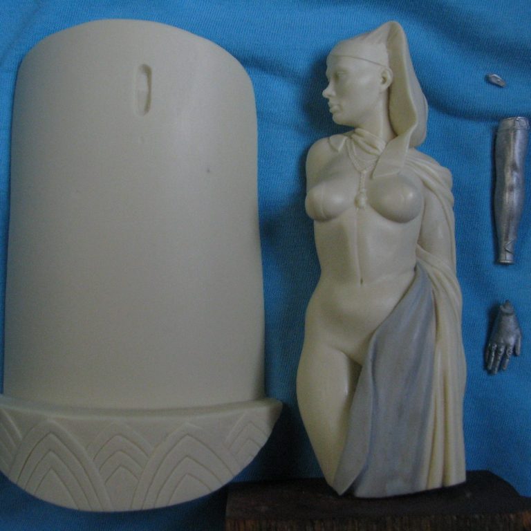
The engineering of the kit is clever too – the sculptor decided to have the model supported only at the right side of the head where it joins to the pillar, and whilst a plug and socket arrangement is cast into the two parts, I did add a couple of brass pins to help support things – the “carting around shows” thing drove the idea behind that one.
The smaller parts are supplied in white metal, and again I added pins to strengthen the joints.
With the model primed with a weak mix of acrylic paint ( in this case Games Workshop Flesh tone ) and isopropyl alcohol, then undercoated in three or four layers of the same colour but mixed with water, I could begin the process of adding the oil paints.
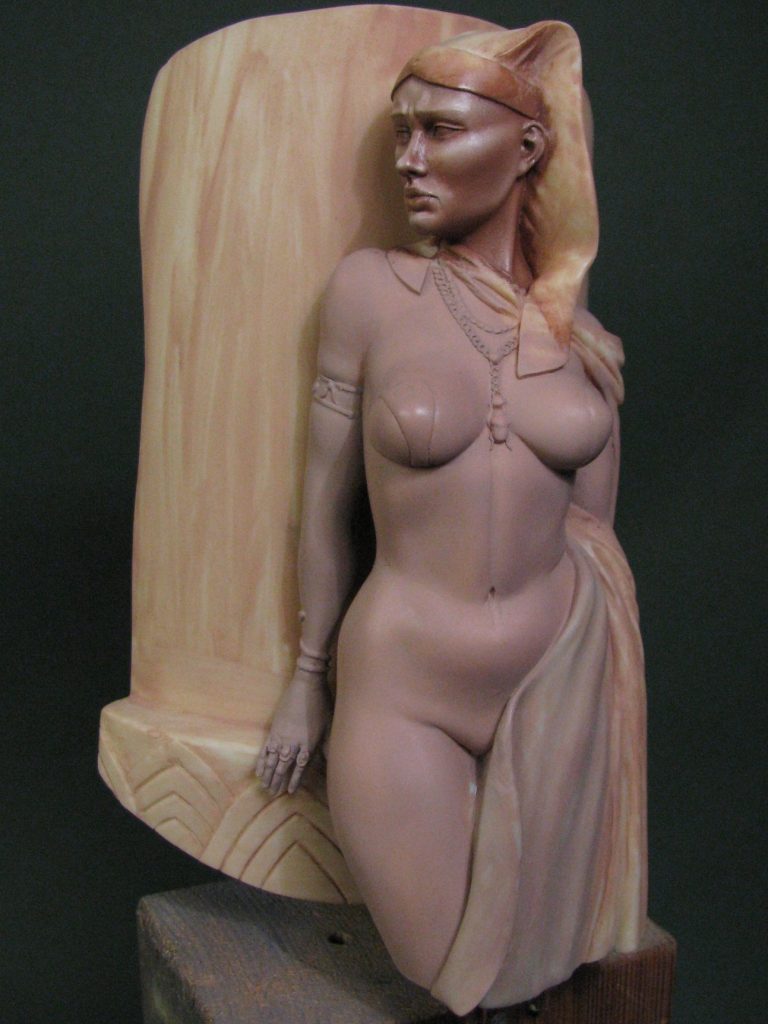
As I’ve mentioned in several articles, I tend to use a very limited palette of colours, and in the case of flesh areas I try and stick to using variations on a Mars Brown and Titanium White mix. In this case about the ratio is about 4:1 brown to white for the mid-tone, with this being lightened further to build up highlights with more of the white. Shadows are initially supplied with more of the Mars Brown, and then the model is left in a drying box ( O.K. a it’s simply an old kitchen cupboard saved from renovating the house, with a 40 watt light bulb in it. ).
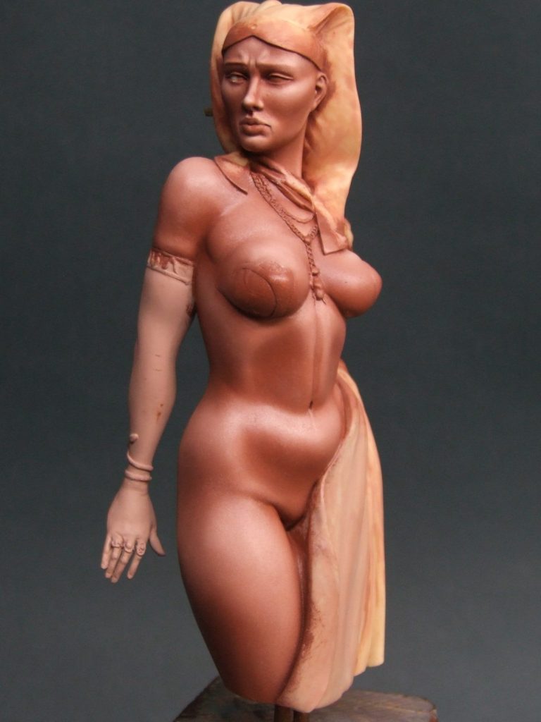
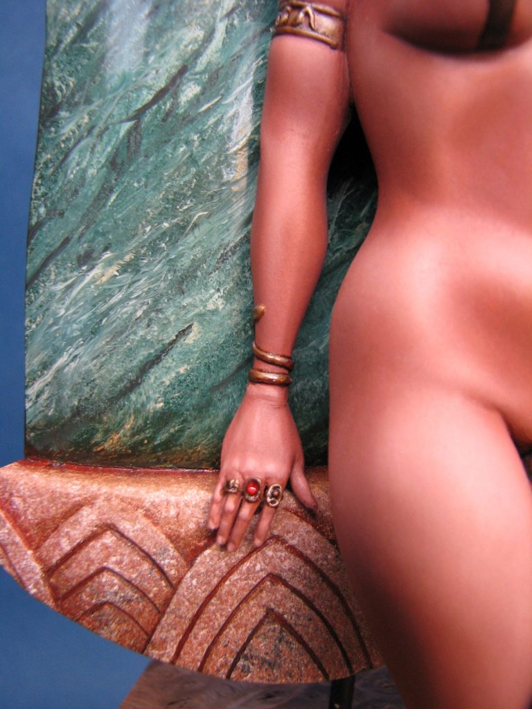
Photo #3 shows the process beginning, where I’ve got the face pretty much done and the rest of the body still has the undercoat layers in place.
Taking things a lot further forward, photo #4 shows the body completed and just the arm and hand now needing painting. This is where you can see the advantage to painting a semi-clothed kit over that of a total nude. With a nude there’s no chance to stop painting – once you start, you have to continue because otherwise “tide marks” will form in the paint as thinner areas dry, and coming back to add paint over the top just doesn’t do enough of a job to disguise where you broke off.
With this kind of figure, where there’s still plenty of flesh on show, the opportunity remains for the modeller to apply paint in sections, and have breaks whenever you need, so long as you factor in enough time to paint large or smaller sections in one sitting.
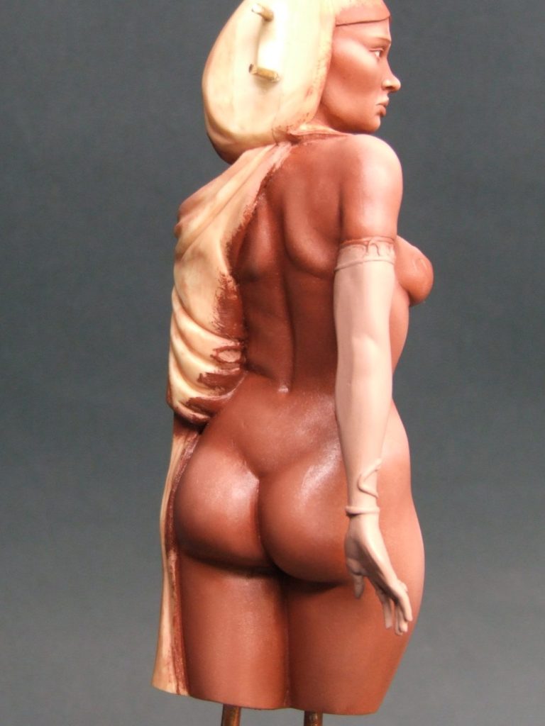
Photo #5 shows the back of the model ( some folk just need to see that for some reason ) and it might be worth comparing photos #4 and #5 with #6 and #7 where the only thing to change is that the paints have dried fully in the last two shots, whilst still being wet in the first two.
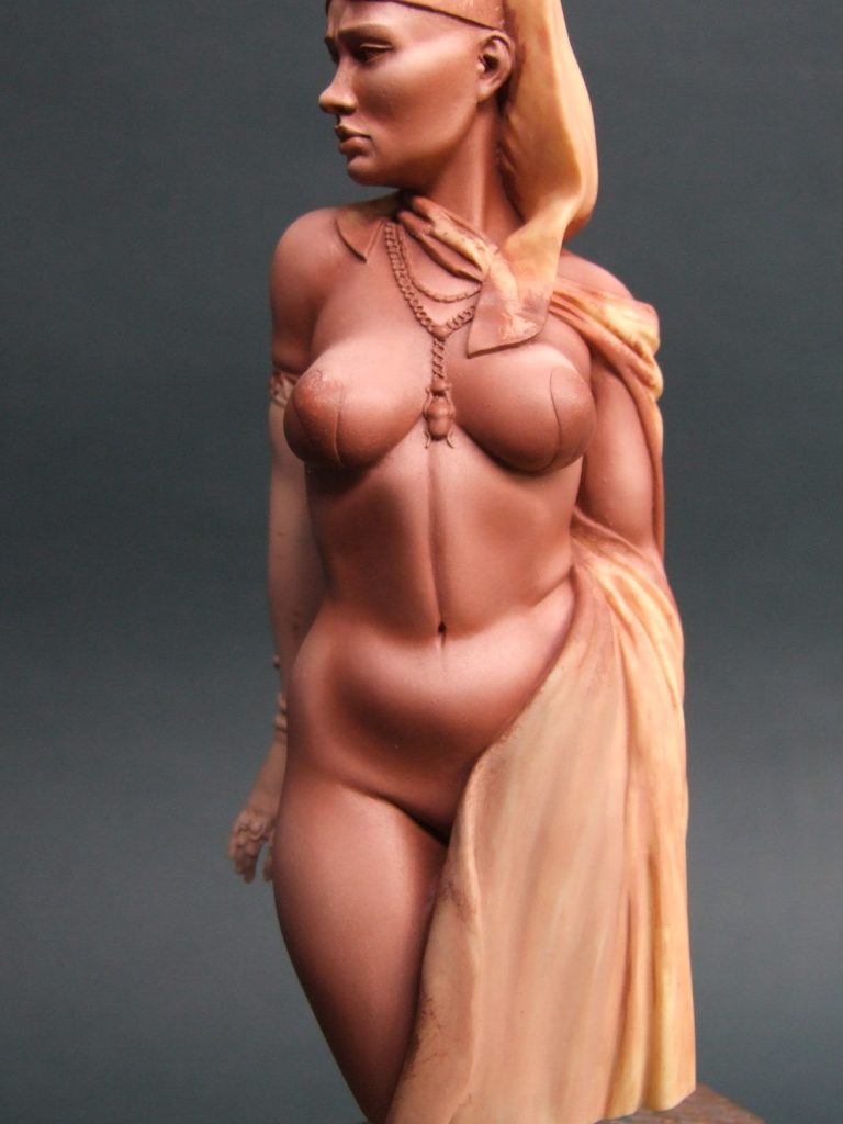
Photo 6

Photo 7
So why’s photo #8 in there – she’s finished after all, and we ain’t got that far yet. Well, it’s simply to demonstrate that adding different colours around the flesh areas alter your perception of what you’ve painted so far. The flesh may look over worked with too deep a colour in the shadows and too light a colour for the highlights, but until you get the other areas blocked in, it’s actually quite difficult to tell what the finished piece will look like. So I advise not altering the flesh too much, and simply to get on with the painting before adding further shadows, highlights and tints to the skin sections.
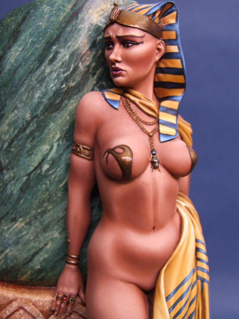
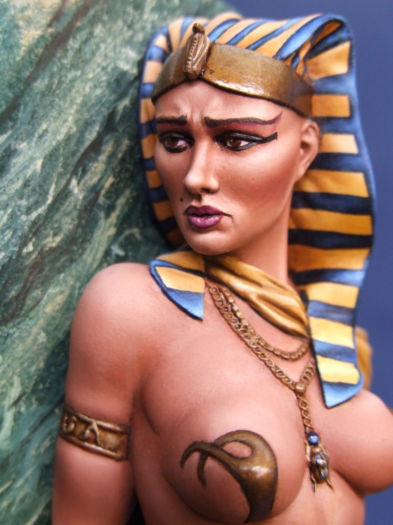
Photo #9 demonstrates this, where I’ve painted in the yellow of the headdress and begun adding the blue lines, then gone and added the purple for the lipstick, and reflected the purple tones in the eye-shadow make-up. The black eyeliner is my effort to drag a fantasy piece back somewhere within shouting distance to history, although it was never going to be much of a working plan.
Darker eyeliner would be added later, the work so far was just a skeleton for the make-up to hang on.
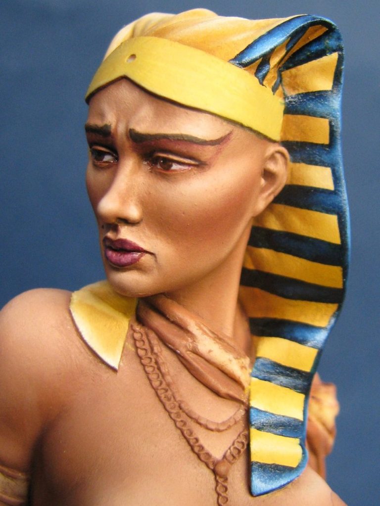
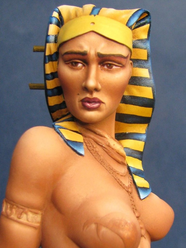
The blue banding on the headdress was a nightmare to paint. Getting the spacing correct around the compound curves of the cloth sculpture was bad enough; then to mirror that on the opposite side of the head was a real pain.
However, by marking out the side nearest to the pillar first, then marking out the lines on the side that is most easily seen and painted afterwards, I found it worked better.

Each line is marked out with a dark blue oil paint over the top of the dried yellow oils. The blue stains the yellow very effectively, so there’s not much room for error, but using a fine brush and paint that is heavily thinned helps with accuracy, not to mention having a steady hand.
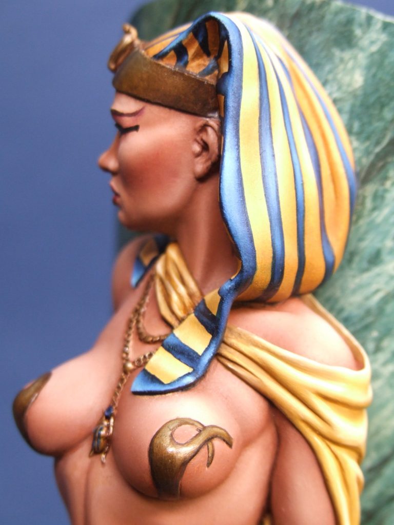
You can see on the banding higher up the side of the head where I’ve added some Titanium White to the blue areas within the lines to build up a mid-tone and highlight, whilst retaining a darker colour at the edges of the lines regardless of how much light is hitting them – cheating with the overhead lighting technique, but it’s visually pleasing. Oh, the blue being used is Prussian Blue.
Photo #10 shows how after marking out, the lines are gradually tinted with white paint to begin building up mid-tones,
and photo #11 show the side of the head-dress closest to the pillar is kept slightly darker to reinforce the idea of less light hitting it from a fairly central but high up light source.
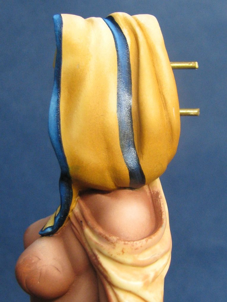
With the sides of the headdress painted in and allowed to dry, I could work on the easier section of lines that would run down the back of the head-dress. This is shown in photo #12 and a view from the side showing sections of the front and back of the headdress is in photo #13
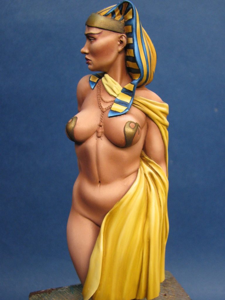
This shot also shows how the yellow colour has been extended down the cloth on the lower areas of the figure, and I was going to leave it like this, but once dry it looked a bit flat and boring.
In photo # 14 I’ve thought of a way to stop the boredom, by adding thin lines of the blue paint that was used on the headdress. It’s exactly the same method – thin paint, fine brush and a steady hand, but also a bit of thought to work out where the lines will go when they travel over the folds, and more importantly how they will double back on the reverse of the cloth where it folds over itself near the centre of the model.

In this photo, yes I’m still rattling on about #14, you can see the top line is being marked out, and that lower lines have had mid-tone and highlights built up using some of the Titanium White. As with the lines on the headdress, it’s a case of leaving a dark border and then working out where light and shade will be, and working the colour changes to reflect this. Beginning with the shadow colour helps, because then you only have to get a straight line in the creases once.
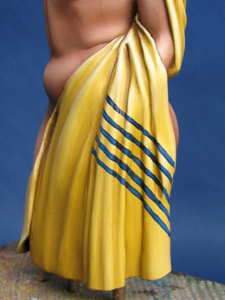
Granted, the blending is a bit rough at the moment on the lower lines, it needs neatening up and smoothing out; That’s the advantage with oils, in that the pattern can be done in half an hour or so, simply getting the paint in the right place and then worrying about smooth blending effects afterwards. Doing it that way will allow the light and shadow areas to flow through each section naturally, as the colours are blended together.
Photo #15 shows this section finished, with the blending neatened up.
On to photo #16 and I’ve had to carefully work out where the lines would reappear after the cloth has been through a process of folds. I worked this out with an old rag, drawing on lines with a felt tip, and then kind of folding it round a miniature arm on an armature ( O.K. fancy words for a bit of bent wire and an old hanky ).
More use of the above for working out the final set of lines to be added where the thin cloth she’s nearly wearing folds back on itself and the pattern can be seen on the reverse. I was tempted to have this colour faded as though it’s printed on the cloth, but as printing hadn’t been invented in Egyptian times, I assumed that either this pattern is dyed on, could be cloth strips sewn in place, or ( for the really rich ) is embroidered on by a bunch of handmaidens or slaves, and they were told to make a nice job of both sides……or else !
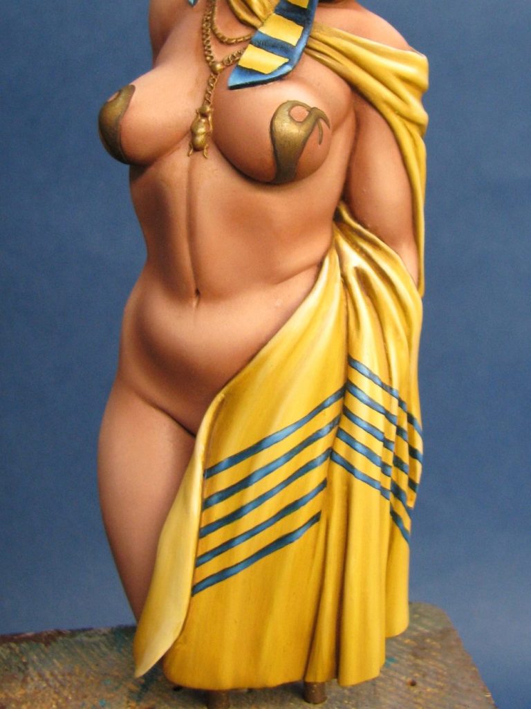
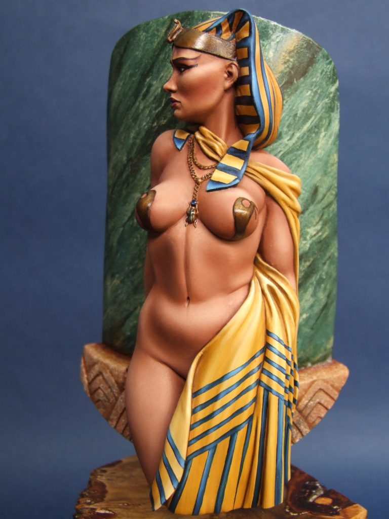
Also on show in photo #17 is that wonderful piece of resin that now looks like marble – the magic of article writing, you just can’t beat it.
There’s a few methods online for painting marble in 1:1 scale, and to be honest these are excellent tutorials in the art of faking it ( in a decorating sense ) and all that is necessary is that you scale down the tools and refine the movement of the hand to a miniature scale.
Goose feathers seem to be the favoured tool for the final marbling, I went and bothered Mother’s Budgie – Oh alright I waited until it’s lost a few large feathers and stored them for just a case like this……No I did, honest !
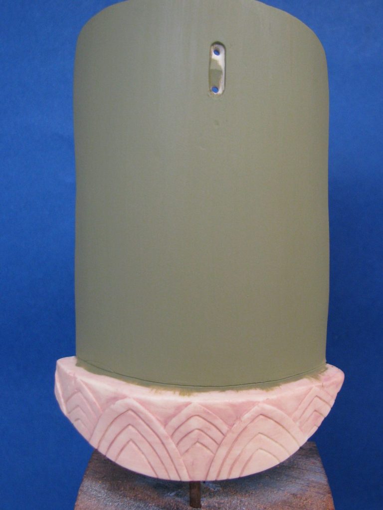
So, working through this production of marble.
Beginning with photo #18.
What’re we seeing here ?
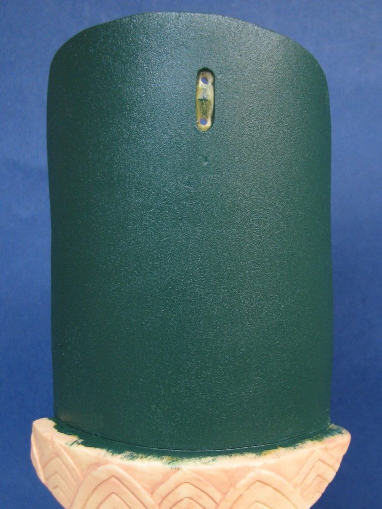
Well, the main part of the marble column has been painted with about five coats of a mid-green acrylic. I used very thin applications of paint so that it was smooth – something that is of great importance to the finished effect.
Photo #19 looks pretty much the same, but it has in fact been covered with a thin layer of oil colours. The green is a little more vivid, and is a mix of Prussian Green ( found somewhere near the bottom of a box of old paints ) Mars Yellow and Oxide of Chromium. No particular ratio of paints was used, I just added bits of each until I was happy with the colour. In this shot you’ll also notice that there is a slight texture to the paint when compared to photo #18. this is because I used a small section of sponge to stipple the whole area so that an even texture ran across the wet paint. Again, this is important, but that’ll become apparent as we move through the painting method.
In photo #20 I’ve begun adding a different colour to the marble – It’s interesting to have a look at different marble colourations ( because there are so many colour and pattern types ) and decide which you’re going to try and depict. Once you’ve done that, then you need to separate out the different colours that make up the marble – in this case a major part of the green marble is made up of quartz flecking, which from a distance appears to be a pale buff colour – exactly like Buff Titanium oil paint – how convenient is that !
An amount of the colour laid out on a tile and swirled around with a brush, then picked up on a small piece of sponge and dabbed on will recreate the basis of the pattern.
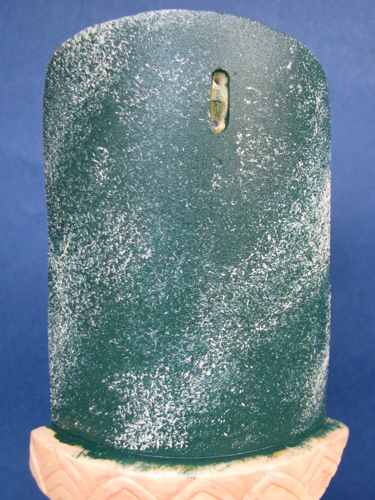
Again, like the colouration, look at the pattern on sections of marble, there is usually a distinct grain or layout to marble, and splitting this up so you can depict it in miniature will make the observer believe that it’s a natural substance, rather than a painted effect – bear in mind that the marble columns and panels that you see in a lot of North European stately homes are actually painted on plaster or wood, and not marble at all.
If you look at photo #20 you’ll notice a diagonal pattern formed from the lighter colour that runs from top right to bottom left. This will define the whole column for later on.
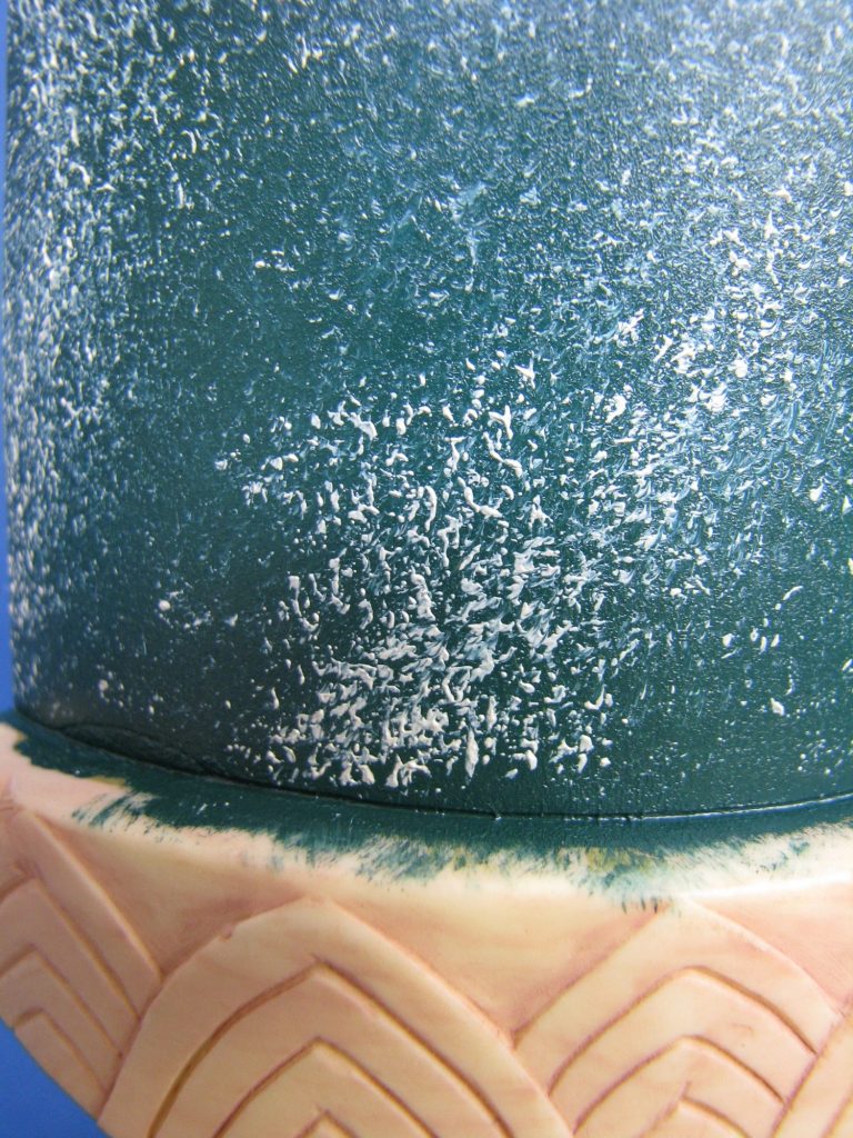
Photo #21 shows a close up of the sponged effect – the idea is to put on enough pressure to get the paint to semi mix with the layer it’s going on to, but not enough that there is anywhere near a full blending of the two colours. Confidence is the key here, and rather than dabbing with the sponge, strong definite placement of the colour will give a better effect.
Moving to photo #22, I’m now adding black paint to the areas that didn’t get too much of the Buff Titanium. This is easier because the sponge doesn’t get as contaminated with the green as it did when applying the lighter colour.
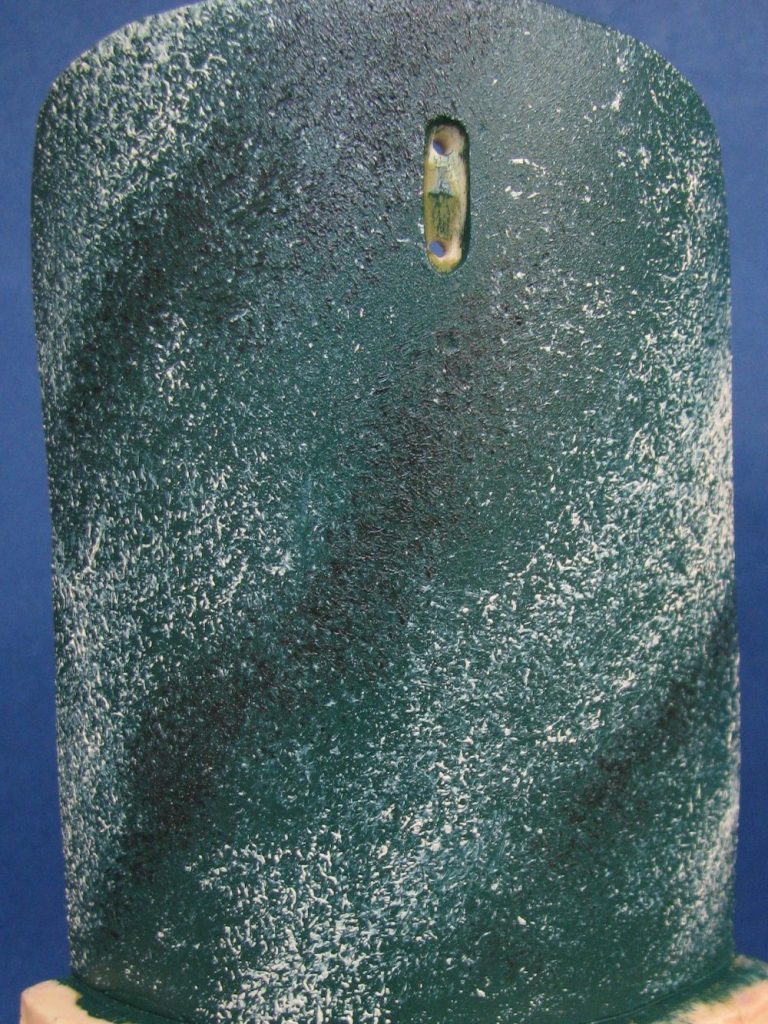
Now it might seem that all that hard work done so far has just been undone in photo #23. It hasn’t, the sponged effect is still there, but only in the small areas that this latest application hasn’t covered over. Simply put, I’ve tried my best to destroy a couple of long feathers ( from the tail or main flight areas of the wing ) from Mother’s Budgie. You’ll see the effect the paint has had on the feather in photo #29 – no peeping, we’ve not got that far yet.
The method with the feather is to push it against itself along the flow of the marble.
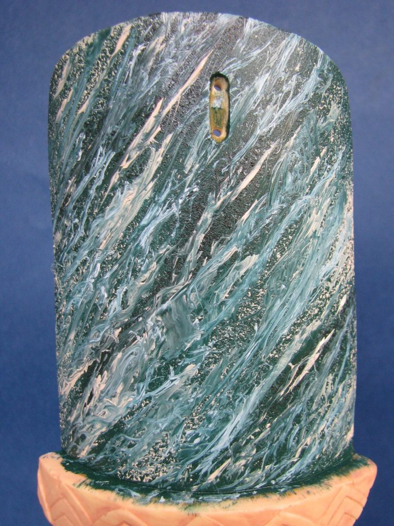
Explanation:- the design is running from top right to bottom left, so the feather is pushed in a line from bottom left to top right and the filaments of the feather react by splitting off in a very random manner to from the pattern seen in this shot. Constant wiping of the feather to reset its proper shape and to remove excess paint is necessary, as too is charging the feather with clean paint so it adds to the design.
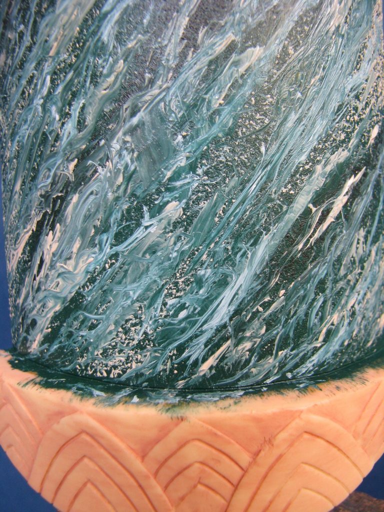
It looks messy, it is messy, but it’s like going back to childhood where you got to paint using your hands – expect a mess and don’t touch anything before you’ve washed your hands – paint will get all over the place.
Another close-up in photo #24, and you can just about make out the sponged effect still there in places under the mess made with the feather.
In photo #25 I’ve used a smaller feather to define some of the lighter patterning, again pushing the feather against it’s grain to get random splitting of the filaments.
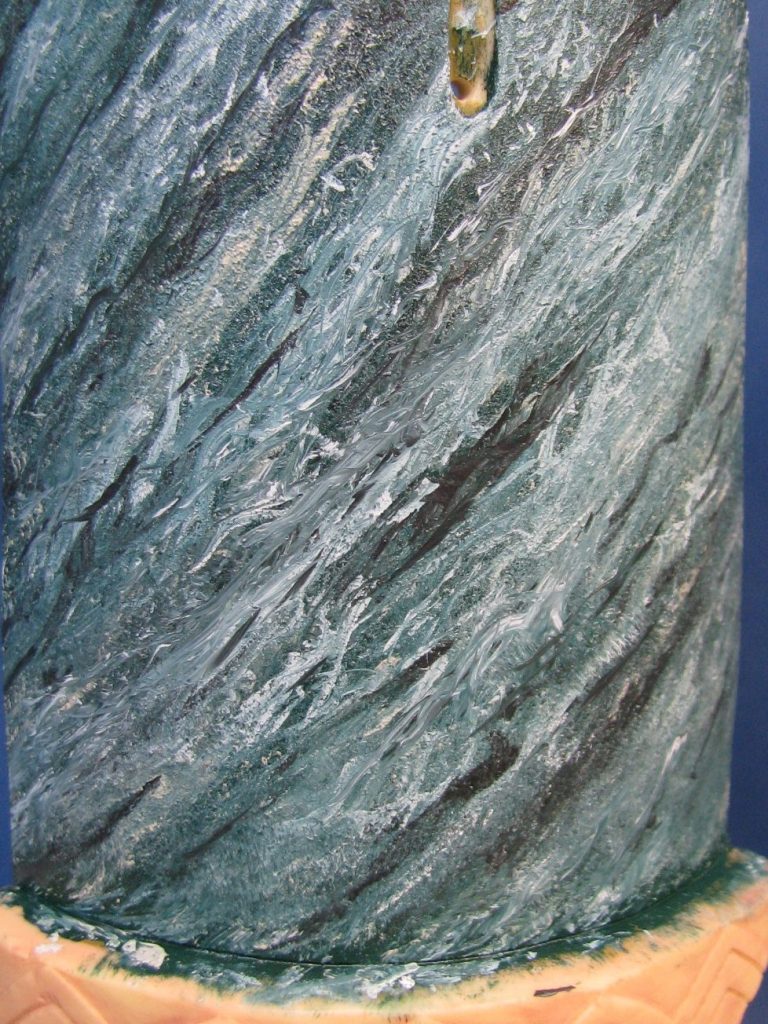
Because I’ve added a lot of light paint to the surface of the column, I thought I’d better get some of the darker colours in, so again using the small feather, I added some dark green and black to reinvent some of the fine line breaks in the pattern. See photo #26.
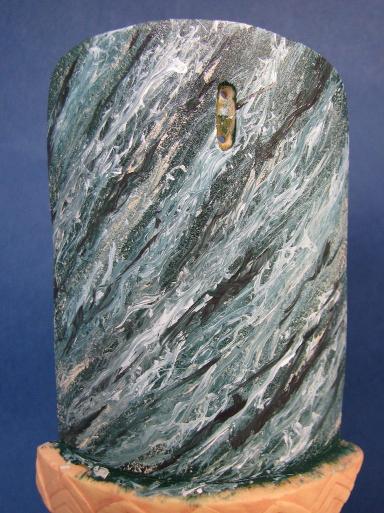
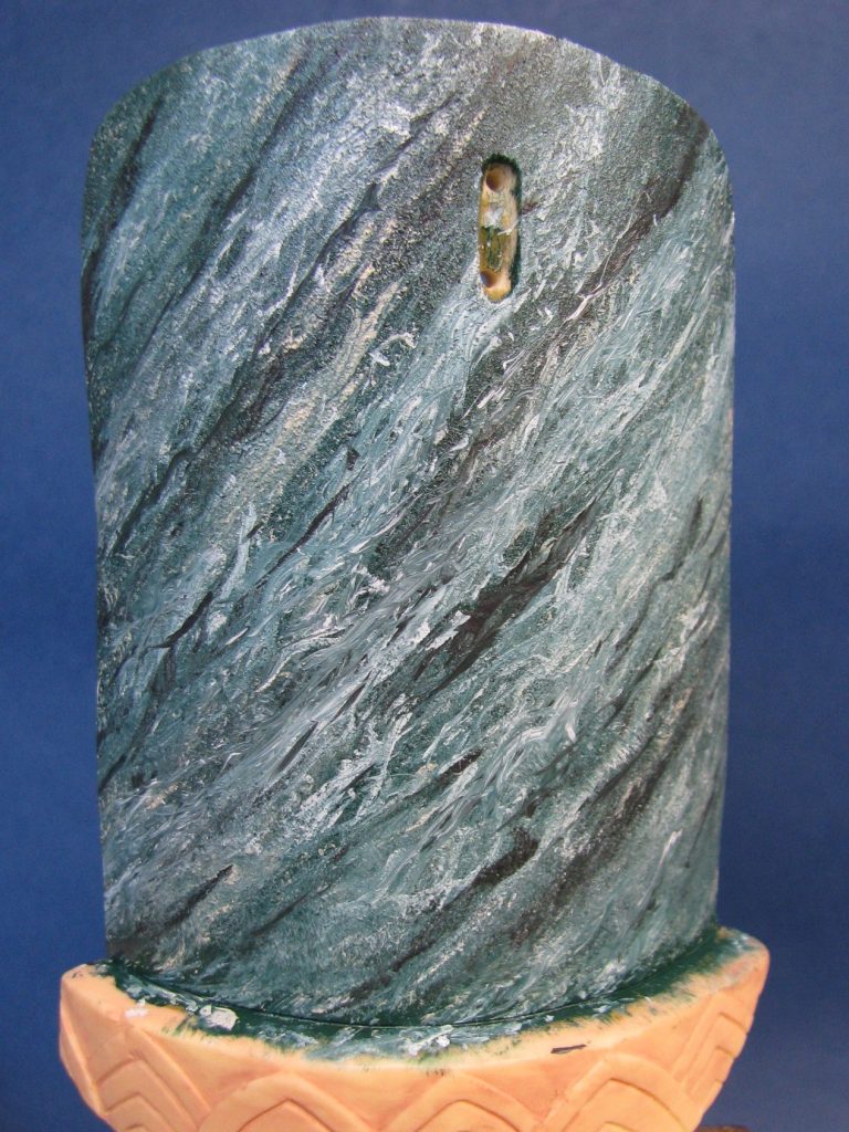
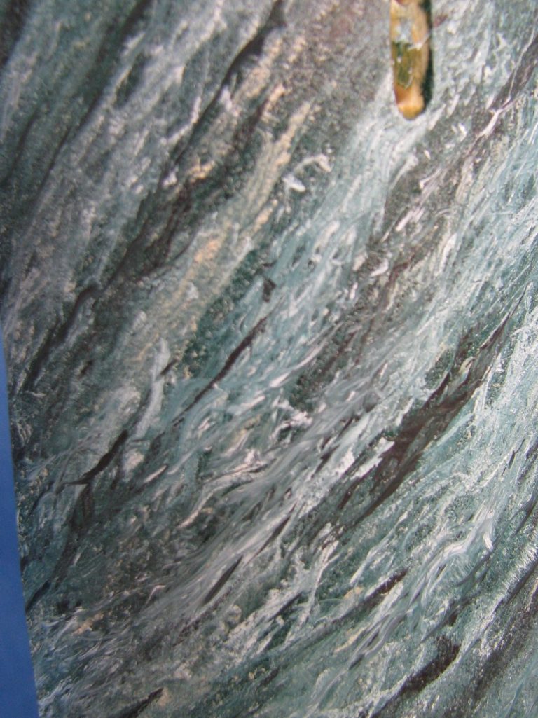
Now for the final tricks – a gentle pass over with a clean sponge evens out the texture, blurs some of the harsher effects and generally pulls things back into harmony – that’s photo #27 and a close-up in photo #28.
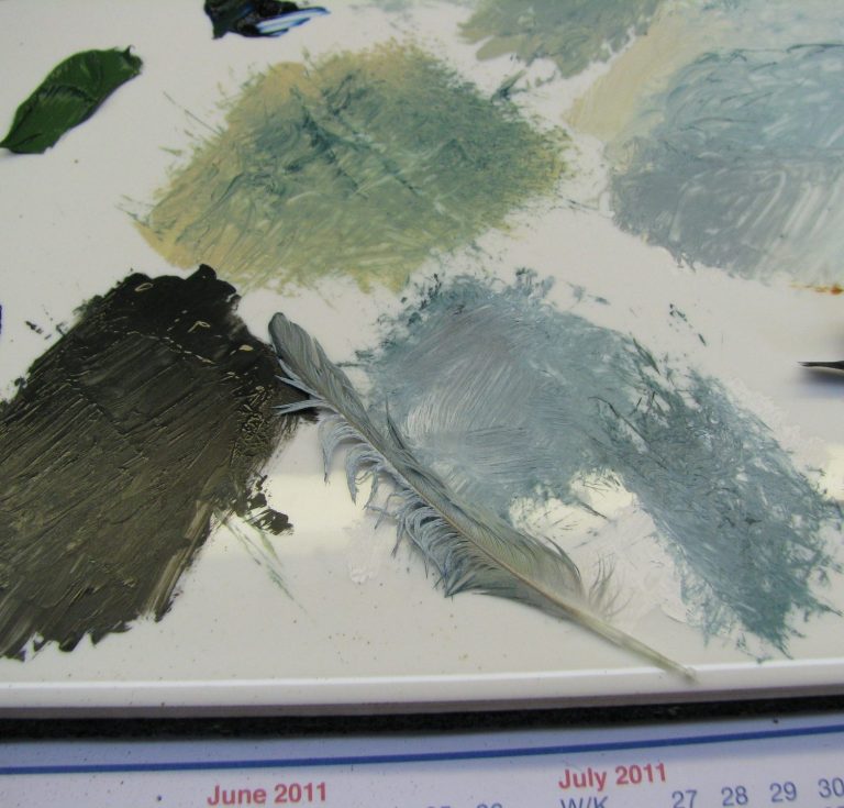
O.K. you can look at photo #29 now – that’s the smaller of the feathers and you can see how it’s been pushed out of shape and why the random effect happens. You can also see how big an area of your palette you’ll use – I use a 200mm x 150mm tile, and it’s pretty much covered with the paint mixes used on the column during this process.
With the amount of oil now on the model, it’s time to let it all dry, but just before that it’s an idea to clean off any areas that the paint shouldn’t have gotten on to, simply because this will show up under any paint applied later on. Even with the final pass of that sponge, the paint is thick enough to have a texture, and so once fully dry ( a week in the drying cabinet at least ) I began adding thin layers of varnish and then lightly sanding the whole area to level it all out. Again, this is a time consuming process, and probably something to do in between working on other projects, but the effect is worth the effort, and once flattened out with the varnish layers, it really looks cool.
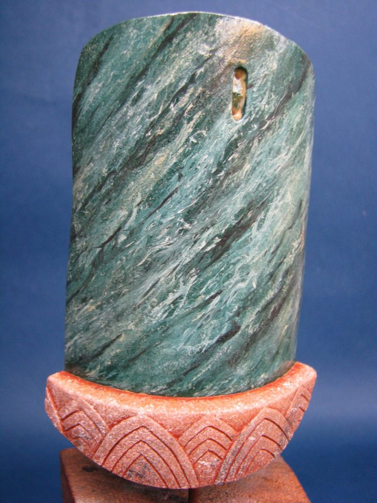
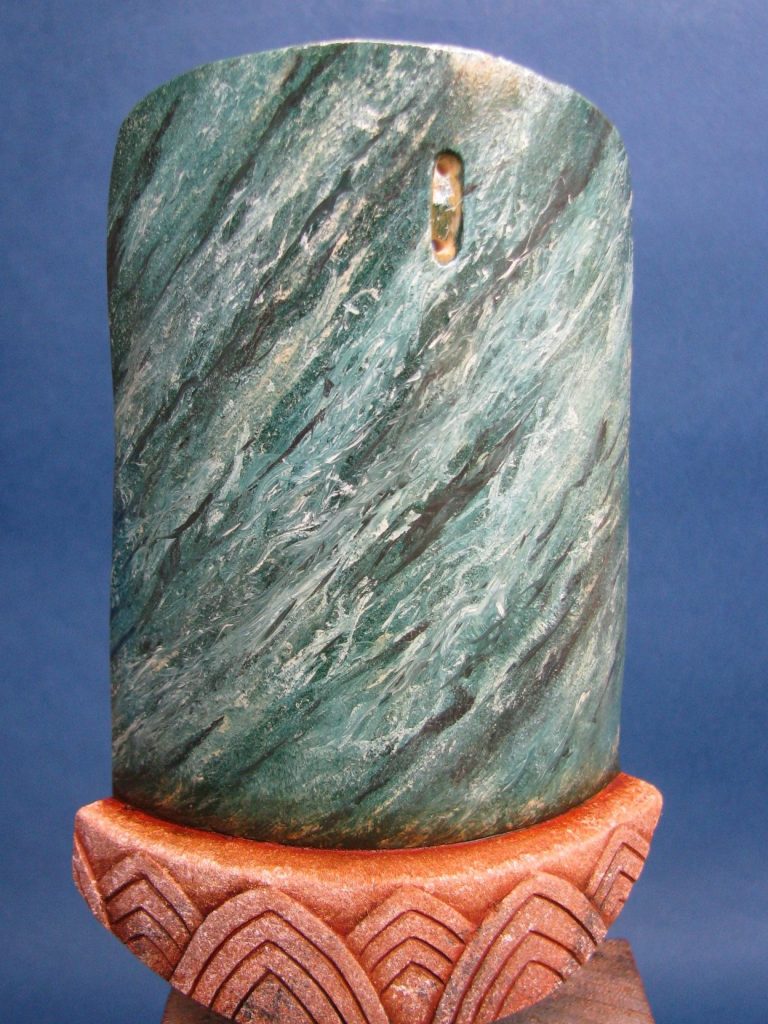
Again, it’s a case of deciding what you want to depict, as to whether the marble is to be highly polished or a more subtle silk finish – this will control how much and also the type of varnish you add to the area.
In photos #30 and 31 I’ve painted in the base to represent sandstone, using the rougher texture of the sculpting to add washes to make the column look a little grubby and stained – useless palace cleaners again, obviously !
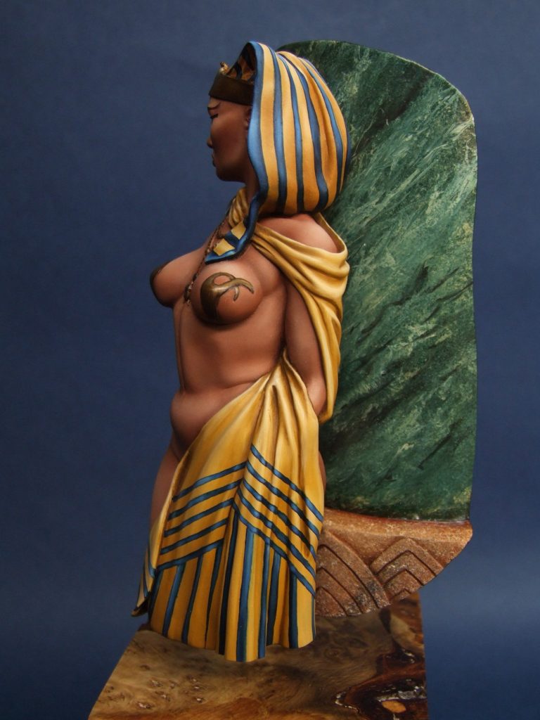
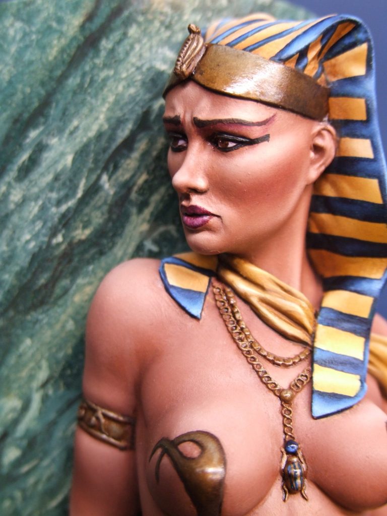
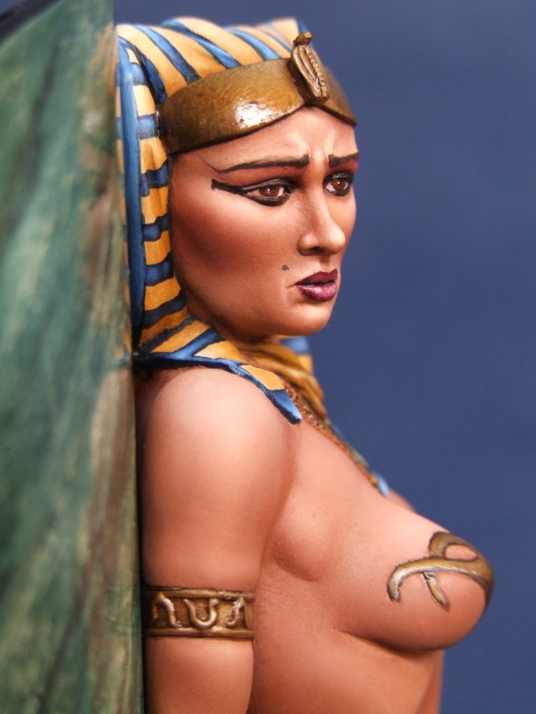
After that, some metallic areas and precious stones painted onto the jewellery and rings, fasten the figure to the column and then the whole piece onto a nice bit of wood, and that’s it finished.
Overall a nice kit to work on, plenty of areas to stretch the painter and also to practice new techniques with.
If memory serves me, this kit cost about £45 from El Greco Miniatures, and stands about 120mm tall – with it being semi-suspended on the tall wood plinth, it does dominate a display, oh alright, the bright colours and large expanses of flesh possibly draw the eye too, but it’s a piece that gets commented on and photographed regularly at shows – like a lot of the El Veijo Dragon kits, this one is reasonably priced, well sculpted and is eye-catching…….and fun to work on.

We need your consent to load the translations
We use a third-party service to translate the website content that may collect data about your activity. Please review the details in the privacy policy and accept the service to view the translations.